Interactive Table Visualization with lc_table_*
The lc_table_* prefix is used for SVG element IDs that need to display interactive table visualizations. This component renders tables directly in SVG using <text> and <rect> elements without relying on foreignObject, providing smooth scrolling, text truncation, and responsive layout capabilities perfect for data presentation, reporting, and dashboard interfaces.
What’s New
The lc_table component has been enhanced with powerful new features:
- Cell Highlighting System: Highlight specific cells, rows, or columns during narration with custom background and text colors
- Per-Column Highlight Colors: Define custom background and text colors per column for cell highlighting
- Row Identification: Use
reserved_rowidto uniquely identify rows for precise highlighting control - Font Size Control: Customize font sizes independently for desktop and mobile views, with separate control over content and header fonts
- Per-Column Font Sizing: Each column can have its own font size for better visual hierarchy and emphasis
- Platform-Specific Font Sizes: Different font sizes for desktop (16px default) and mobile (12px default) views
- Vertical Padding Control: Add configurable spacing to both headers and data rows for consistent column alignment
- Built-in Base Padding System: Automatic 5px cell padding, 12px column padding, 8px line padding, and 5px row padding
- Horizontal Padding Control: Add configurable horizontal spacing to the right of each column (12px default when not specified)
- Horizontal Row Spacing: Add configurable vertical spacing between all rows for improved readability and visual separation
- Platform-Specific Padding: Different padding values for desktop and mobile views (both vertical and horizontal)
- Smart Multi-Line Padding: Automatically handles padding when columns wrap across multiple visual lines
- Per-Column Configuration: Set different padding values for each column based on content needs
- Icon Support: Display icons from CDN URLs next to text in data rows with automatic scaling and optical centering
- Hide Row Separators: Option to hide horizontal separator lines between rows
Quick Start Tips
Highlighting Cells During Narration:
- Add
reserved_rowidcolumn to your data to enable cell highlighting - Use
highlightColorto define per-column background colors for highlights - Use
highlightTextColorto define per-column text colors during highlighting - Highlight format:
{tableId}__elements:[{"row":"rowId","column":"value"}] - Supports highlighting specific cells, entire rows, or entire columns
- Intelligent rounded corners create unified visual blocks
Adding Icons:
- Use
_icon_columnNameto add icons to any column - Icons work best with reliable CDN URLs (e.g., jsDelivr, Unpkg)
- SVG format recommended for best quality
- Icons automatically scale with font size
Customizing Font Sizes:
- Use
desktopFontSizeandmobileFontSizeto control content font sizes per column - Use
desktopHeaderFontSizeandmobileHeaderFontSizefor separate header font control - Default is 16px for desktop and 12px for mobile
- Minimum font size is 11px (smaller values are clamped)
- Great for emphasizing important columns or creating visual hierarchy
Improving Readability:
- Add
desktopVerticalPaddingandmobileVerticalPaddingto create space in both headers and data rows - Start with values like “8”, “10”, or “12” pixels
- Vertical padding applied below text for consistent column alignment
- Built-in 5px row padding automatically included
Controlling Spacing:
- Use
desktopHorizontalPaddingandmobileHorizontalPaddingfor precise column spacing - Default 12px right padding applied when horizontal padding not specified
- When defined, overrides the default 12px padding with your custom values
- Use
horizontalRowSpacingto add vertical space between all rows - You have full control over all spacing
Clean Design:
- Add
hideRowSeparatorsreserved type to remove row lines - Combine with
horizontalRowSpacingfor consistent spacing without separator lines - Works great with vertical padding for visual separation
- Creates a modern, minimal look
Use Cases
- Data Storytelling: Guide viewers through narrative by highlighting key data points during narration
- Trend Analysis: Highlight specific rows or columns to emphasize patterns and anomalies
- Comparison Tables: Use cell highlighting to focus attention on comparative values
- Status Dashboards: Combine icons and highlighting for real-time status visualization
- Equipment inventory and asset management tables with status icons and highlighting
- Customer data and contact lists with visual indicators and selective emphasis
- Financial reports and accounting data with improved readability through padding and highlighting
- Project status and task tracking with priority icons, color coding, and progress highlighting
- Performance metrics and KPI dashboards with visual status indicators and dynamic highlighting
- Product catalogs and specifications with category icons and featured product highlighting
- User activity logs and audit trails with clean, spacious layouts and event highlighting
- Sales pipeline and opportunity tracking with stage icons, visual hierarchy, and deal highlighting
Element Identification
The target element must be a <rect> with an ID that starts with lc_table_* for automatic table visualization.
Input Format
The input value must be provided as a JSON array of objects with a specific row-based structure that includes both configuration rows (reserved rows) and actual data rows.
Table Data Structure
The table handler consumes an array of row objects where some rows are “reserved” configuration rows (identified by reserved_type), and the rest are data rows. The structure is read-only and immutable.
Row Types:
- Reserved Rows: Configure header labels, colors, alignment, layout, and font sizes
- Data Rows: Actual table data with string values, keys matching the column keys
Reserved Row Types
| reserved_type | Required Keys | Type | Description |
|---|---|---|---|
columnLabel | <colKey>: <header label> | string | Defines column order and header labels. The object’s key order determines column order. If omitted, order falls back to the first data row’s keys (excluding reserved_type). |
textcolor | <colKey>: <color> | string | Per-column text color for both header and body. Any valid CSS color (hex/name). Falls back to scene text color. |
textColumnHeaderColor | <colKey>: <color> | string | Per-column header text color only. Takes precedence over textcolor for headers. Falls back to textcolor if not specified. |
textAlignment | <colKey>: left\|center\|right | string | Per-column alignment. Mapped to SVG text-anchor: start/middle/end. Defaults to left. |
desktopLayoutHint | <colKey>: <fraction 0..1> | number | Per-column width fractions for desktop. Fractions are normalized per header “line”. If cumulative sum exceeds 1, layout wraps to next line. |
mobileLayoutHint | <colKey>: <fraction 0..1> | number | Same as desktopLayoutHint, applied when not in desktop mode. |
desktopFontSize | <colKey>: <px number> | number | Font size in pixels per column for desktop content (minimum 11px). If not specified, defaults to 16px. |
desktopHeaderFontSize | <colKey>: <px number> | number | Font size in pixels per column for desktop headers (minimum 11px). If not specified, uses same as content font size. |
mobileFontSize | <colKey>: <px number> | number | Font size in pixels per column for mobile content (minimum 11px). If not specified, defaults to 12px. |
mobileHeaderFontSize | <colKey>: <px number> | number | Font size in pixels per column for mobile headers (minimum 11px). If not specified, uses same as content font size. |
desktopVerticalPadding | <colKey>: <px number> | number | Vertical padding in pixels per column for desktop view (both headers and data rows). Padding is added entirely below the text. |
mobileVerticalPadding | <colKey>: <px number> | number | Vertical padding in pixels per column for mobile view (both headers and data rows). Padding is added entirely below the text. |
desktopHorizontalPadding | <colKey>: <px number> | number | Horizontal padding in pixels per column for desktop view (headers and data rows). Default is 12px if not specified. When defined, overrides default. |
mobileHorizontalPadding | <colKey>: <px number> | number | Horizontal padding in pixels per column for mobile view (headers and data rows). Default is 12px if not specified. When defined, overrides default. |
horizontalRowSpacing | <colKey>: <px number> | number | Spacing in pixels between all rows. Values defined per column; the maximum value across all columns is used as the effective spacing for the entire table. |
highlightColor | <colKey>: <color> | string | Per-column background color for cell highlighting during narration. Supports hex colors or color names. Falls back to scene text color if not specified. |
highlightTextColor | <colKey>: <color> | string | Per-column text color for cell highlighting during narration. Optional. If not specified, text color remains unchanged during highlighting. |
hideRowSeparators | none | n/a | Hides horizontal separator lines between rows. Simply add this reserved_type object to enable (no additional properties needed). |
Data Row Format
| Key | Type | Description |
|---|---|---|
reserved_type | string | If omitted or set to “data”, the row is treated as a data row. |
reserved_rowid | string | Required for cell highlighting. Unique identifier for each row used to target specific rows during highlighting. Not displayed in the rendered table. |
<colKey> | string | Cell value for that column. Keys must match column keys defined by columnLabel (or implied by first data row if columnLabel is missing). |
JSON Format
A JSON string containing an array of row objects:
[
  {
    "reserved_type": "columnLabel",
    "reserved_rowid": "Row ID",
    "Serial Number": "Serial Number",
    "Product": "Product",
    "Install Date": "Install Date",
    "Last Upload Time": "Last Upload Time",
    "Equipment Group": "Equipment Group"
  },
  {
    "reserved_type": "textcolor",
    "reserved_rowid": "#666666",
    "Serial Number": "#111111",
    "Product": "#111111",
    "Install Date": "#111111",
    "Last Upload Time": "#111111",
    "Equipment Group": "#111111"
  },
  {
    "reserved_type": "textColumnHeaderColor",
    "reserved_rowid": "#0066CC",
    "Serial Number": "#0066CC",
    "Product": "#0066CC",
    "Install Date": "#FF6600",
    "Last Upload Time": "#FF6600",
    "Equipment Group": "#009900"
  },
  {
    "reserved_type": "textAlignment",
    "reserved_rowid": "left",
    "Serial Number": "left",
    "Product": "left",
    "Install Date": "right",
    "Last Upload Time": "center",
    "Equipment Group": "right"
  },
  {
    "reserved_type": "desktopLayoutHint",
    "reserved_rowid": "0.1",
    "Serial Number": "0.25",
    "Product": "0.25",
    "Install Date": "0.2",
    "Last Upload Time": "0.3",
    "Equipment Group": "0.3"
  },
  {
    "reserved_type": "mobileLayoutHint",
    "reserved_rowid": "0.2",
    "Serial Number": "1",
    "Product": "0.5",
    "Install Date": "0.5",
    "Last Upload Time": "0.4",
    "Equipment Group": "0.6"
  },
  {
    "reserved_type": "desktopFontSize",
    "reserved_rowid": "14",
    "Serial Number": "14",
    "Product": "18",
    "Install Date": "14",
    "Last Upload Time": "14",
    "Equipment Group": "16"
  },
  {
    "reserved_type": "desktopHeaderFontSize",
    "reserved_rowid": "12",
    "Serial Number": "12",
    "Product": "14",
    "Install Date": "12",
    "Last Upload Time": "12",
    "Equipment Group": "13"
  },
  {
    "reserved_type": "mobileFontSize",
    "reserved_rowid": "12",
    "Serial Number": "12",
    "Product": "13",
    "Install Date": "12",
    "Last Upload Time": "12",
    "Equipment Group": "12"
  },
  {
    "reserved_type": "mobileHeaderFontSize",
    "reserved_rowid": "11",
    "Serial Number": "11",
    "Product": "12",
    "Install Date": "11",
    "Last Upload Time": "11",
    "Equipment Group": "11"
  },
  {
    "reserved_type": "highlightColor",
    "reserved_rowid": "#E3F2FD",
    "Serial Number": "#FFEB3B",
    "Product": "#4285F4",
    "Install Date": "#81C784",
    "Last Upload Time": "#FF9800",
    "Equipment Group": "#9C27B0"
  },
  {
    "reserved_type": "data",
    "reserved_rowid": "eq1",
    "Serial Number": "17034EL-002",
    "Product": "SafeCore Module",
    "Install Date": "",
    "Last Upload Time": "01/06/2023 06:35 AM",
    "Equipment Group": "Turnaround Pool"
  },
  {
    "reserved_rowid": "eq2",
    "Serial Number": "18045EL-003",
    "Product": "Control Unit",
    "Install Date": "12/15/2022",
    "Last Upload Time": "01/06/2023 08:20 AM",
    "Equipment Group": "Primary Operations"
  }
]
Note: The reserved_rowid column is included in this example to enable cell highlighting. If you don’t need highlighting functionality, you can omit it from your data.
Dataset/CSV Format
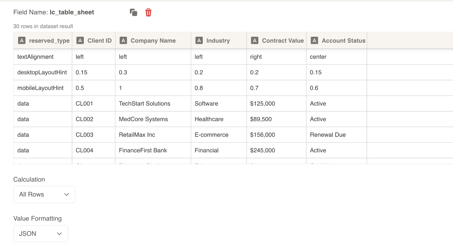
Alternatively, you can use tabular data from your datasets. Since the table uses a row-based configuration system, you’ll need to structure your dataset with both configuration and data rows:
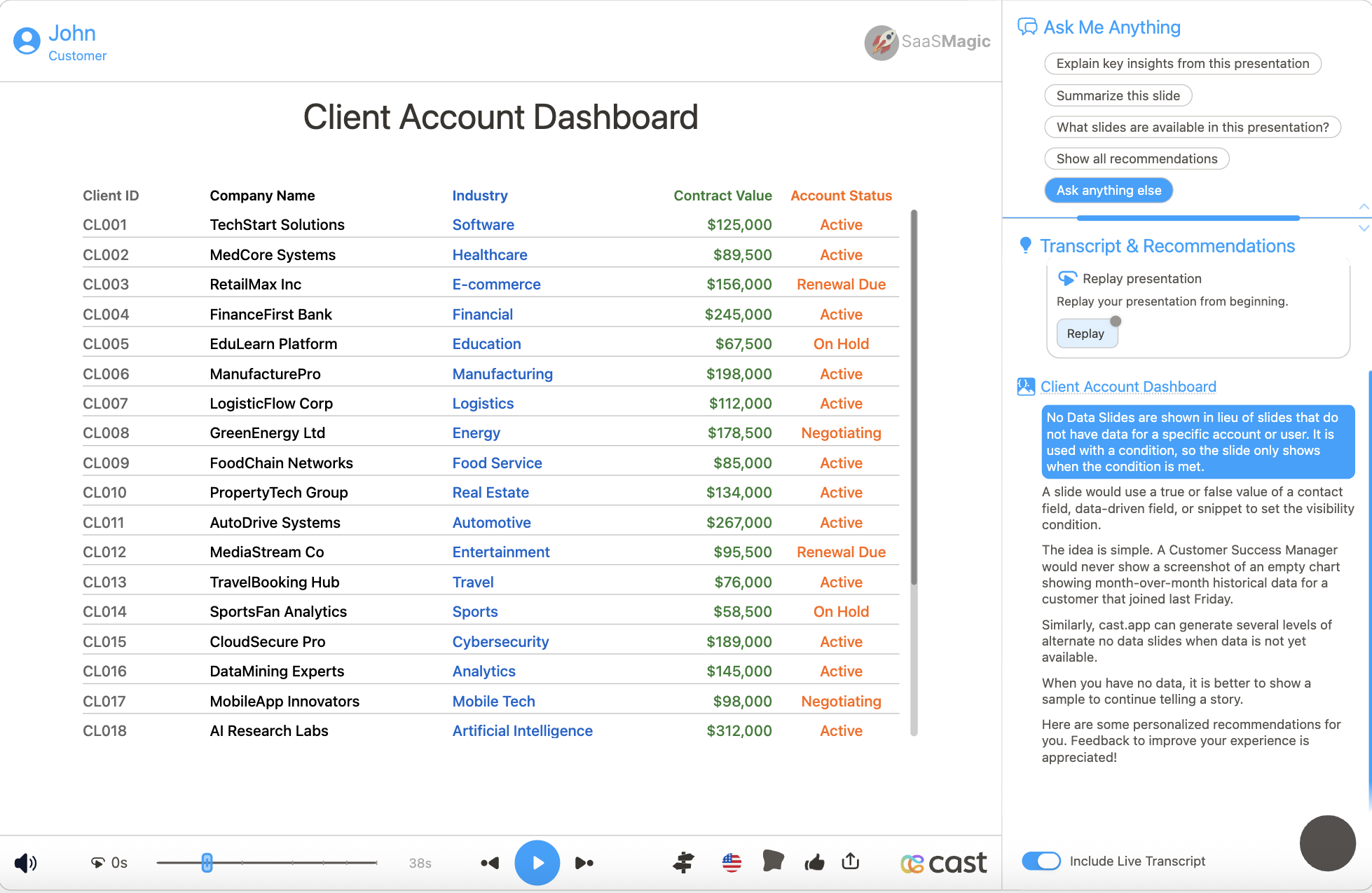
| reserved_type | reserved_rowid | Client ID | Company Name | Industry | Contract Value | Account Status |
|---|---|---|---|---|---|---|
| columnLabel | Row ID | Client ID | Company Name | Industry | Contract Value | Account Status |
| textcolor | #666666 | #666666 | #000000 | #0066CC | #2E7D32 | #FF6600 |
| textAlignment | left | left | left | left | right | center |
| desktopLayoutHint | 0.1 | 0.15 | 0.25 | 0.2 | 0.15 | 0.15 |
| mobileLayoutHint | 0.2 | 0.5 | 1 | 0.8 | 0.7 | 0.6 |
| desktopFontSize | 14 | 14 | 18 | 14 | 16 | 14 |
| desktopHeaderFontSize | 12 | 12 | 14 | 12 | 13 | 12 |
| mobileFontSize | 12 | 12 | 13 | 12 | 12 | 12 |
| mobileHeaderFontSize | 11 | 11 | 12 | 11 | 11 | 11 |
| highlightColor | #E3F2FD | #FFEB3B | #4285F4 | #34A853 | #81C784 | #FF9800 |
| data | client1 | CL001 | TechStart Solutions | Software | $125,000 | Active |
| data | client2 | CL002 | MedCore Systems | Healthcare | $89,500 | Active |
| data | client3 | CL003 | RetailMax Inc | E-commerce | $156,000 | Renewal Due |
Dataset Usage:
- Connect your table to a dataset containing both configuration and data rows
- The system will automatically parse reserved rows and data rows based on
reserved_type - Filter data rows to show relevant table content
- Use configuration rows to control appearance and layout
Important Notes:
- Column names must match exactly between configuration rows and data rows
- Column names are case-sensitive and must be consistent across all rows
- Include
reserved_rowidcolumn if you plan to use cell highlighting features - The
reserved_rowidcolumn will not be displayed in the rendered table - If data is not passed in the correct format, the element will display as a plain
<rect>without any table visualization
Implementation Steps for Dataset Usage
To use dataset/CSV format with tables, follow these steps:
Create Dataset: Import your data containing both configuration rows (with reserved_type) and data rows
Create Field: Create a field from your dataset that contains the table data
Set Value Formatting: In the field settings, set Value Formatting to “JSON” - this is crucial for proper data formatting
Override SVG Variables: In the SVG slide design tab, go to “Override SVG Variables”
Select Variable: Choose your table variable and use the format with your field
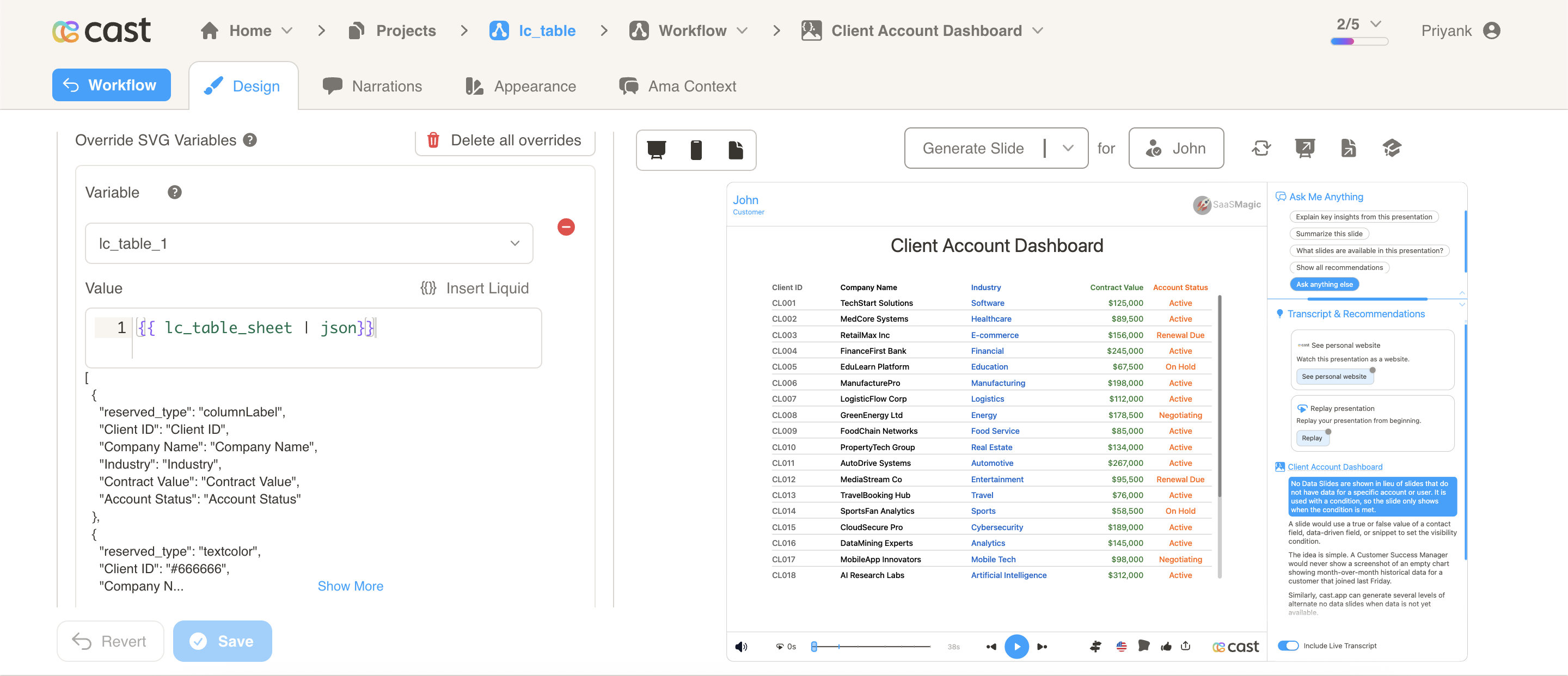
Include JSON Filter: Critical: Always include the | json filter with your field, otherwise the table will not work
Scrolling Behavior
- Wheel-Only Scrolling: Scrolling active when cursor is inside table rect
- No Drag Scrolling: Only mouse wheel scrolling is supported
- Conditional Scrollbar: Scrollbar appears only when content overflows
Cell Highlighting
The table supports a powerful cell highlighting system that allows you to highlight specific cells, entire rows, or entire columns during narration. This is perfect for drawing attention to important data, emphasizing trends, or guiding viewers through your data story.
Row Identifier (reserved_rowid)
To enable cell highlighting, you must include a reserved_rowid column in your data. This column:
- Provides a unique identifier for each row
- Is used to target specific rows during highlighting
- Is not displayed in the rendered table
- Should be included as a regular column in both configuration and data rows
Example:
[
  {
    "reserved_type": "columnLabel",
    "reserved_rowid": "Row ID",
    "name": "Name",
    "status": "Status",
    "value": "Value"
  },
  {
    "reserved_rowid": "row1",
    "name": "Alice Johnson",
    "status": "Active",
    "value": "$125,000"
  },
  {
    "reserved_rowid": "row2",
    "name": "Bob Smith",
    "status": "Pending",
    "value": "$89,500"
  }
]
Important: Without reserved_rowid, all highlighting will be skipped with a console warning.
Highlight Colors
Define per-column background and text colors for cell highlighting. When cells are highlighted during narration, they use these colors with intelligent 20px rounded corners based on adjacent highlighted cells.
Highlight Background Color
Define background colors per column when cells are highlighted:
{
  "reserved_type": "highlightColor",
  "status": "yellow",
  "name": "#FFD700",
  "value": "#4285F4"
}
Configuration Details:
- Set background color for each column using hex codes or color names
- Falls back to scene text color if not specified
- Each column can have its own highlight color
- Supports all valid CSS color formats
Highlight Text Color (Optional)
Define text colors per column during highlighting:
{
  "reserved_type": "highlightTextColor",
  "status": "#000000",
  "name": "#FFFFFF",
  "value": "#FFFFFF"
}
Configuration Details:
- Optional: if not specified, text color remains unchanged during highlighting
- Useful for ensuring text readability on colored backgrounds
- Each column can have its own highlight text color
- Supports all valid CSS color formats
Color Behavior Scenarios
| Scenario | Background Color | Text Color |
|---|---|---|
| No highlight colors defined | Scene text color | Unchanged (original) |
Only highlightColor defined | Per-column custom colors | Unchanged (original) |
Only highlightTextColor defined | Scene text color | Per-column custom colors |
Both highlightColor and highlightTextColor | Per-column custom colors | Per-column custom colors |
Highlight Format
Table cells are highlighted using a JSON array format: [{"row":"rowId","column":"value"}]
Three Highlight Types:
| Type | Format | Description | Example |
|---|---|---|---|
| Value-Based Cell | {"row":"rowId","column":"cellValue"} | Highlights all cells in the specified row containing the matching value | [{"row":"row1","column":"High"}] highlights all “High” cells in row1 |
| Entire Row | {"row":"rowId"} | Highlights all cells in the specified row | [{"row":"row1"}] highlights all cells in row1 |
| Entire Column | {"column":"columnName"} | Highlights all cells in the specified column by name | [{"column":"status"}] highlights entire status column |
Key Features:
- Case Insensitive: Row IDs, column names, and cell values are matched case-insensitively
- Multiple Targets: Combine different highlight types in one array:
[{"row":"row1"},{"column":"priority"}] - Value Search: When both
rowandcolumnare specified, searches by cell VALUE (not column name) - Smart Corners: 20px rounded corners automatically applied based on adjacent highlighted cells
Practical Highlight Examples
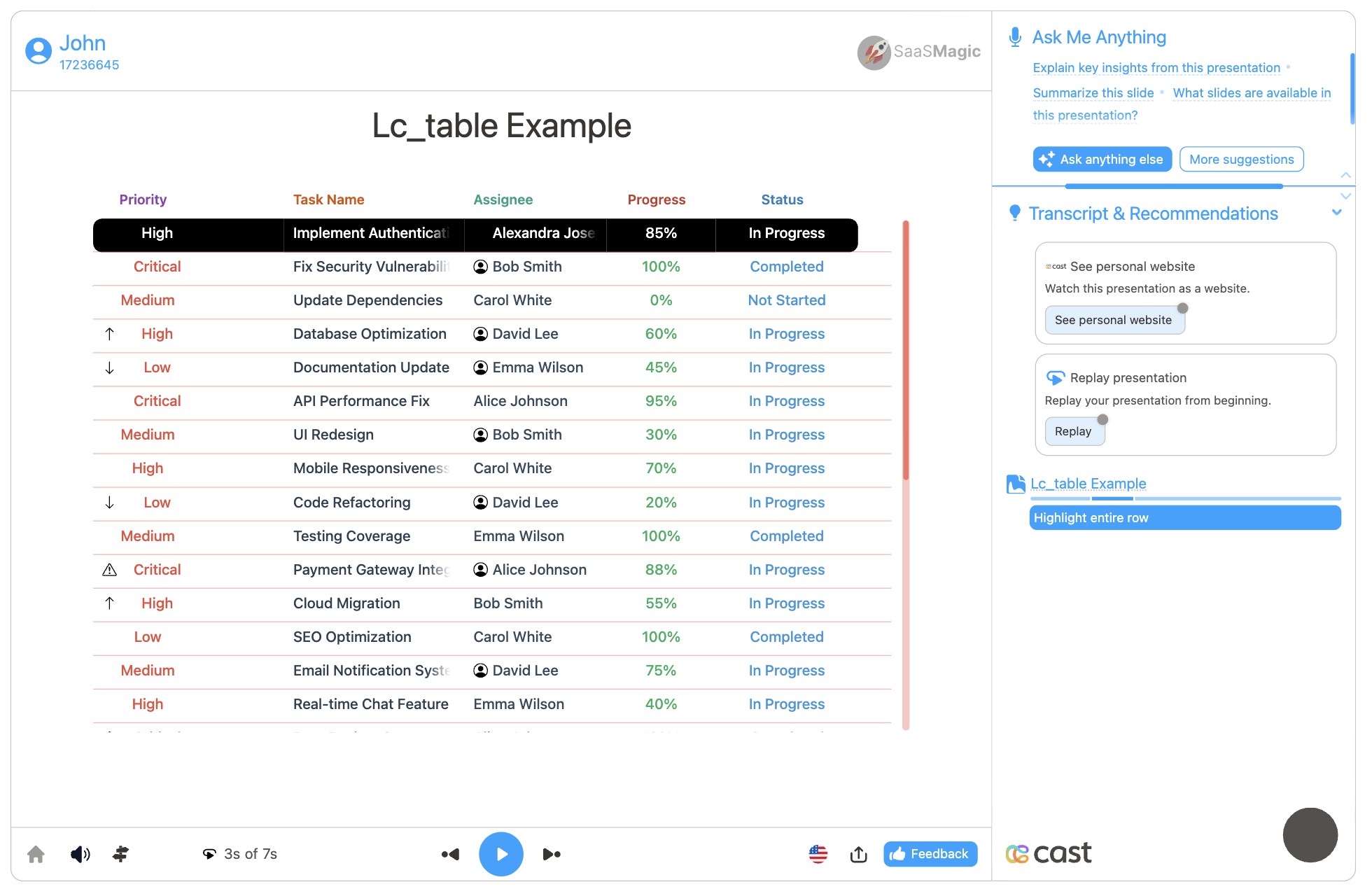
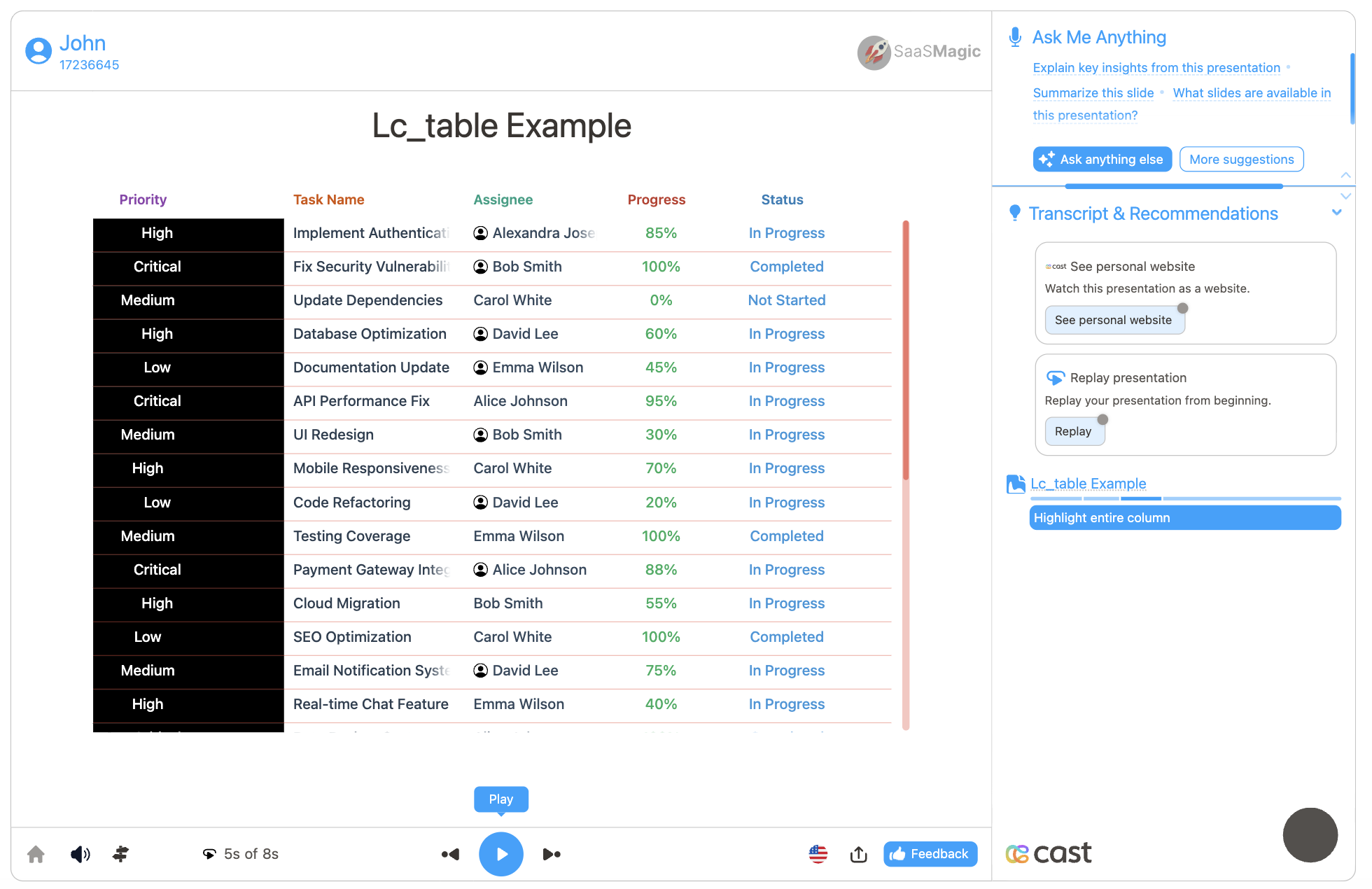
Using this task management table data as an example:
[
  {
    "reserved_type": "columnLabel",
    "reserved_rowid": "Row ID",
    "priority": "Priority",
    "taskName": "Task Name",
    "assignee": "Assignee",
    "progress": "Progress",
    "status": "Status"
  },
  {
    "reserved_type": "highlightColor",
    "reserved_rowid": "#000000",
    "priority": "#e74c3c",
    "taskName": "#2c3e50",
    "assignee": "#34495e",
    "progress": "#27ae60",
    "status": "#3498db"
  },
  {
    "reserved_type": "highlightTextColor",
    "reserved_rowid": "#000000",
    "priority": "#ffffff",
    "taskName": "#ffffff",
    "assignee": "#ffffff",
    "progress": "#ffffff",
    "status": "#ffffff"
  },
  {
    "reserved_rowid": "row1",
    "priority": "High",
    "taskName": "Implement Authentication System",
    "assignee": "Alice Johnson",
    "progress": "85%",
    "status": "In Progress"
  },
  {
    "reserved_rowid": "row2",
    "priority": "Critical",
    "taskName": "Fix Security Vulnerability",
    "assignee": "Bob Smith",
    "progress": "100%",
    "status": "Completed"
  },
  {
    "reserved_rowid": "row3",
    "priority": "Medium",
    "taskName": "Update Dependencies",
    "assignee": "Carol White",
    "progress": "0%",
    "status": "Not Started"
  }
]
Highlight Usage Examples:
Example 1: Highlight specific cell value
[{ "row": "row2", "column": "Critical" }]
Highlights all “Critical” priority cells in row2.

Example 2: Highlight entire row
[{ "row": "row1" }]
Example 3: Highlight entire column
[{ "column": "priority" }]
Highlights entire priority column to emphasize task priorities.
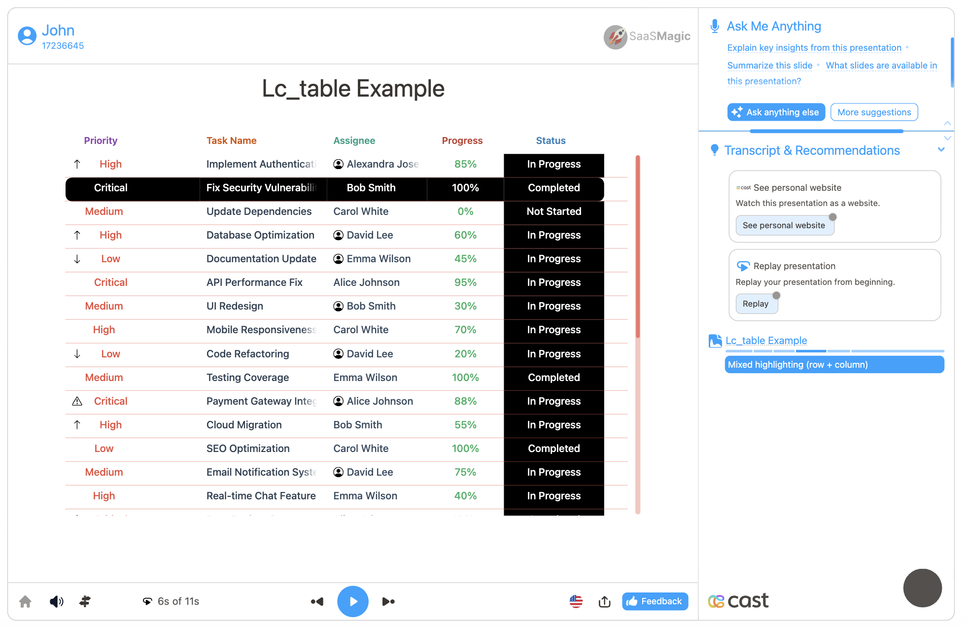
Example 4: Mixed highlighting (row + column)
[{ "row": "row2" }, { "column": "status" }]
Highlights specific task row AND entire status column, creating a cross pattern.
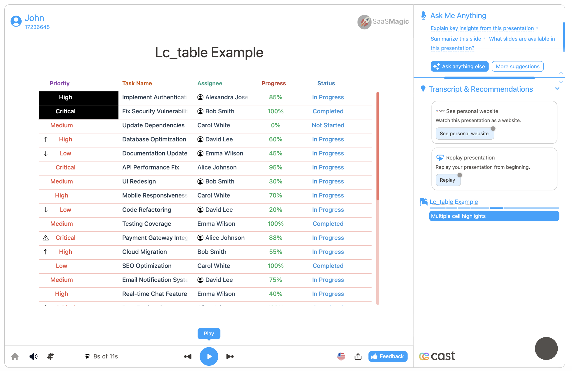
Example 5: Multiple cell highlights
[
  { "row": "row1", "column": "High" },
  { "row": "row2", "column": "Critical" }
]
Highlights multiple high-priority tasks across different rows.
Applying Highlights During Narration:
- Click Visual Explanation on your narration step
- Find the
lc_tableelement input field - Add your highlight format to emphasize cells during that narration
Icon Support
The table supports displaying icons from CDN URLs next to text in data rows, providing visual indicators for status, categories, and priorities.
Icon Column Format
Icons are added using a special column naming convention with the _icon_ prefix:
_icon_columnName
For example, to add icons to a status column, create an _icon_status column with CDN URLs:
{
  "status": "Active",
  "_icon_status": "https://cdn.jsdelivr.net/npm/heroicons@2.0.18/24/solid/check-circle.svg",
  "priority": "High",
  "_icon_priority": "https://cdn.jsdelivr.net/npm/heroicons@2.0.18/24/solid/arrow-up.svg"
}
Icon Behavior:
_icon_columns are hidden and don’t appear as separate visible columns- Icons only display in data rows, not in headers
- Icon appears 5px to the left of the text
- Icon size automatically matches the font size of the row
- Icons and text move together based on the column’s
textAlignmentsetting - Supports SVG, PNG, JPG, GIF, and WebP formats
- Invalid URLs are gracefully handled (icon hidden on error)
Supported Icon Sources:
- CDN URLs (jsDelivr, Unpkg, Cloudflare, etc.)
- Direct image URLs
- SVG format recommended for best quality
When to Use Icons:
- Status indicators (active, pending, complete)
- Priority levels (high, medium, low)
- Category identification (device types, departments)
- Visual data emphasis
Vertical Padding
Vertical padding controls the vertical spacing in both headers and data rows, ensuring consistent column alignment. The table uses a multi-layer padding system with built-in base padding plus optional user-defined padding.
Base Vertical Padding (Built-in)
The table automatically includes base padding that is always applied:
- 5px row padding at the bottom of each row (provides spacing between rows)
- 8px line padding between wrapped visual lines within a row (only when vertical padding > 0; otherwise wrapped lines have no gap)
These base padding values are built-in and not configurable.
User-Configurable Vertical Padding (Optional)
In addition to the base padding, you can add custom vertical padding per column:
{
  "reserved_type": "desktopVerticalPadding",
  "columnName1": "12",
  "columnName2": "8",
  "columnName3": "10"
}
{
  "reserved_type": "mobileVerticalPadding",
  "columnName1": "10",
  "columnName2": "6",
  "columnName3": "8"
}
Configuration Details:
- Set padding value in pixels for each column (e.g., “8”, “12”, “16”)
- Applied to both headers and data rows for consistent column alignment
- Padding is added BELOW the text: 100% of the padding is added below the cell content
- Vertical centering preserved: Text remains centered within the original cell height (line height without padding)
- Use
desktopVerticalPaddingfor desktop views - Use
mobileVerticalPaddingfor mobile views - When columns wrap to multiple lines, the maximum padding from each line is used
- Defaults to 0 if not specified (only base padding applied)
Total Vertical Spacing Formula
Header:
Header height = line height + user vertical padding + 8px line padding (if multi-line AND vertical padding > 0)
Data Row:
Row height = line height + user vertical padding + 8px line padding (if multi-line AND vertical padding > 0) + 5px row padding
Example: If desktopVerticalPadding: "100":
- Cell gets 100px padding added below the text content
- Text remains centered within the original cell height (e.g., 32px line height)
- The 100px padding is added entirely below the text
- Plus 5px row padding at bottom = 105px total additional vertical space
Multi-line Padding Logic
When columns wrap to multiple visual lines:
- If a table row displays as 3 columns on line 1 and 2 columns on line 2:
- Line 1 uses
max(padding of column 1, column 2, column 3) - Line 2 uses
max(padding of column 4, column 5)
- Line 1 uses
- Each visual line independently determines its padding
- 8px line padding is added between line 1 and line 2 (only if any vertical padding > 0; otherwise no gap)
Vertical Centering Behavior
The text always remains centered within the original cell height, with padding added below only:
Without padding (32px line height):
┌────────────┐
│   TEXT     │  ← Centered in 32px
└────────────┘

With 100px padding:
┌────────────┐
│   TEXT     │  ← Centered in original 32px height
│            │
│  100px     │  ← All padding below the text
│  padding   │
│            │
└────────────┘
This ensures consistent vertical alignment across columns with different padding values.
When to Use:
- Add spacing between rows for better readability
- Improve visual separation of data on dense tables
- Create breathing room on mobile devices
- Enhance accessibility for better content scanning
- Maintain consistent column alignment across headers and data rows
Horizontal Padding
Horizontal padding controls the space on the right side of each column, affecting both headers and data rows. This gives you precise control over column spacing.
Default Behavior (No Custom Padding Defined)
When desktopHorizontalPadding or mobileHorizontalPadding is NOT defined:
- Each column automatically gets 12px right padding
- This provides visual separation between columns
- All columns use the same 12px padding
Custom Padding Behavior (User-Defined)
When desktopHorizontalPadding or mobileHorizontalPadding IS defined:
{
  "reserved_type": "desktopHorizontalPadding",
  "columnName1": "12",
  "columnName2": "8",
  "columnName3": "0"
}
{
  "reserved_type": "mobileHorizontalPadding",
  "columnName1": "10",
  "columnName2": "6",
  "columnName3": "0"
}
Configuration Details:
- Overrides the default 12px padding for all columns
- Set padding value in pixels for each column (e.g., “0”, “8”, “12”, “16”)
- Each column can use a different padding value
- Setting a column to “0” means zero right padding for that column
- Use
desktopHorizontalPaddingfor desktop views - Use
mobileHorizontalPaddingfor mobile views - Padding is applied to the right edge of each column (inside the cell boundary)
- Users have full per-column control
Layout Calculation
- Specified in pixels per column
- Always applied to the right edge of the column
desktopLayoutHintandmobileLayoutHintfractions apply to the usable content width (after subtracting all padding), then padding is added to each column
Layout Calculation Example:
For a line with columns having layout hints [0.5, 0.3, 0.2] (sum = 1.0) and horizontal padding [10px, 5px, 0px]:
- Total horizontal padding for line = 10 + 5 + 0 = 15px
- Usable content width = contentW - lineHorizontalPadding - totalColumnPadding
- Column 1: content width = usableWidth × 0.5, actual width = contentWidth + 10px
- Column 2: content width = usableWidth × 0.3, actual width = contentWidth + 5px
- Column 3: content width = usableWidth × 0.2, actual width = contentWidth + 0px
When to Use:
- Control precise spacing between columns
- Create custom column layouts
- Improve visual separation of data
- Override default 12px spacing with custom values
Horizontal Row Spacing
The horizontalRowSpacing reserved type controls the vertical spacing between all rows in the table, creating consistent visual separation throughout the table regardless of highlight state.
Configuration Format
Spacing values are defined per column (following the table’s structure constraints), and the maximum value across all columns is used as the effective spacing:
{
  "reserved_type": "horizontalRowSpacing",
  "reserved_rowid": "15",
  "priority": "15",
  "taskName": "25",
  "assignee": "2",
  "progress": "15",
  "status": "2"
}
In this example, the maximum value is 25 (from taskName), so 25px spacing will be added between all rows.
Configuration Details:
- Column-Level Definition: Spacing values are defined per column (like other reserved types)
- Maximum Value Used: The table takes the maximum value across all columns as the effective spacing
- Applied to All Rows: Spacing is added between all rows by default, not just highlighted ones
- Cumulative Effect: Each row is offset by the cumulative spacing of all rows above it
- Static: Spacing is applied during initial render and does not change with highlights
- No Default: If not specified, no extra spacing is added (default behavior)
- Units: Values are in pixels (number)
Example Configuration
[
  {
    "reserved_type": "columnLabel",
    "reserved_rowid": "Row ID",
    "name": "Employee Name",
    "department": "Department",
    "status": "Status"
  },
  {
    "reserved_type": "horizontalRowSpacing",
    "reserved_rowid": "0",
    "name": "20",
    "department": "15",
    "status": "20"
  },
  {
    "reserved_rowid": "emp1",
    "name": "Alice Johnson",
    "department": "Engineering",
    "status": "Active"
  },
  {
    "reserved_rowid": "emp2",
    "name": "Bob Smith",
    "department": "Marketing",
    "status": "Active"
  }
]
In this example, the maximum spacing value is 20px (from name and status columns), so 20px of vertical space will be added between each row.
When to Use:
- Create visual breathing room between rows
- Improve readability on dense tables
- Separate logical groups of data within a table
- Combine with
hideRowSeparatorsfor a clean, modern look with consistent spacing - Use with cell highlighting to maintain spacing during narration
Hide Row Separators
By default, tables display horizontal separator lines between rows. You can hide these separators for a cleaner appearance.
Configuration Format
{
  "reserved_type": "hideRowSeparators"
}
Notes:
- Simply add this reserved_type object to your dataset
- No additional properties needed (presence of this object enables the feature)
- Useful for cleaner table appearance when vertical padding provides enough visual separation
Font Sizing
Font sizes can be configured independently per column for both desktop and mobile views, with separate control over content and header font sizes.
Desktop Font Size Configuration
Desktop Content Font Size:
{
  "reserved_type": "desktopFontSize",
  "status": "18",
  "name": "16",
  "value": "14"
}
Desktop Header Font Size:
{
  "reserved_type": "desktopHeaderFontSize",
  "status": "14",
  "name": "12",
  "value": "12"
}
Mobile Font Size Configuration
Mobile Content Font Size:
{
  "reserved_type": "mobileFontSize",
  "status": "14",
  "name": "12",
  "value": "12"
}
Mobile Header Font Size:
{
  "reserved_type": "mobileHeaderFontSize",
  "status": "11",
  "name": "11",
  "value": "11"
}
Font Size Features
Key Features:
- Per-column sizing: Each column can have its own font size for content and headers
- Separate header control: Headers can use different font sizes than content rows
- Platform-specific: Different font sizes for desktop and mobile views
- Minimum font size: 11px enforced (values below 11 are clamped to 11px)
- Default values: 16px for desktop, 12px for mobile (if not specified)
- Header font size fallback: If header font size is not specified, uses the same as content font size
- Adaptive line height: Row height adjusts to accommodate the largest font size in each visual line
- Icon scaling: Icons scale to match the font size of their column for visual consistency
Font Size Priority
| Platform | Content Font Size | Header Font Size |
|---|---|---|
| Desktop | desktopFontSize → default 16px | desktopHeaderFontSize → same as content font size |
| Mobile | mobileFontSize → default 12px | mobileHeaderFontSize → same as content font size |
Example Use Cases
- Emphasize important columns with larger fonts (e.g., product name at 18px, SKU at 14px)
- Use smaller header fonts for a more compact look
- Reduce font size for dense data columns on small screens (e.g., timestamps, IDs)
- Maintain visual hierarchy across columns with mixed content types
- Create visual emphasis by varying font sizes between columns
Color Configuration
The table supports a flexible color hierarchy for maximum customization:
-
Header Text Colors:
- Primary:
textColumnHeaderColor(if specified) - Fallback:
textcolor(if specified) - Default: Scene text color
- Primary:
-
Body Text Colors:
- Primary:
textcolor(if specified) - Default: Scene text color
- Primary:
Valid Color Formats:
- Hex codes:
#FF0000,#0066CC - CSS color names:
red,blue,green - RGB values:
rgb(255, 0, 0)
Per-Column Customization:
- Each column can have its own header and body text colors
- Colors are specified in reserved rows by column key
Required Configuration
- Data Rows: At least one data row (with or without
reserved_type: "data")
Optional Configuration Rows
All reserved row types are optional with intelligent defaults:
| Configuration | Default Behavior |
|---|---|
columnLabel | Uses first data row keys in object order |
textcolor | Uses scene text color |
textColumnHeaderColor | Falls back to textcolor, then scene color |
textAlignment | Left alignment for all columns |
desktopLayoutHint | Equal width distribution |
mobileLayoutHint | Same as desktop layout |
desktopFontSize | 16px for all columns |
desktopHeaderFontSize | Same as content font size (16px default) |
mobileFontSize | 12px for all columns |
mobileHeaderFontSize | Same as content font size (12px default) |
desktopVerticalPadding | No padding (0px), only base padding |
mobileVerticalPadding | No padding (0px), only base padding |
desktopHorizontalPadding | Default 12px padding per column |
mobileHorizontalPadding | Default 12px padding per column |
horizontalRowSpacing | No extra spacing (0px) between rows |
highlightColor | Falls back to scene text color |
highlightTextColor | Text color remains unchanged |
hideRowSeparators | Row separators shown |
reserved_rowid | Not required unless using cell highlighting |
_icon_<columnName> columns | No icons displayed |
Example Usage
Example 1: Minimal Configuration
The simplest table requires only data rows:
[
  {
    "reserved_type": "data",
    "Client ID": "CL001",
    "Company Name": "TechStart Solutions",
    "Industry": "Software",
    "Contract Value": "$125,000",
    "Account Status": "Active"
  }
]
Example 2: Table with Icons
Add icons to enhance data visualization:
[
  {
    "reserved_type": "columnLabel",
    "status": "Status",
    "name": "Name",
    "priority": "Priority"
  },
  {
    "reserved_type": "textAlignment",
    "status": "left",
    "name": "left",
    "priority": "center"
  },
  {
    "status": "Active",
    "_icon_status": "https://cdn.jsdelivr.net/npm/heroicons@2.0.18/24/solid/check-circle.svg",
    "name": "Task One",
    "priority": "High",
    "_icon_priority": "https://cdn.jsdelivr.net/npm/heroicons@2.0.18/24/solid/arrow-up.svg"
  },
  {
    "status": "Pending",
    "_icon_status": "https://cdn.jsdelivr.net/npm/heroicons@2.0.18/24/solid/clock.svg",
    "name": "Task Two",
    "priority": "Medium",
    "_icon_priority": "https://cdn.jsdelivr.net/npm/heroicons@2.0.18/24/solid/minus.svg"
  },
  {
    "status": "Complete",
    "_icon_status": "https://cdn.jsdelivr.net/npm/heroicons@2.0.18/24/solid/check.svg",
    "name": "Task Three",
    "priority": "Low",
    "_icon_priority": "https://cdn.jsdelivr.net/npm/heroicons@2.0.18/24/solid/arrow-down.svg"
  }
]
Example 3: Table with Vertical Padding
Add spacing to data rows for better readability:
[
  {
    "reserved_type": "columnLabel",
    "product": "Product Name",
    "category": "Category",
    "price": "Price"
  },
  {
    "reserved_type": "desktopLayoutHint",
    "product": "0.5",
    "category": "0.3",
    "price": "0.2"
  },
  {
    "reserved_type": "desktopVerticalPadding",
    "product": "12",
    "category": "12",
    "price": "12"
  },
  {
    "reserved_type": "mobileVerticalPadding",
    "product": "10",
    "category": "10",
    "price": "10"
  },
  {
    "product": "Wireless Headphones",
    "category": "Electronics",
    "price": "$149.99"
  },
  {
    "product": "Coffee Maker",
    "category": "Appliances",
    "price": "$79.99"
  }
]
Example 4: Table with Horizontal Padding
Control column spacing with horizontal padding:
[
  {
    "reserved_type": "columnLabel",
    "product": "Product",
    "price": "Price",
    "quantity": "Qty"
  },
  {
    "reserved_type": "desktopLayoutHint",
    "product": "0.5",
    "price": "0.3",
    "quantity": "0.2"
  },
  {
    "reserved_type": "desktopHorizontalPadding",
    "product": "20",
    "price": "15",
    "quantity": "0"
  },
  {
    "product": "Widget A",
    "price": "$29.99",
    "quantity": "5"
  },
  {
    "product": "Widget B",
    "price": "$49.99",
    "quantity": "3"
  }
]
Example 5: Table with Hidden Row Separators
Create a cleaner look by hiding separator lines:
[
  {
    "reserved_type": "columnLabel",
    "name": "Employee",
    "department": "Department",
    "salary": "Salary"
  },
  {
    "reserved_type": "hideRowSeparators"
  },
  {
    "reserved_type": "desktopVerticalPadding",
    "name": "10",
    "department": "10",
    "salary": "10"
  },
  {
    "name": "Alice Johnson",
    "department": "Engineering",
    "salary": "$120,000"
  },
  {
    "name": "Bob Smith",
    "department": "Marketing",
    "salary": "$95,000"
  }
]
Example 6: Table with Horizontal Row Spacing
Add consistent vertical spacing between rows for improved readability:
[
  {
    "reserved_type": "columnLabel",
    "reserved_rowid": "ID",
    "product": "Product",
    "category": "Category",
    "price": "Price",
    "stock": "Stock"
  },
  {
    "reserved_type": "hideRowSeparators"
  },
  {
    "reserved_type": "horizontalRowSpacing",
    "reserved_rowid": "15",
    "product": "20",
    "category": "15",
    "price": "15",
    "stock": "15"
  },
  {
    "reserved_type": "desktopVerticalPadding",
    "reserved_rowid": "8",
    "product": "10",
    "category": "10",
    "price": "10",
    "stock": "10"
  },
  {
    "reserved_rowid": "item1",
    "product": "Wireless Headphones",
    "category": "Electronics",
    "price": "$149.99",
    "stock": "45"
  },
  {
    "reserved_rowid": "item2",
    "product": "Coffee Maker",
    "category": "Appliances",
    "price": "$89.99",
    "stock": "23"
  },
  {
    "reserved_rowid": "item3",
    "product": "Desk Lamp",
    "category": "Office",
    "price": "$45.00",
    "stock": "67"
  }
]
Note: In this example, the maximum horizontalRowSpacing value is 20 (from the product column), so 20px of vertical space will be added between each row. Combined with hideRowSeparators, this creates a modern, spacious table design.
Example 7: Table with Custom Font Sizes
Demonstrate per-column font sizing for visual hierarchy:
[
  {
    "reserved_type": "columnLabel",
    "product": "Product",
    "category": "Category",
    "price": "Price",
    "rating": "Rating"
  },
  {
    "reserved_type": "desktopLayoutHint",
    "product": "0.4",
    "category": "0.25",
    "price": "0.2",
    "rating": "0.15"
  },
  {
    "reserved_type": "desktopFontSize",
    "product": "18",
    "category": "14",
    "price": "16",
    "rating": "14"
  },
  {
    "reserved_type": "desktopHeaderFontSize",
    "product": "14",
    "category": "12",
    "price": "13",
    "rating": "12"
  },
  {
    "reserved_type": "mobileFontSize",
    "product": "14",
    "category": "12",
    "price": "13",
    "rating": "12"
  },
  {
    "reserved_type": "mobileHeaderFontSize",
    "product": "12",
    "category": "11",
    "price": "11",
    "rating": "11"
  },
  {
    "product": "Premium Wireless Headphones",
    "category": "Electronics",
    "price": "$299.99",
    "rating": "4.8"
  },
  {
    "product": "Smart Coffee Maker",
    "category": "Appliances",
    "price": "$149.99",
    "rating": "4.5"
  },
  {
    "product": "Ergonomic Office Chair",
    "category": "Furniture",
    "price": "$399.99",
    "rating": "4.9"
  }
]
Note: In this example, the product name uses larger font sizes (18px desktop, 14px mobile) to emphasize it, while supporting columns use smaller sizes for a clear visual hierarchy.
Example 8: Table with Cell Highlighting
Comprehensive example demonstrating cell highlighting with custom colors:
[
  {
    "reserved_type": "columnLabel",
    "reserved_rowid": "Row ID",
    "status": "Status",
    "name": "Employee Name",
    "department": "Department",
    "salary": "Salary"
  },
  {
    "reserved_type": "textcolor",
    "reserved_rowid": "#666666",
    "status": "#2c3e50",
    "name": "#2c3e50",
    "department": "#34495e",
    "salary": "#27ae60"
  },
  {
    "reserved_type": "textAlignment",
    "reserved_rowid": "left",
    "status": "center",
    "name": "left",
    "department": "left",
    "salary": "right"
  },
  {
    "reserved_type": "desktopLayoutHint",
    "reserved_rowid": "0.15",
    "status": "0.2",
    "name": "0.3",
    "department": "0.2",
    "salary": "0.15"
  },
  {
    "reserved_type": "highlightColor",
    "reserved_rowid": "#E3F2FD",
    "status": "#FFEB3B",
    "name": "#4285F4",
    "department": "#34A853",
    "salary": "#FBBC04"
  },
  {
    "reserved_type": "highlightTextColor",
    "reserved_rowid": "#000000",
    "status": "#000000",
    "name": "#FFFFFF",
    "department": "#FFFFFF",
    "salary": "#000000"
  },
  {
    "reserved_type": "desktopVerticalPadding",
    "reserved_rowid": "8",
    "status": "10",
    "name": "10",
    "department": "10",
    "salary": "10"
  },
  {
    "reserved_rowid": "row1",
    "status": "Active",
    "name": "Alice Johnson",
    "department": "Engineering",
    "salary": "$120,000"
  },
  {
    "reserved_rowid": "row2",
    "status": "Active",
    "name": "Bob Smith",
    "department": "Marketing",
    "salary": "$95,000"
  },
  {
    "reserved_rowid": "row3",
    "status": "Inactive",
    "name": "Carol White",
    "department": "Sales",
    "salary": "$105,000"
  }
]
Highlight Examples for This Table:
// Highlight all "Active" cells in row1
lc_table_1__elements: [{ row: "row1", column: "Active" }];

// Highlight entire first row
lc_table_1__elements: [{ row: "row1" }];

// Highlight entire status column
lc_table_1__elements: [{ column: "status" }];

// Highlight all "Active" status cells across all rows
lc_table_1__elements: [
  { row: "row1", column: "Active" },
  { row: "row2", column: "Active" },
];

// Mixed: Highlight row1 AND entire salary column
lc_table_1__elements: [{ row: "row1" }, { column: "salary" }];
Example 9: Full Configuration with All Features
Comprehensive example demonstrating all available features including highlighting:
[
  {
    "reserved_type": "columnLabel",
    "reserved_rowid": "ID",
    "status": "Status",
    "product": "Product Name",
    "category": "Category",
    "price": "Price",
    "stock": "Stock"
  },
  {
    "reserved_type": "textcolor",
    "reserved_rowid": "#666666",
    "status": "#2c3e50",
    "product": "#2c3e50",
    "category": "#34495e",
    "price": "#27ae60",
    "stock": "#e67e22"
  },
  {
    "reserved_type": "textColumnHeaderColor",
    "reserved_rowid": "#1a1a1a",
    "status": "#1a1a1a",
    "product": "#1a1a1a",
    "category": "#1a1a1a",
    "price": "#1a1a1a",
    "stock": "#1a1a1a"
  },
  {
    "reserved_type": "textAlignment",
    "reserved_rowid": "left",
    "status": "center",
    "product": "left",
    "category": "left",
    "price": "right",
    "stock": "center"
  },
  {
    "reserved_type": "desktopLayoutHint",
    "reserved_rowid": "0.1",
    "status": "0.15",
    "product": "0.3",
    "category": "0.2",
    "price": "0.15",
    "stock": "0.1"
  },
  {
    "reserved_type": "mobileLayoutHint",
    "reserved_rowid": "0.2",
    "status": "0.3",
    "product": "0.5",
    "category": "0.5",
    "price": "0.35",
    "stock": "0.35"
  },
  {
    "reserved_type": "desktopFontSize",
    "reserved_rowid": "14",
    "status": "16",
    "product": "18",
    "category": "14",
    "price": "16",
    "stock": "14"
  },
  {
    "reserved_type": "desktopHeaderFontSize",
    "reserved_rowid": "12",
    "status": "13",
    "product": "14",
    "category": "12",
    "price": "13",
    "stock": "12"
  },
  {
    "reserved_type": "mobileFontSize",
    "reserved_rowid": "12",
    "status": "12",
    "product": "13",
    "category": "12",
    "price": "13",
    "stock": "12"
  },
  {
    "reserved_type": "mobileHeaderFontSize",
    "reserved_rowid": "11",
    "status": "11",
    "product": "12",
    "category": "11",
    "price": "11",
    "stock": "11"
  },
  {
    "reserved_type": "desktopVerticalPadding",
    "reserved_rowid": "8",
    "status": "8",
    "product": "12",
    "category": "8",
    "price": "10",
    "stock": "8"
  },
  {
    "reserved_type": "mobileVerticalPadding",
    "reserved_rowid": "6",
    "status": "6",
    "product": "10",
    "category": "6",
    "price": "10",
    "stock": "8"
  },
  {
    "reserved_type": "desktopHorizontalPadding",
    "reserved_rowid": "8",
    "status": "10",
    "product": "15",
    "category": "12",
    "price": "10",
    "stock": "0"
  },
  {
    "reserved_type": "horizontalRowSpacing",
    "reserved_rowid": "10",
    "status": "15",
    "product": "20",
    "category": "15",
    "price": "15",
    "stock": "10"
  },
  {
    "reserved_type": "highlightColor",
    "reserved_rowid": "#E3F2FD",
    "status": "#FFEB3B",
    "product": "#4285F4",
    "category": "#34A853",
    "price": "#81C784",
    "stock": "#FF9800"
  },
  {
    "reserved_type": "highlightTextColor",
    "reserved_rowid": "#000000",
    "status": "#000000",
    "product": "#FFFFFF",
    "category": "#FFFFFF",
    "price": "#000000",
    "stock": "#000000"
  },
  {
    "reserved_type": "hideRowSeparators"
  },
  {
    "reserved_rowid": "prod1",
    "status": "Available",
    "_icon_status": "https://cdn.jsdelivr.net/npm/heroicons@2.0.18/24/solid/check-circle.svg",
    "product": "Wireless Headphones",
    "category": "Electronics",
    "price": "$149.99",
    "stock": "45"
  },
  {
    "reserved_rowid": "prod2",
    "status": "Low Stock",
    "_icon_status": "https://cdn.jsdelivr.net/npm/heroicons@2.0.18/24/solid/exclamation-triangle.svg",
    "product": "Coffee Maker Pro",
    "category": "Appliances",
    "price": "$89.99",
    "stock": "12"
  },
  {
    "reserved_rowid": "prod3",
    "status": "Out of Stock",
    "_icon_status": "https://cdn.jsdelivr.net/npm/heroicons@2.0.18/24/solid/x-circle.svg",
    "product": "Yoga Mat",
    "category": "Fitness",
    "price": "$29.99",
    "stock": "0"
  },
  {
    "reserved_rowid": "prod4",
    "status": "Available",
    "_icon_status": "https://cdn.jsdelivr.net/npm/heroicons@2.0.18/24/solid/check-circle.svg",
    "product": "Desk Lamp",
    "category": "Office",
    "price": "$45.00",
    "stock": "89"
  }
]
Highlight Examples for This Complete Table:
// Highlight low stock product
lc_table_1__elements: [{ row: "prod2" }];

// Highlight all "Out of Stock" status cells
lc_table_1__elements: [{ row: "prod3", column: "Out of Stock" }];

// Highlight entire stock column to emphasize inventory levels
lc_table_1__elements: [{ column: "stock" }];

// Highlight specific product and entire price column
lc_table_1__elements: [{ row: "prod1" }, { column: "price" }];
Best Practices
- Always include
reserved_rowidif you plan to use cell highlighting features - Use consistent column names across all configuration and data rows
- Keep column names descriptive and concise
- Define
highlightColorandhighlightTextColorfor better visual emphasis during narration - Use contrasting colors for highlights to ensure accessibility and readability
- Test highlight combinations to ensure rounded corners create cohesive visual blocks
- Use font sizing strategically to create visual hierarchy and emphasize important columns
- Consider larger font sizes (18-20px) for primary columns like product names or titles
- Use smaller font sizes (12-14px) for supporting data like IDs, timestamps, or metadata
- Keep header font sizes slightly smaller than content for a compact, modern look
- Remember minimum font size is 11px to ensure readability
- Use SVG format for icons for best rendering quality
- Start with vertical padding values of 8-12 pixels for improved readability
- Remember that vertical padding affects both headers and data rows
- Horizontal padding defaults to 12px when not specified; define custom values only when needed
- Use
horizontalRowSpacingto add breathing room between rows (typically 10-25px) - Combine
horizontalRowSpacingwithhideRowSeparatorsfor clean, modern table designs - Test your table on both desktop and mobile viewports with different font size configurations
- Use
hideRowSeparatorswith vertical padding for clean, modern designs - Provide meaningful header labels via
columnLabelreserved type - Use reliable CDN services for icon URLs (jsDelivr, Unpkg)
- Consider using cell highlighting to guide viewers through your data story
Compatibility: Works with <rect> elements only