Dynamic Spark Chart Visualization with lc_spark_*
lc_spark is a prefix used for the IDs of SVG elements that need to display compact trend visualization in sparkline format, ideal for showing data trends and patterns in a minimal space without axes or labels.
Spark Chart Types
Cast supports three types of spark chart visualizations:
- sparkline: Line-based spark charts for trend visualization
- sparkbar: Bar-based spark charts for discrete value comparison
- sparkarea: Area-filled spark charts for trend visualization with emphasis on magnitude
Use Cases
- Performance trends over time (revenue, engagement, conversion rates)
- Quick visual comparison of multiple metrics
- Dashboard widgets showing trend direction
- Compact data visualization in reports and presentations
- Historical data patterns and fluctuations
- Key performance indicator (KPI) trend visualization
- Space-efficient data representation in infographics
Element Identification
The target element must be a <rect> with an ID that starts with one of:
lc_sparkline_*for line chartslc_sparkbar_*for bar chartslc_sparkarea_*for area charts
Input Format
The input value can be provided in two formats:
Note: The same data format is used for all three spark chart types (lc_sparkline_*, lc_sparkbar_*, lc_sparkarea_*). The visualization type is determined by the element ID prefix, not the data format.
JSON Format
A JSON string containing an array of objects with the following structure:
[
  {
    "value": 0,
    "title": "This is a chart title",
    "chartColor": "red;blue;green",
    "labelColor": "red",
    "foregroundColor": "red"
  },
  {
    "value": 20,
    "title": "This is a chart title",
    "chartColor": "red"
  },
  {
    "value": 100,
    "title": "This is a chart title",
    "chartColor": "red"
  },
  {
    "value": 0,
    "title": "This is a chart title",
    "chartColor": "red"
  }
]
Dataset/CSV Format
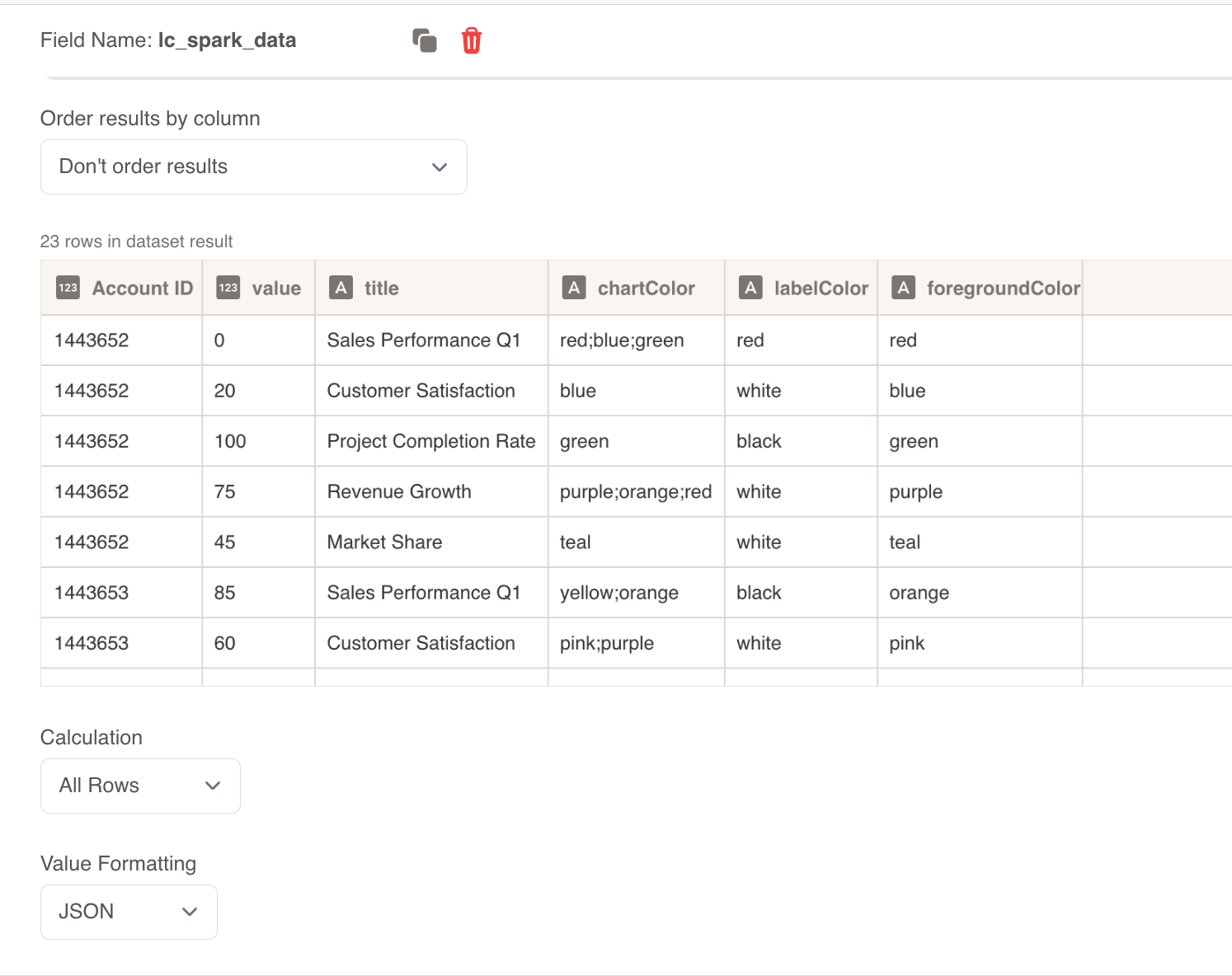
Alternatively, you can use tabular data from your datasets with the following columns:
| Account ID | value | title | chartColor | labelColor | foregroundColor |
|---|---|---|---|---|---|
| 1443652 | 20 | Customer S blue | white | blue | |
| 1443652 | 100 | Project Cor red | black | green | |
| 1443652 | 75 | Revenue blue/grey | white | purple | |
| 1443652 | 45 | Market Sha teal | white | teal | |
| 1443653 | 25 | Sales Perf yellow/red | black | orange |
Dataset Usage:
- Connect your spark chart to a dataset containing the required columns
- The system will automatically map the columns to the appropriate chart properties
- Filter data by Account ID or other criteria to show relevant spark charts
- Multiple rows for the same Account ID will create multi-point spark charts
Important Notes:
- Column names must match exactly as shown in the example (
value,title,chartColor,labelColor,foregroundColor) - Column names are case-sensitive and must be spelled exactly as specified
- If data is not passed in the correct format or column names don’t match, the element will display as a plain
<rect>without any spark chart visualization
Implementation Steps for Dataset Usage
To use dataset/CSV format with spark charts, follow these steps:
Create Dataset: Import your data containing the required columns (value, title, chartColor, labelColor, foregroundColor)
Create Field: Create a field from your dataset that contains the spark chart data
Set Value Formatting: In the field settings, set Value Formatting to “JSON” - this is crucial for proper data formatting
Override SVG Variables: In the SVG slide design tab, go to “Override SVG Variables”
Select Variable: Choose your spark chart variable and use the format:
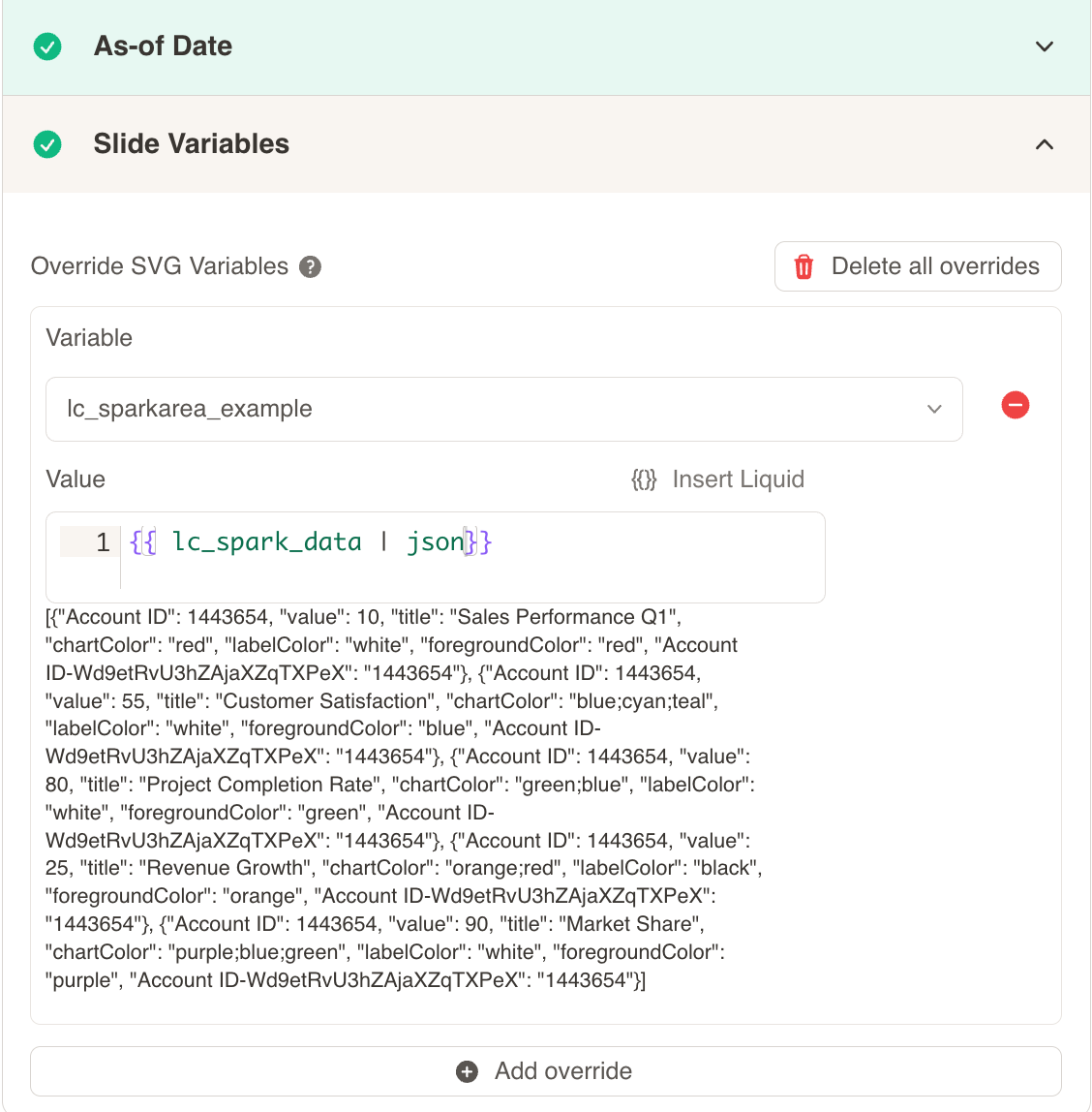
Include JSON Filter: Critical: Always include the | json filter with your field, otherwise the spark chart will not work
Configuration Properties
Required Properties:
value: Numeric value for the data point (mandatory)
Optional Properties:
title: Text title for the spark chart (optional)chartColor: Color specification for the chart line/area (optional)labelColor: Color specification for labels and text (optional)foregroundColor: Color specification for foreground elements (optional)
Color Specifications
Single Color:
- Provide a single color value:
"red","#FF0000" - Uses CSS color names or hex values
Gradient Color:
- Provide multiple colors separated by semicolons:
"red;blue;green" - Creates a gradient effect across the specified colors
- Colors are blended smoothly from first to last
Default Behavior:
- If no color is provided, colors will be taken from the appearance settings and Color Palette
- This ensures consistency with your overall design palette
Spark Chart Types
Line Charts with lc_sparkline_*
lc_sparkline creates smooth line-based trend visualizations ideal for showing continuous data flow and patterns over time.
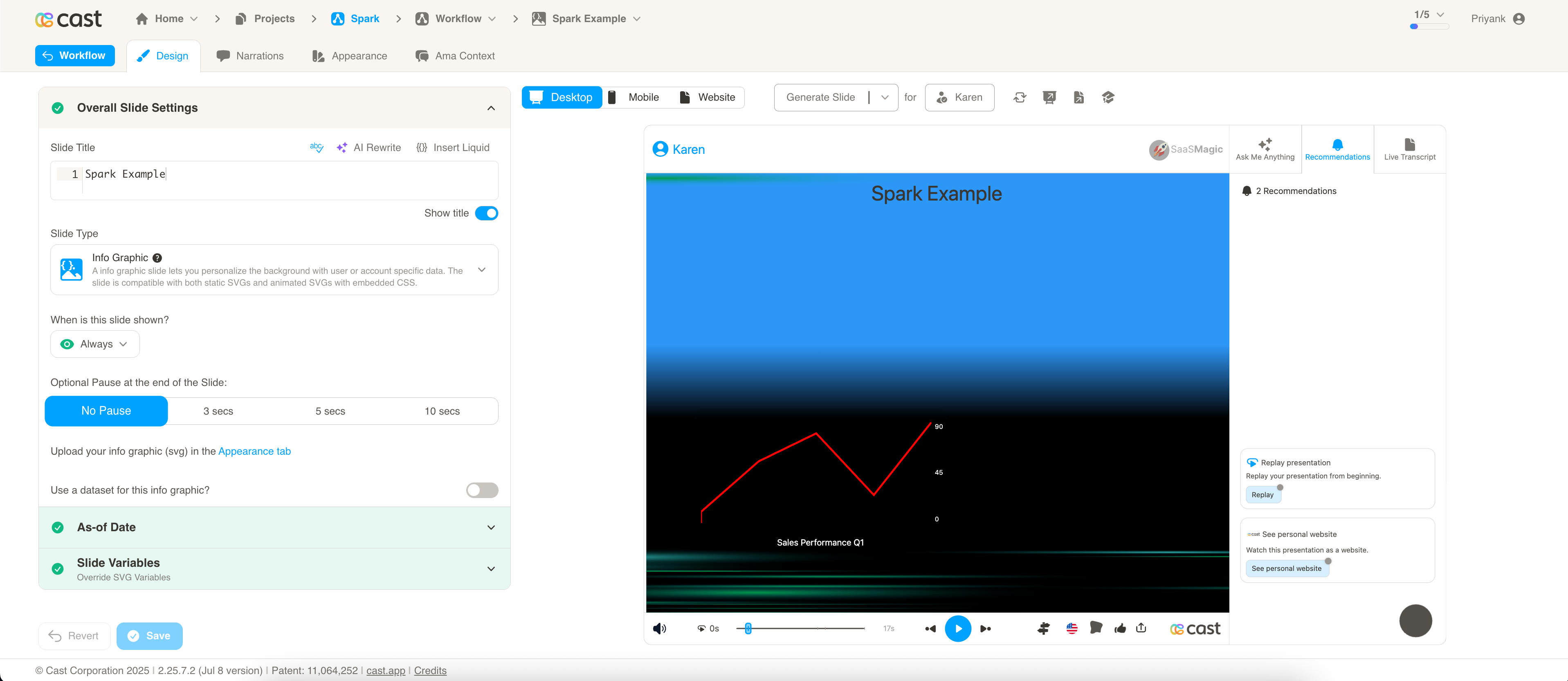
Best for:
- Time series data and trends
- Continuous metrics like temperature, stock prices, or website traffic
- Showing smooth progression and changes over time
Bar Charts with lc_sparkbar_*
lc_sparkbar creates discrete bar-based visualizations ideal for comparing individual values and showing discrete data points.
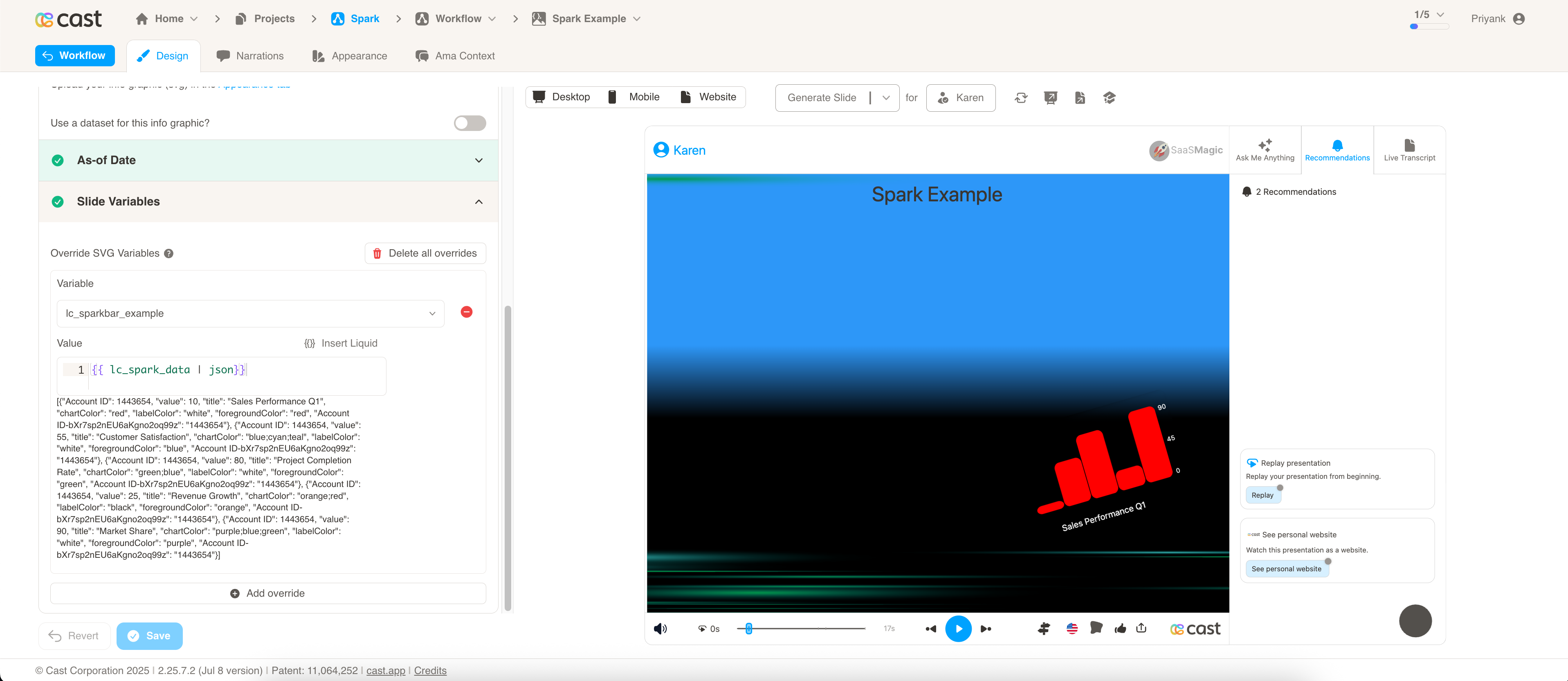
Best for:
- Categorical data comparison
- Discrete time periods (monthly sales, quarterly results)
- Highlighting individual data point values
- Comparing magnitudes across categories
Implementation:
- Each value is represented as a separate bar
- Clear distinction between individual data points
Area Charts with lc_sparkarea_*
lc_sparkarea creates filled area visualizations that combine the benefits of line charts with visual emphasis on magnitude and volume.
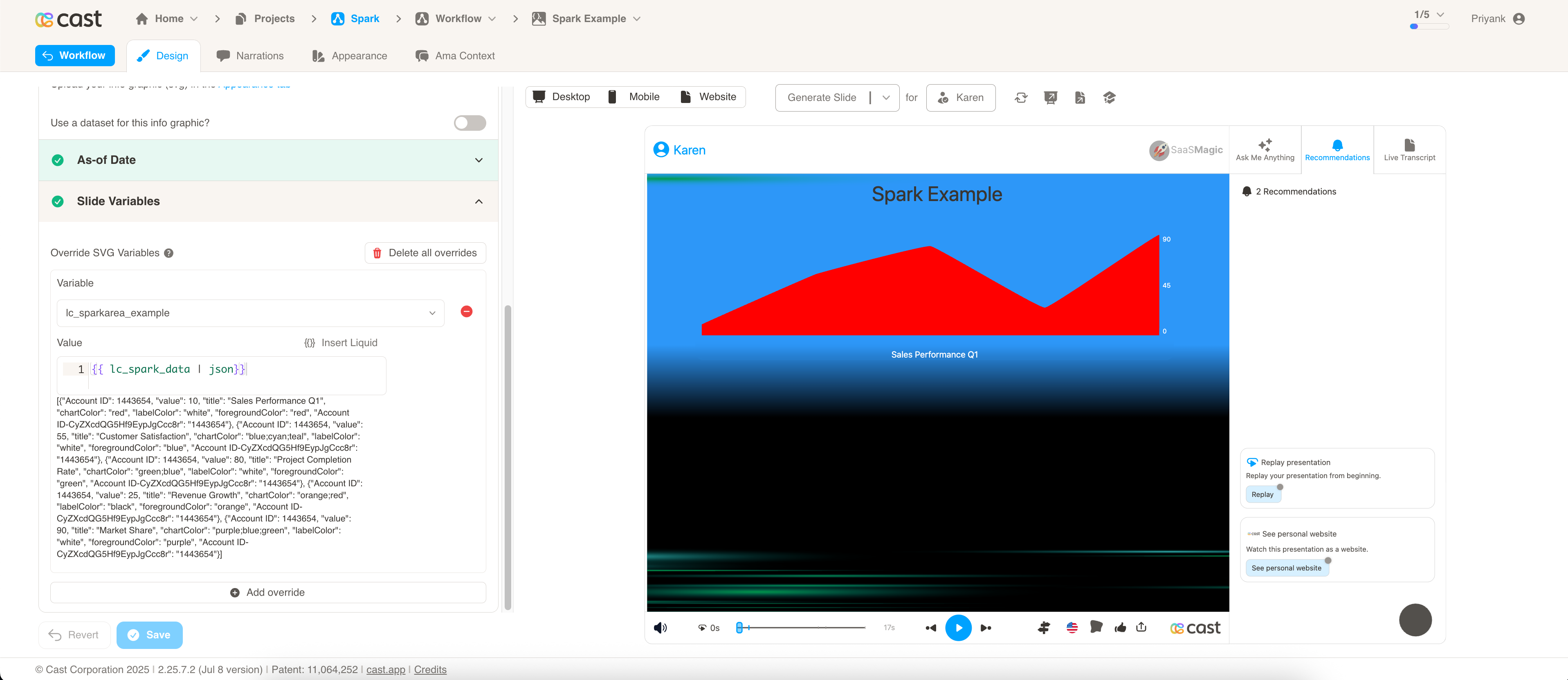
Best for:
- Cumulative data and totals
- Showing volume or magnitude trends
- Emphasizing the “weight” of data over time
- Visualizing filled quantities or percentages
Implementation:
- Area under the curve is filled with color or gradient
Implementation Notes
- Spark charts automatically scale to fit the container dimensions
- Data points are connected with smooth curves for better visual flow
- The chart adapts to the available space while maintaining proportional relationships
Compatibility: Works with <rect> elements only
Example Usage
Basic Spark Chart:
[{ "value": 10 }, { "value": 25 }, { "value": 15 }, { "value": 35 }]
Styled Spark Chart:
[
  {
    "value": 45,
    "title": "Q1 Performance",
    "chartColor": "#1E88E5",
    "labelColor": "#333333"
  },
  {
    "value": 62,
    "title": "Q2 Performance",
    "chartColor": "#43A047"
  },
  {
    "value": 38,
    "title": "Q3 Performance",
    "chartColor": "#FB8C00"
  }
]
Gradient Spark Chart:
[
  {
    "value": 30,
    "title": "Revenue Trend",
    "chartColor": "#FF6B6B;#4ECDC4;#45B7D1",
    "foregroundColor": "#2C3E50"
  }
]