Interactive Bar Chart Visualization with lc_multiple_bars_*, lc_funnel_bars_*, lc_stacked_bars_*
The bar chart components provide comprehensive interactive bar chart visualization with three distinct display modes. These components include advanced features like animated bar growth, interactive legends, tooltips, and responsive design, making them perfect for comparative analysis, hierarchical data visualization, and part-to-whole relationships.
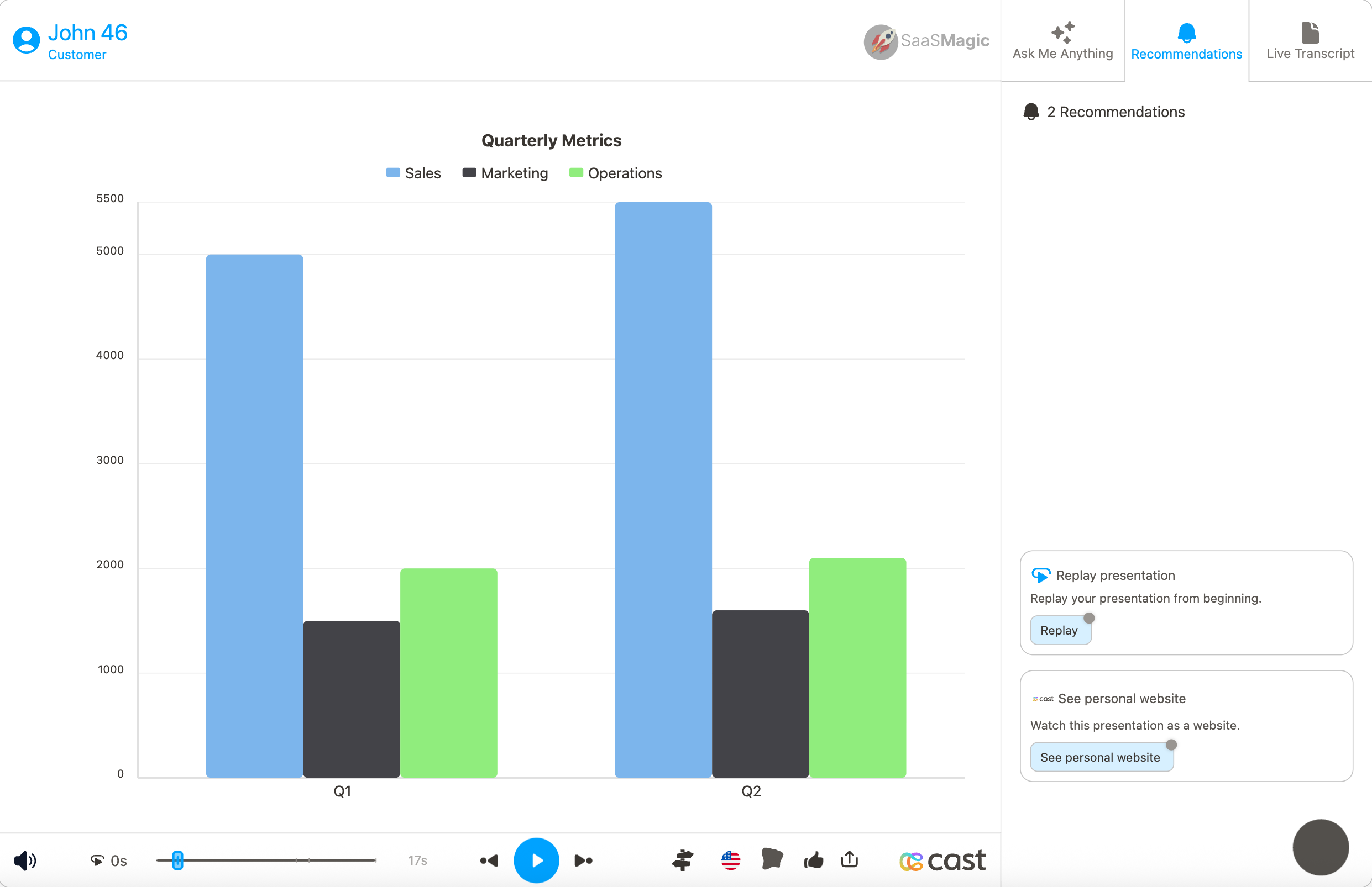
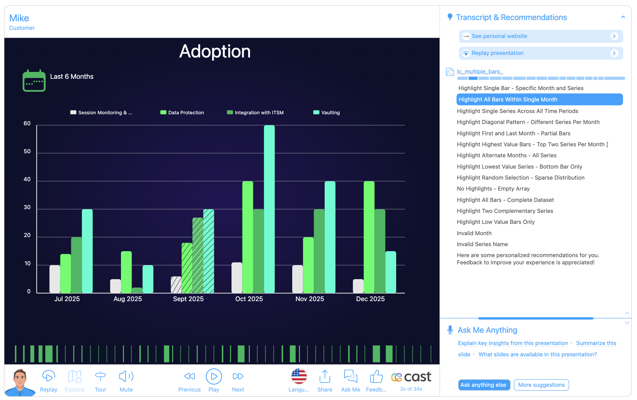
lc_multiple_bars_*
Series displayed side-by-side within each category for direct comparison.
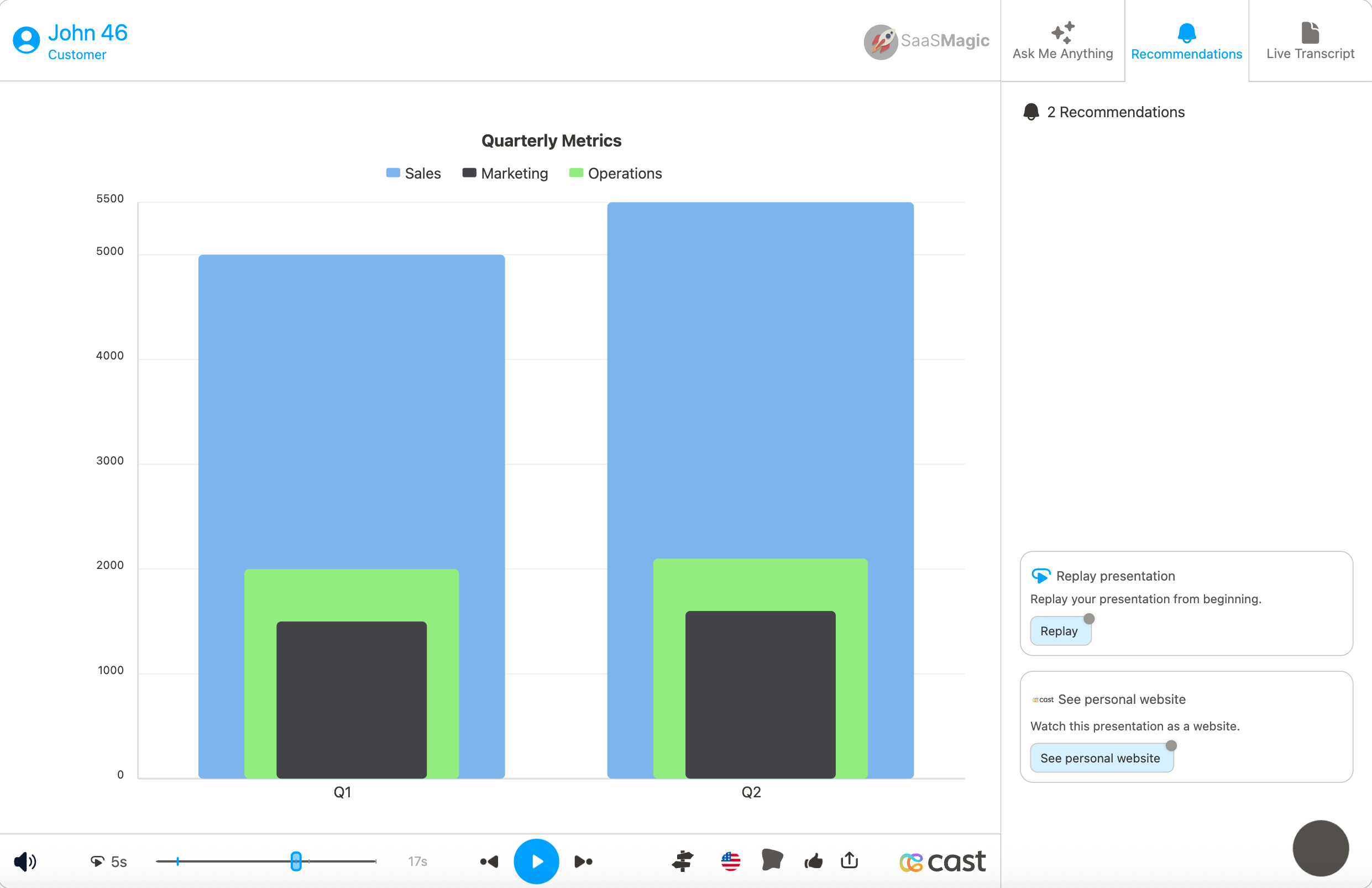
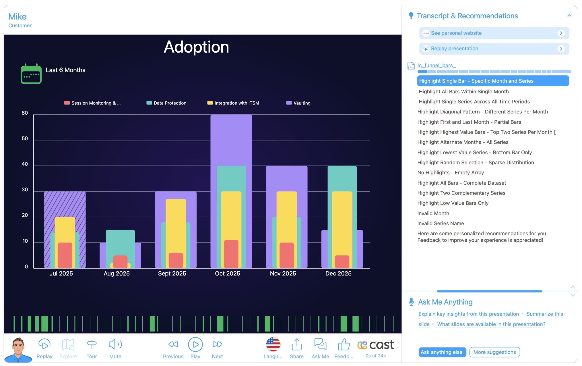
lc_funnel_bars_*
Series displayed as concentric bars (largest to smallest) for hierarchical relationships.
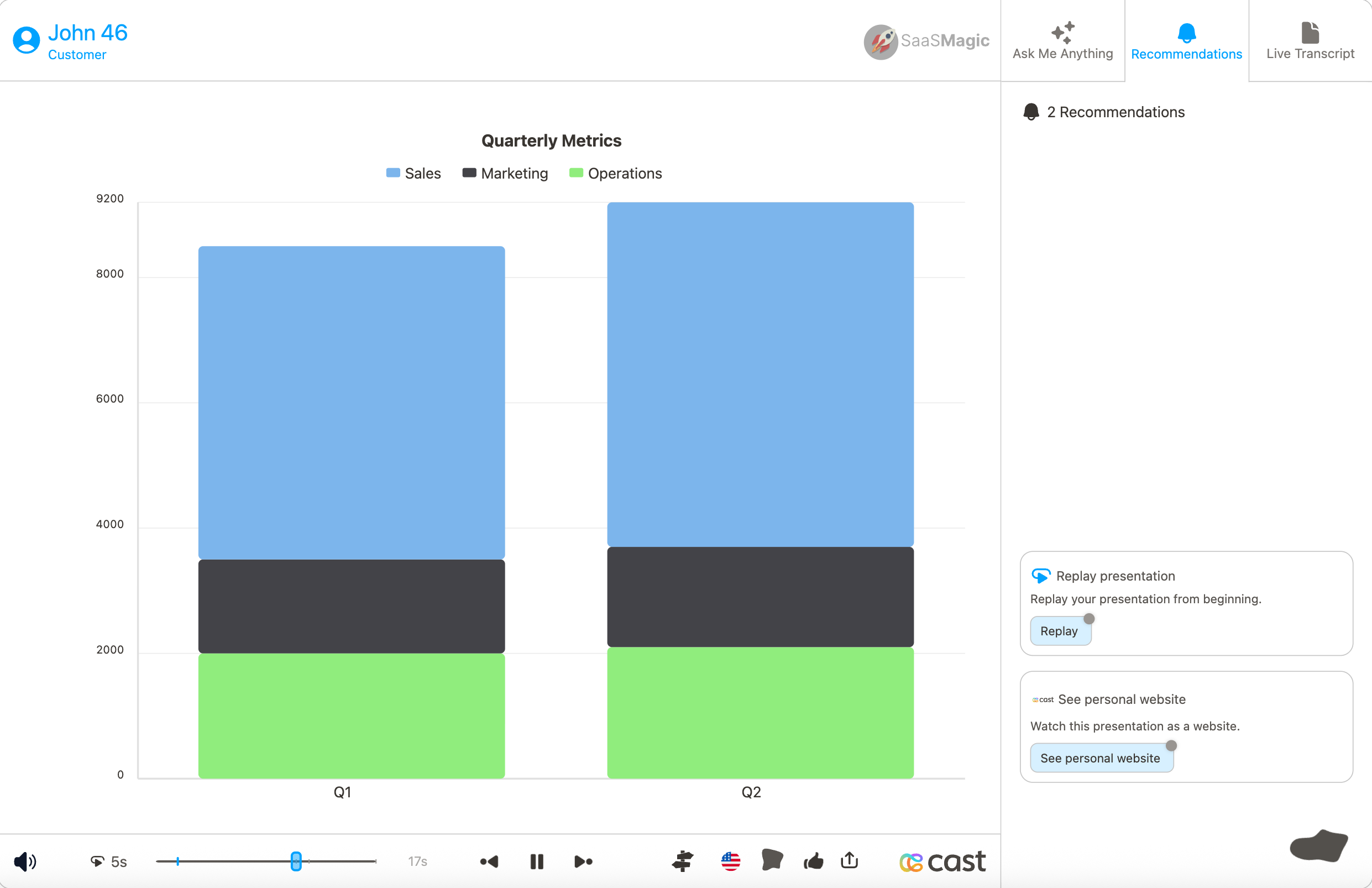
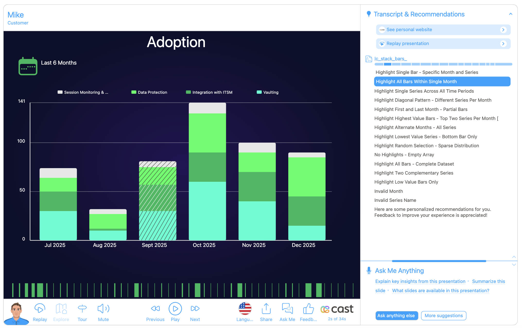
lc_stacked_bars_*
Series stacked vertically to show cumulative totals and part-to-whole relationships.
Use Cases
lc_multiple_bars_*:
- Quarterly revenue vs expenses comparison
- Department performance metrics side-by-side
- Product sales comparison across regions
- Multi-metric dashboards and scorecards
- Year-over-year performance analysis
lc_funnel_bars_*:
- Budget vs actual vs target visualization
- Hierarchical organizational data
- Nested category analysis
- Contained value relationships
- Multi-level performance indicators
- Concentric data comparisons
lc_stacked_bars_*:
- Revenue breakdown by product lines
- Time allocation across projects
- Market share composition
- Budget allocation visualization
- Cumulative performance metrics
- Part-to-whole relationship analysis
Element Identification
The target element must be a <rect> with an ID that starts with one of:
lc_multiple_bars_*for grouped column charts (side-by-side comparison)lc_funnel_bars_*for nested column charts (concentric bars)lc_stacked_bars_*for stacked column charts (cumulative totals)
Input Format
The input value must be provided as a JSON array of objects with the following structure:
JSON Format
A JSON string containing an array of objects with the following structure:
[
  {
    "x": "Q1",
    "name": "Revenue",
    "yvalue": 1000,
    "color": "#7cb5ec",
    "chart-title": "Quarterly Performance"
  },
  {
    "x": "Q1",
    "name": "Expenses",
    "yvalue": 800,
    "color": "#434348"
  },
  {
    "x": "Q2",
    "name": "Revenue",
    "yvalue": 1200,
    "color": "#7cb5ec"
  },
  {
    "x": "Q2",
    "name": "Expenses",
    "yvalue": 900,
    "color": "#434348"
  }
]
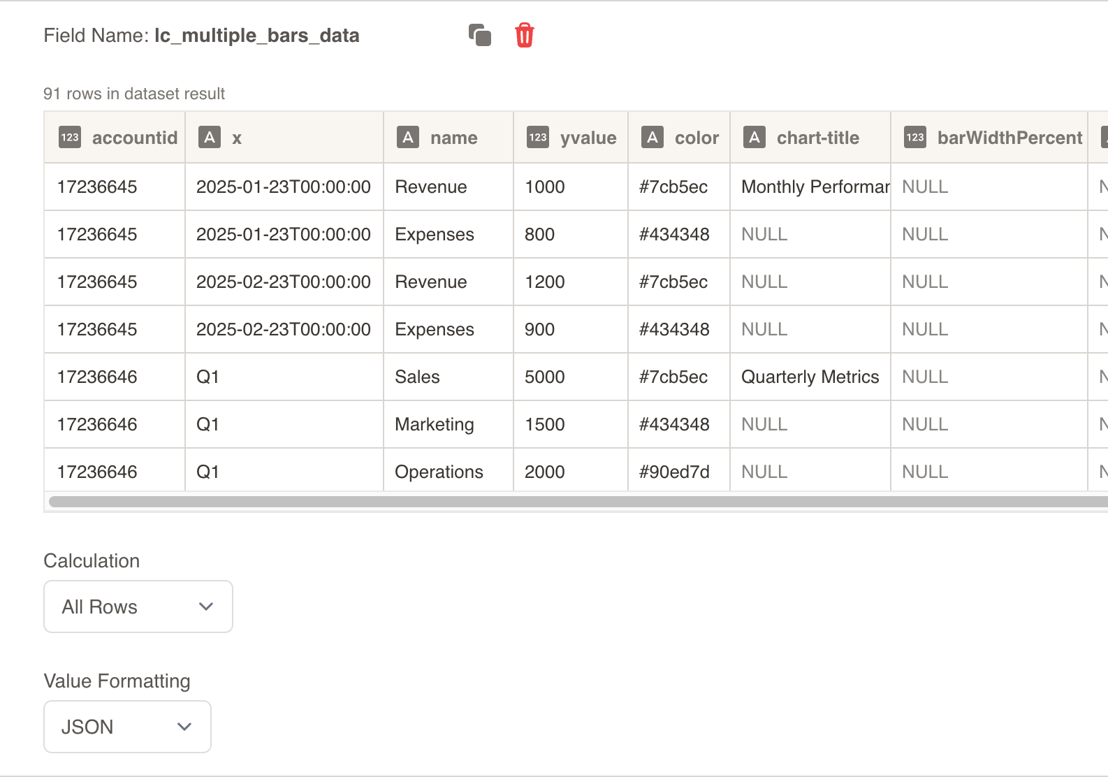
Dataset/CSV Format
Alternatively, you can use tabular data from your datasets with the following columns:
| x | name | yvalue | color | chart-title | hideGridLines | barWidthPercent |
|---|---|---|---|---|---|---|
| Jan | Sales | 850 | #7cb5ec | Monthly Performance | - | - |
| Jan | Profit | 320 | #434348 | - | - | - |
| Feb | Sales | 920 | #7cb5ec | - | - | - |
| Feb | Profit | 380 | #434348 | - | - | - |
| Mar | Sales | 1150 | #7cb5ec | - | - | - |
| Mar | Profit | 450 | #434348 | - | - | - |
Download Sample Data - Column Charts
Advanced Example with Custom Settings:
| x | name | yvalue | color | chart-title | backgroundColor | barWidthPercent | hideXAxisLabel |
|---|---|---|---|---|---|---|---|
| Team A | Score | 85 | #f15c80 | Team Performance | #ffe6f0 | 60 | - |
| Team B | Score | 92 | #f15c80 | - | #ffe6f0 | 60 | - |
| Team C | Score | 78 | #f15c80 | - | #ffe6f0 | 60 | - |
Complex Multi-Series Example:
| x | name | yvalue | color | backgroundColor | barWidthPercent | hideLegend | hideXAxisLabel | labelColor | gridLineColor |
|---|---|---|---|---|---|---|---|---|---|
| Q1 2023 | Revenue | 125000 | #3498db | #ecf0f1 | 40 | - | - | #2c3e50 | #bdc3c7 |
| Q1 2023 | Profit | 28000 | #27ae60 | #d5f4e6 | 40 | - | - | - | - |
| Q1 2023 | Internal Costs | 15000 | #e74c3c | - | 20 | true | - | - | - |
| Q2 2023 | Revenue | 142000 | #3498db | #ecf0f1 | 40 | - | - | - | - |
| Q2 2023 | Profit | 35000 | #27ae60 | #d5f4e6 | 40 | - | true | - | - |
| Q2 2023 | Internal Costs | 18000 | #e74c3c | - | 20 | - | - | - | - |
Additional Property Examples:
| x | name | yvalue | hideAllLegends | disableStaggering | showBackgroundBar | totalXSeries | highlightColor |
|---|---|---|---|---|---|---|---|
| 2019 | Growth | 15.5 | true | - | false | - | - |
| 2020 | Growth | -2.3 | - | - | - | - | #ff6b6b |
| 2021 | Growth | 8.7 | - | true | - | 4 | - |
Dataset Usage:
- Connect your column chart to a dataset containing the required columns
- The system will automatically map the columns to the appropriate chart properties
- Filter data by categories or time ranges to show relevant comparisons
- Multiple rows create comprehensive multi-series column visualizations
Important Notes:
- Column names must match exactly as shown in the example (
x,name,yvalue,color, etc.) - Column names are case-sensitive and must be spelled exactly as specified
- If data is not passed in the correct format or column names don’t match, the element will display as a plain
<rect>without any chart visualization - Series limit is capped at 10 to maintain chart readability and performance
- Negative values are automatically clamped to 0 for proper visualization
Implementation Steps for Dataset Usage
To use dataset/CSV format with column charts, follow these steps:
Create Dataset: Import your data containing the required columns (x, name, yvalue, and optional styling columns)
Create Field: Create a field from your dataset that contains the column chart data
Set Value Formatting: In the field settings, set Value Formatting to “JSON” - this is crucial for proper data formatting
Override SVG Variables: In the SVG slide design tab, go to “Override SVG Variables”
Select Variable: Choose your column chart variable and use the format with your field
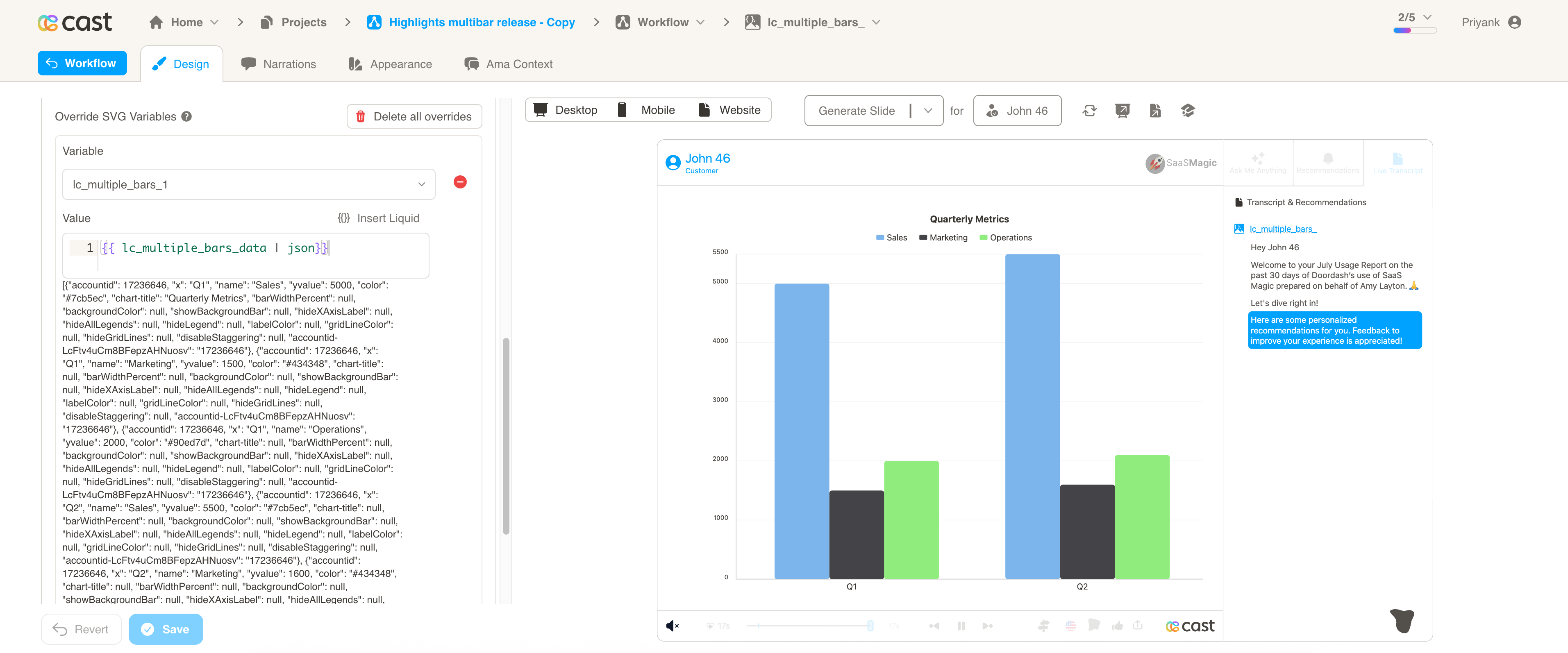
Include JSON Filter: Critical: Always include the | json filter with your field, otherwise the column chart will not work
Bar Chart Highlights (Visual Explanations)
When you create SVG elements with lc_multiple_bars_*, lc_funnel_bars_*, or lc_stacked_bars_*, the designer exposes one highlight per chart (the rect ID). Bar charts use Bar Highlights: a JSON value that specifies which categories and/or series to highlight.
- One highlight variable per chart (e.g.
lc_multiple_bars_1→ that chart’s highlight) - Bar charts get a Bar Highlights field: a JSON array of
{"x":"Category","series":"SeriesName"}(at least one ofxorseriesper item) x= category label (e.g. “Q1”, “Q2”);series= series name (must match thenamefield in your chart data)
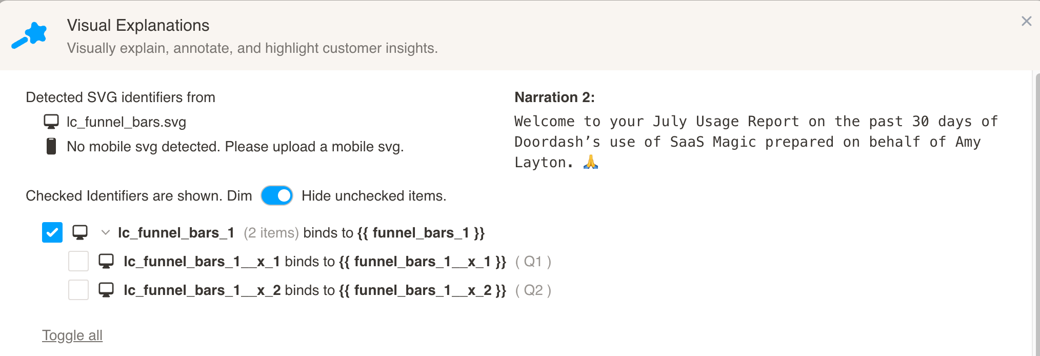
Highlight variables (one per chart):
| Chart type | Example variable | Bar Highlights value (JSON) |
|---|---|---|
lc_multiple_bars_* | lc_multiple_bars_1 | [{"x":"Q1","series":"Revenue"},{"x":"Q2","series":"2024"}] |
lc_funnel_bars_* | lc_funnel_bars_1 | [{"x":"Q1"},{"series":"Expenses"}] |
lc_stacked_bars_* | lc_stacked_bars_1 | [{"x":"Q1","series":"Revenue"}] |
Bar Highlights JSON rules:
- Each item is an object with
x(category label) and/orseries(series name). At least one is required per item. - Category-only:
[{"x":"Q1"}]— highlights that category (e.g. border). - Series-only:
[{"series":"2024"}]— dims other series. - Both:
[{"x":"Q1","series":"Revenue"}]— highlights that bar/cell.
Multiple bars
Stacked bars
Funnel bars
Data Field Requirements
All chart types use the same data structure, but the designer optimizes the visualization based on the element type:
Required Fields:
x: Category labelsname: Series namesyvalue: Numeric values
Optional Fields:
- All styling and configuration properties work across all chart types
- Some properties (like
showBackgroundBar) are optimized for specific chart types
Configuration Properties
Required Properties
x: Category label for x-axis (string, mandatory)name: Series identifier/name (string, mandatory)yvalue: Numeric value for the data point (number, mandatory, negative values clamped to 0)
Optional Chart-Level Properties (taken from first occurrence)
chart-title: Title displayed at the top of the chart (string, optional)
Optional Series-Level Properties (taken from first occurrence of each series)
| Property | Type | Description |
|---|---|---|
color | string | Color for this series (hex code or color name) |
backgroundColor | string | Background color for this series |
highlightColor | string | Color for category highlighting borders |
barWidthPercent | number | Width as percentage of available space |
hideAllLegends | boolean | Hide all legend items |
hideLegend | boolean | Hide legend for this specific series |
labelColor | string | Color for legend text of this series |
hideGridLines | boolean | Hide all grid lines |
gridLineColor | string | Override grid line color |
Optional Global Settings (taken from first data object)
| Property | Type | Description |
|---|---|---|
disableStaggering | boolean | Prevent automatic label staggering |
showBackgroundBar | boolean | Show/hide background bars (default: true, only for lc_multiple_bars_*) |
labelColor | string | Global color for all chart labels and text |
totalXSeries | number | Define number of axis points for layout (e.g. spacing; overrides data calculation) |
Optional Per-Category Settings (checked for each x-value)
| Property | Type | Description |
|---|---|---|
hideXAxisLabel | boolean | Hide the x-axis label for this specific category |
Series Order Properties (lc_funnel_bars_* only)
| Property | Type | Description |
|---|---|---|
orderBy | string | Order strategy - use "seriesOrder" to order by data array sequence |
order | string | Explicit series order - comma-separated list of series names |
Series Order Strategies (lc_funnel_bars_*)
For lc_funnel_bars_* (nested/concentric bar charts), you can control which series appears widest (back) vs thinnest (front).
Strategy 1: Default (Global Max)
No configuration needed - series are automatically ordered by their maximum values.
- Series with highest max value → widest (back)
- Series with lowest max value → thinnest (front)
[
  { "x": "Jan 25", "name": "Used", "yvalue": 500 },
  { "x": "Jan 25", "name": "Owned", "yvalue": 2500 }
]
Result: “Owned” appears widest (back) because it has the higher value.
Strategy 2: Series Order (orderBy)
Use when you want the data array order to determine bar widths.
Key: orderBy
Value: "seriesOrder" (case-insensitive)
[
  { "x": "Jan 25", "name": "Owned", "yvalue": 2500, "orderBy": "seriesOrder" },
  { "x": "Jan 25", "name": "Used", "yvalue": 500 }
]
- First series appearing in your data → widest (back)
- Subsequent series → progressively thinner
Strategy 3: Explicit Order (order)
Use when you want full control over the order, regardless of data arrangement or values.
Key: order
Value: Comma-separated list of series names (case-insensitive)
Example:
[
  { "x": "Jan 25", "name": "Owned", "yvalue": 2500, "order": "Owned, Used" },
  { "x": "Jan 25", "name": "Used", "yvalue": 500 }
]
Result:
- “Owned” → widest (back)
- “Used” → thinner (front)
Partial Order Support:
If you have 10 series but only specify 2 in the order, the remaining 8 will be sorted using the default (global-max) strategy.
[
  { "x": "Jan 25", "name": "Series A", "yvalue": 100, "order": "Series C, Series A" },
  { "x": "Jan 25", "name": "Series B", "yvalue": 200 },
  { "x": "Jan 25", "name": "Series C", "yvalue": 150 }
]
- “Series C” → widest (specified first)
- “Series A” → second (specified second)
- “Series B” → third (sorted by global-max, appended)
Order Strategy Summary
| Strategy | Key | Value | Behavior |
|---|---|---|---|
| Default | (none) | - | Sorted by max value (highest = widest) |
| Series Order | orderBy | "seriesOrder" | First in data = widest |
| Explicit Order | order | "A, B, C" | A = widest, B = second, C = third |
Important Notes:
- All matching is case-insensitive and trimmed
"owned","Owned"," OWNED "all match the same seriesordertakes precedence overorderByif both are specified- Only one row needs to specify
orderororderBy(typically the first)
Dataset/CSV Format Example:
| x | name | yvalue | order |
|---|---|---|---|
| Jan 25 | Owned | 2500 | Owned, Used |
| Jan 25 | Used | 500 | - |
| Feb 25 | Owned | 2800 | - |
| Feb 25 | Used | 600 | - |
Technical Implementation
Dynamic Text Fitting
- Width-Based Truncation: Labels are truncated based on actual bar width, not fixed character limits
Data Structure Assumptions
Data Assumptions
- X-axis values are categorical (strings) and represent distinct categories
- Y-axis values are numeric and non-negative (negative values are clamped to 0)
- Series limit is capped at 10 to maintain chart readability and performance
- Missing values are treated as 0 in calculations and display
- Chart title is optional but when provided, affects legend positioning
Display Assumptions
- Minimum bar width is 1px to ensure visibility
- Default colors cycle through a predefined palette when series exceed color count
- Font family is extracted from the global story metadata (
fontHint) - Text color is derived from the current chart’s image text color setting
- Container dimensions are expected to be reasonable (minimum 100x100px)
Interaction Assumptions
- Background bars are shown by default unless explicitly disabled (
lc_multiple_bars_*only)
Best Practices
- Ensure consistent series names across all categories
- Use meaningful category labels that fit within available space
- Provide colors for series to maintain consistent branding
- Keep series count under 10 for optimal performance
- Include
highlightColorproperties for categories you plan to emphasize - Use
totalXSerieswhen you need consistent axis layout (e.g. fixed category count)