Styling & Visual Effects
Add dynamic colors, heatmaps, and cinematic animations to enhance your infographic slides with visual effects that respond to data.
When to Use These
Perfect for:
- Status indicators (success, warning, error states)
- Performance heatmaps and intensity visualization
- Data-driven color changes
- Hero images with subtle motion
- Highlighting important elements
- Creating cinematic presentation effects
- Drawing attention to key visual content
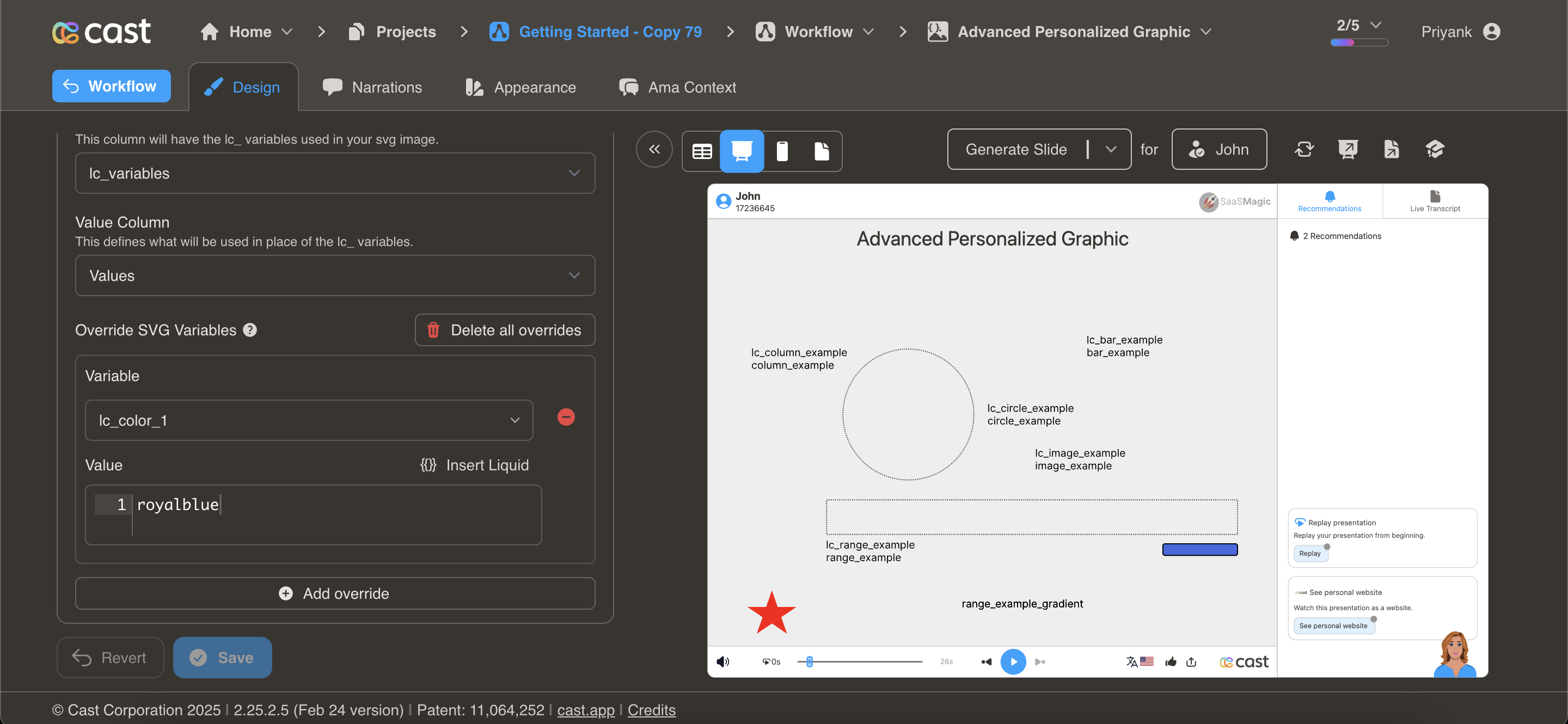
Dynamic Colors
lc_color_*
Change element colors dynamically based on specific values, conditions, or data-driven logic.
Element Setup
Target Element:
- Element type: Any SVG element (
<rect>,<circle>,<path>,<polygon>, etc.) - ID format:
lc_color_*(e.g.,lc_color_status,lc_color_indicator)
Input Format
Hex Color Codes:
"#2196F3"
CSS Color Names:
"royalblue"
"green"
"orange"
RGB Values:
"rgb(33, 150, 243)"
Usage Example
<!-- In your SVG -->
<rect id="lc_color_status" width="100" height="100" fill="#ccc" />
<circle id="lc_color_indicator" cx="50" cy="50" r="20" fill="#000" />

<!-- In your dataset -->
{{ status }} = "#4CAF50"  <!-- Green for success -->
{{ indicator }} = "red"    <!-- Red for alert -->
Result: Elements dynamically change to specified colors
Common Use Cases
Status Indicators:
<!-- Conditional color based on status -->
{% if health_score >= 80 %}
  {{ indicator-color }} = "#4CAF50"  <!-- Green -->
{% elsif health_score >= 60 %}
  {{ indicator-color }} = "#FFC107"  <!-- Yellow -->
{% else %}
  {{ indicator-color }} = "#F44336"  <!-- Red -->
{% endif %}
Performance Colors:
Revenue vs Target:
- Above target: "green"
- At target: "blue"
- Below target: "red"
Priority Levels:
- High: "#F44336" (red)
- Medium: "#FF9800" (orange)
- Low: "#4CAF50" (green)
Sentiment Analysis:
- Positive: "#4CAF50" (green)
- Neutral: "#2196F3" (blue)
- Negative: "#F44336" (red)
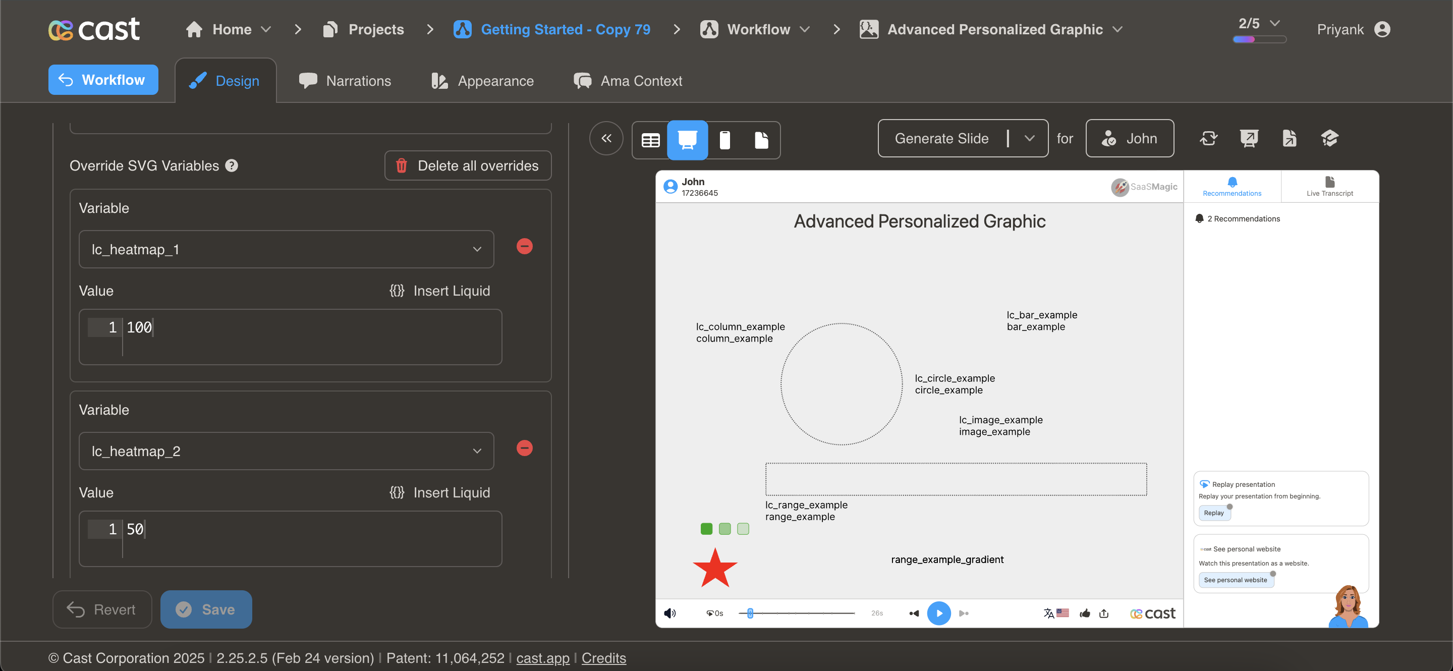
Heatmaps
lc_heatmap_*
Visualize data intensity through color opacity. Perfect for showing performance metrics, engagement levels, or data density.
Element Setup
Target Element:
- Element type: Any SVG element
- ID format:
lc_heatmap_*(e.g.,lc_heatmap_engagement,lc_heatmap_score) - Required attribute:
dataFill(defines base color)
Required Attribute
The element must have a dataFill attribute specifying the base color:
<rect id="lc_heatmap_q1" dataFill="#2196F3" />
The system uses this color and adjusts opacity based on the provided value.
Input Format
Percentage Value (0-100):
"75"
- 0 = Completely transparent (0% opacity)
- 50 = Semi-transparent (50% opacity)
- 100 = Fully opaque (100% opacity)
- Values > 100 are treated as 100
Usage Example
<!-- In your SVG -->
<rect id="lc_heatmap_q1" dataFill="#2196F3" width="50" height="50" />
<rect id="lc_heatmap_q2" dataFill="#2196F3" width="50" height="50" />
<rect id="lc_heatmap_q3" dataFill="#2196F3" width="50" height="50" />
<rect id="lc_heatmap_q4" dataFill="#2196F3" width="50" height="50" />

<!-- In your dataset -->
{{ q1 }} = "45"   <!-- 45% opacity -->
{{ q2 }} = "70"   <!-- 70% opacity -->
{{ q3 }} = "90"   <!-- 90% opacity -->
{{ q4 }} = "100"  <!-- 100% opacity -->
Result: Four squares with same color but varying intensity based on values
Common Use Cases
Engagement Heatmap:
Content pieces with engagement scores:
- Article A: 25 (light)
- Article B: 65 (medium)
- Article C: 95 (dark/intense)
Performance Matrix:
Regional performance scores:
- West: 85% opacity (high performance)
- East: 60% opacity (medium)
- South: 40% opacity (lower)
- North: 90% opacity (highest)
Activity Tracking:
User activity by day of week:
- Monday: 45
- Tuesday: 70
- Wednesday: 85
- Thursday: 90
- Friday: 60
Conversion Rates:
Landing page conversion intensity:
- Page 1: 30% → light blue
- Page 2: 75% → medium blue
- Page 3: 95% → dark blue
Design Tips
- Choose appropriate base colors - Use colors that remain visible at low opacity
- Provide a legend - Show what intensity levels mean
- Use consistent scales - Keep value ranges consistent across related heatmaps
- Consider contrast - Ensure minimum opacity is still visible
- Group related data - Use same base color for related metrics
Ken Burns Animation
lc_kenburns_*
Add cinematic zoom and pan effects to create visual interest and draw attention to key elements.
Element Setup
Target Element:
- Element type: Any SVG element
- ID format:
lc_kenburns_*(e.g.,lc_kenburns_hero,lc_kenburns_feature)
Input Format
JSON Configuration:
{
  "duration": 4,
  "startScale": 0.8,
  "endScale": 1.0,
  "ease": "power2.out"
}
Configuration Properties
duration (optional)
- Animation duration in seconds
- Range: 1-10 seconds
- Default: 4 seconds
- Example:
"duration": 6
startScale (optional)
- Initial scale factor at animation start
- Range: 0-2 (where 1.0 = 100%)
- Default: 0.8 (80% of original size)
- Example:
"startScale": 0.7
endScale (optional)
- Final scale factor at animation end
- Range: 0-2 (where 1.0 = 100%)
- Default: 1.0 (100% of original size)
- Example:
"endScale": 1.2
ease (optional)
- GSAP easing function name
- Default:
"power2.out" - Common options:
"power1.inOut"- Gradual start and end"power2.out"- Slow end"power3.in"- Slow start"elastic.out"- Bouncy effect"back.out"- Slight overshoot
Animation Trigger
Important: Animation starts when the element transitions from dimmed/hidden to visible state during narration playback.
Usage Example
<!-- In your SVG -->
<image id="lc_kenburns_hero" href="hero-image.jpg" width="1080" height="810" />

<!-- In your dataset -->
{{ hero }} = '{"duration": 5, "startScale": 0.8, "endScale": 1.1, "ease": "power2.out"}'
Result: Image gradually zooms from 80% to 110% over 5 seconds with smooth easing
Common Use Cases
Subtle Hero Animation:
{
  "duration": 6,
  "startScale": 0.95,
  "endScale": 1.0,
  "ease": "power1.inOut"
}
Gentle zoom for professional presentations
Dramatic Zoom:
{
  "duration": 4,
  "startScale": 0.7,
  "endScale": 1.2,
  "ease": "power3.out"
}
Strong emphasis effect for key visuals
Quick Attention Grab:
{
  "duration": 2,
  "startScale": 0.85,
  "endScale": 1.0,
  "ease": "back.out"
}
Fast zoom with slight bounce
Slow Cinematic:
{
  "duration": 8,
  "startScale": 0.9,
  "endScale": 1.05,
  "ease": "power2.out"
}
Slow, documentary-style movement
Design Tips
- Keep it subtle - Overly dramatic animations can be distracting
- Match content tone - Use gentle animations for professional content
- Consider duration - Longer narrations allow slower animations
- Test visibility - Ensure startScale doesn’t crop important content
- Use sparingly - Not every element needs animation
- Coordinate with narration - Time animations to match voice-over timing
Troubleshooting
| Issue | Solution |
|---|---|
| Animation too fast | Increase duration value |
| Animation too slow | Decrease duration value |
| Crops content | Increase startScale (use values closer to 1.0) |
| Too dramatic | Reduce difference between startScale and endScale |
| Doesn’t animate | Ensure element transitions from hidden/dimmed to visible |
| Wrong easing | Try different ease values (power2.out, power1.inOut, etc.) |
Combining Effects
You can combine multiple styling effects for powerful visual impact:
Example: Conditional Color + Heatmap
<!-- Color changes based on threshold, opacity shows intensity -->

<!-- In SVG -->
<rect id="lc_color_region" dataFill="#2196F3" width="100" height="100" />
<rect id="lc_heatmap_intensity" dataFill="#2196F3" width="100" height="100" />

<!-- In dataset -->
{% if score >= 80 %}
  {{ region }} = "#4CAF50"  <!-- Green for high -->
{% else %}
  {{ region }} = "#F44336"  <!-- Red for low -->
{% endif %}

{{ intensity }} = "{{ score }}"  <!-- Opacity matches score -->
Example: Ken Burns + Dynamic Color
<!-- Animated background with conditional color -->

<!-- In SVG -->
<rect id="lc_kenburns_background" width="1080" height="810" />
<rect id="lc_color_background" width="1080" height="810" />

<!-- In dataset -->
{{ background }} = '{"duration": 6, "startScale": 0.9, "endScale": 1.0}'
{{ background-color }} = "#2196F3"  <!-- Dynamic color -->
Best Practices
Color Strategy
-
Semantic colors - Use colors that convey meaning
- Green: Success, positive, complete
- Red: Error, negative, alert
- Yellow/Orange: Warning, caution
- Blue: Information, neutral
- Gray: Inactive, disabled
- Accessibility - Ensure sufficient contrast
- Consistency - Use same colors for same meanings across slides
- Brand alignment - Incorporate brand colors where appropriate
Animation Guidelines
- Subtlety wins - Less is more with animations
- Performance - Limit simultaneous animations
- Purpose - Every animation should serve a purpose
- Timing - Coordinate with narration and music
- Testing - Preview on target devices
Related Features
- Progress Charts - Use with bar/column colors
- Distribution Charts - Color donut segments
- Content Display - Animate images and media