Distribution & Proportions
Visualize proportional data, market share, survey results, and category distributions using doughnut charts, ring charts, and labels.
When to Use These
Perfect for:
- Market share and competitive analysis
- Survey results and response distributions
- Budget allocation across categories
- Customer segmentation data
- NPS scores and satisfaction ratings
- Resource distribution
- Category breakdowns and proportions
Doughnut Charts
lc_doughnut_*
Display segmented data in a circular doughnut chart format. The chart always displays as a complete circle with values proportionally adjusted to fill the entire circumference.
Element Setup
Main Element:
-
Element type:
<circle>lc_doughnut requires a “circle” svg element with a stroke for border. Border is used to determine the thickness.
-
ID format:
lc_doughnut_*(e.g.,lc_doughnut_nps,lc_doughnut_market-share)
Companion Element:
- Use
lc_label_*for legends and segment labels (see Labels section below)
Input Format
Basic Format - Values Only:
58;32;10
Creates three segments:
- Segment 1: 58%
- Segment 2: 32%
- Segment 3: 10%
With Color Specification:
58,#1E88E5;32,purple;10,orange
Creates three colored segments:
- Segment 1: 58% with hex color #1E88E5 (blue)
- Segment 2: 32% with named color “purple”
- Segment 3: 10% with named color “orange”
Color Options
CSS Color Names:
45,red;30,blue;25,green
Hexadecimal Values:
45,#FF0000;30,#0000FF;25,#00FF00
Mixed Formats:
45,#1E88E5;30,purple;25,orange
Default Colors: If no colors are specified, the system uses your project’s default color palette.
Value Processing
- Minimum value: 1 (segments require at least 1 to be visible)
- Zero values: Converted to 1
- Negative values: Treated as 1
- Proportional: Values are automatically scaled to fill 100% of the circle
- Start position: Segments begin at 12 o’clock and progress clockwise
Usage Example
<!-- In your SVG -->
<circle id="lc_doughnut_nps" cx="200" cy="200" r="100" />
<text id="lc_label_nps-legend">Placeholder text</text>

<!-- In your dataset -->
{{ nps }} = "58,green;32,blue;10,red"
{{ nps-legend }} = "Promoters,green;Passives,blue;Detractors,red"
Result: Three-segment doughnut showing NPS distribution with colored legend
Common Use Cases
NPS Scores:
58,green;32,blue;10,red
Labels: Promoters,green;Passives,blue;Detractors,red
Market Share:
45,blue;30,purple;15,orange;10,gray
Labels: Product A,blue;Product B,purple;Product C,orange;Others,gray
Budget Allocation:
40,#2196F3;30,#4CAF50;20,#FF9800;10,#9C27B0
Labels: Engineering,#2196F3;Marketing,#4CAF50;Sales,#FF9800;Operations,#9C27B0
Highlighting Individual Segments
Doughnut charts support selective highlighting during your presentation, allowing you to draw attention to specific segments while others fade into the background.
How It Works:
When you reference a segment’s label in your narration, that segment automatically highlights (full brightness with increased thickness) while other segments dim to about 12% brightness. This creates a strong visual focus on the data you’re discussing.
Setting Up Highlights:
To enable highlighting, your segment data must include labels. The system matches these labels with your highlight configuration to determine which segments to highlight. There are two ways to provide labels:
- Embedded Labels (in the data itself):
5000,#FF5733,Rent;3000,#33FF57,Food;2000,#3357FF,Transport
- Companion lc_label (separate label element with matching ID):
- Doughnut:
lc_doughnut_expenses - Label:
lc_label_expenses
- Doughnut:
Rent;Food;Transport
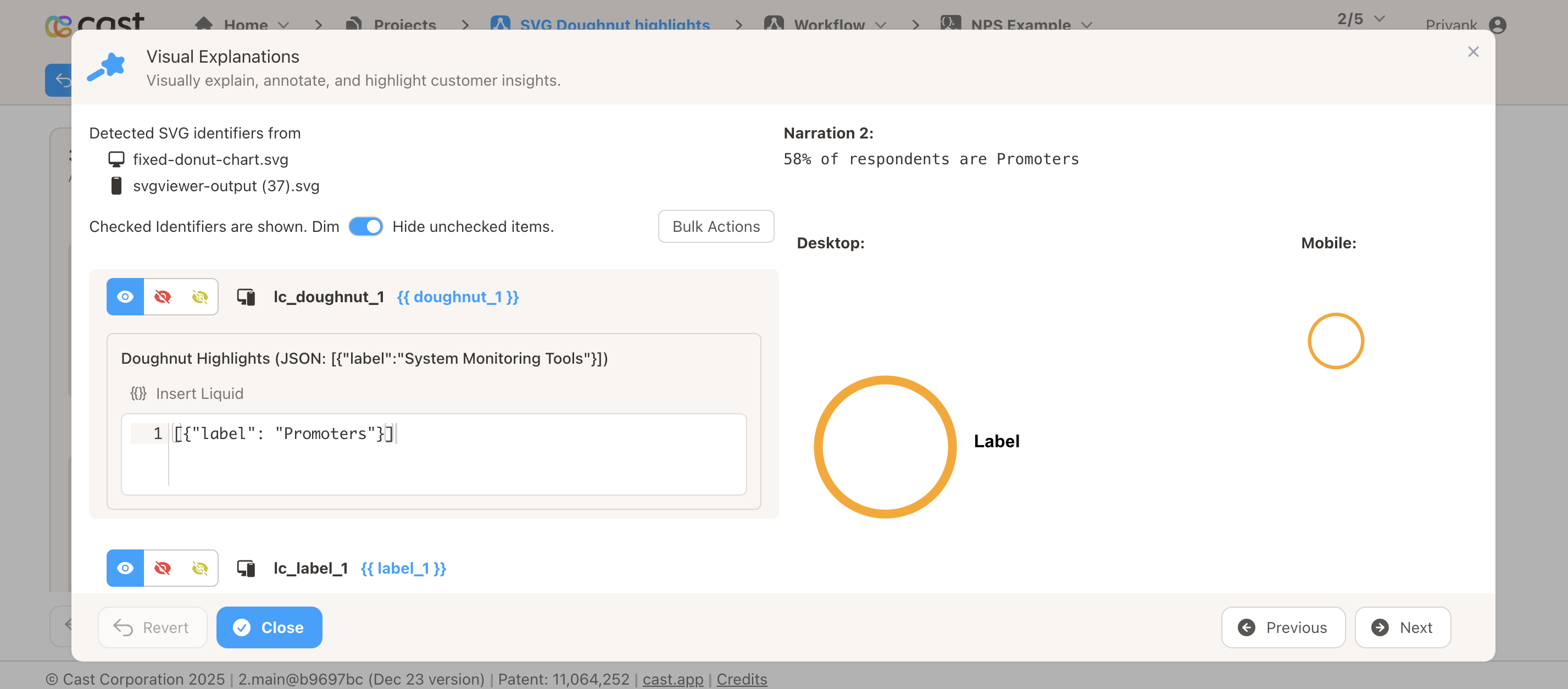
How to Add Highlights in Cast Designer:
- Open your project in Cast designer
- Navigate to Narration tab
- Click on Visual Explanations for the slide with your doughnut
- Find the liquid block for your
lc_doughnutelement - Add the highlight format directly in the liquid block
Highlight Format:
Single segment:
[{ "label": "Rent" }]
Multiple segments:
[{ "label": "Rent" }, { "label": "Food" }]
All segments visible (no dimming):
(Don't add any highlight to the liquid block)
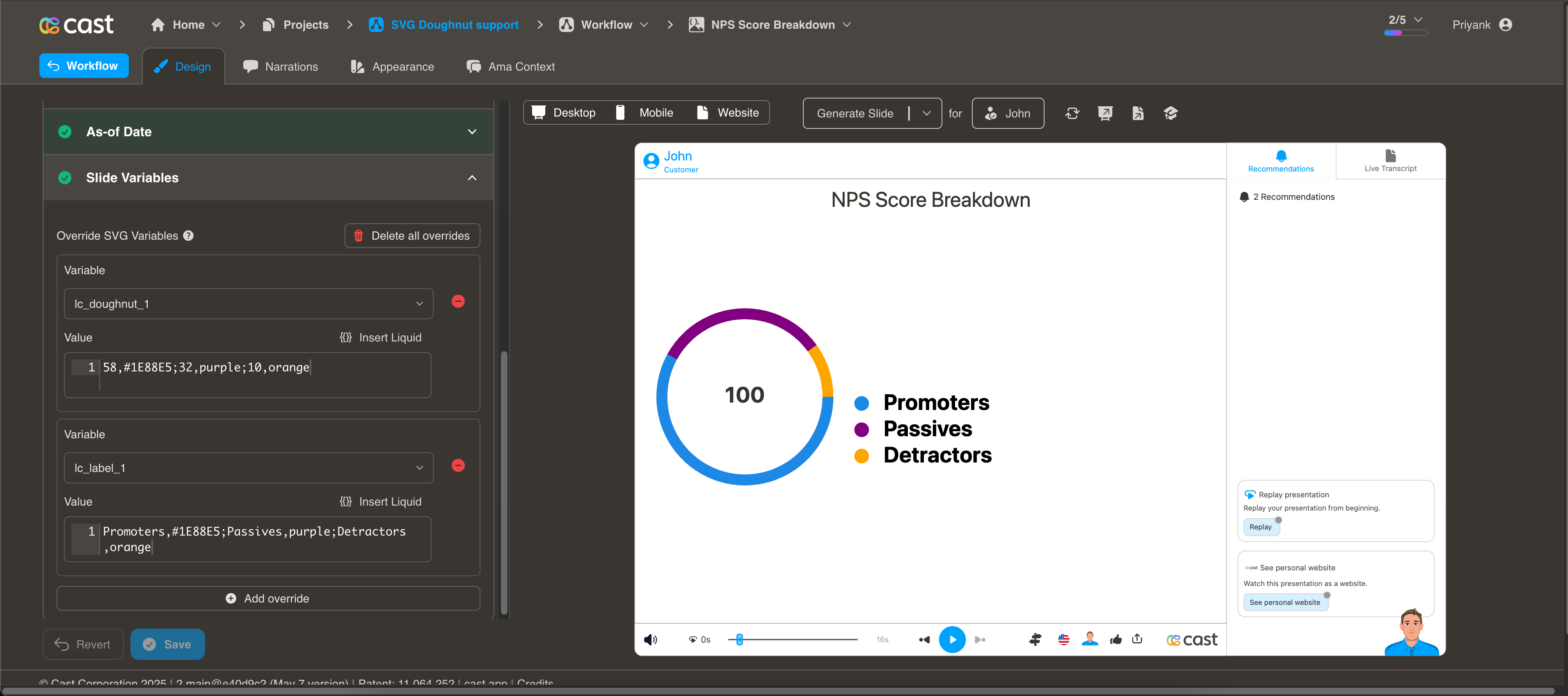
Example 1: NPS Score Breakdown
Your Doughnut Data:
58,green;32,blue;10,red
Your Label Data (lc_label_nps):
Promoters,green;Passives,blue;Detractors,red
Setting Up Visual Explanations:
In Cast designer:
- Navigate to Narration tab
- Click on Visual Explanations
- Find the liquid block for your
lc_doughnutelement (e.g.,lc_doughnut_nps) - Add the highlight format directly in the liquid block
Preview Result:
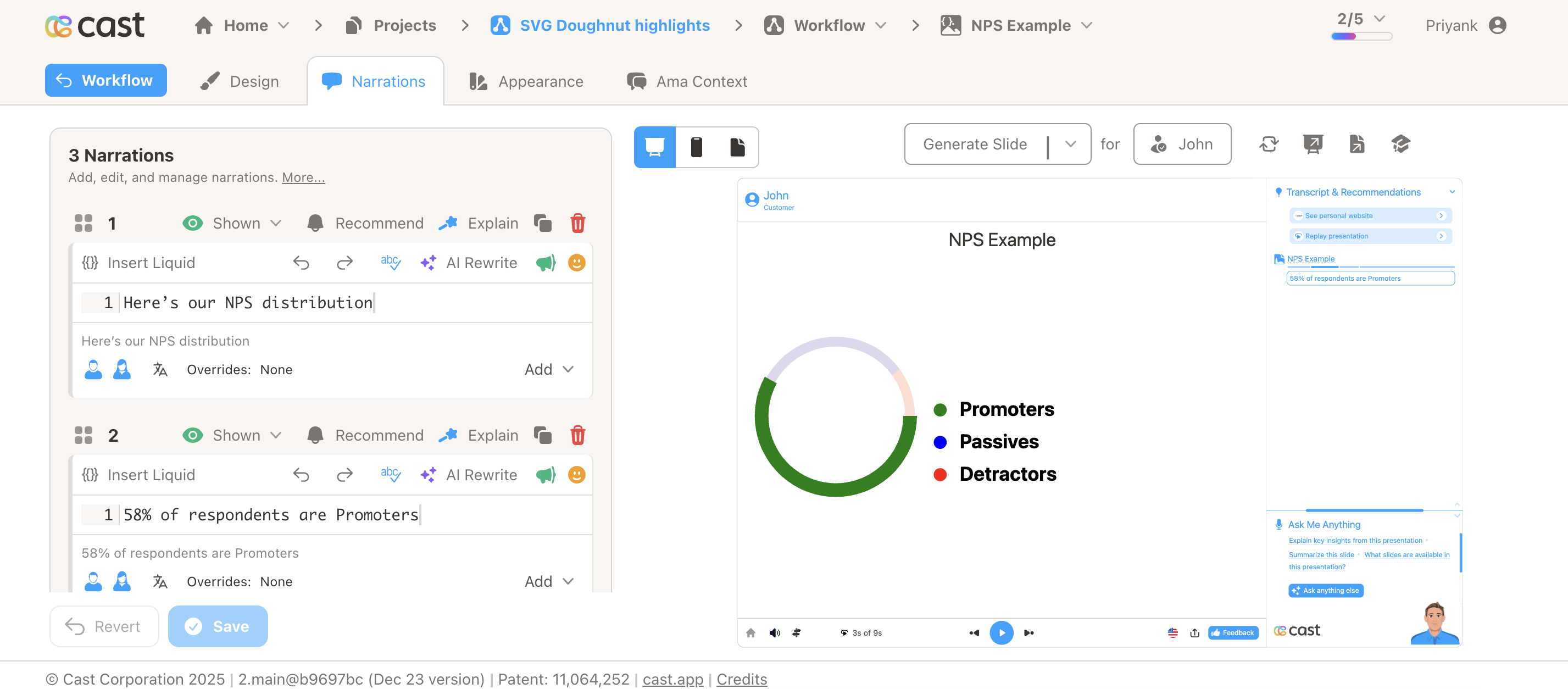
Narration Steps:
-
Narration Step 1: “Here’s our NPS distribution…”
- Add to liquid block: Don’t add any highlight
- Result: All three segments visible at full brightness
-
Narration Step 2: “58% of respondents are Promoters…”
- Add to liquid block:
[{"label": "Promoters"}] - Result: Promoters segment stays bright, others dim
- Add to liquid block:
-
Narration Step 3: “Only 10% are Detractors…”
- Add to liquid block:
[{"label": "Detractors"}] - Result: Detractors segment brightens, Promoters/Passives dim
- Add to liquid block:
-
Narration Step 4: “Together, Promoters and Passives make up 90%…”
- Add to liquid block:
[{"label": "Promoters"}, {"label": "Passives"}] - Result: Both Promoters and Passives bright, Detractors dims
- Add to liquid block:
Example 2: Budget Allocation
Your Doughnut Data with Embedded Labels:
40000,#2196F3,Engineering;30000,#4CAF50,Marketing;20000,#FF9800,Sales;10000,#9C27B0,Operations
Narration Steps:
-
All Departments Overview: Show all segments together (no specific highlight)
- Liquid block: Don’t add any highlight
- Result: All departments appear at full brightness
-
Focus on Engineering: “Engineering receives the largest allocation…”
- Liquid block:
[{"label": "Engineering"}] - Result: Engineering segment brightens, others dim
- Liquid block:
-
Marketing and Sales: “Marketing and Sales together account for half…”
- Liquid block:
[{"label": "Marketing"}, {"label": "Sales"}] - Result: Both Marketing and Sales segments bright, Engineering/Operations dim
- Liquid block:
Example 3: Market Share Analysis
Your Doughnut Data:
45,blue;30,purple;15,orange;10,gray
Your Label Data (lc_label_market):
Product A;Product B;Product C;Others
Liquid Block Highlights:
-
All Products Overview: Show all segments together (no specific highlight)
- Liquid block: Don’t add any highlight
- Result: All segments appear at full brightness
-
Focus on Product A: Mention “Product A” in your narration
- Liquid block:
[{"label": "Product A"}] - Result: Product A segment brightens, others dim
- Liquid block:
-
Compare Products A and B: “Product A and B together control 75%…”
- Liquid block:
[{"label": "Product A"}, {"label": "Product B"}] - Result: Both Product A and B bright, others dim
- Liquid block:
Tips for Effective Highlighting:
-
Use Clear Labels: Make labels descriptive and easy to reference in narration
- ✅ Good: “Promoters”, “Engineering”, “Product A”
- ❌ Avoid: “Seg1”, “Item”, “A”
-
Use Correct Format: Add the JSON array directly in the liquid block
- Single segment:
[{"label": "Engineering"}] - Multiple segments:
[{"label": "Promoters"}, {"label": "Passives"}] - All segments: Don’t add any highlight
- Single segment:
-
Match Labels Exactly: The label text in your data must exactly match the label in your highlight
- If data has
"label": "Engineering", use[{"label": "Engineering"}] - Labels are case-sensitive
- If data has
-
Highlight Multiple Segments: Add multiple objects in the array to highlight several segments
- Example:
[{"label": "Sales"}, {"label": "Marketing"}] - Result: Both Sales and Marketing segments highlight together
- Example:
-
Show All Segments: For overview sections, don’t add any highlight to the liquid block
- Result: All segments appear at full brightness
- Use this when discussing all data together
-
Test Your Presentation: Use preview mode to ensure highlights sync correctly with your narration timing
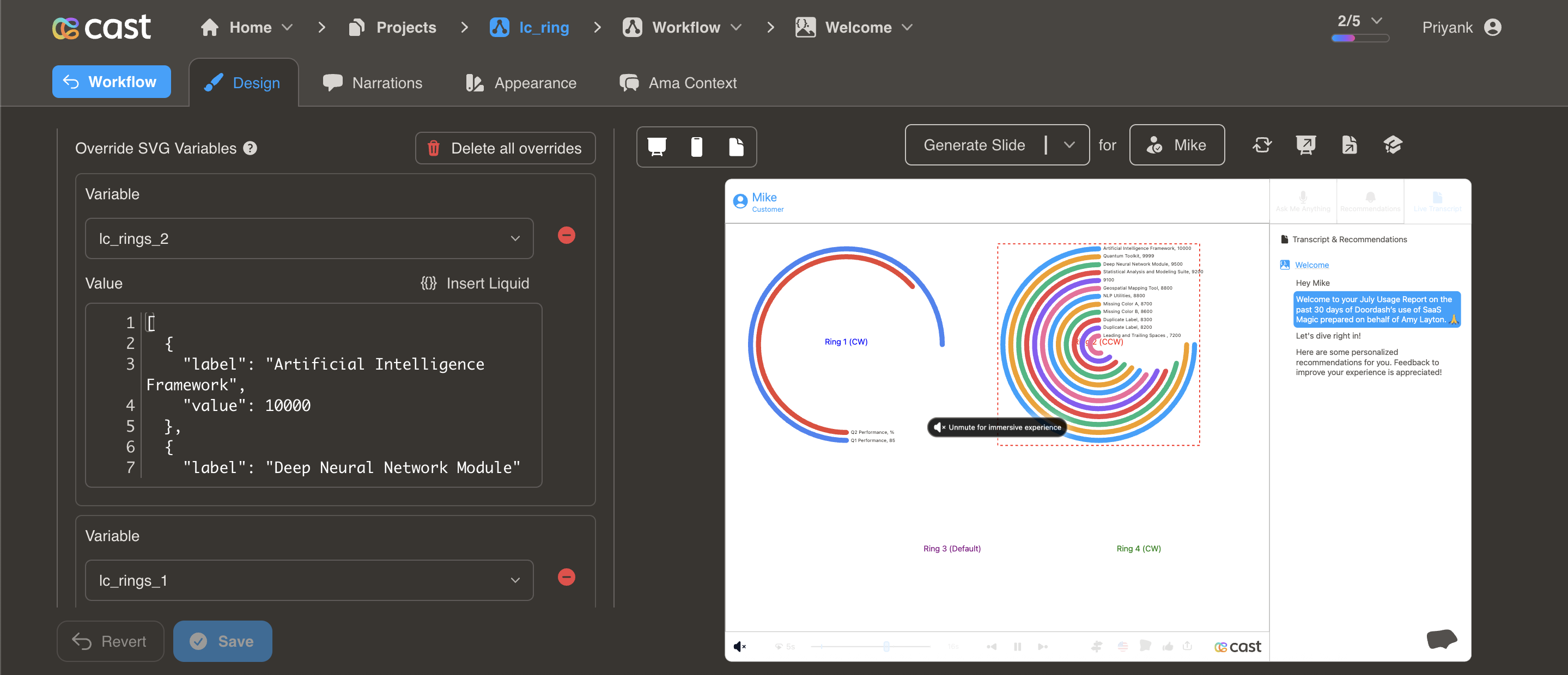
Ring Charts
lc_rings_*
Display hierarchical or comparative data in concentric ring format. Ideal for showing multiple data points with emphasis on top performers through ring positioning.
Element Setup
Main Element:
- Element type:
<rect> - ID format:
lc_rings_*(e.g.,lc_rings_performance,lc_rings_comparison)
Input Format
JSON Array of Objects:
[
  {
    "value": 85,
    "label": "Artificial Intelligence Framework",
    "color": "#4285F4"
  },
  {
    "value": 72,
    "label": "Deep Neural Network Module",
    "color": "#EA4335"
  },
  {
    "value": 58,
    "label": "Machine Learning Pipeline",
    "color": "#FBBC04"
  }
]
Required Properties
value: Numeric value for ring sizing- Negative values automatically converted to 0
- Higher values get outermost rings
label: Text description for the ring- Displayed at the start of each ring
- Automatically formatted with value
Optional Properties
color: Color specification- Hex codes:
"#4285F4" - CSS names:
"royalblue" - RGB values:
"rgb(66, 133, 244)" - If omitted, uses project’s color palette
- Hex codes:
Automatic Features
- Auto-sorting: Rings automatically sort by value (highest = outermost)
- Maximum rings: Displays up to 12 rings (additional data truncated)
- Auto-sizing: Ring thickness and spacing calculated automatically
- Label positioning: Labels placed at ring start with formatted values
Usage Example
<!-- In your SVG -->
<rect id="lc_rings_products" width="400" height="400" />

<!-- In your dataset (as JSON string) -->
{{ products }} = '[
  {"value": 85, "label": "Product A", "color": "#4285F4"},
  {"value": 72, "label": "Product B", "color": "#EA4335"},
  {"value": 58, "label": "Product C", "color": "#FBBC04"}
]'
Result: Three concentric rings with Product A (85) as outermost ring
Common Use Cases
Performance Comparison:
[
  { "value": 92, "label": "Q4 Revenue", "color": "green" },
  { "value": 85, "label": "Q3 Revenue", "color": "blue" },
  { "value": 78, "label": "Q2 Revenue", "color": "purple" }
]
Competitive Analysis:
[
  { "value": 45, "label": "Our Company", "color": "#2196F3" },
  { "value": 30, "label": "Competitor A", "color": "#FF5722" },
  { "value": 15, "label": "Competitor B", "color": "#FFC107" }
]
Hierarchical Data:
[
  { "value": 100, "label": "Total Market", "color": "#9C27B0" },
  { "value": 65, "label": "Our Segment", "color": "#4CAF50" },
  { "value": 25, "label": "Our Share", "color": "#2196F3" }
]
Highlighting Individual Rings
Ring charts support selective highlighting during your presentation, allowing you to draw attention to specific rings while others fade into the background.
How It Works:
When you reference a ring’s label in your narration, that ring automatically highlights (full brightness) while other rings dim to about 12% brightness. Labels remain fully visible so your audience can always read them.
Setting Up Highlights:
To enable highlighting, your ring data must include the label property. The system matches these labels with your highlight configuration to determine which rings to highlight.
How to Add Highlights in Cast Designer:
- Open your project in Cast designer
- Navigate to Narration tab
- Click on Visual Explanations for the slide with your rings
- Find the liquid block for your
lc_ringselement - Add the highlight format directly in the liquid block
Highlight Format:
Single ring:
[{ "label": "Label Name" }]
Multiple rings:
[{ "label": "First Label" }, { "label": "Second Label" }]
All rings visible (no dimming):
(Don't add any highlight to the liquid block)
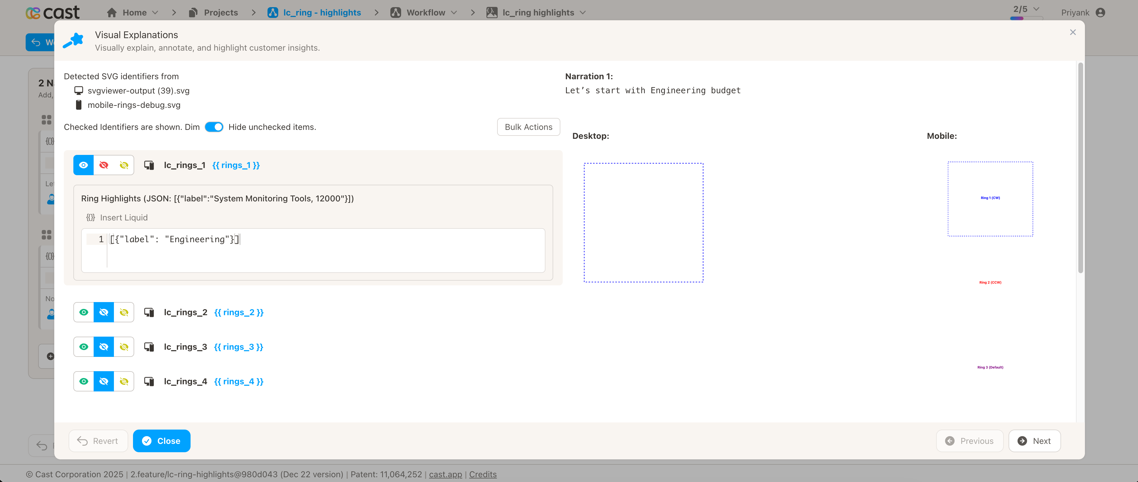
Example 1: Department Budget Comparison
Your Ring Data:
[
  { "value": 150000, "label": "Engineering", "color": "#4285F4" },
  { "value": 120000, "label": "Sales", "color": "#EA4335" },
  { "value": 80000, "label": "Marketing", "color": "#FBBC04" },
  { "value": 50000, "label": "Operations", "color": "#34A853" }
]
Setting Up Visual Explanations:
In Cast designer:
- Navigate to Narration tab
- Click on Visual Explanations
- Find the liquid block for your
lc_ringselement (e.g.,lc_rings_departments) - Add the highlight format directly in the liquid block
Preview Result:
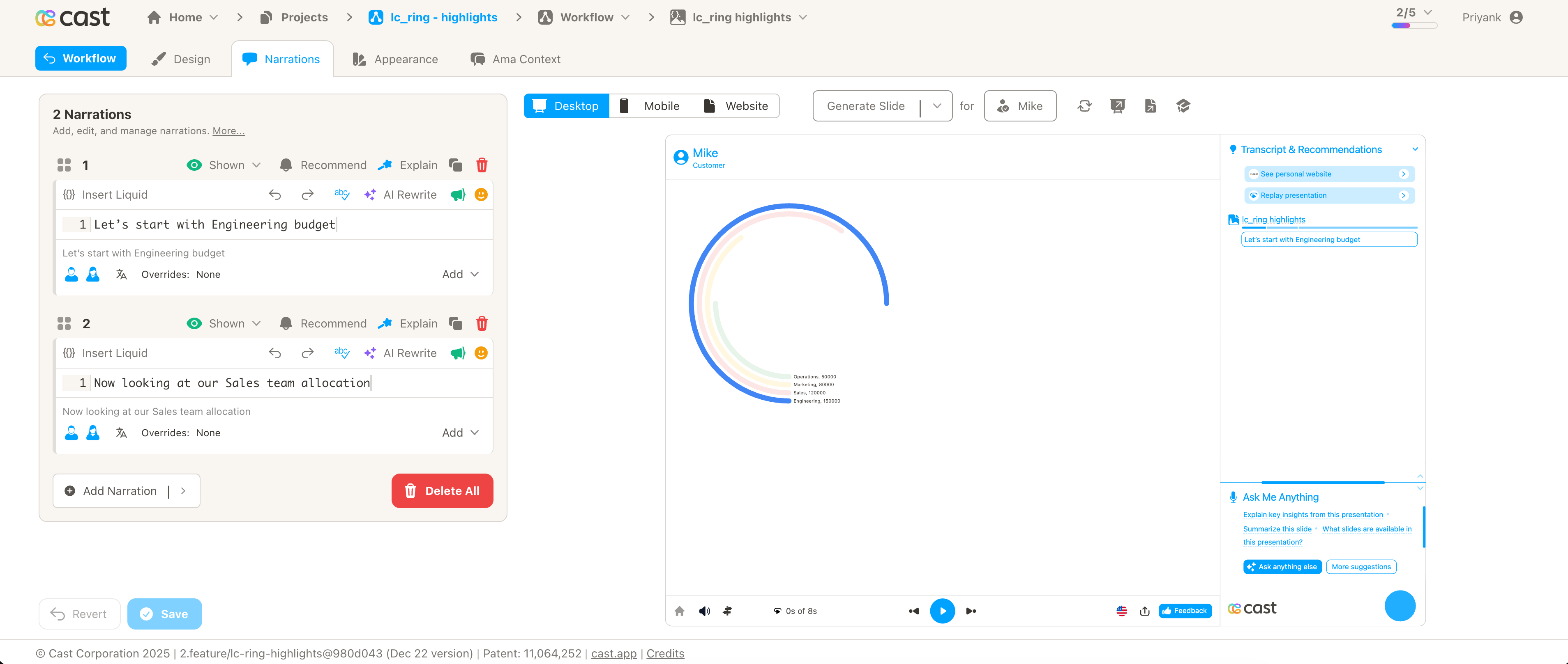
Narration Steps:
-
Narration Step 1: “Let’s start with Engineering budget…”
- Add to liquid block:
[{"label": "Engineering"}] - Result: Engineering ring stays bright, all others dim
- Add to liquid block:
-
Narration Step 2: “Now looking at our Sales team allocation…”
- Add to liquid block:
[{"label": "Sales"}] - Result: Sales ring brightens, Engineering/Marketing/Operations dim
- Add to liquid block:
-
Narration Step 3: “Marketing receives a smaller portion…”
- Add to liquid block:
[{"label": "Marketing"}] - Result: Marketing ring brightens, others dim
- Add to liquid block:
-
Narration Step 4: “Finally, Operations budget…”
- Add to liquid block:
[{"label": "Operations"}] - Result: Operations ring brightens, others dim
- Add to liquid block:
Example 2: Quarterly Performance
Your Ring Data:
[
  { "value": 92, "label": "Q4 Performance", "color": "#2E7D32" },
  { "value": 85, "label": "Q3 Performance", "color": "#1976D2" },
  { "value": 78, "label": "Q2 Performance", "color": "#F57C00" },
  { "value": 70, "label": "Q1 Performance", "color": "#C62828" }
]
Liquid Block Highlights:
-
All Quarters Overview: Show all rings together (no specific highlight)
- Liquid block: Don’t add any highlight
- Result: All rings appear at full brightness
-
Focus on Q4: Mention “Q4 Performance” in your narration
- Liquid block:
[{"label": "Q4 Performance"}] - Result: Q4 ring brightens, Q1-Q3 rings dim
- Liquid block:
-
Compare Q3 to Q4: Reference “Q3 Performance”
- Liquid block:
[{"label": "Q3 Performance"}] - Result: Q3 ring brightens, Q4 dims along with Q1-Q2
- Liquid block:
-
Show Growth: Highlight both Q1 and Q4
- Liquid block:
[{"label": "Q1 Performance"}, {"label": "Q4 Performance"}] - Result: Both Q1 and Q4 rings bright, Q2-Q3 dim
- Liquid block:
Example 3: Product Comparison
Your Ring Data:
[
  { "value": 450, "label": "Premium Plan", "color": "#9C27B0" },
  { "value": 320, "label": "Professional Plan", "color": "#3F51B5" },
  { "value": 180, "label": "Starter Plan", "color": "#00BCD4" }
]
Liquid Block Highlights:
-
“Our Premium Plan leads with…“
- Liquid block:
[{"label": "Premium Plan"}] - Result: Premium Plan ring highlights
- Liquid block:
-
“Professional Plan is popular with…“
- Liquid block:
[{"label": "Professional Plan"}] - Result: Professional Plan ring highlights
- Liquid block:
-
“Starter Plan provides entry-level…“
- Liquid block:
[{"label": "Starter Plan"}] - Result: Starter Plan ring highlights
- Liquid block:
-
“Comparing all three plans…“
- Liquid block: Don’t add any highlight
- Result: All rings at full brightness
Tips for Effective Highlighting:
-
Use Clear Labels: Make labels descriptive and easy to reference in narration
- ✅ Good: “Q4 Revenue”, “Engineering Team”, “Premium Plan”
- ❌ Avoid: “A”, “Item 1”, “Data”
-
Use Correct Format: Add the JSON array directly in the liquid block
- Single ring:
[{"label": "Engineering"}] - Multiple rings:
[{"label": "Q1 Performance"}, {"label": "Q4 Performance"}] - All rings: Don’t add any highlight
- Single ring:
-
Match Labels Exactly: The label text in your data must exactly match the label in your highlight
- If data has
"label": "Engineering", use[{"label": "Engineering"}] - Labels are case-sensitive
- If data has
-
Highlight Multiple Rings: Add multiple objects in the array to highlight several rings
- Example:
[{"label": "Sales"}, {"label": "Marketing"}] - Result: Both Sales and Marketing rings highlight together
- Example:
-
Show All Rings: For overview sections, don’t add any highlight to the liquid block
- Result: All rings appear at full brightness
- Use this when discussing all data together
-
Test Your Presentation: Use preview mode to ensure highlights sync correctly with your narration timing
Labels and Legends
lc_label_*
Create labeled lists with optional colored bullets. While commonly used with doughnut charts, labels operate independently and work with any visualization.
Element Setup
Main Element:
- Element type:
<text> - ID format:
lc_label_*(e.g.,lc_label_legend,lc_label_categories)
Input Format
Basic Format - Labels Only:
Label1;Label2;Label3
Creates three labels without color bullets.
With Color Bullets:
Label1,color1;Label2,color2;Label3,color3
Adds colored circular bullets before each label.
With Word Wrapping:
Long Label Text,blue,20;Another Long Label,red,20
Third parameter sets character limit for word wrapping.
Color Options
Named Colors:
Promoters,blue;Passives,purple;Detractors,orange
Hex Values:
Promoters,#1E88E5;Passives,#9C27B0;Detractors,#FF9800
Default Colors: If colors are omitted, uses project’s default color palette:
Category A;Category B;Category C
Bullet Behavior
- Auto-sizing: Bullet size scales with font size
- Positioning: Placed to the left of label text
- Spacing: Automatically calculated for clean alignment
- Optional: Only appears when colors are specified
Usage Example
<!-- In your SVG -->
<text id="lc_label_nps-scores" x="50" y="100" font-size="16">
  Placeholder text
</text>

<!-- In your dataset -->
{{ nps-scores }} = "Promoters (9-10),green;Passives (7-8),blue;Detractors (0-6),red"
Result: Three labeled items with colored bullets matching colors
Word Wrapping
With Character Limit:
This is a very long product description that needs wrapping,blue,30
- Text wraps after 30 characters per line
- Preserves word boundaries
- Maintains bullet alignment
Multiple Wrapped Labels:
Long Category Name One,blue,25;Long Category Name Two,green,25;Long Category Name Three,red,25
Common Use Cases
Doughnut Chart Legend:
Promoters (58%),green;Passives (32%),blue;Detractors (10%),red
Status Indicators:
Completed,#4CAF50;In Progress,#2196F3;Not Started,#9E9E9E
Product Categories:
Enterprise Plan,#1E88E5;Professional Plan,#7B1FA2;Starter Plan,#F57C00
Survey Responses:
Strongly Agree,#4CAF50;Agree,#8BC34A;Neutral,#FFC107;Disagree,#FF5722;Strongly Disagree,#F44336
Best Practices
Choosing the Right Chart
| Use This | When You Need To |
|---|---|
| Doughnut | Show percentage distribution, compare parts to whole |
| Rings | Show hierarchical data, emphasize top performers, compare metrics |
| Labels | Add legends, create status lists, label any chart |
Design Tips
- Limit segments - Keep doughnut charts to 3-7 segments for clarity
- Sort meaningfully - Order segments by size or importance
- Use color wisely - Choose colors that convey meaning (red=negative, green=positive)
- Add labels - Always include
lc_label_*with doughnut charts - Match colors - Ensure label colors match chart segment colors
- Include values - Show percentages or numbers in labels
Color Strategy
Status Colors:
- ✅ Green: Positive, success, promoters
- ⚠️ Yellow/Orange: Warning, neutral, passives
- ❌ Red: Negative, error, detractors
- 🔵 Blue: Neutral, information
- ⚫ Gray: Inactive, unknown, other
Brand Colors:
- Use your company’s color palette
- Maintain consistency across slides
- Ensure sufficient contrast
Complete Example
NPS Score Visualization
<!-- In your SVG -->
<circle id="lc_doughnut_nps" cx="300" cy="200" r="120" />
<text id="lc_label_nps-legend" x="450" y="150" font-size="18">
  Placeholder
</text>

<!-- In your dataset -->
{{ nps }} = "58,green;32,blue;10,red"
{{ nps-legend }} = "Promoters (58%),green;Passives (32%),blue;Detractors (10%),red"
Result:
- Doughnut chart with three segments (green, blue, red)
- Matching legend with colored bullets and percentages
- Clear visual indication of NPS distribution
Troubleshooting
| Issue | Solution |
|---|---|
| Doughnut not showing | Verify element is <circle> with correct ID prefix |
| Rings not displaying | Check element is <rect> and JSON is valid |
| Labels missing bullets | Add color specification: "Label,color" |
| Colors not matching | Ensure exact color values match between chart and labels |
| Segments too many | Limit to 5-7 segments for readability |
| Ring labels cut off | Increase rect dimensions to provide more space |
| Values don’t add to 100% | Values are automatically scaled - this is normal |
Related Features
- Progress Metrics - Bar and column charts
- Dynamic Colors - Change colors conditionally
- Quick Reference - Syntax cheat sheet