Appearance Tab
The Appearance tab lets you override the slide’s visual appearance. Settings apply only to the current slide and take precedence over project defaults when overridden.
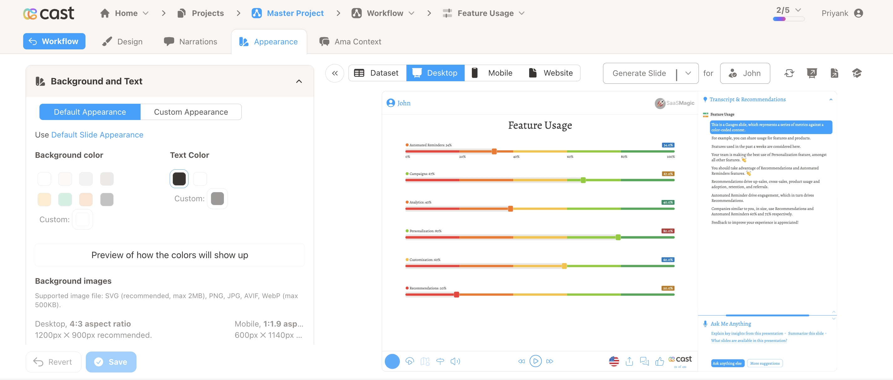
Background and Text
The Background and Text section lets you override:
- Background Color – Choose from preset colors or use a custom color picker.
- Text Color – Choose the text color (dark or light) for the slide.
- Background Image (Desktop) – Upload a desktop background. Aspect ratio 4:3 (1200×900px recommended). Delete or replace anytime.
- Background Image (Mobile) – Upload a mobile background. Aspect ratio 1:1.9 (600×1140px recommended).
Supported image formats: SVG (recommended, max 2MB); for non-SVG slides: PNG, JPG, AVIF, WebP (max 500KB). Images with transparent backgrounds show the specified background color.
Default vs Custom Appearance
Toggle between Default Appearance and Custom Appearance:
- Default Appearance – Inherits from Settings → Default Slide Appearance. Settings are disabled.
- Custom Appearance – Override background, colors, and images for this slide only.
For SVG (Personalized Graphic) slides, the default option is disabled; appearance is always customized per slide.
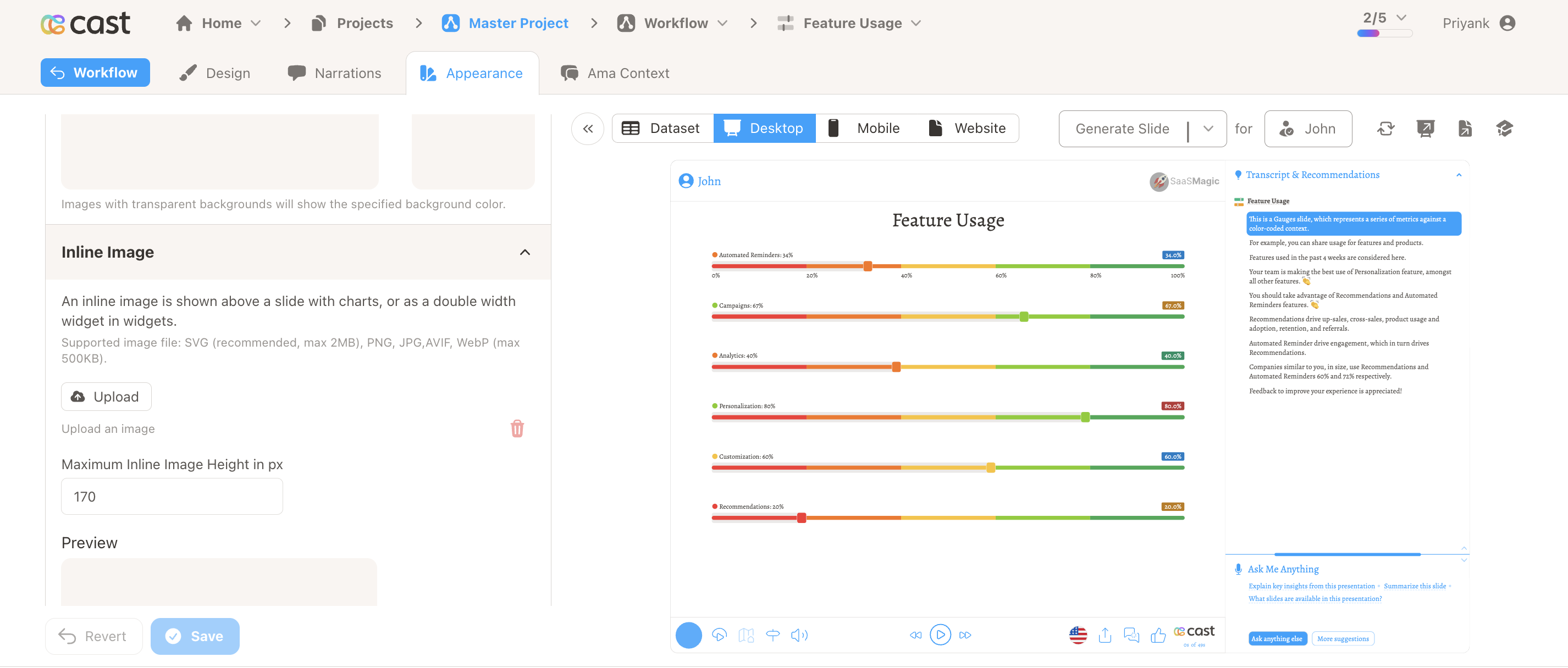
Inline Image
For slides that are neither SVG nor Widgets (e.g. charts, editorials), an Inline Image section is shown:
- Upload an image that appears above the slide content or as a double-width widget.
- Set Maximum Inline Image Height (in pixels) to control sizing.
- Supported: SVG (max 2MB), PNG, JPG, AVIF, WebP (max 500KB).
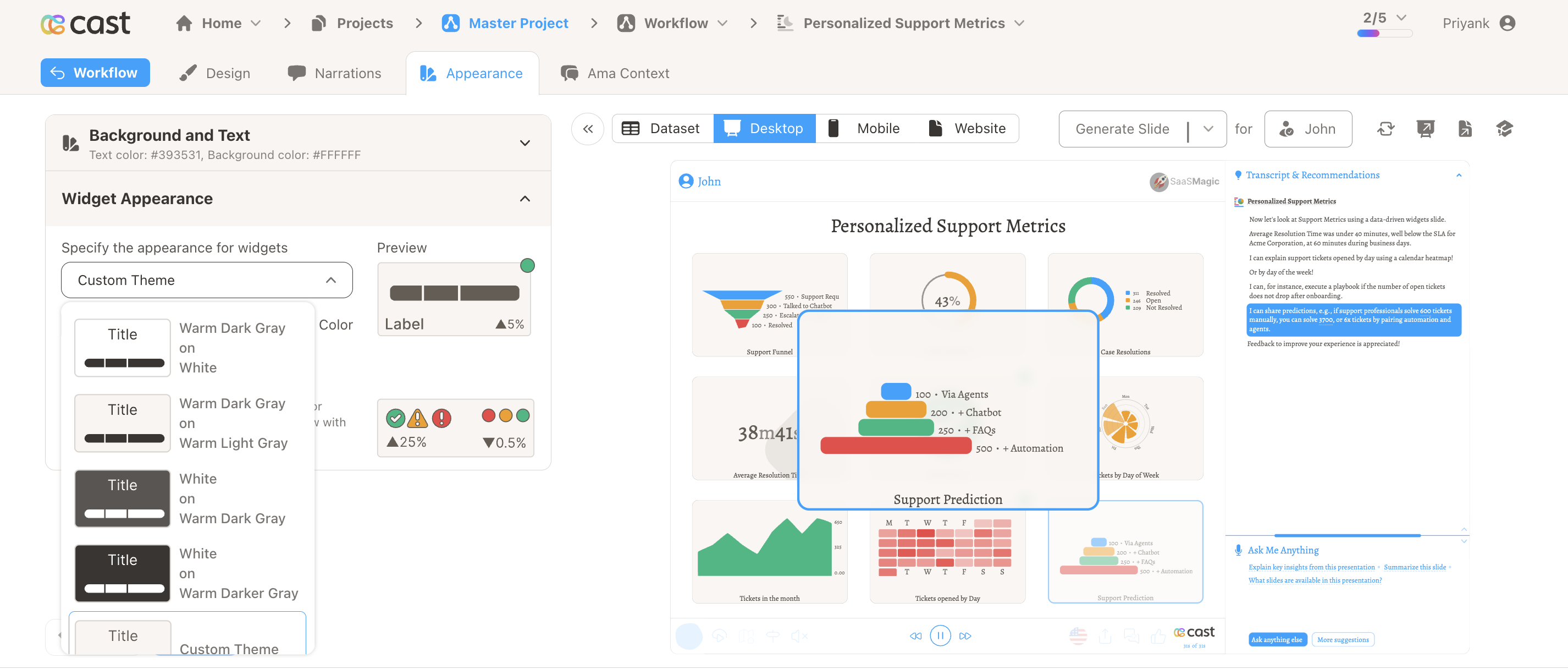
Widget Appearance
For Widget slides, the Widget Appearance section appears:
- Theme dropdown – Pick a preset theme (e.g. Warm Dark Gray on White, White on Warm Dark Gray) or Custom Theme.
- Background Color and Text Color – Fine-tune with color pickers.
- Preview – See how indicators (green, yellow, red) and widgets look with the selected colors.
Related
- Slide – Overview of slide editor tabs
- Design – Configure slide content and data
- Narrations – Add voice to your slide
- AMA Context – Add AMA context for this slide
- Project Settings – Default slide appearance