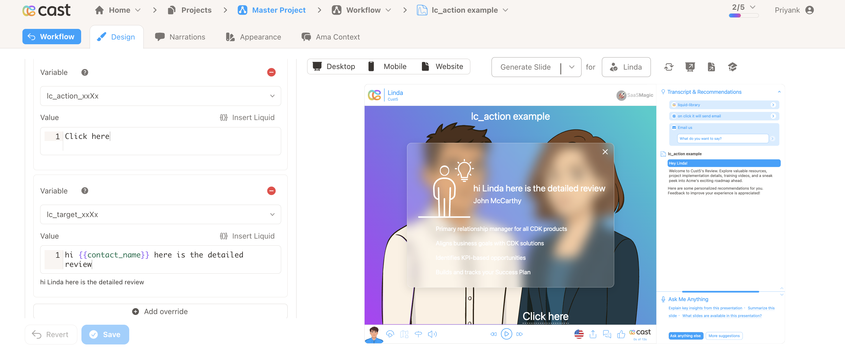
Click-to-Reveal Overlay with lc_action_* and lc_target_*
lc_action_ and lc_target_ work together to create an interactive click-to-reveal experience inside SVG slides. An lc_action_* element renders as a clickable underlined label. When clicked, the matching lc_target_* group opens in a frosted-glass modal overlay, with optional narration text read aloud via TTS.
Naming Convention
Both elements share an identifier that links them together:
lc_action_<identifier>   — clickable label
lc_target_<identifier>   — hidden group revealed in modal
| Part | Description | Example |
|---|---|---|
<identifier> | Shared key that pairs the action with its target | revenue, details, trend |
The identifier must match exactly for the system to pair the action with its target.
Pairing examples:
| Action ID | Target ID |
|---|---|
lc_action_revenue | lc_target_revenue |
lc_action_details | lc_target_details |
lc_action_info | lc_target_info |
Element Identification
lc_action_*— a<text>or<rect>element. Text elements get a dotted underline. Rect elements get a hyperlink icon positioned at the bottom-left of the label.lc_target_*— a<g>(group) element, hidden by default and revealed in the modal when the matching action is clicked. The override value becomes the narration text spoken via TTS.lc_glass_*— a<rect>placed inside thelc_target_*group that defines the overlay’s position and size. Give it afillcolor to set the backdrop tint (defaults to black at 25% opacity). The override value controls the blur radius in pixels (0–100, default 20px).
Input Format
lc_action_* — Label Text
The override value sets the display text on the clickable label. If no override is set, the original SVG text is used.
"Learn more"
lc_target_* — Narration Text
The override value is the narration text displayed and spoken in the modal.
"Revenue grew 12% YoY due to new enterprise accounts."
With Liquid variables:
"The {{metric_name}} showed a {{change_pct}}% change compared to {{previous_period}}."
If no narration text is set, the default message is:
Click on the X in the top-right corner to continue.
lc_glass_* — Blur Radius
The override value sets the frosted-glass blur radius in pixels. Leave empty for the default blur (20px).
"10"
With optional px suffix:
"13.5px"
Valid range is 0–100. The designer validates input within this range; values above 100 are clamped to 100px by the player.
Important Notes:
- Presentation playback pauses when the overlay opens and resumes when it closes
- Close the overlay by clicking the X button, pressing Escape, or clicking outside the card
- Multiple independent action/target pairs can coexist on a single slide
- If no matching
lc_target_*is found for an action, or the target has nolc_glass_*child, the action is hidden automatically at slide load - The
lc_glass_*element is not visible in the overlay — it is only used for positioning
Compatibility: lc_action_* works with <text> and <rect> elements. lc_target_* works with <g> (group) elements.
Example Usage
Example 1: Basic Revenue Detail
Action element:
ID: lc_action_revenue
Text: "Learn more"
Target element:
ID: lc_target_revenue
Value: "Revenue grew 12% YoY due to new enterprise accounts."
Clicking “Learn more” pauses playback and opens a glass overlay showing the revenue content, while narrating the explanation.
Example 2: Multiple Pairs on One Slide
Action: lc_action_details  → Target: lc_target_details
Action: lc_action_trend    → Target: lc_target_trend
Each pair works independently — clicking one action opens only its corresponding target overlay.
Example 3: No Narration Text
Action: lc_action_info
Target: lc_target_info   (no override value set)
The glass overlay opens with the target content. The default narration “Click on the X in the top-right corner to continue.” is spoken.
Example 4: Invalid Pair (Missing Target)
Action: slide_lc_action_missing
(no matching lc_target_missing exists)
The action is hidden automatically at slide load — no label or icon is rendered.
Designer Guidelines
- Use a
<text>element for simple link-style labels — the player adds a dotted underline automatically (no icon) - Use a
<rect>element for button-style actions — the player creates a text label with a hyperlink icon (no underline) and truncates long labels to fit - Place an
lc_glass_*rect inside the target group to define the overlay position and size - Add content elements (text, charts, shapes) inside the target group — these appear in the modal
- On desktop, design for the full slide viewBox dimensions; on mobile, consider a taller, narrower glass rect
Highlight Integration
lc_action_*follows the standard highlight system — fully visible when highlighted, dimmed when notlc_target_*is always skipped in highlighting — it remains hidden and is only rendered via the glass overlay