Stacked Bar Chart Visualization with lc_pie_bar_*
The lc_pie_bar_* prefix is used for SVG element IDs that need to display a horizontal stacked bar chart with a legend. Each segment represents a proportion of the total, making it ideal for showing part-to-whole relationships, category breakdowns, and distribution analysis at a glance.
Element Identification
The target element must be a <rect> with an ID that starts with lc_pie_bar_* for stacked bar chart visualization.
Input Format
The input value must be provided as a JSON object containing a data array of segment objects.
JSON Format
{
  "data": [
    {
      "label": "Product Questions",
      "color": "#1ABC84",
      "value": 380,
      "displayValue": "38%"
    },
    {
      "label": "Implementation Support",
      "color": "#F59E0B",
      "value": 140,
      "displayValue": "14%"
    },
    {
      "label": "Escalated Tickets",
      "color": "#111111",
      "value": 20,
      "displayValue": "2%"
    },
    {
      "label": "Usage and Adoption Reviews",
      "color": "#1D9BF0",
      "value": 260,
      "displayValue": "26%"
    },
    {
      "label": "Renewal and Commercial Questions",
      "color": "#DC3232",
      "value": 200,
      "displayValue": "20%"
    }
  ],
  "fontSize": 12,
  "fontColor": "#222222",
  "barHeight": 24
}
Download Sample Data - Pie Bar
Important Notes:
- Segments with negative or non-numeric values are silently skipped; zero-value segments render as a thin colored line and still appear in the legend
displayValueis shown in the legend as-is — it does NOT affect segment proportions (proportions are always based onvalue)- Key names are case-insensitive for the first character (e.g.
Labelandlabelboth work) - If data is not passed in the correct format, the element will display as a plain
<rect>without any chart visualization
Configuration Properties
Required Segment Properties
label: Display name for the segment (string, mandatory)value: Numeric value for the segment (number, mandatory — negative and non-numeric values are skipped; zero renders as a thin line)
Optional Segment Properties
| Property | Type | Description |
|---|---|---|
displayValue | string | Text shown in the legend (e.g. “38%”) — does not affect bar proportions |
color | string | Custom hex color code or color name for the segment fill |
Optional Chart-Level Properties
| Property | Type | Description |
|---|---|---|
barHeight | number | Custom bar height in pixels (defaults to the full rect height) |
fontSize | number | Font size for legend text in pixels (auto-calculated from bar height if not set) |
fontColor | string | Color for legend text (defaults to the current chart’s text color) |
Color Specifications
Custom Color:
- Provide hex color codes:
"#1ABC84","#F59E0B" - Use CSS color names:
"red","blue","green" - Each segment can have its own individual color
Default Behavior:
- If no color is provided, colors are auto-assigned from the appearance settings and project color palette (
castColor(0),castColor(1), etc.)
Compatibility: Works with <rect> elements only
Layout Behaviour
- The stacked bar occupies 80% of the rect width, left-aligned with padding
- When
barHeightis omitted, the bar fills the full rect height - When a custom
barHeightis set and leaves enough room, the legend is placed inside the rect below the bar; otherwise the legend renders below the rect boundary - Legend items wrap to multiple lines if the rect is narrow
- Long labels are truncated with
…based on available space - Segments use selective corner rounding — left corners on the first segment, right corners on the last
Highlighting Segments
Stacked bar charts support two levels of highlighting during your presentation:
Whole-Chart Visibility
Use the chart ID (e.g. lc_pie_bar_tickets) in your highlight configuration to control the entire chart’s visibility. The chart fades in with a left-to-right fill animation when it first becomes visible.
Segment-Level Highlighting
Highlight specific segments by referencing their label in your highlight configuration. The widget matches these labels against the chart data and highlights the matching segments. Label matching is case-insensitive, so "product questions" matches a segment labeled "Product Questions".
Highlight Format:
Single segment:
[{ "label": "Negotiation" }]
Multiple segments:
[{ "label": "Closed Won" }, { "label": "Closed Lost" }]
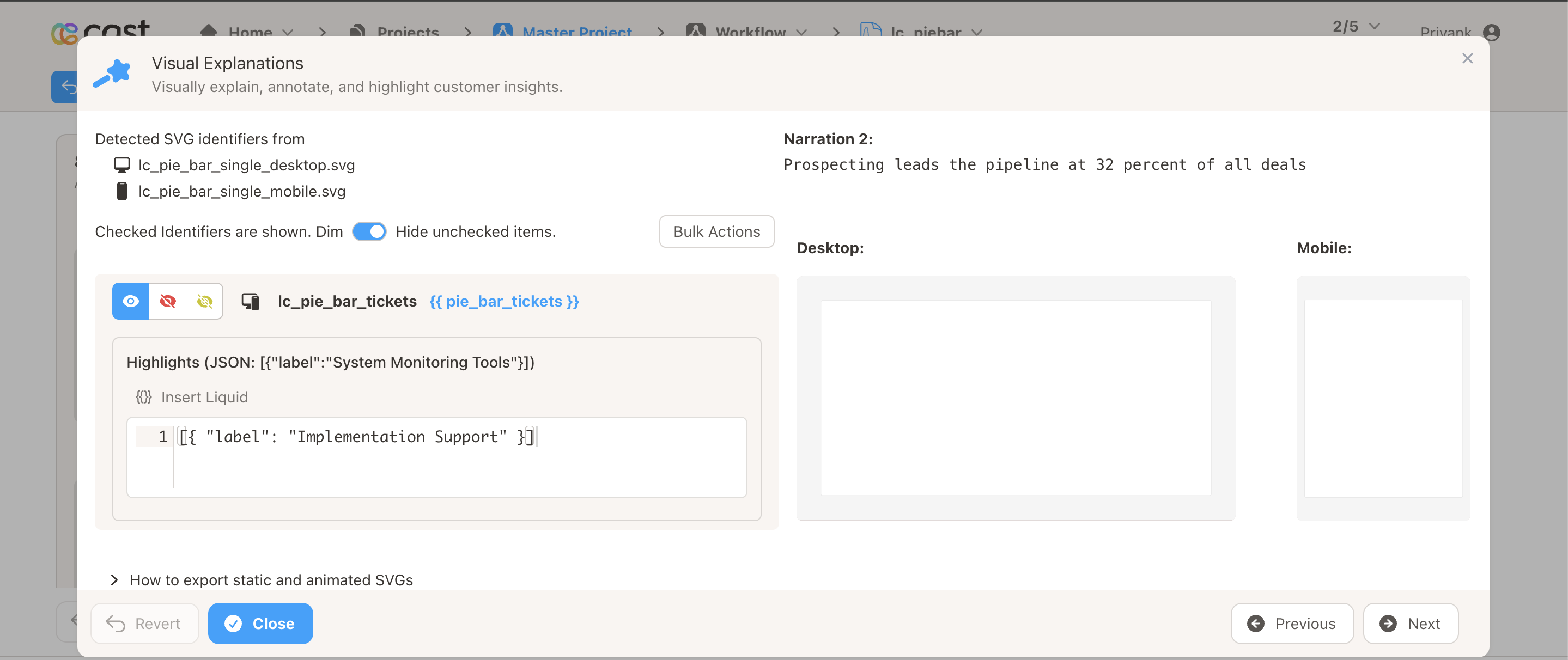
How to Add Highlights in Cast Designer:
- Open your project in Cast designer
- Navigate to the Narration tab
- Click on Visual Explanations for the slide with your stacked bar chart
- Find the liquid block for your
lc_pie_barelement - Add the highlight format directly in the liquid block
Highlight Modes
The lc_pie_bar widget automatically selects the best highlight mode based on available space and context:
Expanded Rows Mode (default when space allows)
- All segments translate down into an expanded row layout extending below the bar
- Each highlighted segment gets its own row; contiguous non-highlighted segments share a row
- Rows stack flush below the main bar (no gap between rows)
- Breakout labels appear beside highlighted segments showing the label and display value
- The legend shifts down to clear the expanded rows
- Rows stagger in with a slight delay between them (~0.08s)
Modal Popup Mode (when expanded rows don’t fit)
- A centered modal card appears with a frosted glass backdrop
- The modal contains a stacked bar replica, expanded rows, and legend
- Breakout labels appear inside the modal for highlighted segments
- The original bar and legend remain visible at full opacity behind the modal
Opacity-Only Mode (multiple charts highlighted simultaneously)
- When two or more
lc_pie_barrects have segment highlights in the same step, all charts fall back to opacity-only mode - Highlighted segments stay at full opacity; others dim
- No expanded rows, no popup, no glass overlay
Highlight Behaviour Summary
| Scenario | Behaviour |
|---|---|
| No segment highlight | Whole chart fades in with left-to-right fill animation |
| Segment highlight with space | Expanded row layout with breakout labels |
| Segment highlight without space | Modal popup with stacked bar and expanded rows inside |
| Multiple charts highlighted | Opacity-only — no expanded rows or modal |
| Non-existent label | No matches — all segments restored to full opacity |
| Empty highlight list | No effect — chart stays at current state |
Example Usage
Example 1: Simple Two-Segment Breakdown
{
  "data": [
    { "label": "Won", "value": 340, "displayValue": "68%" },
    { "label": "Lost", "value": 160, "displayValue": "32%" }
  ]
}
Example 2: Support Ticket Categories with Custom Colors
{
  "data": [
    {
      "label": "Product Questions",
      "color": "#1ABC84",
      "value": 380,
      "displayValue": "38%"
    },
    {
      "label": "Implementation Support",
      "color": "#F59E0B",
      "value": 140,
      "displayValue": "14%"
    },
    {
      "label": "Escalated Tickets",
      "color": "#111111",
      "value": 20,
      "displayValue": "2%"
    },
    {
      "label": "Usage and Adoption Reviews",
      "color": "#1D9BF0",
      "value": 260,
      "displayValue": "26%"
    },
    {
      "label": "Renewal and Commercial Questions",
      "color": "#DC3232",
      "value": 200,
      "displayValue": "20%"
    }
  ]
}
Example 3: Custom Bar Height and Font Size
{
  "data": [
    { "label": "Alpha", "value": 60 },
    { "label": "Beta", "value": 40 }
  ],
  "barHeight": 32,
  "fontSize": 14
}
Example 4: Quarterly Breakdown (Auto-Colored)
{
  "data": [
    { "label": "Q1", "value": 25 },
    { "label": "Q2", "value": 25 },
    { "label": "Q3", "value": 25 },
    { "label": "Q4", "value": 25 }
  ]
}
Example 5: Narration with Segment Highlights
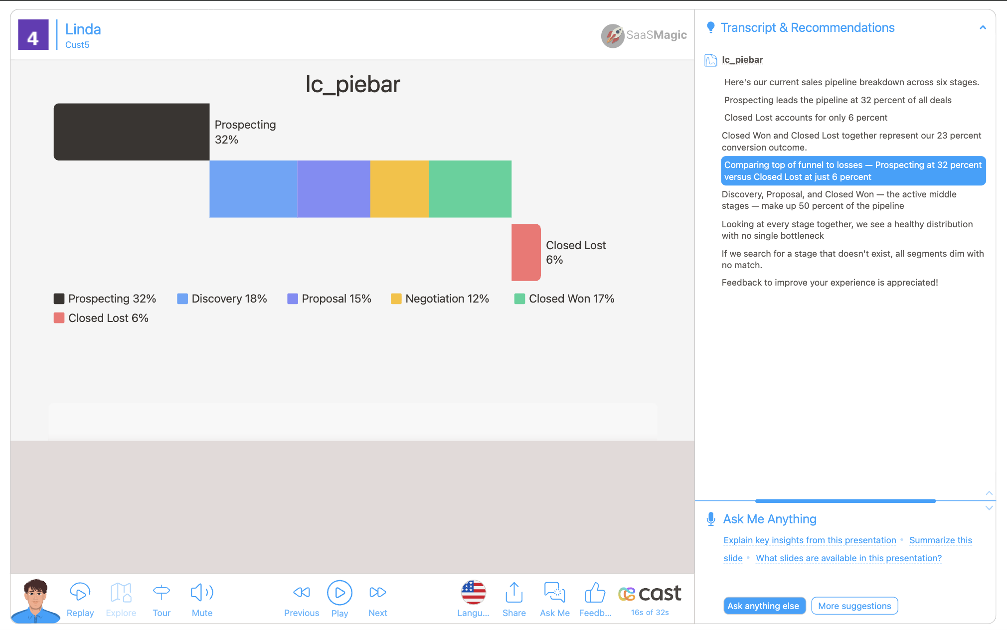
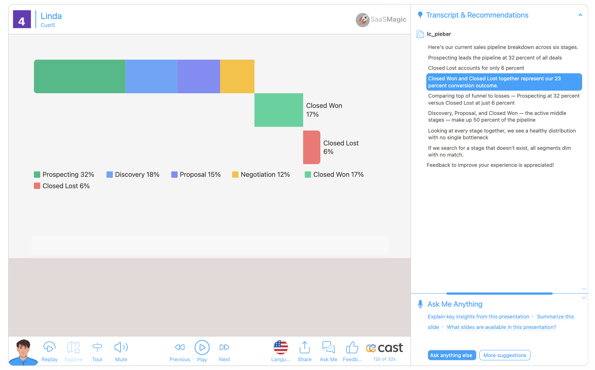
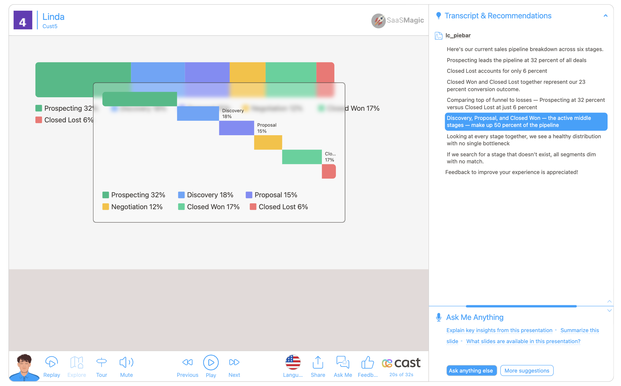
Your Stacked Bar Data:
{
  "data": [
    { "label": "Prospecting", "color": "#1ABC84", "value": 320, "displayValue": "32%" },
    { "label": "Discovery", "color": "#60A5FA", "value": 180, "displayValue": "18%" },
    { "label": "Proposal", "color": "#818CF8", "value": 150, "displayValue": "15%" },
    { "label": "Negotiation", "color": "#FBBF24", "value": 120, "displayValue": "12%" },
    { "label": "Closed Won", "color": "#34D399", "value": 170, "displayValue": "17%" },
    { "label": "Closed Lost", "color": "#F87171", "value": 60, "displayValue": "6%" }
  ],
  "barHeight": 90
}
Narration Steps:
-
Step 1: “Here’s your sales pipeline breakdown…”
- Liquid block: No highlight (whole chart visible)
- Result: All segments appear at full brightness with left-to-right fill animation
-
Step 2: “Prospecting makes up the largest share at 32%…”
- Liquid block:
[{"label": "Prospecting"}] - Result: Expanded row layout with “Prospecting” breakout label
- Liquid block:
-
Step 3: “Discovery and Proposal together account for 33% of the pipeline…”
- Liquid block:
[{"label": "Discovery"}, {"label": "Proposal"}] - Result: Both segments highlighted with individual breakout labels
- Liquid block:
-
Step 4: “Let’s look at the closed deals — 17% won vs 6% lost…”
- Liquid block:
[{"label": "Closed Won"}, {"label": "Closed Lost"}] - Result: Previous expanded rows clear, new expanded rows render for both closed segments
- Liquid block:
-
Step 5: “Overall, your pipeline looks healthy…”
- Liquid block: No highlight
- Result: All segments return to full opacity, expanded rows removed
Data Handling
- Segments with negative or non-numeric
valueare silently skipped; zero-value segments render as a thin colored line and still appear in the legend - If all segments are invalid, nothing renders and the original rect stays hidden
- If the JSON is malformed or the
dataarray is missing, the handler returns early without crashing - On re-render with the same ID but new data, previous elements are cleaned up automatically
- Key names are case-insensitive for the first character (
Labelandlabelboth work)