Slope Visualization with lc_slope_*
The lc_slope_* prefix is used for SVG element IDs that need to display slope data visualizations, ideal for showing trends, comparisons between two data points, and directional changes over time or categories.
A dedicated legend panel displays each line as:
[colored dot]  Label
               ▲ startValue to endValue (pct%)
Use Cases
- Performance comparisons between two time periods
- Before/after analysis and trend visualization
- Sales performance tracking and revenue changes
- Progress tracking and goal achievement
- Comparative analysis between categories or segments
- Change indicators and directional trends
Element Identification
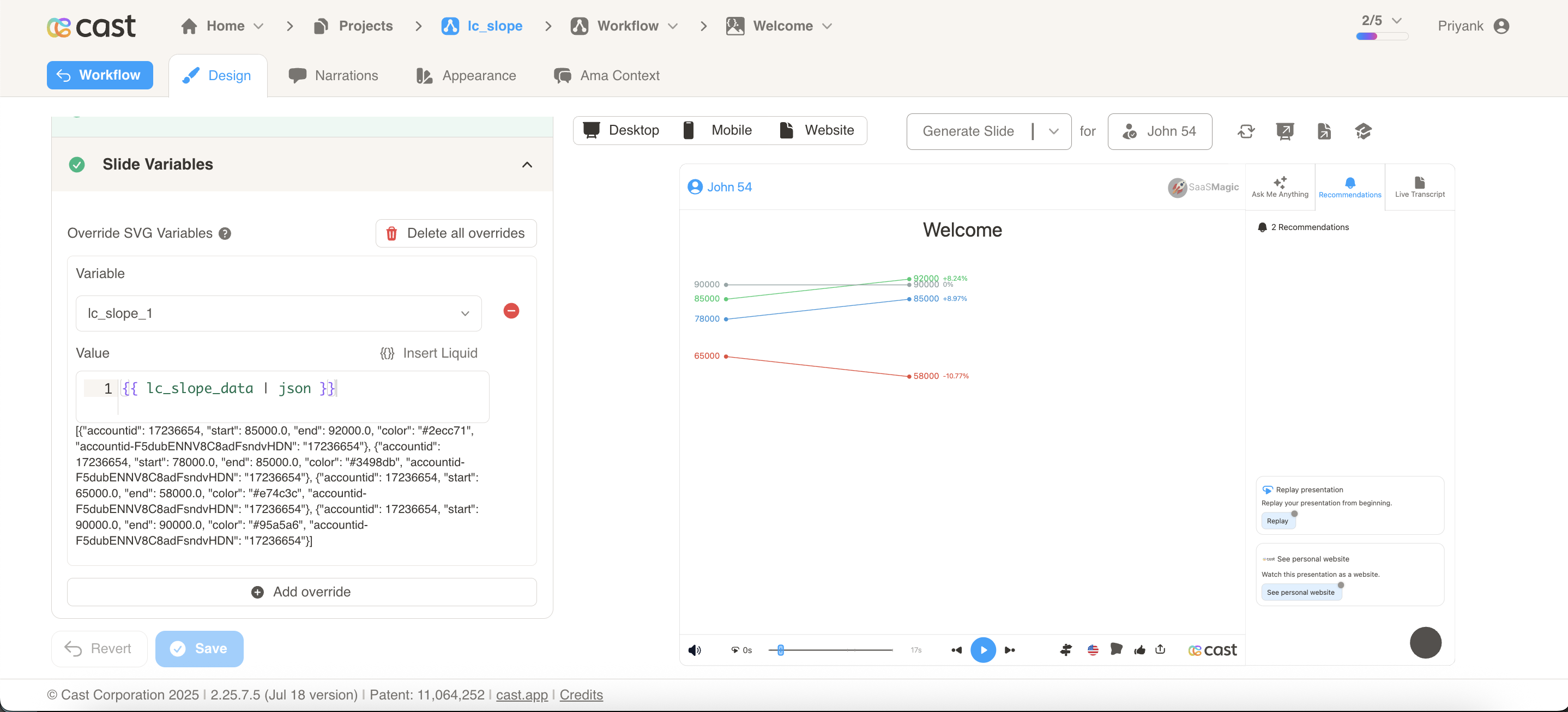
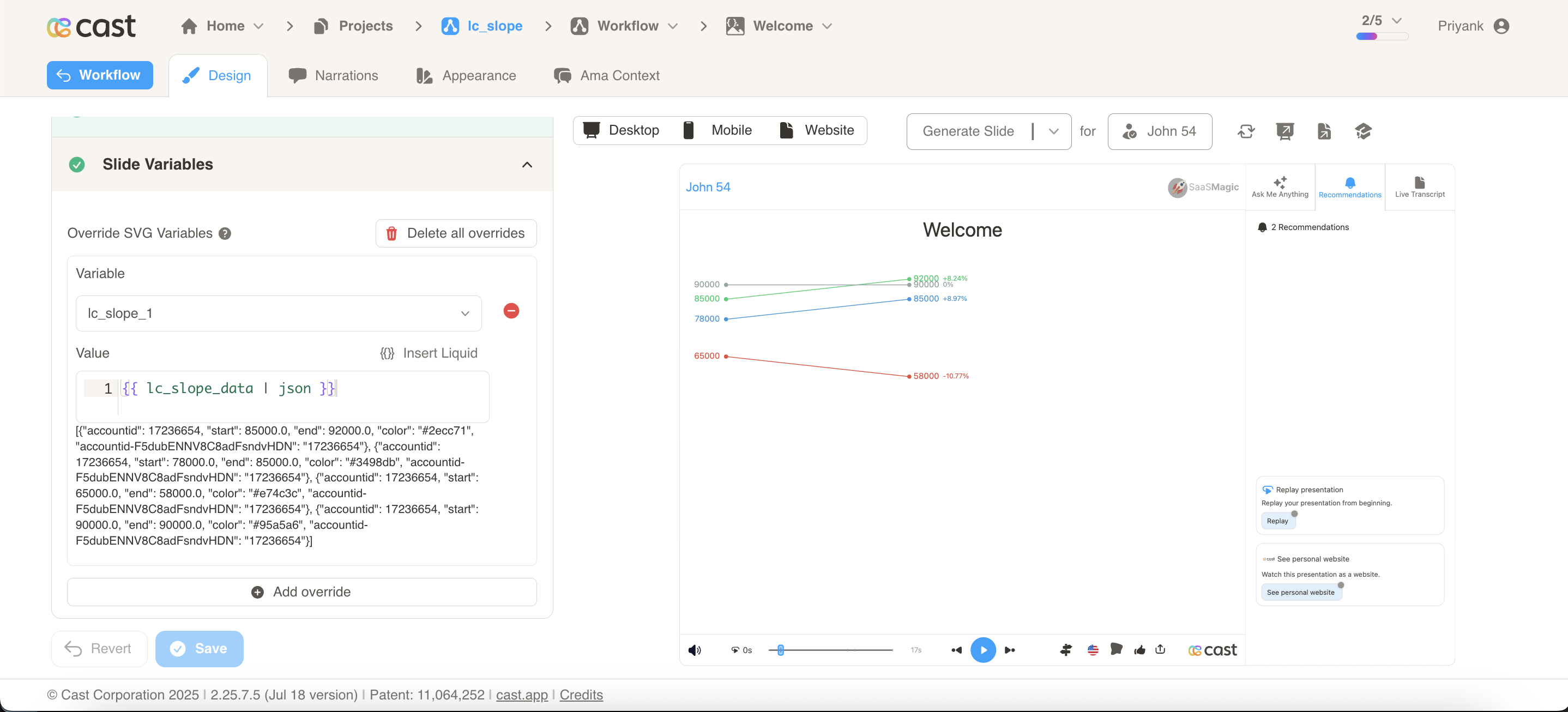
The target element must be a <rect> with an ID that starts with lc_slope_* for slope chart visualizations.
Input Format
The input value must be provided as a JSON array of objects with the following structure:
JSON Format
A JSON string containing an array of objects with the following structure:
[
  {
    "label": "North America",
    "start": 2450000,
    "end": 2890000,
    "color": "#2ecc71",
    "legendPosition": "right",
    "leftLabel": "Q1 2024",
    "rightLabel": "Q2 2024"
  },
  {
    "label": "Europe",
    "start": 1850000,
    "end": 2100000,
    "color": "#3498db"
  },
  {
    "label": "Asia Pacific",
    "start": 1620000,
    "end": 1450000,
    "color": "#e74c3c"
  },
  {
    "label": "Latin America",
    "start": 980000,
    "end": 1250000,
    "color": "#f39c12"
  }
]
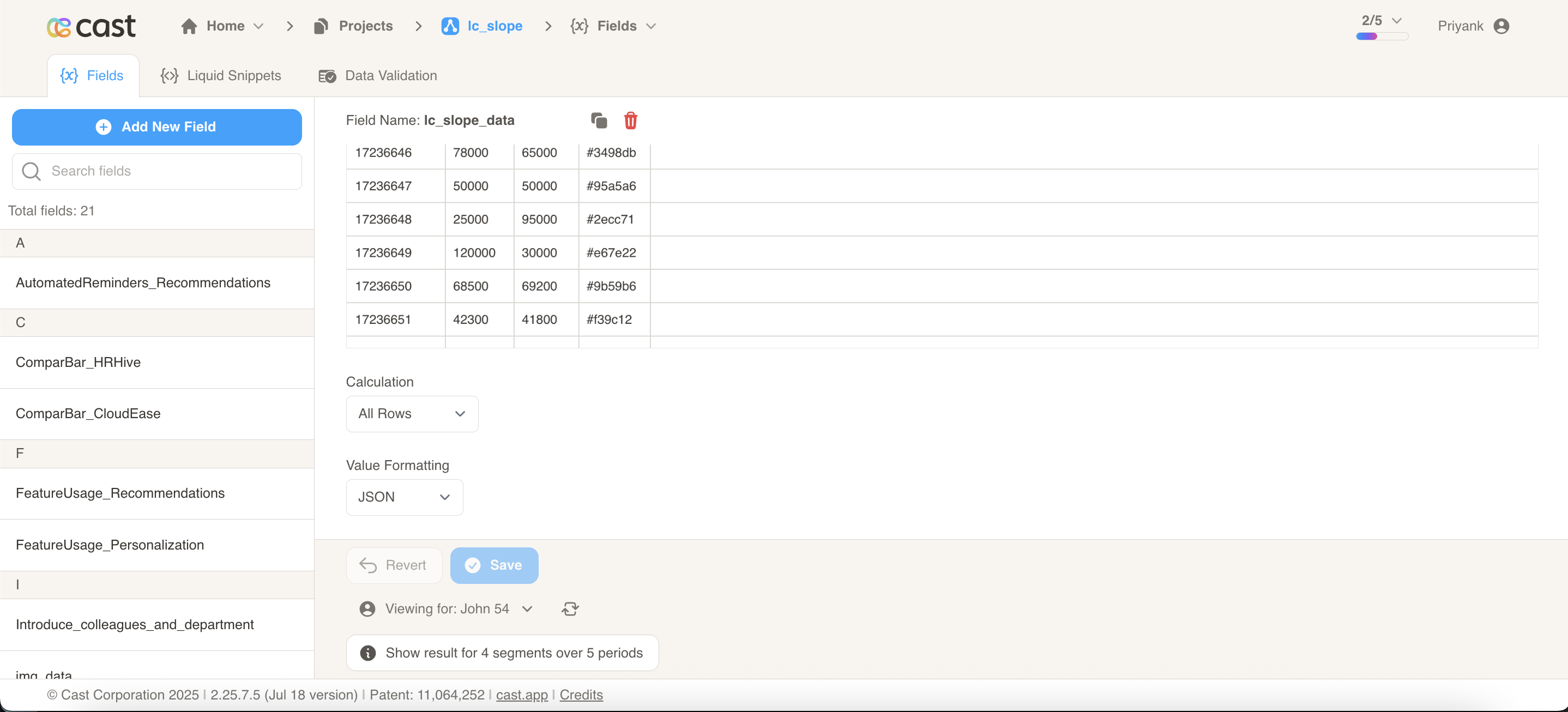
Dataset/CSV Format
Alternatively, you can use tabular data from your datasets with the following columns:
| label | start | end | color | legendPosition | leftLabel | rightLabel |
|---|---|---|---|---|---|---|
| North America | 2450000 | 2890000 | #2ecc71 | right | Q1 2024 | Q2 2024 |
| Europe | 1850000 | 2100000 | #3498db | |||
| Asia Pacific | 1620000 | 1450000 | #e74c3c | |||
| Latin America | 980000 | 1250000 | #f39c12 | |||
| Middle East | 650000 | 780000 | #9b59b6 |
legendPosition,leftLabel, andrightLabelare read from the first row only. You only need to fill them in the first row.
Dataset Usage:
- Connect your slope chart to a dataset containing the required columns
- The system will automatically map the columns to the appropriate chart properties
- Filter data by categories or time ranges to show relevant slope comparisons
- Multiple rows create multi-line slope visualizations for comprehensive trend analysis
Important Notes:
- Column names must match exactly as shown in the example (
label,start,end,color) - Column names are case-sensitive and must be spelled exactly as specified
- If data is not passed in the correct format or column names don’t match, the element will display as a plain
<rect>without any slope visualization - The
labelfield is used for legend display and highlighting. If omitted, the legend shows a compact single-line format with values only - The
startandendfields must contain numeric values for proper slope calculation - Non-numeric
startorendvalues default to0
Implementation Steps for Dataset Usage
To use dataset/CSV format with slope charts, follow these steps:
Create Dataset: Import your data containing the required columns (label, start, end, color)
Create Field: Create a field from your dataset that contains the slope chart data
Set Value Formatting: In the field settings, set Value Formatting to “JSON” - this is crucial for proper data formatting
Override SVG Variables: In the SVG slide design tab, go to “Override SVG Variables”
Select Variable: Choose your slope chart variable and use the format:
Include JSON Filter: Critical: Always include the | json filter with your field, otherwise the slope chart will not work
Configuration Properties
Required Properties:
| Field | Description |
|---|---|
start | Numeric starting value. Invalid values default to 0 |
end | Numeric ending value. Invalid values default to 0 |
Optional Properties:
| Field | Description |
|---|---|
label | Legend entry label. If omitted, legend shows a compact single-line format: [dot] ▲ startVal to endVal (pct%) |
color | Line, dot, and legend color. Accepts CSS color names or hex values (e.g. "#2ecc71"). If not provided, auto-assigned from the project color palette |
legendPosition | "right" (default) or "left" — position of the legend panel relative to slope lines. Read from first item only |
leftLabel | Label displayed below the left axis line (e.g. "2018"). If not provided, no label is shown. Read from first item only |
rightLabel | Label displayed below the right axis line (e.g. "2021"). If not provided, no label is shown. Read from first item only |
legendLabelFontSize | Font size (px) for the label line in the legend. Default: 18. Read from first item only |
legendValueFontSize | Font size (px) for the values line in the legend. Default: 20. Read from first item only |
Visual Elements
- Slope Lines: Connect start and end points showing direction and magnitude of change
- Data Points: Visual indicators at start and end positions
- Axis lines: Vertical lines at start and end positions with labels below (when
leftLabel/rightLabelare provided) - Legend panel: Vertical list of entries showing label, values, and percentage change for each line
Compatibility: Works with <rect> elements only
Example Usage
Example 1: Basic Slope Chart (Right Legend, Default)
[
  { "label": "Revenue", "start": 1000, "end": 1500 },
  { "label": "Costs",   "start": 800,  "end": 1200 },
  { "label": "Margin",  "start": 1200, "end": 1100 }
]
Legend shows: Revenue - 1K to 1.5K (+50%), Costs - 800 to 1.2K (+50%), Margin - 1.2K to 1.1K (-8.33%)
Example 2: With Axis Labels
[
  { "label": "Revenue", "start": 1000, "end": 1500, "leftLabel": "2018", "rightLabel": "2021" },
  { "label": "Costs",   "start": 800,  "end": 1200 }
]
Vertical axis lines with serif caps at start/end, with “2018” and “2021” labels centered below.
Example 3: Left-Positioned Legend
[
  { "label": "Sales", "start": 100, "end": 200, "color": "#4285F4", "legendPosition": "left" },
  { "label": "Marketing", "start": 80, "end": 90, "color": "#EA4335" }
]
The legend panel appears on the left side, with the slope lines on the right.
Example 4: Regional Revenue (Q1 to Q2 2024)
[
  { "label": "North America", "start": 2450000, "end": 2890000, "leftLabel": "Q1 2024", "rightLabel": "Q2 2024" },
  { "label": "Europe", "start": 1850000, "end": 2100000 },
  { "label": "Asia Pacific", "start": 1620000, "end": 1450000 },
  { "label": "Latin America", "start": 980000, "end": 1250000 }
]
Example 5: Customer Satisfaction Scores (Before/After Initiative)
[
  {
    "label": "Product Support",
    "start": 78.5,
    "end": 92.3,
    "color": "#2ecc71"
  },
  {
    "label": "Sales Experience",
    "start": 85.2,
    "end": 88.7,
    "color": "#3498db"
  },
  { "label": "Onboarding", "start": 72.8, "end": 95.1, "color": "#f39c12" },
  { "label": "Documentation", "start": 68.3, "end": 71.5, "color": "#e74c3c" },
  {
    "label": "Account Management",
    "start": 91.2,
    "end": 93.8,
    "color": "#9b59b6"
  }
]
Highlighting Individual Slope Lines
Slope charts support selective highlighting during your presentation, allowing you to draw attention to specific slope lines while others fade into the background.
How It Works:
When you reference a slope line’s label in your narration, that line automatically highlights (full brightness) while other lines dim to about 12% brightness. Labels remain fully visible so your audience can always read them.
Setting Up Highlights:
To enable highlighting, your slope data must include the label property. The system matches these labels with your highlight configuration to determine which slope lines to highlight.
How to Add Highlights in Cast Designer:
- Open your project in Cast designer
- Navigate to Narration tab
- Click on Visual Explanations for the slide with your slope chart
- Find the liquid block for your
lc_slopeelement - Add the highlight format directly in the liquid block
Highlight Format:
Single slope line:
[{ "label": "North America" }]
Multiple slope lines:
[{ "label": "North America" }, { "label": "Europe" }]
All slope lines visible (no dimming):
(Don't add any highlight to the liquid block)
Highlight Example 1: Regional Revenue Growth (Q1 to Q2 2024)
Your Slope Data:
[
  {
    "label": "North America",
    "start": 2450000,
    "end": 2890000,
    "color": "#2ecc71",
    "leftLabel": "Q1 2024",
    "rightLabel": "Q2 2024"
  },
  { "label": "Europe", "start": 1850000, "end": 2100000, "color": "#3498db" },
  {
    "label": "Asia Pacific",
    "start": 1620000,
    "end": 1450000,
    "color": "#e74c3c"
  },
  {
    "label": "Latin America",
    "start": 980000,
    "end": 1250000,
    "color": "#f39c12"
  }
]
Setting Up Visual Explanations:
In Cast designer:
- Navigate to Narration tab
- Click on Visual Explanations
- Find the liquid block for your
lc_slopeelement (e.g.,lc_slope_revenue) - Add the highlight format directly in the liquid block
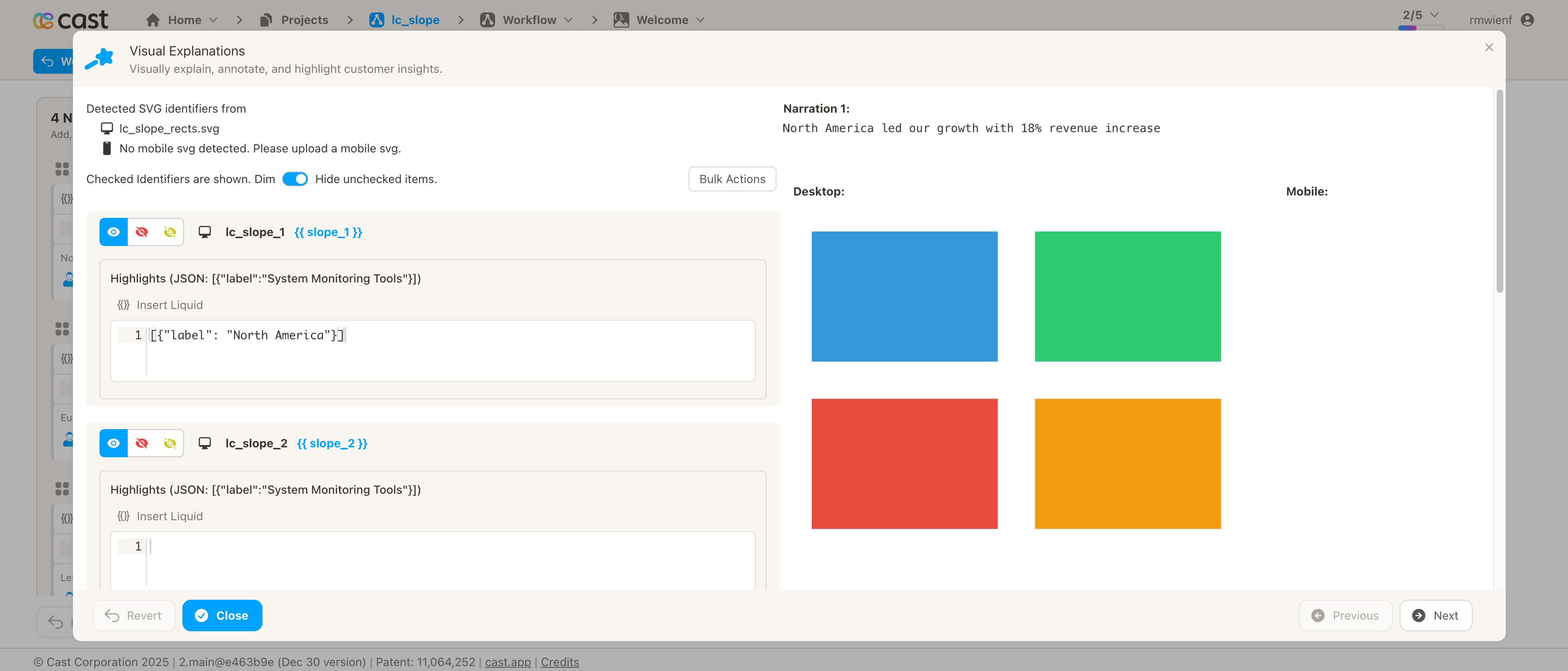
Preview Result:
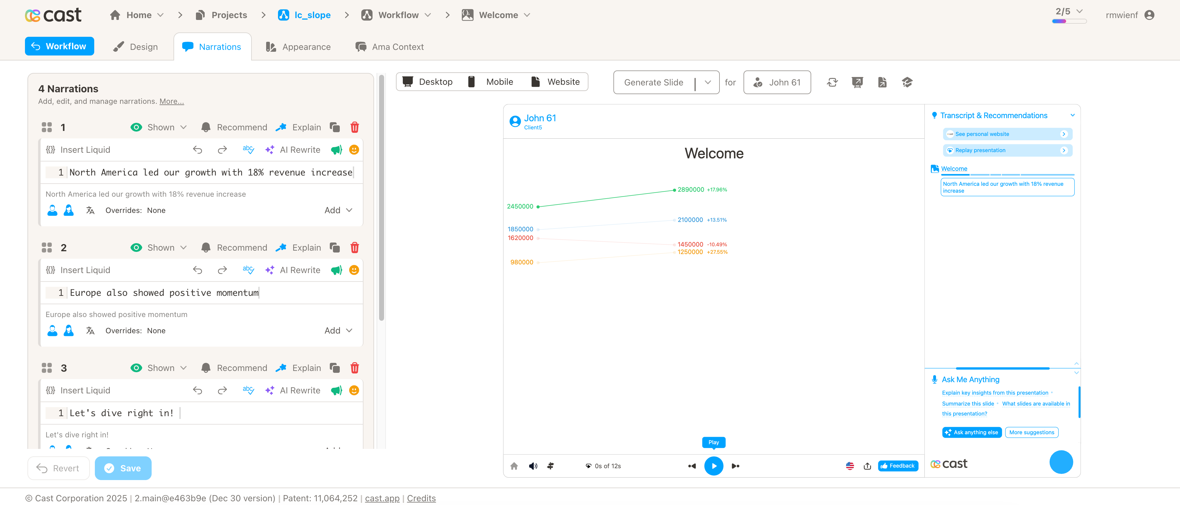
Narration Steps:
-
Narration Step 1: “North America led our growth with 18% revenue increase…”
- Add to liquid block:
[{"label": "North America"}] - Result: North America line stays bright, all others dim
- Add to liquid block:
-
Narration Step 2: “Europe also showed positive momentum…”
- Add to liquid block:
[{"label": "Europe"}] - Result: Europe line brightens, North America/Asia Pacific/Latin America dim
- Add to liquid block:
-
Narration Step 3: “Asia Pacific experienced a decline…”
- Add to liquid block:
[{"label": "Asia Pacific"}] - Result: Asia Pacific line brightens, others dim
- Add to liquid block:
-
Narration Step 4: “Overall, three of four regions grew…”
- Add to liquid block: Don’t add any highlight
- Result: All slope lines appear at full brightness
Highlight Example 2: Customer Satisfaction Scores (Before/After Initiative)
Your Slope Data:
[
  {
    "label": "Product Support",
    "start": 78.5,
    "end": 92.3,
    "color": "#2ecc71"
  },
  {
    "label": "Sales Experience",
    "start": 85.2,
    "end": 88.7,
    "color": "#3498db"
  },
  { "label": "Onboarding", "start": 72.8, "end": 95.1, "color": "#f39c12" },
  { "label": "Documentation", "start": 68.3, "end": 71.5, "color": "#e74c3c" },
  {
    "label": "Account Management",
    "start": 91.2,
    "end": 93.8,
    "color": "#9b59b6"
  }
]
Liquid Block Highlights:
-
All Departments Overview: Show all slope lines together (no specific highlight)
- Liquid block: Don’t add any highlight
- Result: All lines appear at full brightness
-
Focus on Onboarding: “Onboarding satisfaction improved by 31%…”
- Liquid block:
[{"label": "Onboarding"}] - Result: Onboarding line brightens, others dim
- Liquid block:
-
Product Support Improvement: “Product Support also saw significant gains…”
- Liquid block:
[{"label": "Product Support"}] - Result: Product Support line brightens, others dim
- Liquid block:
-
Compare Top Performers: “Both Onboarding and Product Support exceeded targets…”
- Liquid block:
[{"label": "Onboarding"}, {"label": "Product Support"}] - Result: Both Onboarding and Product Support lines bright, others dim
- Liquid block:
Highlight Example 3: Department Performance Tracking
Your Slope Data:
[
  {
    "label": "Engineering",
    "start": 850000,
    "end": 1020000,
    "color": "#4285F4"
  },
  { "label": "Sales", "start": 920000, "end": 780000, "color": "#EA4335" },
  { "label": "Marketing", "start": 670000, "end": 890000, "color": "#FBBC04" }
]
Liquid Block Highlights:
-
“Engineering delivered exceptional results…“
- Liquid block:
[{"label": "Engineering"}] - Result: Engineering line highlights
- Liquid block:
-
“Sales faced market challenges…“
- Liquid block:
[{"label": "Sales"}] - Result: Sales line highlights
- Liquid block:
-
“Marketing’s new strategy paid off…“
- Liquid block:
[{"label": "Marketing"}] - Result: Marketing line highlights
- Liquid block:
-
“Looking at all departments together…“
- Liquid block: Don’t add any highlight
- Result: All lines at full brightness