
lc_widget Spark
Dynamic Spark Chart Visualization with lc_spark_*
Section titled “Dynamic Spark Chart Visualization with lc_spark_*”Compact trend charts without axes or labels — line, bar, or area spark visualizations in minimal space.
When to use it
- KPI trend direction in dashboards and infographics
- Performance trends over time in compact layouts
- Quick multi-metric comparison without full chart chrome
Quick reference
Section titled “Quick reference”| ID prefixes | lc_sparkline_*, lc_sparkbar_*, lc_sparkarea_* |
| SVG element | <rect> only |
| Override value | JSON array of { value, title?, chartColor?, labelColor?, foregroundColor? } |
| Gotcha | Chart type is determined by the ID prefix, not the data shape |
Minimal example:
[ { "value": 0, "chartColor": "red" }, { "value": 20, "chartColor": "red" }, { "value": 100, "chartColor": "red" }]Setup in Cast
Section titled “Setup in Cast”- Add a
<rect>withlc_sparkline_*,lc_sparkbar_*, orlc_sparkarea_*. - Connect a dataset with a
valuecolumn; set Value Formatting → JSON. - In Override SVG Variables, use
{% raw %}{{ my_field | json }}{% endraw %}.
Samples
Section titled “Samples”
Advanced: chart types, JSON reference, dataset usage, and configuration
Spark Chart Types
Cast supports three types of spark chart visualizations:
- sparkline: Line-based spark charts for trend visualization
- sparkbar: Bar-based spark charts for discrete value comparison
- sparkarea: Area-filled spark charts for trend visualization with emphasis on magnitude
Use Cases
- Performance trends over time (revenue, engagement, conversion rates)
- Quick visual comparison of multiple metrics
- Dashboard widgets showing trend direction
- Compact data visualization in reports and presentations
- Historical data patterns and fluctuations
- Key performance indicator (KPI) trend visualization
- Space-efficient data representation in infographics
Element Identification
The target element must be a <rect> with an ID that starts with one of:
lc_sparkline_*for line chartslc_sparkbar_*for bar chartslc_sparkarea_*for area charts
Input Format
The input value can be provided in two formats:
Note: The same data format is used for all three spark chart types (lc_sparkline_*, lc_sparkbar_*, lc_sparkarea_*). The visualization type is determined by the element ID prefix, not the data format.
JSON Format
Section titled “JSON Format”A JSON string containing an array of objects with the following structure:
[ { "value": 0, "title": "This is a chart title", "chartColor": "red;blue;green", "labelColor": "red", "foregroundColor": "red" }, { "value": 20, "title": "This is a chart title", "chartColor": "red" }, { "value": 100, "title": "This is a chart title", "chartColor": "red" }, { "value": 0, "title": "This is a chart title", "chartColor": "red" }]Dataset/CSV Format
Section titled “Dataset/CSV Format”Alternatively, you can use tabular data from your datasets with the following columns:
| Account ID | value | title | chartColor | labelColor | foregroundColor |
|---|---|---|---|---|---|
| 1443652 | 20 | Customer S blue | white | blue | |
| 1443652 | 100 | Project Cor red | black | green | |
| 1443652 | 75 | Revenue blue/grey | white | purple | |
| 1443652 | 45 | Market Sha teal | white | teal | |
| 1443653 | 25 | Sales Perf yellow/red | black | orange |
Dataset Usage:
- Connect your spark chart to a dataset containing the required columns
- The system will automatically map the columns to the appropriate chart properties
- Filter data by Account ID or other criteria to show relevant spark charts
- Multiple rows for the same Account ID will create multi-point spark charts
Important Notes:
- Column names must match exactly as shown in the example (
value,title,chartColor,labelColor,foregroundColor) - Column names are case-sensitive and must be spelled exactly as specified
- If data is not passed in the correct format or column names don’t match, the element will display as a plain
<rect>without any spark chart visualization
Implementation Steps for Dataset Usage
Section titled “Implementation Steps for Dataset Usage”To use dataset/CSV format with spark charts, follow these steps:
Create Dataset: Import your data containing the required columns (value, title, chartColor, labelColor, foregroundColor)
Create Field: Create a field from your dataset that contains the spark chart data
Set Value Formatting: In the field settings, set Value Formatting to “JSON” - this is crucial for proper data formatting
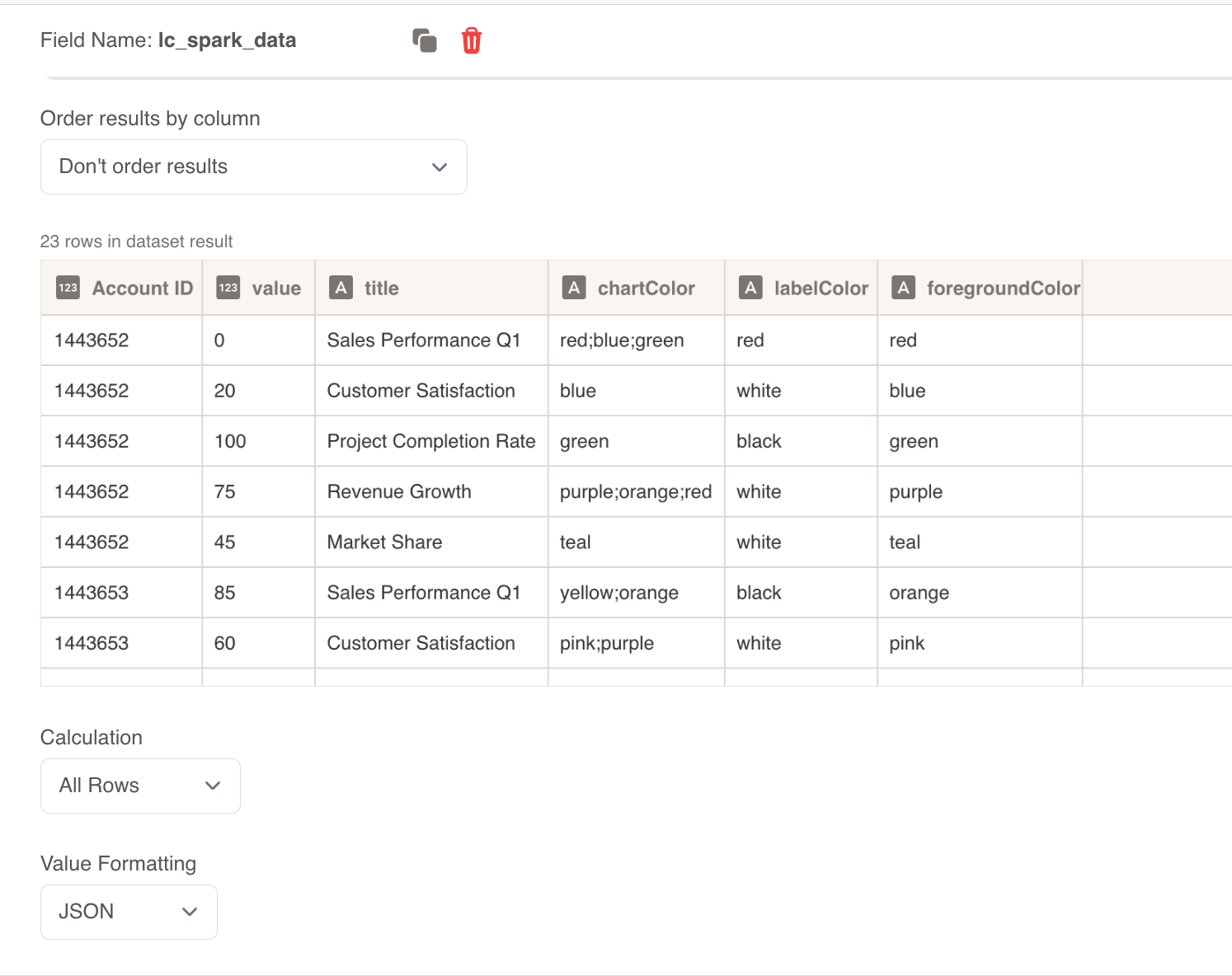
Override SVG Variables: In the SVG slide design tab, go to “Override SVG Variables”
Select Variable: Choose your spark chart variable and use the format:
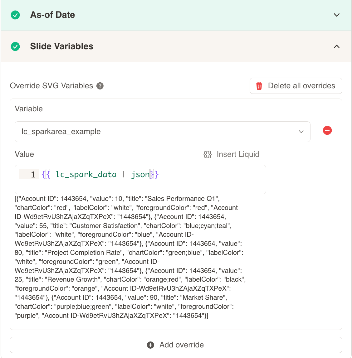
Include JSON Filter: Critical: Always include the | json filter with your field, otherwise the spark chart will not work
Configuration Properties
Required Properties:
value: Numeric value for the data point (mandatory)
Optional Properties:
title: Text title for the spark chart (optional)chartColor: Color specification for the chart line/area (optional)labelColor: Color specification for labels and text (optional)foregroundColor: Color specification for foreground elements (optional)
Color Specifications
Single Color:
- Provide a single color value:
"red","#FF0000" - Uses CSS color names or hex values
Gradient Color:
- Provide multiple colors separated by semicolons:
"red;blue;green" - Creates a gradient effect across the specified colors
- Colors are blended smoothly from first to last
Default Behavior:
- If no color is provided, colors will be taken from the appearance settings and Color Palette
- This ensures consistency with your overall design palette
Spark Chart Types
Section titled “Spark Chart Types”Line Charts with lc_sparkline_*
Section titled “Line Charts with lc_sparkline_*”lc_sparkline creates smooth line-based trend visualizations ideal for showing continuous data flow and patterns over time.
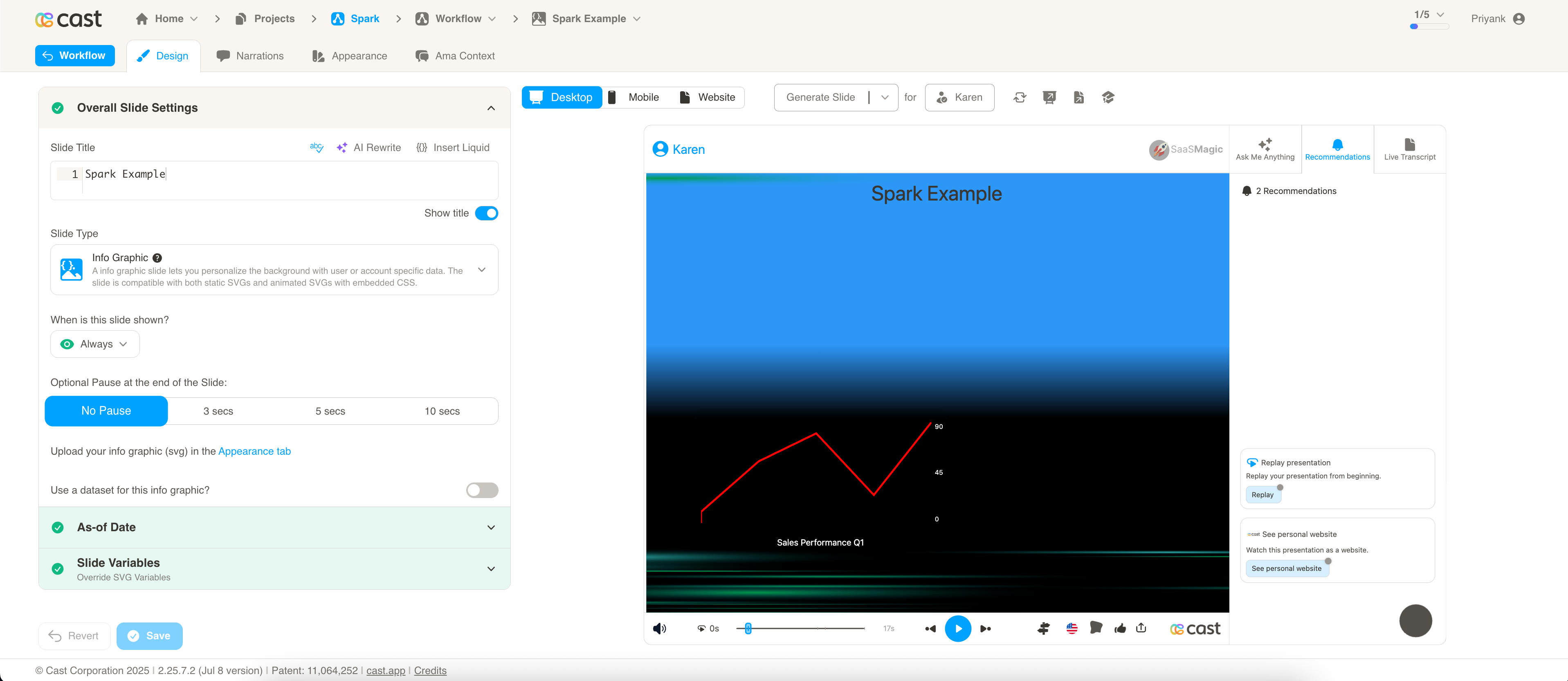
Best for:
- Time series data and trends
- Continuous metrics like temperature, stock prices, or website traffic
- Showing smooth progression and changes over time
Bar Charts with lc_sparkbar_*
Section titled “Bar Charts with lc_sparkbar_*”lc_sparkbar creates discrete bar-based visualizations ideal for comparing individual values and showing discrete data points.
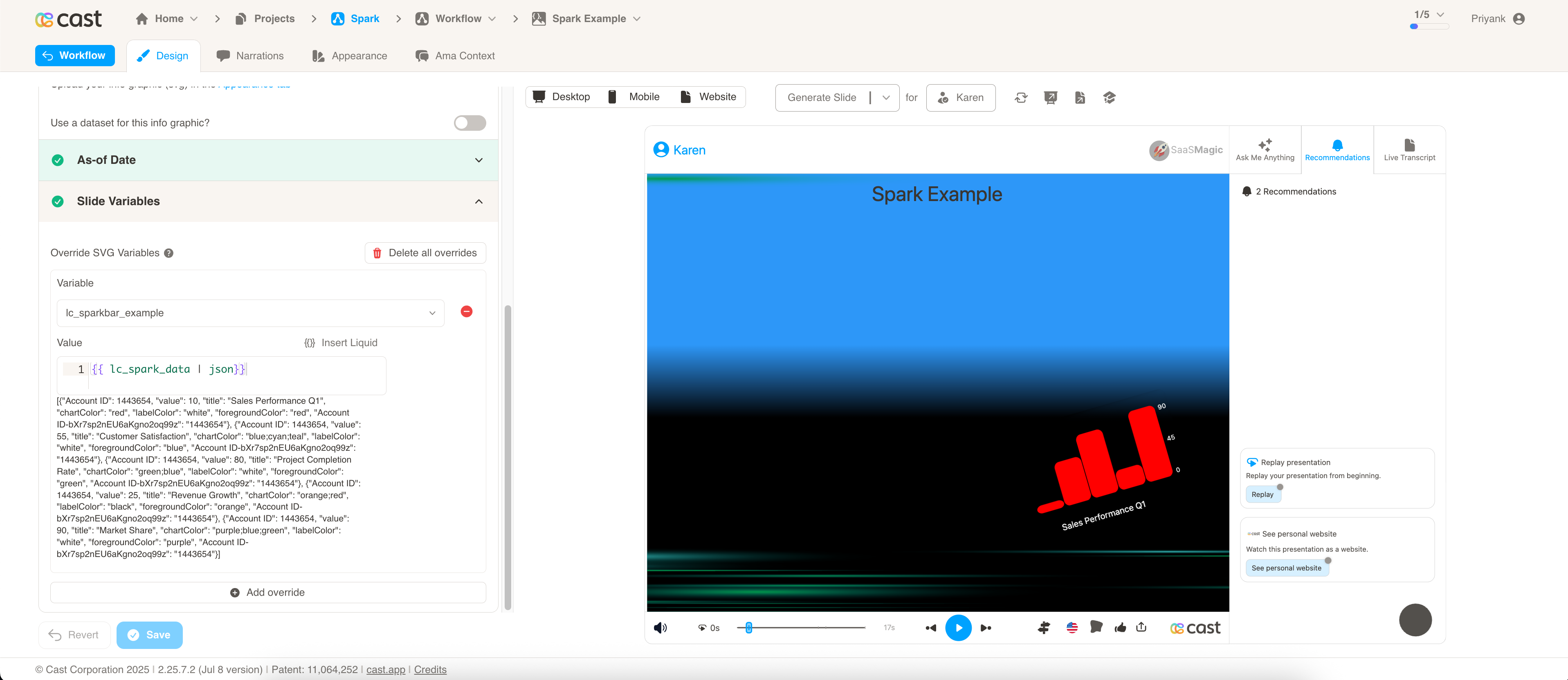
Best for:
- Categorical data comparison
- Discrete time periods (monthly sales, quarterly results)
- Highlighting individual data point values
- Comparing magnitudes across categories
Implementation:
- Each value is represented as a separate bar
- Clear distinction between individual data points
Area Charts with lc_sparkarea_*
Section titled “Area Charts with lc_sparkarea_*”lc_sparkarea creates filled area visualizations that combine the benefits of line charts with visual emphasis on magnitude and volume.
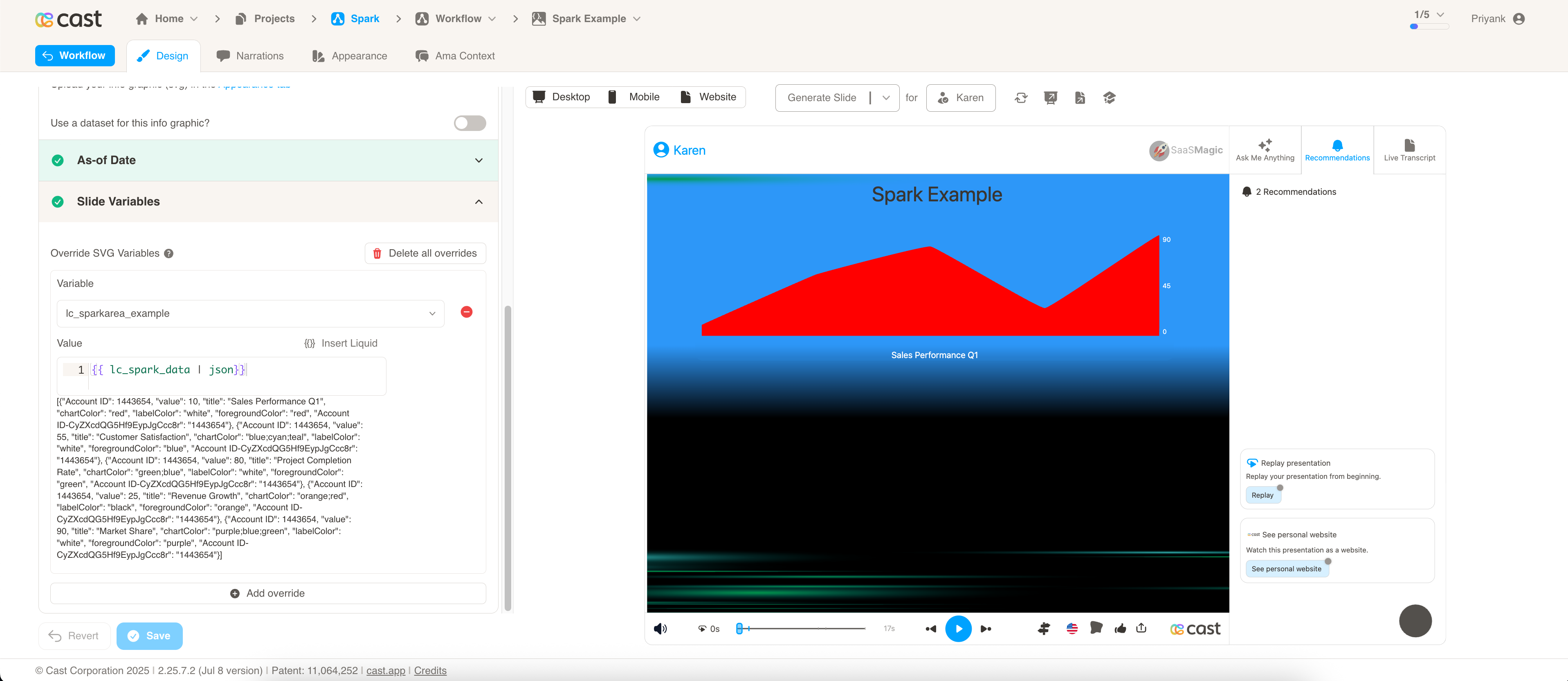
Best for:
- Cumulative data and totals
- Showing volume or magnitude trends
- Emphasizing the “weight” of data over time
- Visualizing filled quantities or percentages
Implementation:
- Area under the curve is filled with color or gradient
Implementation Notes
- Spark charts automatically scale to fit the container dimensions
- Data points are connected with smooth curves for better visual flow
- The chart adapts to the available space while maintaining proportional relationships
Compatibility: Works with <rect> elements only
Example Usage
Basic Spark Chart:
[{ "value": 10 }, { "value": 25 }, { "value": 15 }, { "value": 35 }]Styled Spark Chart:
[ { "value": 45, "title": "Q1 Performance", "chartColor": "#1E88E5", "labelColor": "#333333" }, { "value": 62, "title": "Q2 Performance", "chartColor": "#43A047" }, { "value": 38, "title": "Q3 Performance", "chartColor": "#FB8C00" }]Gradient Spark Chart:
[ { "value": 30, "title": "Revenue Trend", "chartColor": "#FF6B6B;#4ECDC4;#45B7D1", "foregroundColor": "#2C3E50" }]