Single Bar Chart
 Single Bar Chart
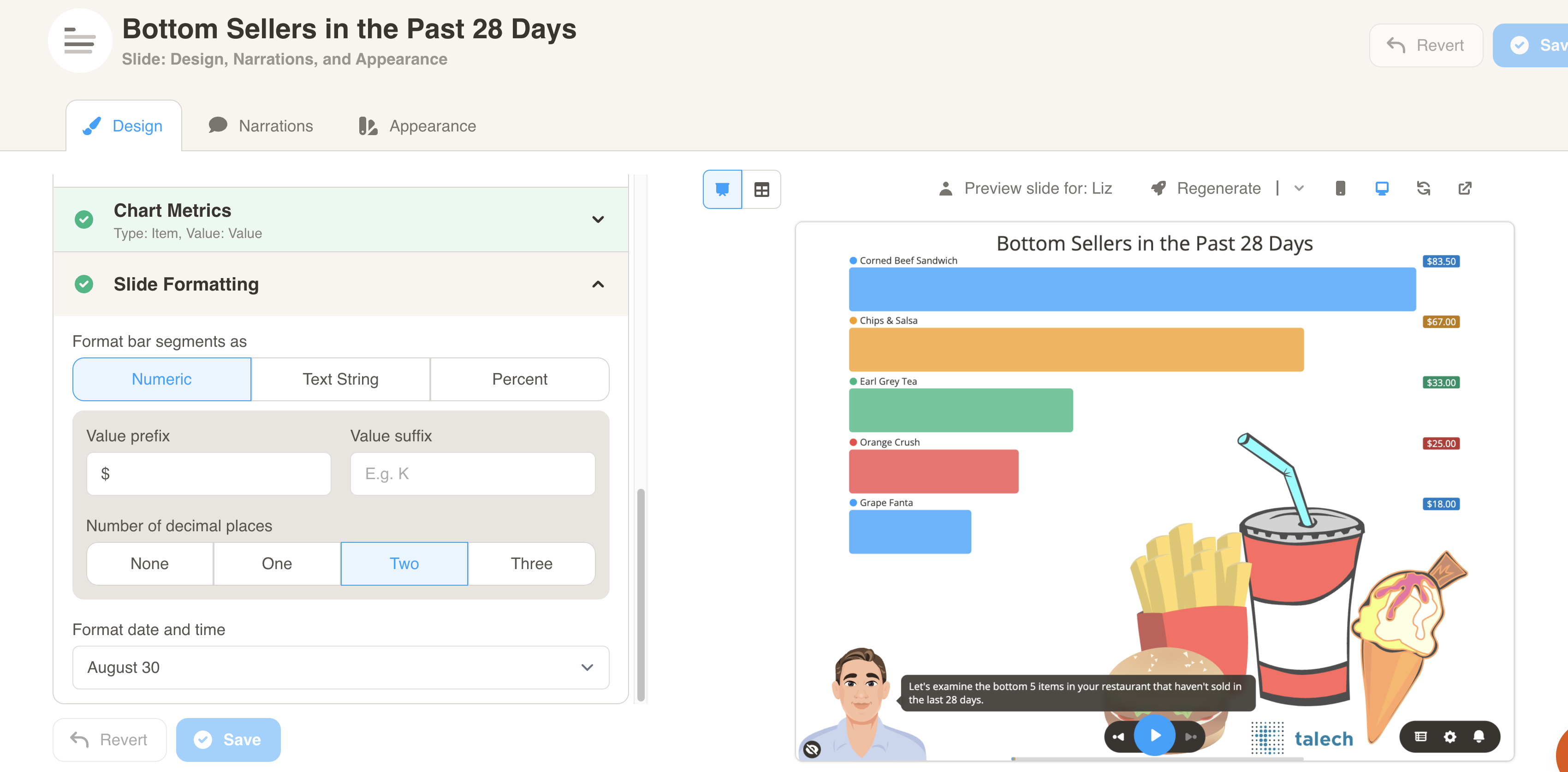
Section titled “ Single Bar Chart”A bar slide presents categorical data with lengths proportional to the represented values.
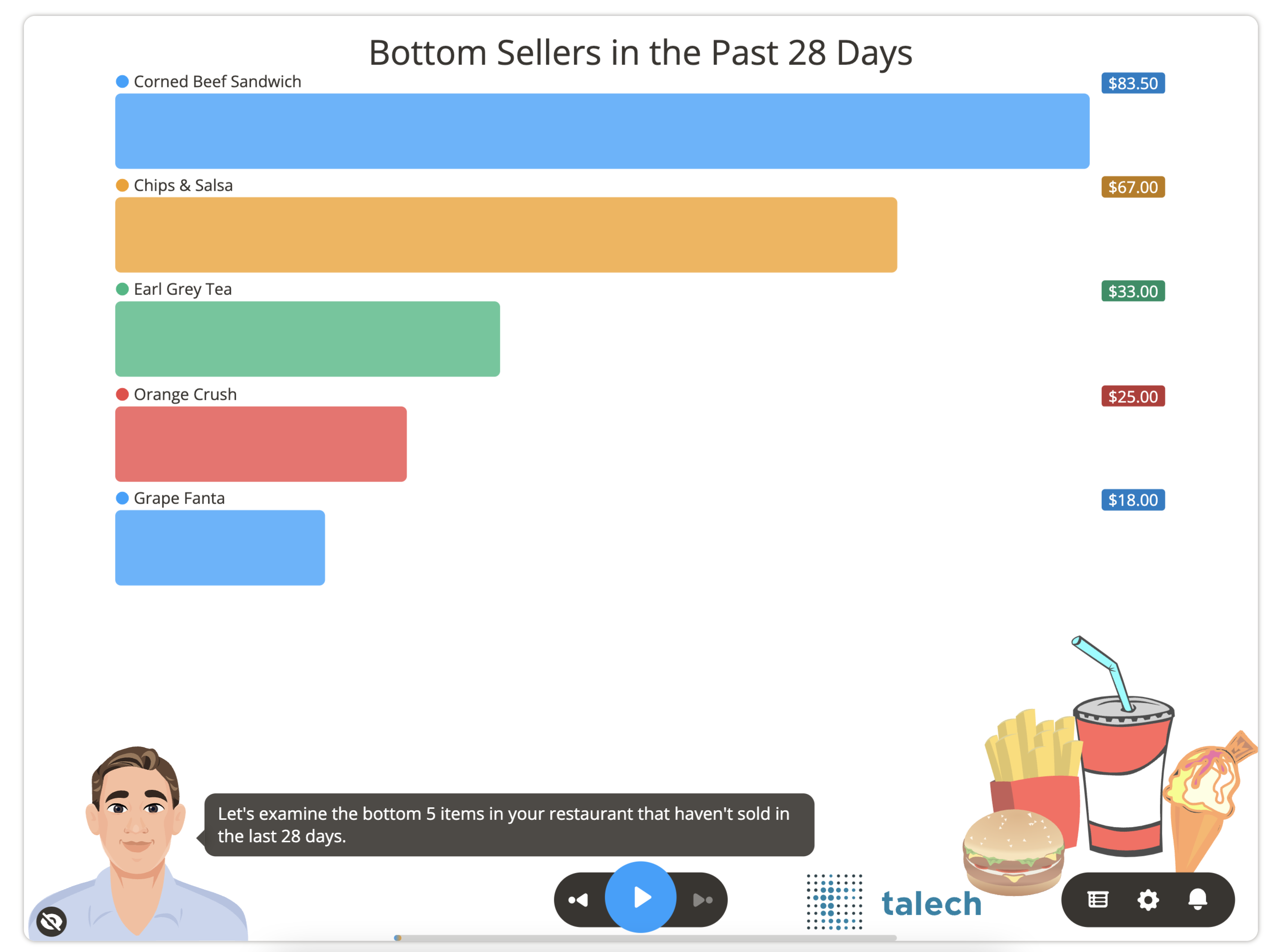
Here is some of the data that is used to generate the chart above for account `15687`. You will need to format your data similar to the sample datasets for each slide type.
| AccountID | Item | Value |
|---|---|---|
| 15687 | Corned Beef Sandwich | 83.5 |
| 15687 | Chips & Salsa | 67 |
| 15687 | Earl Grey Tea | 33 |
| 15687 | Orange Crush | 25 |
| 15687 | Grape Fanta | 18 |
Download Sample Data - Single Bar
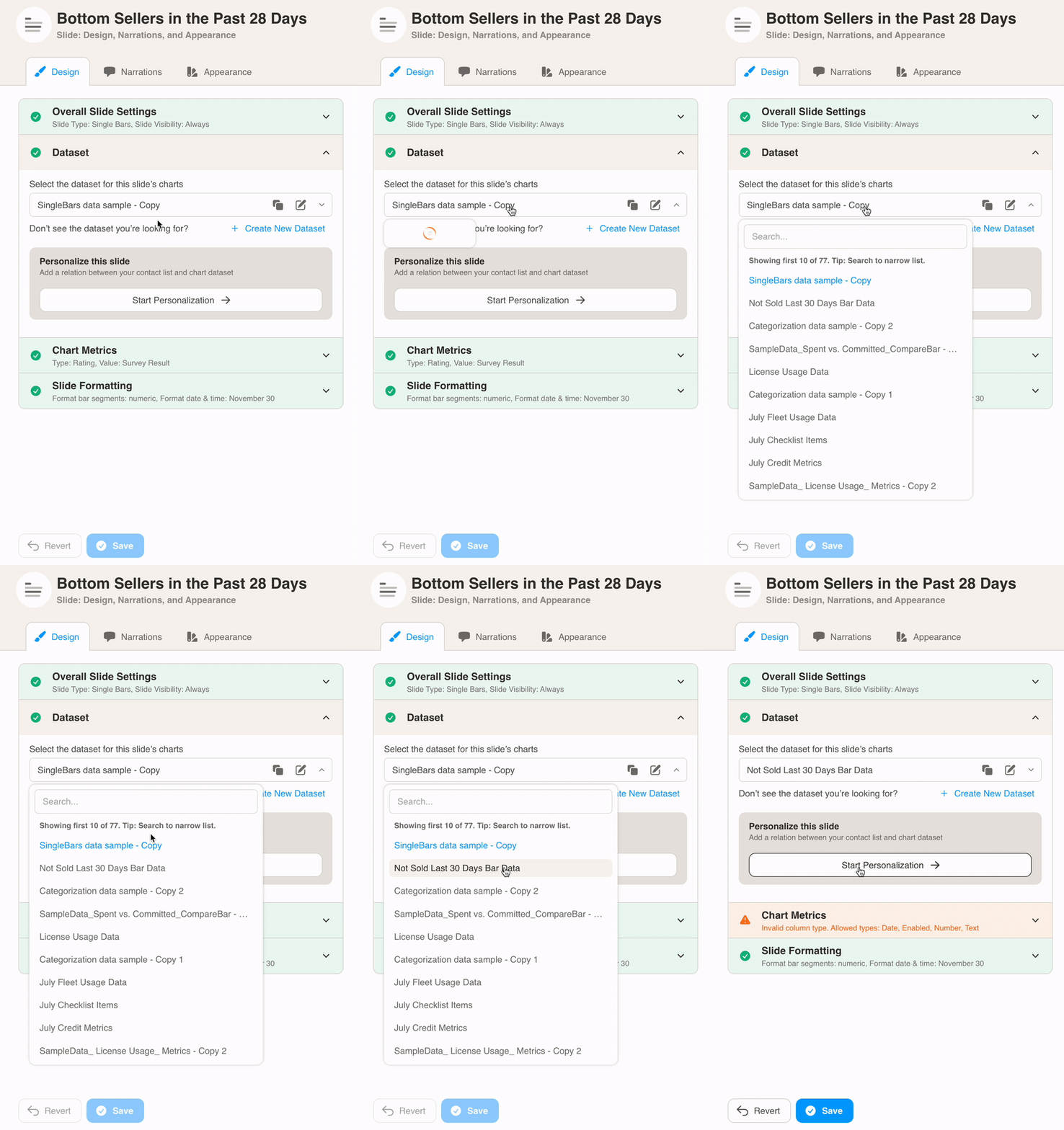
You can format the chart under Design. First, select your dataset from the dropdown menu.
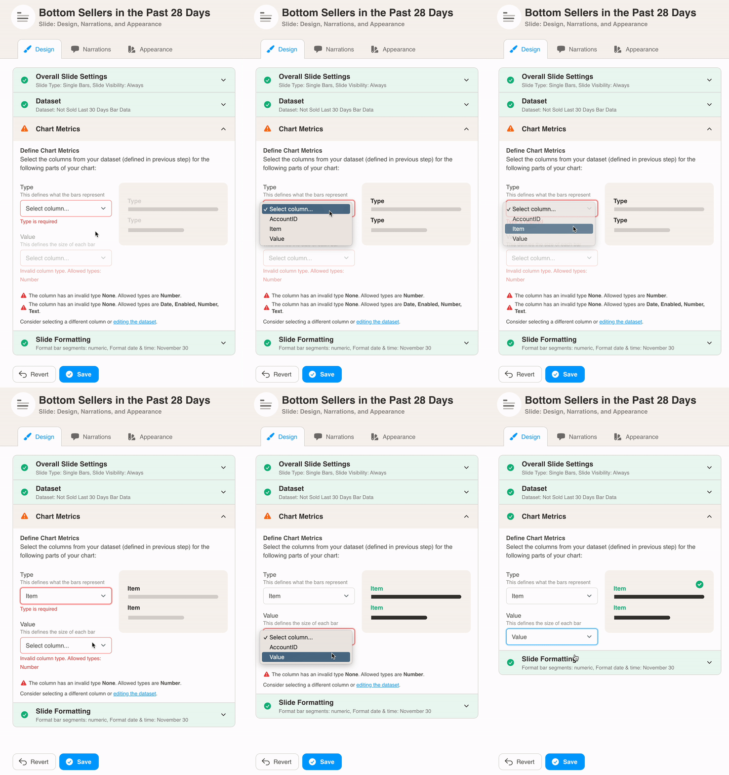
Then, define the chart metrics for your slide. Pick the Type and Value from your dataset columns. Type is the name of the metric, and defines what the bars represent.
In this example, the Item column is used as as Type.
Finally, choose Slide Formatting for your metrics values. Here we added the `$` symbol as a prefix before the bar values to denote currency.
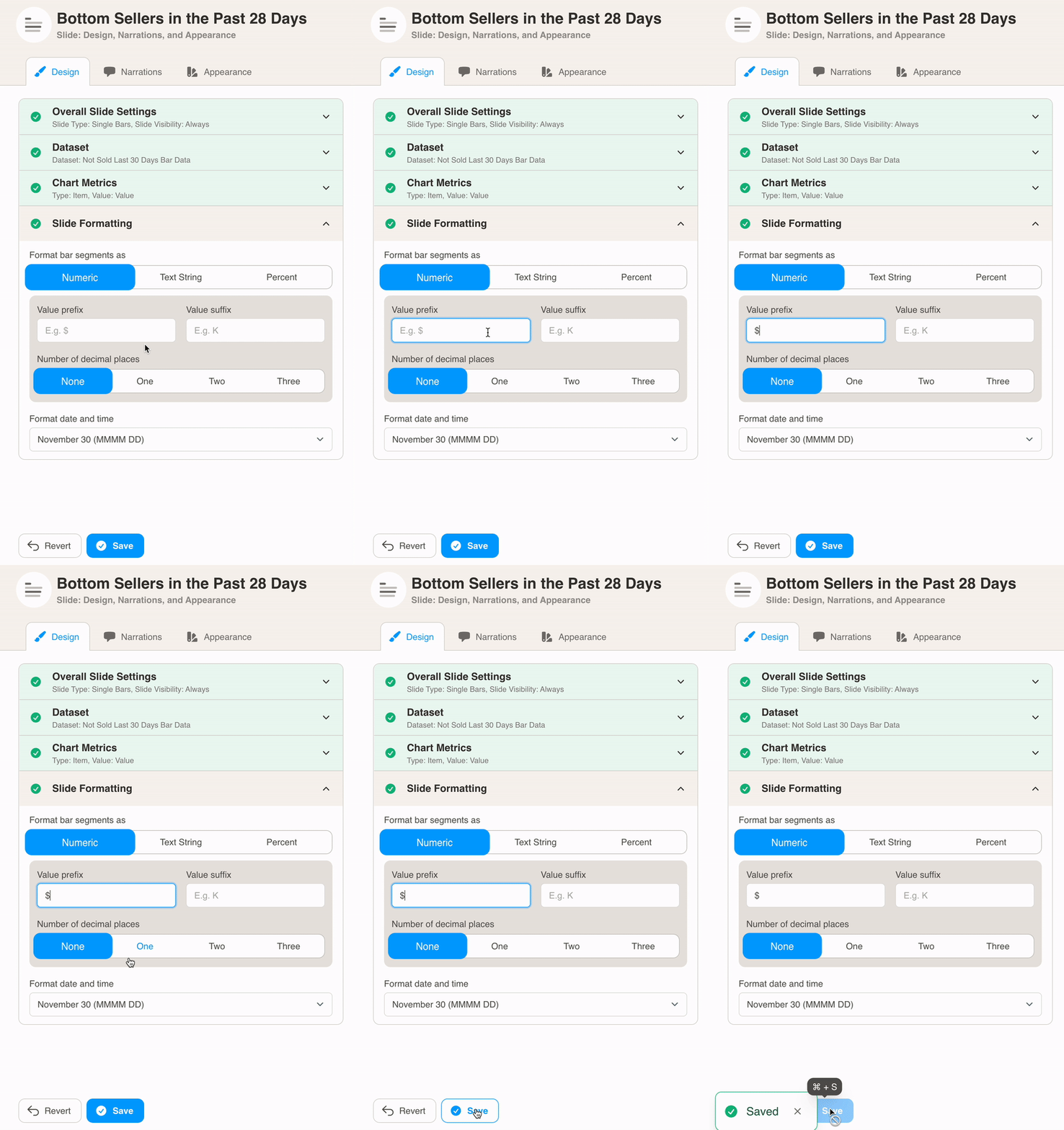
Press the Save button to view your changes.