lc_html_table
Responsive HTML Table with lc_html_table_*
Section titled “Responsive HTML Table with lc_html_table_*”The lc_html_table_* prefix renders a responsive HTML table inside your SVG using CSS Grid — card layouts, progress bars, image cells, theming, and cell highlighting.
When to use it
- KPI dashboards and metric cards
- Scorecards with progress bars and row spanning
- Data storytelling with cell-level highlighting during narration

Quick reference
Section titled “Quick reference”| ID prefix | lc_html_table_* (e.g. lc_html_table_1) |
| SVG element | <rect> only |
| Override value | JSON array of row objects |
| Gotcha | Figma stroke position must be Center — Inside/Outside exports as <path> and breaks the widget |
Minimal row example:
[ { "reserved_rowid": "row1", "name": "Alice Johnson", "department": "Engineering", "progress": "85%", "status": "Active" }]Setup in Cast
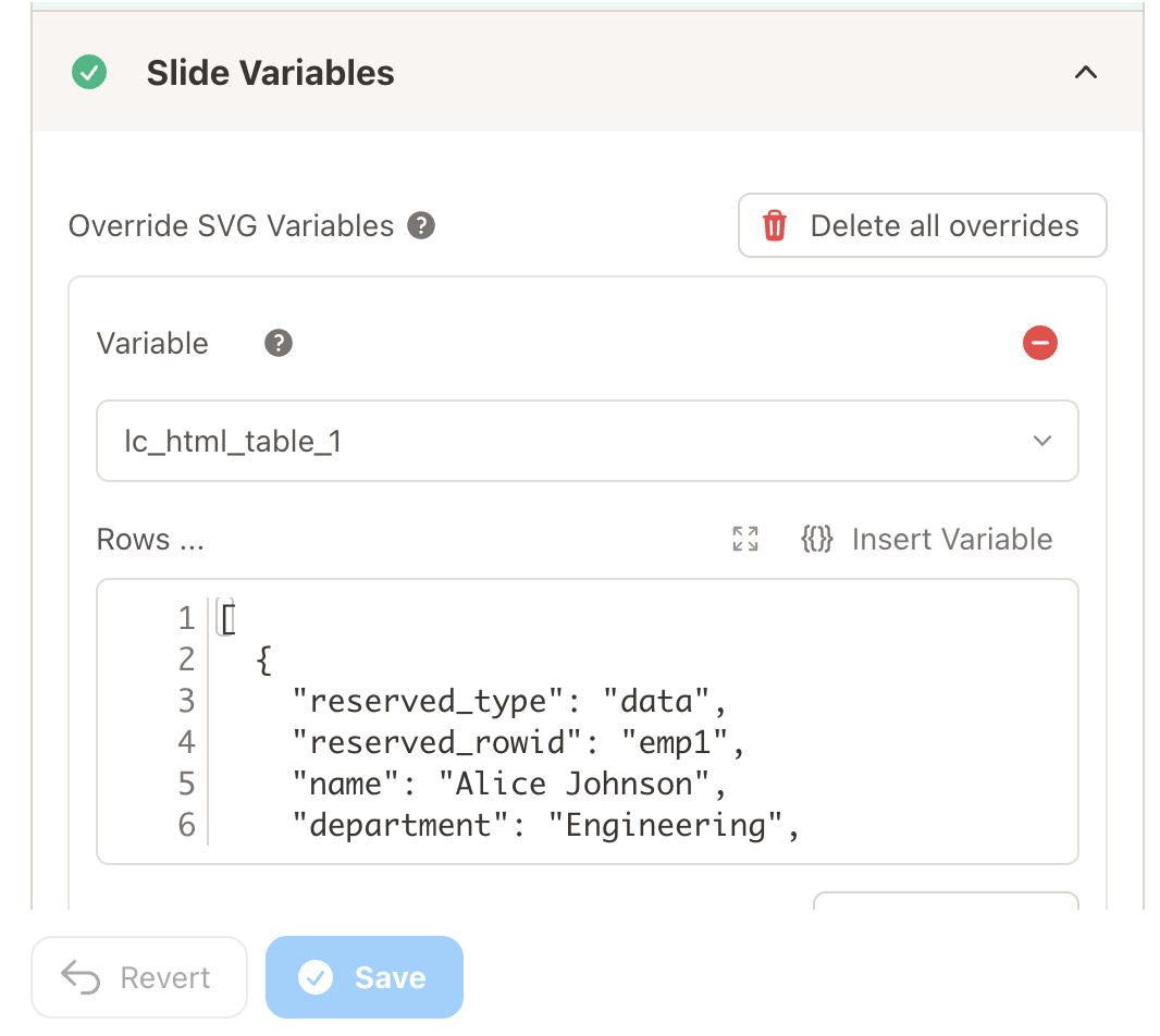
Section titled “Setup in Cast”- Add the SVG element — a
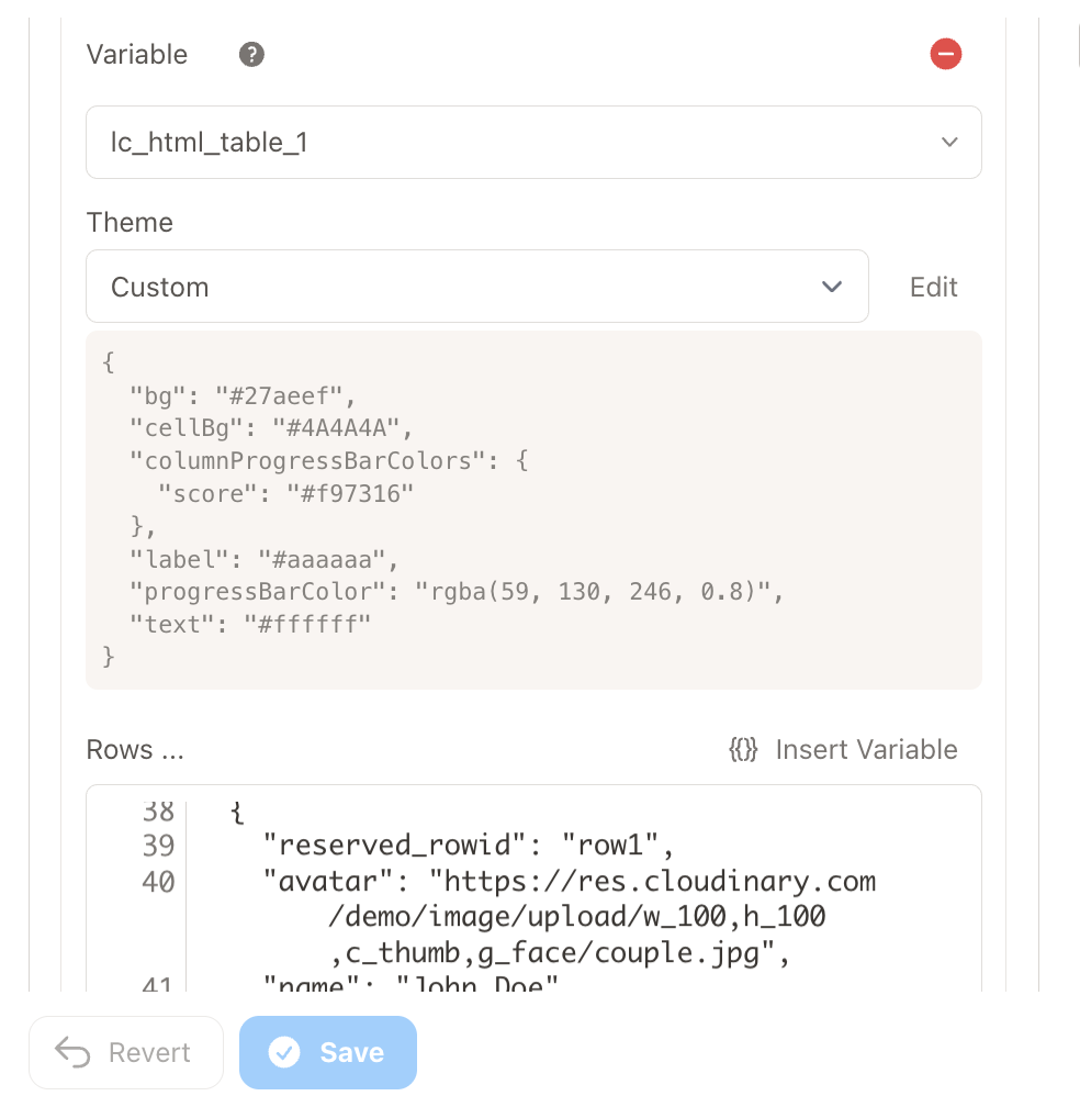
<rect>whose ID starts withlc_html_table_. - Define rows — paste JSON in the Rows editor, or connect a dataset field with Value Formatting → JSON and reference it in Override SVG Variables using
{% raw %}{{ my_field | json }}{% endraw %}. - Open Table Editor (optional) — adjust theme, desktop layout, and mobile layout.
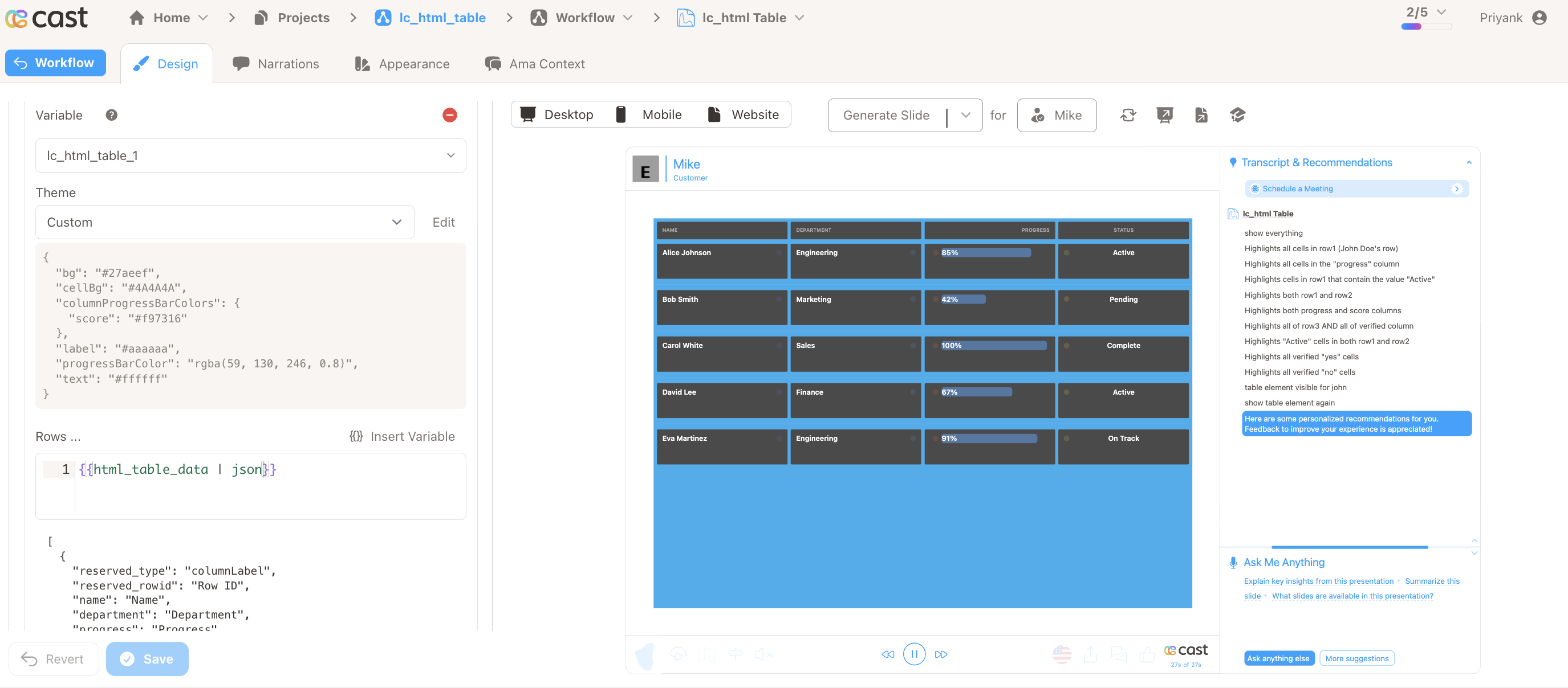
Critical: Always include the
| jsonfilter with dataset fields, otherwise the table will not render.
Samples
Section titled “Samples”
Advanced: Rows, dataset format, and field reference
Define Your Rows
Section titled “Define Your Rows”The Rows editor accepts a JSON array of row objects. There are two kinds of rows:
- Configuration rows (optional) — identified by a
reserved_typefield for features such as per-column highlight colors (see Highlighting cells) - Data rows — the actual table content; each row’s keys define the columns
You can provide rows in two ways: write JSON directly in the Rows editor, or pull from a dataset using Liquid variables.
Row Structure
Section titled “Row Structure”Data row fields:
| Key | Description |
|---|---|
reserved_rowid |
Unique row identifier for highlighting (not displayed in table) |
<columnKey> |
Cell value — text, percentage (e.g. "75%"), or CDN image URL |
_display_<columnKey> |
Display override — replaces the visible cell text while the raw value still drives progress bars |
Option A: Write JSON Directly
Type or paste a JSON array into the Rows editor:
[ { "reserved_rowid": "row1", "name": "Alice Johnson", "department": "Engineering", "progress": "85%", "status": "Active" }, { "reserved_rowid": "row2", "name": "Bob Smith", "department": "Marketing", "progress": "42%", "status": "Pending" }]Option B: Pull from a Dataset
You can use tabular data from your datasets instead of writing JSON manually. Structure your dataset with both configuration rows and data rows:
| reserved_type | reserved_rowid | avatar | name | department | progress | _display_progress | completion | score | verified | status |
|---|---|---|---|---|---|---|---|---|---|---|
| data | row1 | https://res.cloudinary.com/… | John Doe | Engineering | 75% | $1,200 | 80% | 92% | yes | Active |
| data | row2 | https://res.cloudinary.com/… | Jane Smith | Marketing | 45% | $540 | 60% | 88% | yes | Active |
| data | row3 | https://res.cloudinary.com/… | Bob Wilson | Sales | 100% | $2,000 | 100% | 65% | no | Inactive |
| data | row4 | https://res.cloudinary.com/… | Alice Brown | Engineering | 20% | $300 | 35% | 100% | yes | Active |
| data | row5 | https://res.cloudinary.com/… | Charlie Davis | HR | 3.5% | $50 | 12% | 78.2% | no | Pending |
Download Sample Data - HTML Table
Steps to connect a dataset:
-
Create Dataset — Import your data rows (and optional configuration rows with
reserved_typewhere needed, e.g. for highlighting) -
Create Field — Create a field from your dataset that contains the table data
-
Set Value Formatting — In the field settings, set Value Formatting to “JSON” — this is crucial for proper data formatting

Important notes for dataset usage:
- The system automatically parses reserved rows and data rows based on
reserved_type - Column keys must match exactly across all data rows (case-sensitive)
- Include a
reserved_rowidcolumn if you plan to use cell highlighting features - The
reserved_rowidcolumn will not be displayed in the rendered table - If data is not passed in the correct format, the element will display as a plain
<rect>without any table visualization
Advanced: Table Editor, theme, and layout
Table Editor
Section titled “Table Editor”The Table Editor button (next to the Rows and Override Layout fields) opens a unified modal with three tabs:
| Tab | What it contains |
|---|---|
| Theme | Preset toggle (Light / Dark / Custom), all color and font controls, and per-column overrides (pick a column, then add properties from a dropdown) |
| Desktop Layout | Drag-and-drop grid editor for desktop column arrangement, with undo/redo/revert and live preview |
| Mobile Layout | Separate drag-and-drop grid editor for mobile, with its own independent undo/redo history |
Choose a Theme
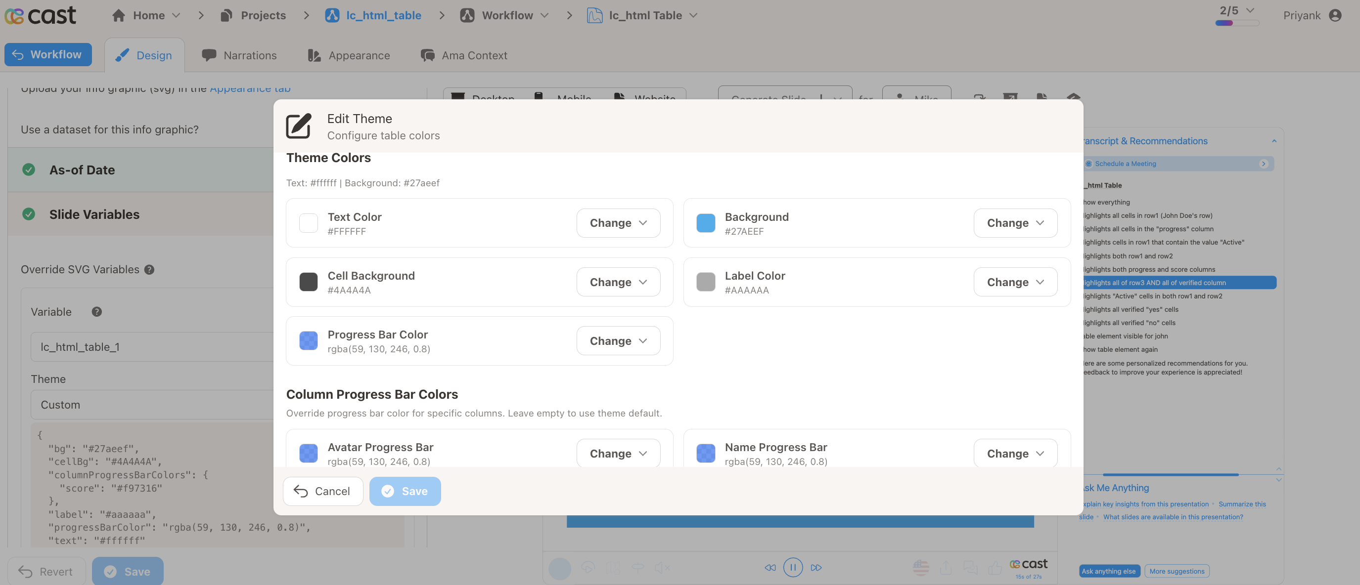
Section titled “Choose a Theme”The Theme tab in the Table Editor modal controls the table’s visual appearance. A preset toggle at the top lets you pick a starting point:
| Preset | Description |
|---|---|
| Light | Light background, dark text (default) |
| Dark | Dark background, light text |
| Custom | Full control over every property |
Selecting Dark or Light applies the preset colors immediately. Changing any individual property automatically switches the preset to Custom.
Table Defaults
The Table Defaults section in the Theme tab provides visual controls for every theme property. Click Change next to any color to open its picker, adjust, then click Confirm. Numeric inputs accept pixel values. Each property has a Reset button to revert to the preset default.
| Control | Property | What it controls |
|---|---|---|
| Text Color | text |
Value text color |
| Background | bg |
Table wrapper background (supports transparency) |
| Cell Background | cellBg |
Individual cell background (supports transparency) |
| Label Color | label |
Column label text in card mode |
| Progress Bar Color | progressBarColor |
Default progress bar fill (supports transparency) |
| Header Font Color | headerFontColor |
Header/label text color (defaults to Label Color if not set) |
| Header Background | headerBg |
Header row background color (defaults to Background if not set) |
| Highlight Color | highlightColor |
Default highlight dot color for cell highlighting |
| Hide Row Separator | hideSeparator |
Toggle to hide separator lines between records |
| Font Size | fontSize |
Body value font size in pixels |
| Header Font Size | headerFontSize |
Header/label font size in pixels |
| Text Alignment | textAlignment |
Default text alignment for all cells: left, center, or right |
Column Overrides
Below the Table Defaults section, the Theme tab includes a Column Overrides panel. This lets you override any theme property for specific columns — for example, a different progress bar color for the “revenue” column or a custom font size for “status.”
Instead of listing every column at once, the designer uses two dropdowns: first choose which column to configure, then choose which property to override for that column. Add each property you need; only the overrides you add appear for the selected column.
How to use:
- Open the column dropdown and select the column you want to override
- Open the property dropdown and pick the theme property to override (colors, font sizes, alignment, and other options match Table Defaults)
- Set the value for that property — it applies only to the selected column
- Add more properties for the same column by choosing another entry from the property dropdown, or switch to a different column in the column dropdown
- Click Reset on a property to revert that override to the table default
- Remove an override you no longer need using the remove control for that property
Configure the Layout
Section titled “Configure the Layout”There are two ways to control how columns are arranged: the visual Layout Editor (inside the Table Editor modal) and the Override Layout JSON input.
The Desktop Layout and Mobile Layout tabs in the Table Editor modal each contain a drag-and-drop grid editor for arranging columns. Each tab has three areas: an unplaced columns bar at the top, a drag-and-drop grid in the middle, and a live table preview at the bottom.
Grid interactions:
- Drag columns to reposition them on the grid — the drop position determines column order and placement. Overlapping columns are moved automatically (collision resolution).
- Resize columns by dragging the bottom-right corner handle (visible on hover) — horizontal resize changes column width, vertical resize changes row span (max 6 rows)
- Add columns by clicking the + button next to unplaced column names in the top bar
- Remove columns by clicking the × button on a column tile — the column moves to the unplaced bar
- Each column tile shows its current size (e.g. “6 cols × 2 rows”) as you drag or resize
Desktop and Mobile tabs:
The Desktop Layout and Mobile Layout tabs are fully independent. Changes in one tab do not affect the other. Each tab stores its own column widths, column order, row spans, grid positions, and undo history.
Undo / Redo / Revert:
Each layout tab provides its own history controls:
| Button | Action |
|---|---|
| Undo | Reverts the last grid change (drag, resize, add, remove) |
| Redo | Re-applies a previously undone change |
| Revert | Resets the entire layout back to the last saved state |
History is tracked independently for desktop and mobile. Opening the modal resets both history stacks.
Live preview:
Below the grid, a live table preview renders up to 3 data rows using your current layout and theme, so you can see the result as you make changes.
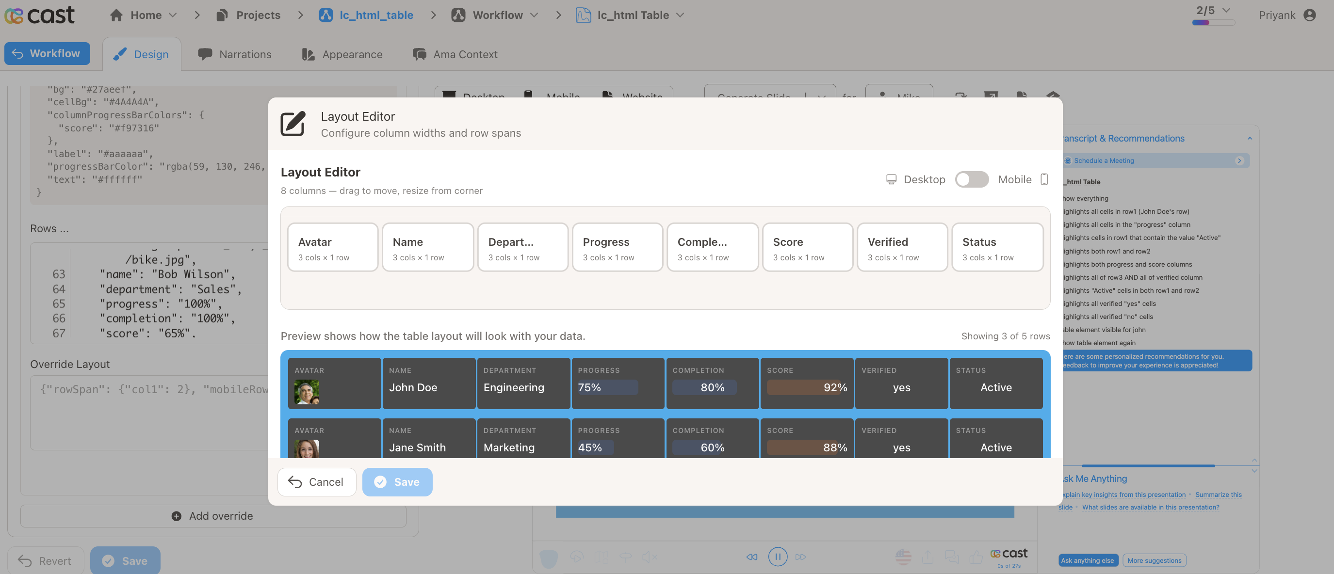
The grid uses a 24-column system. If all columns have equal width and fit on a single row, the table renders in table mode (header + rows). Once widths or positions cause wrapping, it switches to card mode.
Advanced: Table features
Table Features
Section titled “Table Features”Table Mode vs Card Mode
Section titled “Table Mode vs Card Mode”The table automatically chooses between two display modes:
| Mode | When | Behavior |
|---|---|---|
| Table mode | No layout hints, or all columns fit in a single row | Traditional table with sticky header row |
| Card mode | Layout hints cause columns to wrap into multiple rows | Card-style records with label above each cell value |
Smart Value Detection
Section titled “Smart Value Detection”Cell values are automatically enhanced based on their content:
| Value pattern | Detected as | Rendering |
|---|---|---|
"75%" |
Percentage | Progress bar behind the value (0–100 range, clamped) |
| CDN image URL | Image | Rendered as an image (max 32×32px). Allowed hosts: Cloudinary, S3, CloudFront, etc. |
| Any other text | Plain text | Displayed as-is |
Icon Support
Section titled “Icon Support”Add icons next to any column’s values using the _icon_ prefix in data rows:
{ "reserved_rowid": "row1", "status": "Active", "_icon_status": "https://cdn.jsdelivr.net/npm/heroicons@2.0.18/24/solid/check-circle.svg"}_icon_<columnName>columns are hidden — they don’t appear as visible columns- Icons display to the left of the cell value
- SVG format recommended for best quality
Display Override
Section titled “Display Override”Override the visible text of any cell using the _display_ prefix in data rows, while keeping the original value for progress bar rendering and percentage detection.
This is useful when the raw value drives visual behavior (e.g. "75%" renders a progress bar at 75%) but a different label should be shown to the user (e.g. "$1,200").
{ "reserved_rowid": "row1", "progress": "75%", "_display_progress": "$1,200", "status": "Active", "_display_status": "Live"}In this example, the progress cell shows “$1,200” as its label but the progress bar behind it still fills to 75%. The status cell shows “Live” instead of “Active”.
_display_<columnKey>columns are hidden — they don’t appear as visible columns, same as_icon_keys- The original
<columnKey>value is still used for progress bar width and percentage detection - A value of
0is a valid display override; onlynullor missing values fall back to the default display - Non-string values (e.g. numbers) are automatically coerced to strings
Scrolling
Section titled “Scrolling”When table content exceeds the rect height:
- Vertical scrolling is enabled automatically
- Fade indicators appear at top/bottom edges when scrollable
- In table mode, the header row stays sticky at the top
- An auto-scroll animation plays when the table becomes visible (scrolls down, pauses, then scrolls back up)
Advanced: Highlighting cells
Highlighting Cells
Section titled “Highlighting Cells”The HTML table supports cell highlighting during narration, allowing you to focus attention on specific rows, columns, or individual cells.
How It Works:
When a highlight is active, matching cells show an enlarged, fully opaque colored dot. Other cells remain at default dot opacity (15%).
Highlight Format:
| Mode | Format | Description |
|---|---|---|
| Entire row | [{"row":"rowId"}] |
Highlights all cells in the row |
| Entire column | [{"column":"columnKey"}] |
Highlights all cells in the column (+ header) |
| Cell by value | [{"row":"rowId","column":"value"}] |
Highlights cells in the row matching the value |
| Multiple | [{"row":"row1"},{"column":"status"}] |
Combines multiple highlight rules |
| Clear | [] |
Removes all highlights |
Setting Up Highlights:
- Ensure your data rows include
reserved_rowidfor row-level targeting - Add a
highlightColorconfiguration row to define per-column dot colors - In the Cast designer, navigate to Narration > Visual Explanations
- Find the liquid block for your
lc_html_tableelement - Add the highlight JSON
Examples:
[{ "row": "emp1" }]Highlights all cells in the emp1 row.
[{ "column": "status" }]Highlights the entire status column, including the header in table mode.
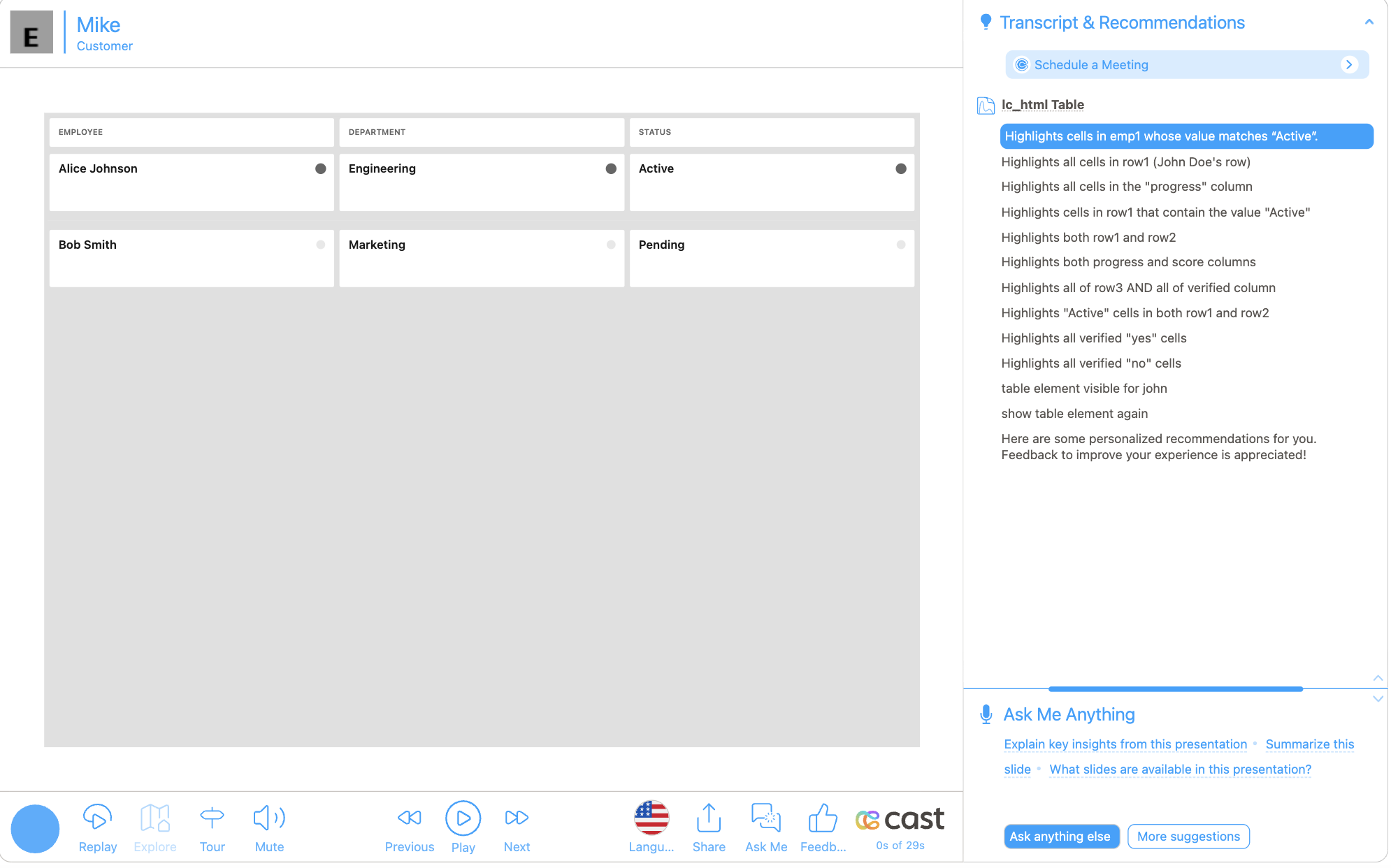
[{ "row": "emp1", "column": "Active" }]Highlights cells in emp1 whose value matches “Active”.
[{ "row": "emp1" }, { "column": "progress" }]Highlights the emp1 row AND the entire progress column.
Advanced: Examples
Examples
Section titled “Examples”Example 1: Simple Table (Table Mode)
Section titled “Example 1: Simple Table (Table Mode)”When no layout hints are provided, the table renders in table mode with equal columns and a sticky header.
Rows:
[ { "reserved_rowid": "emp1", "name": "Alice Johnson", "department": "Engineering", "status": "Active" }, { "reserved_rowid": "emp2", "name": "Bob Smith", "department": "Marketing", "status": "Pending" }]Theme: Light (default) — no changes needed.
Layout: Not needed — equal columns with sticky header are used by default.
Example 2: Card Layout with Row Spanning
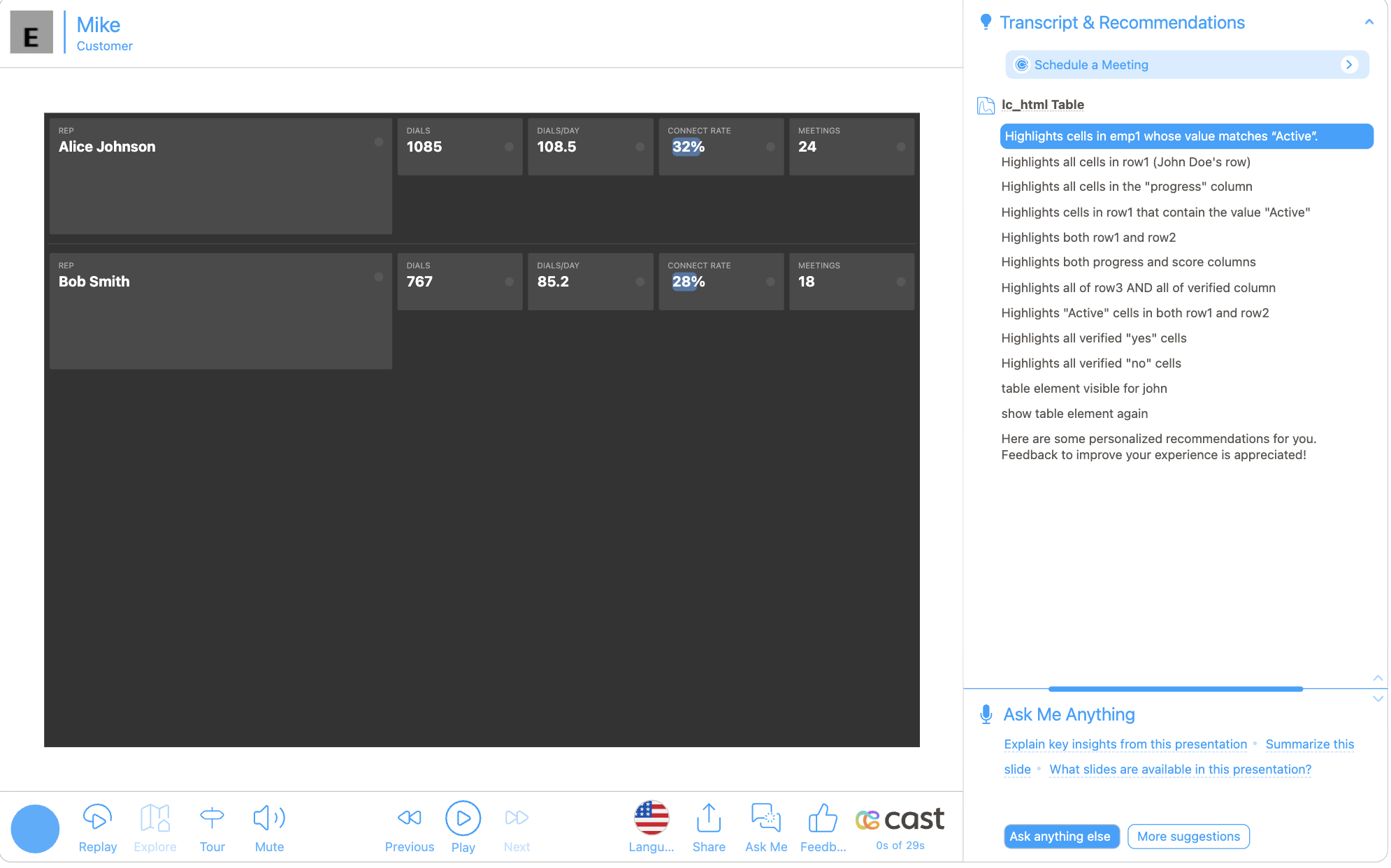
Section titled “Example 2: Card Layout with Row Spanning”Fields span multiple rows for a dashboard card layout.
Rows:
[ { "reserved_rowid": "rep1", "avatar": "Alice Johnson", "dials": "1085", "dialsPerDay": "108.5", "connectRate": "32%", "meetings": "24" }, { "reserved_rowid": "rep2", "avatar": "Bob Smith", "dials": "767", "dialsPerDay": "85.2", "connectRate": "28%", "meetings": "18" }]Theme: Select Dark from the preset toggle.
Layout: In the Desktop Layout tab, drag the “avatar” column wider and resize it to span 2 rows. Switch to the Mobile Layout tab to set up the mobile layout separately.
Example 3: Progress Bars and Custom Theme
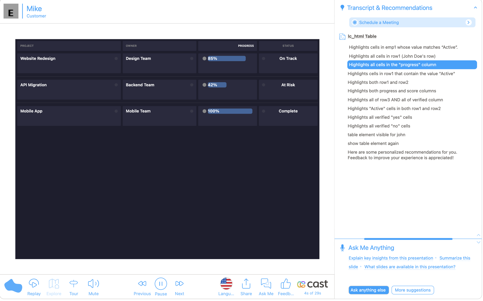
Section titled “Example 3: Progress Bars and Custom Theme”Percentage values automatically render as progress bars.
Rows:
[ { "reserved_rowid": "p1", "project": "Website Redesign", "owner": "Design Team", "progress": "85%", "status": "On Track" }, { "reserved_rowid": "p2", "project": "API Migration", "owner": "Backend Team", "progress": "42%", "status": "At Risk" }, { "reserved_rowid": "p3", "project": "Mobile App", "owner": "Mobile Team", "progress": "100%", "status": "Complete" }]Theme: Select Custom from the preset toggle, then use the Theme controls to customize colors and font sizes.
Layout: Use the Desktop Layout tab to adjust column widths. Set text alignment per column in the Theme tab’s Column Overrides: choose the column, then add Text Alignment from the property dropdown.