
lc_pie_bar
Stacked Bar Chart Visualization with lc_pie_bar_*
Section titled “Stacked Bar Chart Visualization with lc_pie_bar_*”The lc_pie_bar_* prefix renders a horizontal stacked bar with a legend — ideal for part-to-whole relationships and category breakdowns at a glance.
When to use it
- Single-row proportion breakdowns with a legend
- Category distribution and share-of-total analysis
- Compact stacked bars in infographic layouts
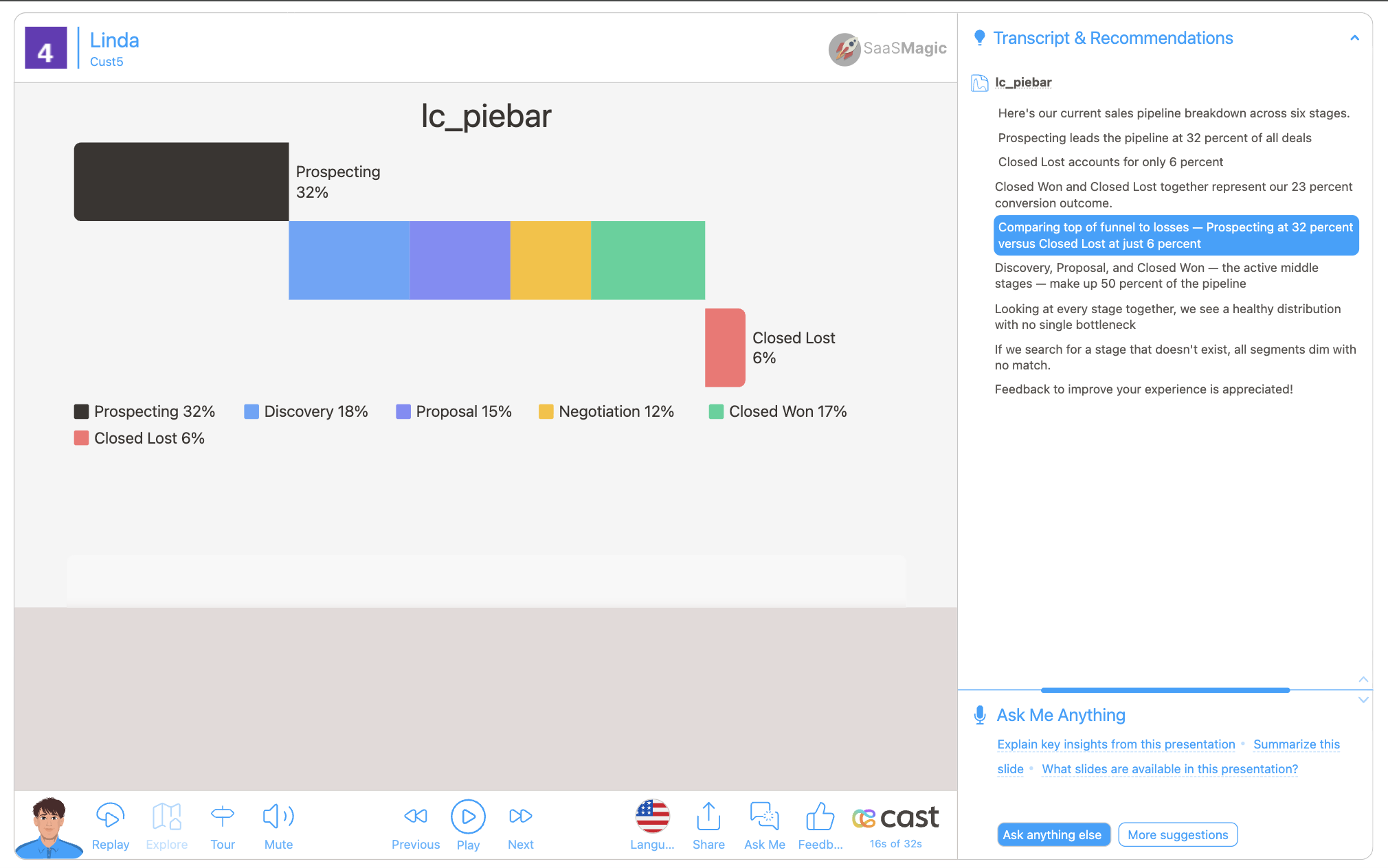
Quick reference
Section titled “Quick reference”| ID prefix | lc_pie_bar_* |
| SVG element | <rect> only |
| Override value | JSON object with data array of { label, value, color?, displayValue? } |
| Gotcha | displayValue affects legend text only — proportions use value |
Minimal example:
{ "data": [ { "label": "Product Questions", "color": "#1ABC84", "value": 380, "displayValue": "38%" }, { "label": "Escalated Tickets", "color": "#111111", "value": 20, "displayValue": "2%" } ]}Setup in Cast
Section titled “Setup in Cast”- Add a
<rect>whose ID starts withlc_pie_bar_. - Provide JSON (directly or via dataset with Value Formatting → JSON).
- In Override SVG Variables, use
{% raw %}{{ my_field | json }}{% endraw %}when pulling from a field.
Samples
Section titled “Samples”
Advanced: JSON reference, configuration, highlighting, and examples
Element Identification
The target element must be a <rect> with an ID that starts with lc_pie_bar_* for stacked bar chart visualization.
Input Format
The input value must be provided as a JSON object containing a data array of segment objects.
JSON Format
Section titled “JSON Format”{ "data": [ { "label": "Product Questions", "color": "#1ABC84", "value": 380, "displayValue": "38%" }, { "label": "Implementation Support", "color": "#F59E0B", "value": 140, "displayValue": "14%" }, { "label": "Escalated Tickets", "color": "#111111", "value": 20, "displayValue": "2%" }, { "label": "Usage and Adoption Reviews", "color": "#1D9BF0", "value": 260, "displayValue": "26%" }, { "label": "Renewal and Commercial Questions", "color": "#DC3232", "value": 200, "displayValue": "20%" } ], "fontSize": 12, "fontColor": "#222222", "barHeight": 24}Download Sample Data - Pie Bar
Important Notes:
- Segments with negative or non-numeric values are silently skipped; zero-value segments render as a thin colored line and still appear in the legend
displayValueis shown in the legend as-is — it does NOT affect segment proportions (proportions are always based onvalue)- Key names are case-insensitive for the first character (e.g.
Labelandlabelboth work) - If data is not passed in the correct format, the element will display as a plain
<rect>without any chart visualization
Configuration Properties
Section titled “Configuration Properties”Required Segment Properties
Section titled “Required Segment Properties”label: Display name for the segment (string, mandatory)value: Numeric value for the segment (number, mandatory — negative and non-numeric values are skipped; zero renders as a thin line)
Optional Segment Properties
Section titled “Optional Segment Properties”| Property | Type | Description |
|---|---|---|
displayValue |
string | Text shown in the legend (e.g. “38%”) — does not affect bar proportions |
color |
string | Custom hex color code or color name for the segment fill |
Optional Chart-Level Properties
Section titled “Optional Chart-Level Properties”| Property | Type | Description |
|---|---|---|
barHeight |
number | Custom bar height in pixels (defaults to the full rect height) |
fontSize |
number | Font size for legend text in pixels (auto-calculated from bar height if not set) |
fontColor |
string | Color for legend text (defaults to the current chart’s text color) |
Color Specifications
Section titled “Color Specifications”Custom Color:
- Provide hex color codes:
"#1ABC84","#F59E0B" - Use CSS color names:
"red","blue","green" - Each segment can have its own individual color
Default Behavior:
- If no color is provided, colors are auto-assigned from the appearance settings and project color palette (
castColor(0),castColor(1), etc.)
Compatibility: Works with <rect> elements only
Layout Behaviour
Section titled “Layout Behaviour”- The stacked bar occupies 80% of the rect width, left-aligned with padding
- When
barHeightis omitted, the bar fills the full rect height - When a custom
barHeightis set and leaves enough room, the legend is placed inside the rect below the bar; otherwise the legend renders below the rect boundary - Legend items wrap to multiple lines if the rect is narrow
- Long labels are truncated with
…based on available space - Segments use selective corner rounding — left corners on the first segment, right corners on the last
Highlighting Segments
Section titled “Highlighting Segments”Stacked bar charts support two levels of highlighting during your presentation:
Whole-Chart Visibility
Section titled “Whole-Chart Visibility”Use the chart ID (e.g. lc_pie_bar_tickets) in your highlight configuration to control the entire chart’s visibility. The chart fades in with a left-to-right fill animation when it first becomes visible.
Segment-Level Highlighting
Section titled “Segment-Level Highlighting”Highlight specific segments by referencing their label in your highlight configuration. The widget matches these labels against the chart data and highlights the matching segments. Label matching is case-insensitive, so "product questions" matches a segment labeled "Product Questions".
Highlight Format:
Single segment:
[{ "label": "Negotiation" }]Multiple segments:
[{ "label": "Closed Won" }, { "label": "Closed Lost" }]How to Add Highlights in Cast Designer:
- Open your project in Cast designer
- Navigate to the Narration tab
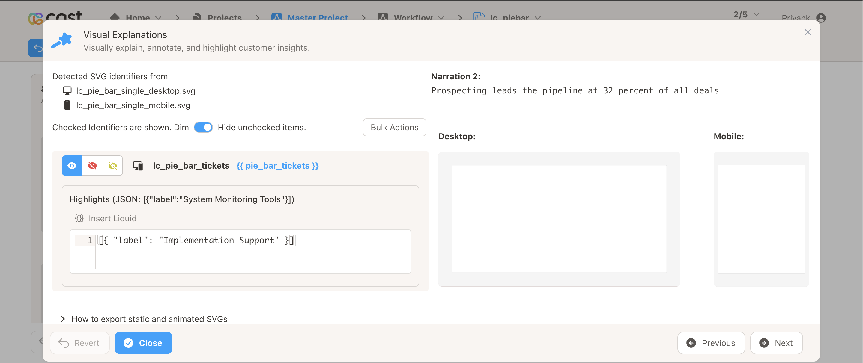
- Click on Visual Explanations for the slide with your stacked bar chart
- Find the liquid block for your
lc_pie_barelement - Add the highlight format directly in the liquid block
Highlight Modes
Section titled “Highlight Modes”The lc_pie_bar widget automatically selects the best highlight mode based on available space and context:
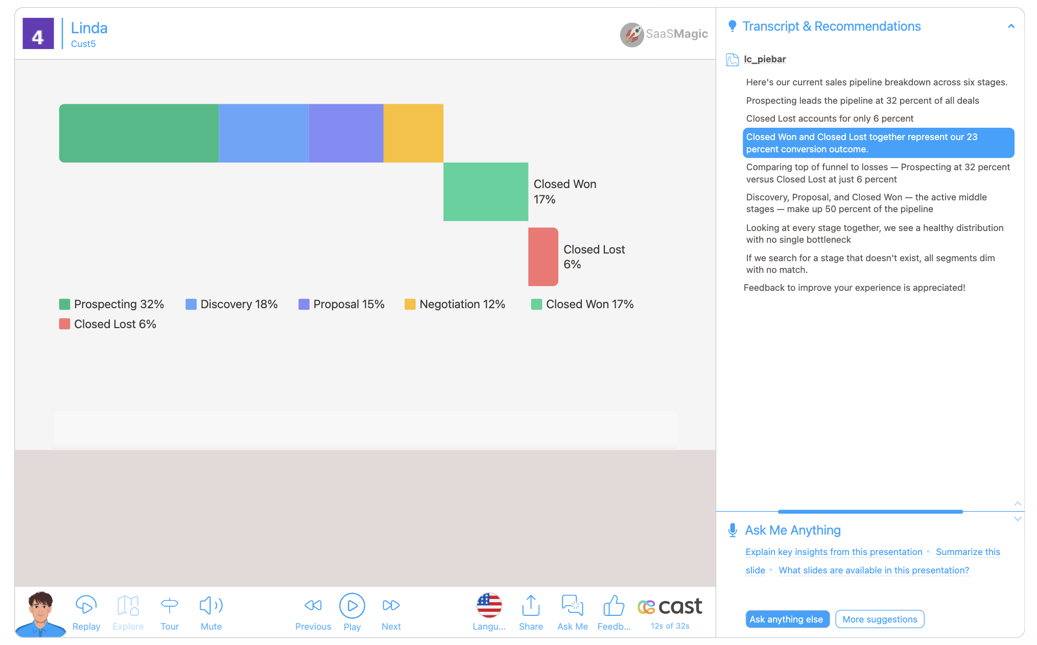
Expanded Rows Mode (default when space allows)
- All segments translate down into an expanded row layout extending below the bar
- Each highlighted segment gets its own row; contiguous non-highlighted segments share a row
- Rows stack flush below the main bar (no gap between rows)
- Breakout labels appear beside highlighted segments showing the label and display value
- The legend shifts down to clear the expanded rows
- Rows stagger in with a slight delay between them (~0.08s)
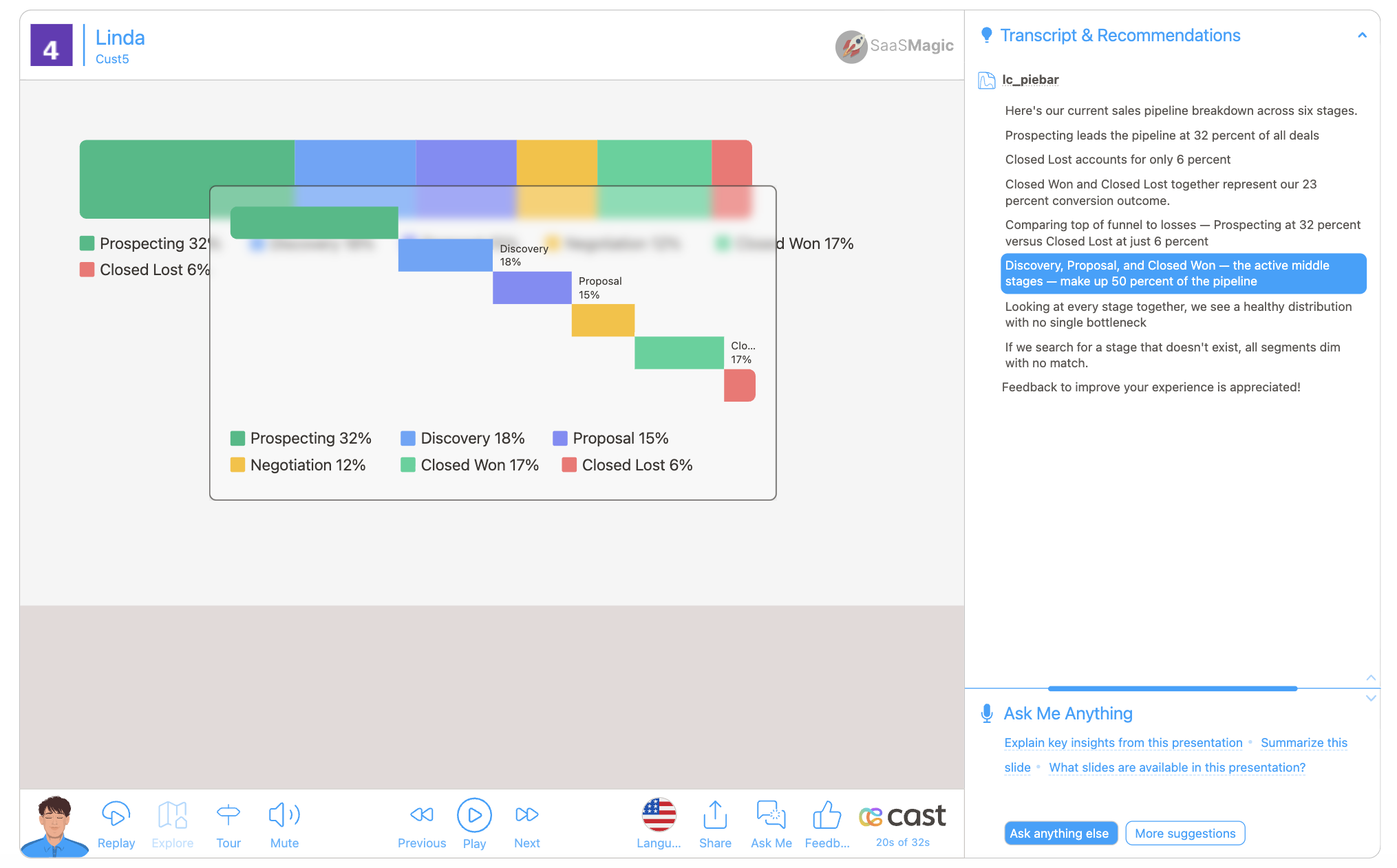
Modal Popup Mode (when expanded rows don’t fit)
- A centered modal card appears with a frosted glass backdrop
- The modal contains a stacked bar replica, expanded rows, and legend
- Breakout labels appear inside the modal for highlighted segments
- The original bar and legend remain visible at full opacity behind the modal
Opacity-Only Mode (multiple charts highlighted simultaneously)
- When two or more
lc_pie_barrects have segment highlights in the same step, all charts fall back to opacity-only mode - Highlighted segments stay at full opacity; others dim
- No expanded rows, no popup, no glass overlay
Highlight Behaviour Summary
Section titled “Highlight Behaviour Summary”| Scenario | Behaviour |
|---|---|
| No segment highlight | Whole chart fades in with left-to-right fill animation |
| Segment highlight with space | Expanded row layout with breakout labels |
| Segment highlight without space | Modal popup with stacked bar and expanded rows inside |
| Multiple charts highlighted | Opacity-only — no expanded rows or modal |
| Non-existent label | No matches — all segments restored to full opacity |
| Empty highlight list | No effect — chart stays at current state |
Example Usage
Section titled “Example Usage”Example 1: Simple Two-Segment Breakdown
Section titled “Example 1: Simple Two-Segment Breakdown”{ "data": [ { "label": "Won", "value": 340, "displayValue": "68%" }, { "label": "Lost", "value": 160, "displayValue": "32%" } ]}Example 2: Support Ticket Categories with Custom Colors
Section titled “Example 2: Support Ticket Categories with Custom Colors”{ "data": [ { "label": "Product Questions", "color": "#1ABC84", "value": 380, "displayValue": "38%" }, { "label": "Implementation Support", "color": "#F59E0B", "value": 140, "displayValue": "14%" }, { "label": "Escalated Tickets", "color": "#111111", "value": 20, "displayValue": "2%" }, { "label": "Usage and Adoption Reviews", "color": "#1D9BF0", "value": 260, "displayValue": "26%" }, { "label": "Renewal and Commercial Questions", "color": "#DC3232", "value": 200, "displayValue": "20%" } ]}Example 3: Custom Bar Height and Font Size
Section titled “Example 3: Custom Bar Height and Font Size”{ "data": [ { "label": "Alpha", "value": 60 }, { "label": "Beta", "value": 40 } ], "barHeight": 32, "fontSize": 14}Example 4: Quarterly Breakdown (Auto-Colored)
Section titled “Example 4: Quarterly Breakdown (Auto-Colored)”{ "data": [ { "label": "Q1", "value": 25 }, { "label": "Q2", "value": 25 }, { "label": "Q3", "value": 25 }, { "label": "Q4", "value": 25 } ]}Example 5: Narration with Segment Highlights
Section titled “Example 5: Narration with Segment Highlights”Your Stacked Bar Data:
{ "data": [ { "label": "Prospecting", "color": "#1ABC84", "value": 320, "displayValue": "32%" }, { "label": "Discovery", "color": "#60A5FA", "value": 180, "displayValue": "18%" }, { "label": "Proposal", "color": "#818CF8", "value": 150, "displayValue": "15%" }, { "label": "Negotiation", "color": "#FBBF24", "value": 120, "displayValue": "12%" }, { "label": "Closed Won", "color": "#34D399", "value": 170, "displayValue": "17%" }, { "label": "Closed Lost", "color": "#F87171", "value": 60, "displayValue": "6%" } ], "barHeight": 90}Narration Steps:
-
Step 1: “Here’s your sales pipeline breakdown…”
- Liquid block: No highlight (whole chart visible)
- Result: All segments appear at full brightness with left-to-right fill animation
-
Step 2: “Prospecting makes up the largest share at 32%…”
- Liquid block:
[{"label": "Prospecting"}] - Result: Expanded row layout with “Prospecting” breakout label
- Liquid block:
-
Step 3: “Discovery and Proposal together account for 33% of the pipeline…”
- Liquid block:
[{"label": "Discovery"}, {"label": "Proposal"}] - Result: Both segments highlighted with individual breakout labels
- Liquid block:
-
Step 4: “Let’s look at the closed deals — 17% won vs 6% lost…”
- Liquid block:
[{"label": "Closed Won"}, {"label": "Closed Lost"}] - Result: Previous expanded rows clear, new expanded rows render for both closed segments
- Liquid block:
-
Step 5: “Overall, your pipeline looks healthy…”
- Liquid block: No highlight
- Result: All segments return to full opacity, expanded rows removed
Data Handling
Section titled “Data Handling”- Segments with negative or non-numeric
valueare silently skipped; zero-value segments render as a thin colored line and still appear in the legend - If all segments are invalid, nothing renders and the original rect stays hidden
- If the JSON is malformed or the
dataarray is missing, the handler returns early without crashing - On re-render with the same ID but new data, previous elements are cleaned up automatically
- Key names are case-insensitive for the first character (
Labelandlabelboth work)