
Navigation
 Navigation
Section titled “ Navigation”A navigation slide lets a persona choose their journey or drill down for details. You can also use it to show a shorter vs. detailed version of the presentation.

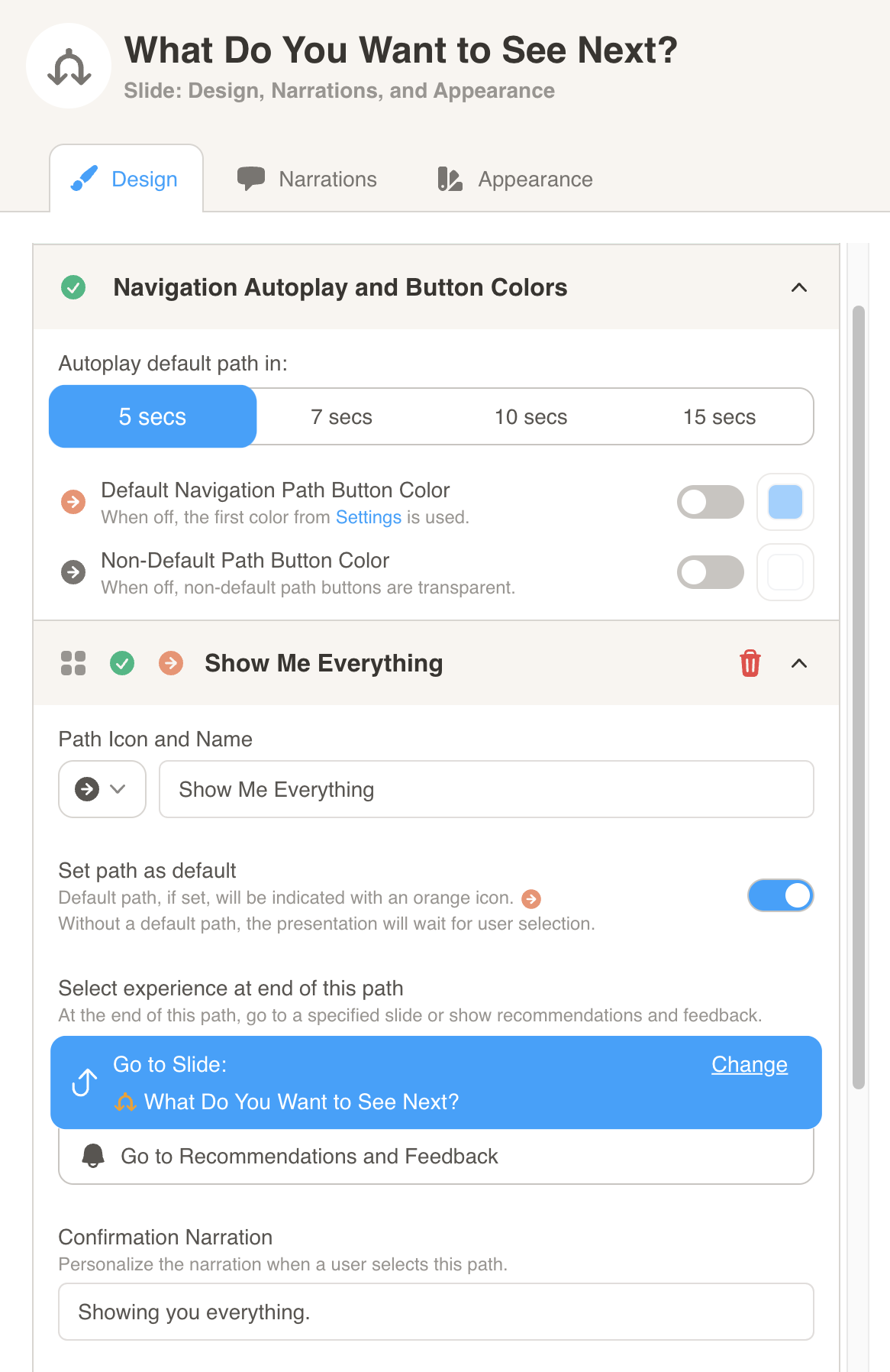
You can format the slide under Design. Here, you can: - Change the autoplay settings for the slide - Change the default path button colors for the slide - Change the name and icon for each path. You can also press the toggle on a specific path to set it as the default.
Enhanced Navigation Settings for NPS Support
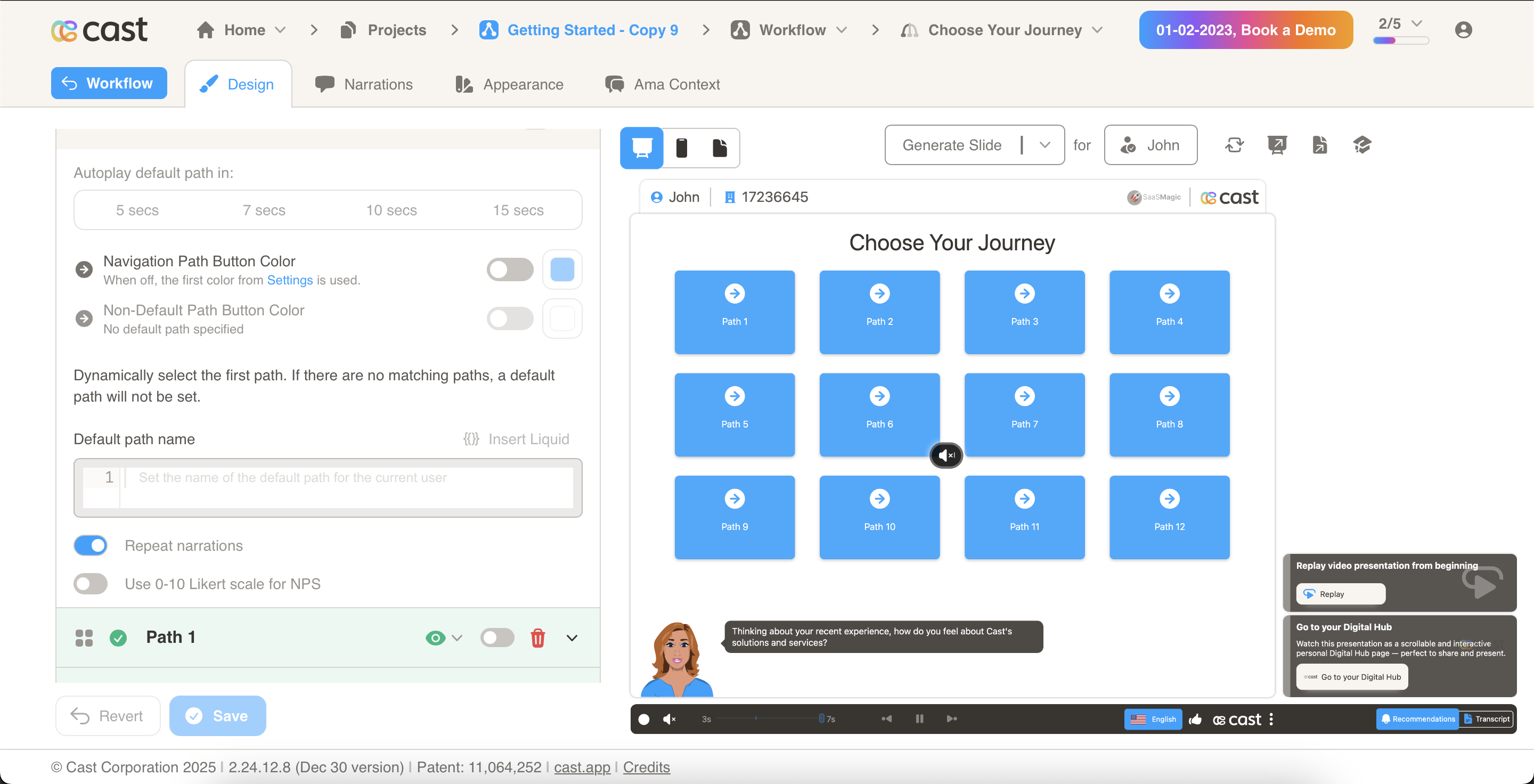
Section titled “Enhanced Navigation Settings for NPS Support”We have updated the navigation slide functionality to provide greater flexibility in handling paths for NPS (Net Promoter Score). Previously, the system automatically converted the setup to NPS when 11 paths were added. Now, we support up to 12 paths and have introduced a new toggle option to allow users to customize their setup.
When users add 11 paths The system will display a toggle inside Navigation Settings, allowing users to choose whether to enable the NPS
-
When the toggle is enabled, the system will adopt the NPS mode using the 0-10 scale.
-
When the toggle is disabled, users can retain the 12-path structure.
Multiple path groups with lc_options_*
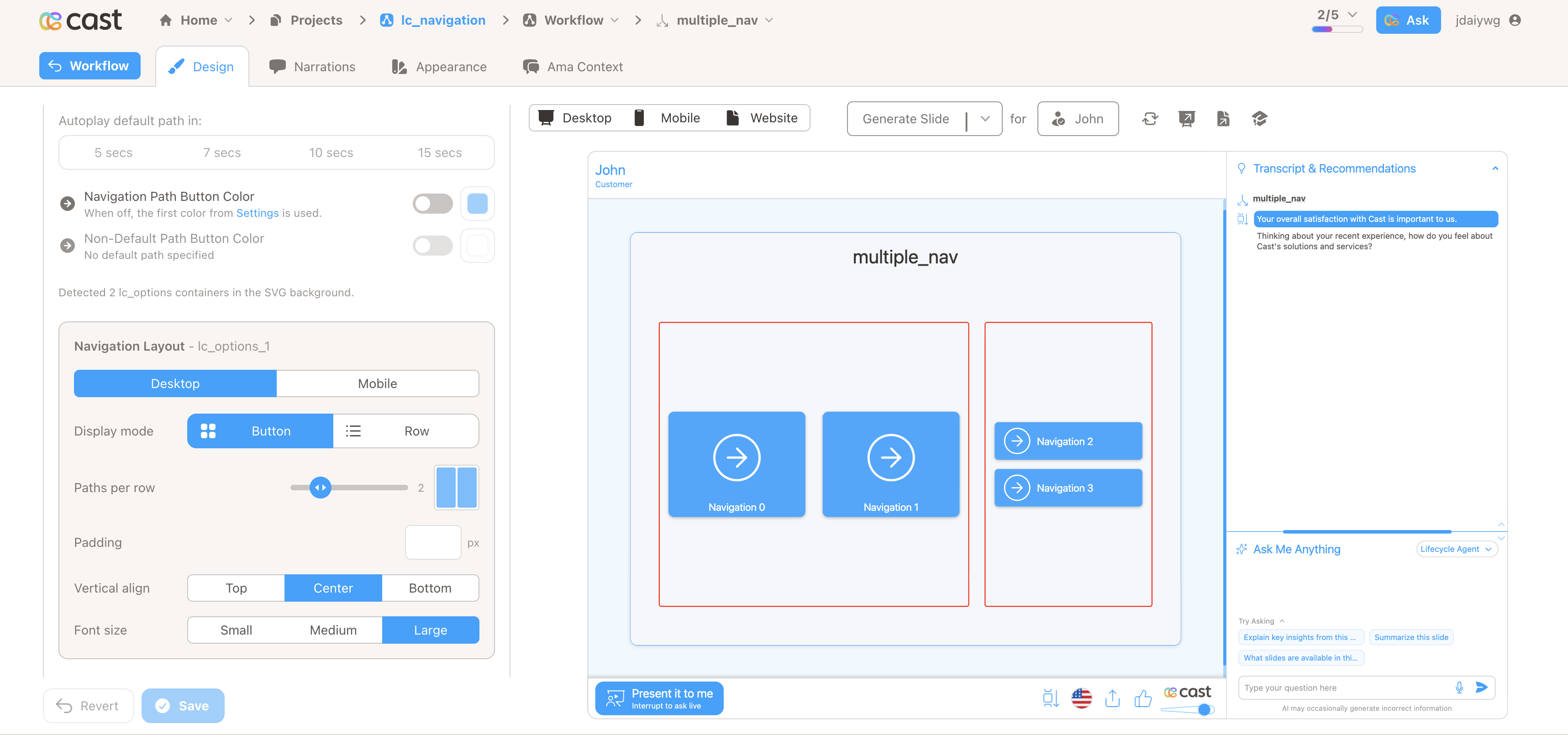
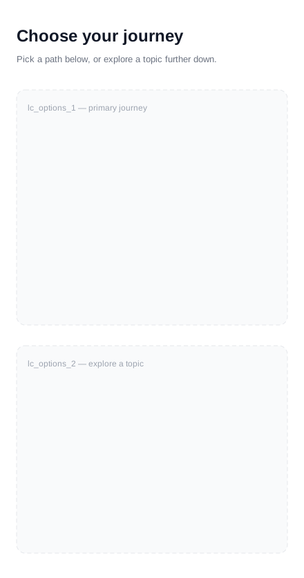
Section titled “Multiple path groups with lc_options_*”By default, a navigation slide renders all of its paths in a single button region. Adding more than one lc_options_<identifier> rectangle to the background SVG splits that into separate, independently styled groups — for example, a set of primary journey choices plus a secondary “drill down” set elsewhere on the slide.
When to use it
- Two visually separate sets of navigation choices on one slide (e.g. “choose a journey” vs. “explore a topic”)
- Giving one group a different layout, font size, or button colors than another
- Keeping an NPS 0–10 scale in its own region while other paths use normal buttons
Quick reference
| Element | ID pattern | SVG type | What it defines |
|---|---|---|---|
| Options region | lc_options_<identifier> |
<rect> |
The area and bounds of one path group (e.g. lc_options_1, lc_options_2) |
Notes
lc_continueis not supported on a slide that also haslc_options— remove anylc_continueelements from the background.- A path with no region assigned (or an unmatched
lcOptionId) always falls back to the first region, in id order.
Setup in Cast
- Add one
<rect>per group to your background SVG, each with a uniquelc_options_<identifier>ID (e.g.lc_options_1,lc_options_2) — its position and size define that group’s on-slide area. - Open Navigation Settings in Design — each detected region gets its own “Navigation Layout” panel (labeled with the region ID once there’s more than one), with a Desktop / Mobile tab. Desktop covers display mode (button vs. row), paths per row, padding, vertical alignment, and font size; Mobile lets you override display mode, paths per row, padding, and font size independently — but only once the same region ID also exists in the mobile background SVG.
- Assign each path to a region by dragging it above or below the draggable divider between groups, or by picking a region from the divider’s dropdown.
Samples
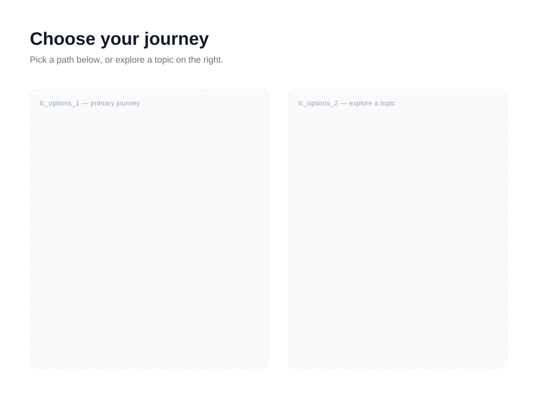
- Desktop sample SVG
- Mobile sample SVG — same
lc_options_1/lc_options_2IDs as the desktop file, so the mobile display-mode and padding overrides in Navigation Settings have a matching region to apply to.
Related
- A scene with only one
lc_options_<id>region (or none at all) behaves exactly like a classic single-group navigation slide — nothing else changes.
Advanced: region detection, path assignment, and settings reference
Naming Convention and Region Detection
Section titled “Naming Convention and Region Detection”- A region is any
<rect>in the background SVG whoseidmatcheslc_options_<identifier>(numeric or word/dash suffix — e.g.lc_options_1,lc_options_secondary). - Regions are sorted in natural numeric order (
lc_options_1,lc_options_2, …lc_options_10), not plain alphabetical order. - If desktop and mobile backgrounds both define the same region ID, the desktop rectangle’s dimensions are used; a region detected in only one of the two backgrounds still works, but its mobile-specific layout override stays disabled until a matching
lc_options_<id>rect is added to the other background. - If desktop and mobile disagree about having any
lc_optionsregions at all, Design shows a dismissible mismatch warning.
Per-Region Settings
Section titled “Per-Region Settings”Each detected region gets its own panel in Navigation Settings, split into a Desktop and a Mobile tab:
Desktop tab
- Display mode:
button(card-styled grid) orrow(full-width list). - Paths per row (1–6), with a live preview grid; rows are derived automatically from path count ÷ columns.
- Padding (0–48px, default 12px) — the gap between paths.
- Vertical align: top, center, or bottom.
- Font size: Small (14px), Medium (16px), or Large (18px).
Mobile tab
- Display mode, paths per row, padding, and font size can each be overridden independently for mobile. Leave any of them unset and it inherits the matching desktop value.
- There’s no mobile override for vertical align.
- The whole Mobile tab is disabled, with a tooltip explaining why, until the same region ID is also detected in the mobile background SVG.
Autoplay (wait-for-click seconds), default/non-default path button colors, dynamic path, and “repeat narrations” remain scene-level settings shared across all regions — they are not configured per region.
If the scene uses the NPS 0–10 scale, display mode and grid controls are locked for that region (NPS renders its own fixed wrapping layout regardless of the configured display mode).
Assigning Paths to Regions
Section titled “Assigning Paths to Regions”- Paths are ordered in one drag-sortable list; with two or more regions, a draggable divider appears between them.
- Dragging a path across a divider reassigns it to the region on the other side. The divider’s dropdown lets you explicitly pick a region instead, independent of drag position.
- A path with no assigned region, or one whose assigned region no longer exists, always defaults to the first region in id order — never to “no region.”
lc_continue Incompatibility
Section titled “lc_continue Incompatibility”lc_options and lc_continue cannot coexist in the same background SVG. If both are present, Navigation Settings shows:
lc_continue is not supported with lc_options in the SVG slide. Remove lc_continue elements from the background.
Backwards Compatibility
Section titled “Backwards Compatibility”A slide with a single lc_options_1 region (or none at all) is not a special case by ID — it behaves identically to a pre-existing navigation slide because there’s only one implicit group: every path lands in it, using the scene’s regular (non-per-region) display mode, layout, and style settings, and no divider or region picker appears in Design.