
lc_radial
Polar Area Chart Visualization with lc_radial_*
Section titled “Polar Area Chart Visualization with lc_radial_*”The lc_radial_* prefix renders a polar area (rose) chart — equal angular slices with radius proportional to value.
When to use it
- Comparing magnitudes across categories at a glance
- Compact radial dashboards and infographic charts
- Highlighting individual segments during narration
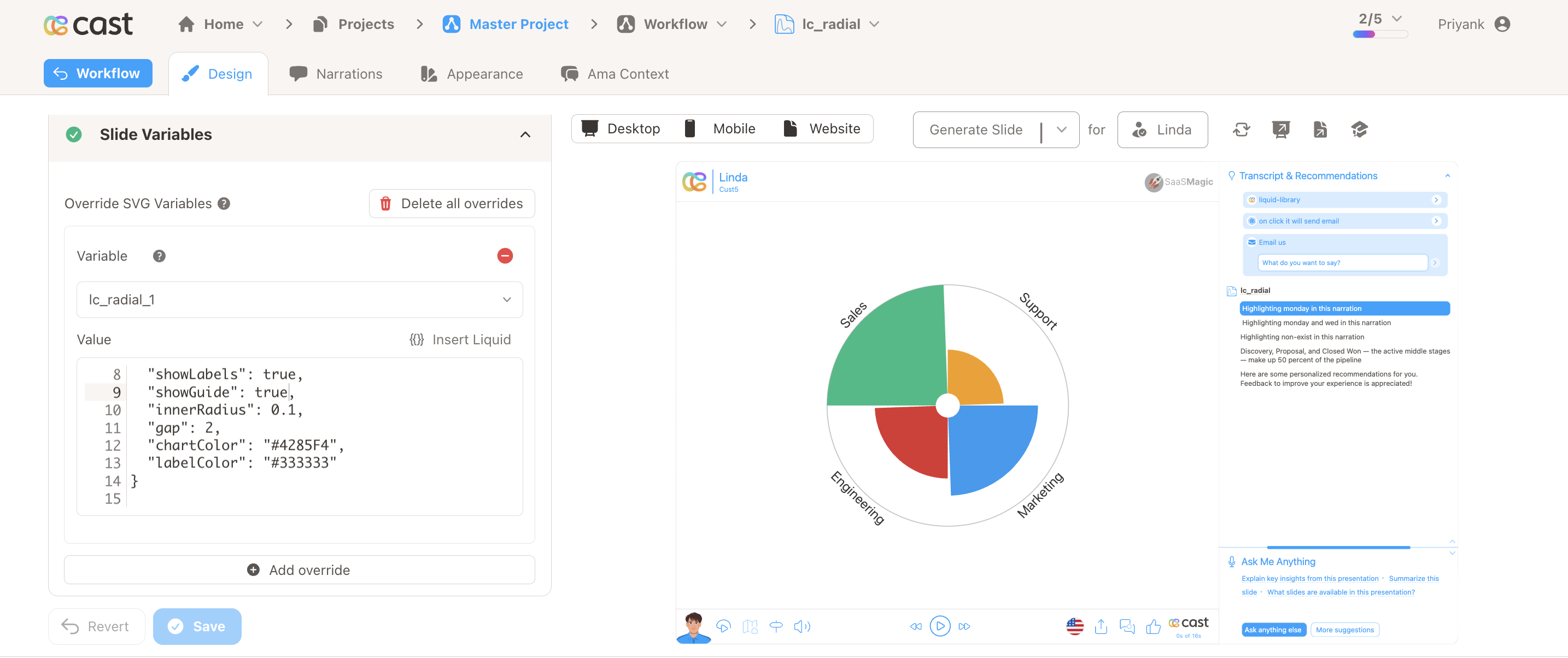
Quick reference
Section titled “Quick reference”| ID prefix | lc_radial_* |
| SVG element | <rect> or <circle> |
| Override value | JSON object with data array of { label, value, color? } |
| Gotcha | Zero, negative, or non-numeric segment values are skipped |
Minimal example:
{ "data": [ { "label": "Sales", "value": 380, "color": "#1ABC84" }, { "label": "Support", "value": 140, "color": "#F59E0B" } ]}Setup in Cast
Section titled “Setup in Cast”- Add a
<rect>or<circle>whose ID starts withlc_radial_. - Provide JSON via the Rows/override field or a dataset with Value Formatting → JSON.
- In Override SVG Variables, use
{% raw %}{{ my_field | json }}{% endraw %}when pulling from a field.
Samples
Section titled “Samples”
Advanced: JSON reference, configuration, highlighting, and examples
Element Identification
The target element must be a <rect> or <circle> with an ID that starts with lc_radial_* for polar area chart visualization.
Input Format
The input value must be provided as a JSON object containing a data array of segment objects.
JSON Format
Section titled “JSON Format”{ "data": [ { "label": "Sales", "value": 380, "color": "#1ABC84" }, { "label": "Support", "value": 140, "color": "#F59E0B" }, { "label": "Marketing", "value": 260, "color": "#1D9BF0" }, { "label": "Engineering", "value": 200, "color": "#DC3232" } ], "showLabels": true, "showGuide": false, "innerRadius": 0.1, "gap": 2, "chartColor": "#4285F4", "labelColor": "#333333"}Important Notes:
- Segments with zero, negative, or non-numeric values are silently skipped
- If the
dataarray is missing or empty, nothing will render - Key names are case-insensitive for the first character (e.g.
Labelandlabelboth work) - If data is not passed in the correct format, the element will display without any chart visualization
Configuration Properties
Section titled “Configuration Properties”Required Segment Properties
Section titled “Required Segment Properties”label: Display name for the segment (string, mandatory for labels and highlighting)value: Numeric value for the segment (number, mandatory — determines the size of the segment)
Optional Segment Properties
Section titled “Optional Segment Properties”| Property | Type | Description |
|---|---|---|
color |
string | Custom hex color code or color name for the segment fill |
Optional Chart-Level Properties
Section titled “Optional Chart-Level Properties”| Property | Type | Default | Description |
|---|---|---|---|
chartColor |
string | (auto from palette) | Default fill color for all segments when per-segment color is not set |
labelColor |
string | Chart text color or #333 |
Color for label text around the chart |
showLabels |
boolean | true |
Show or hide segment labels around the outer ring |
showGuide |
boolean | false |
Show a faint reference circle at the maximum radius |
innerRadius |
number | 0.1 |
Inner radius as a fraction of the max radius (0–1); controls the size of the center hole |
gap |
number | auto | Gap between segments in degrees; auto-calculated if omitted |
Color Specifications
Section titled “Color Specifications”Custom Color:
- Provide hex color codes:
"#1ABC84","#F59E0B" - Use CSS color names:
"red","blue","green" - Each segment can have its own individual color
Default Behavior:
- If no color is provided, colors are auto-assigned from the appearance settings and project color palette
Compatibility: Works with <rect> and <circle> elements
Layout Behaviour
Section titled “Layout Behaviour”- The chart automatically scales to fit the target element
- Labels appear around the outside of the chart and are automatically positioned for readability
- Long labels are truncated with
…when space is limited
Animation
Section titled “Animation”When the chart appears, segments animate outward from the center with a smooth growing effect.
Highlighting Segments
Section titled “Highlighting Segments”Polar area charts support two levels of highlighting during your presentation:
Whole-Chart Visibility
Section titled “Whole-Chart Visibility”Use the chart ID (e.g. lc_radial_categories) in your highlight configuration to control the entire chart’s visibility. The chart fades in with the grow-from-center animation when it first becomes visible.
Segment-Level Highlighting
Section titled “Segment-Level Highlighting”Highlight specific segments by referencing their label in your highlight configuration. The widget matches these labels against the chart data and highlights the matching segments.
Highlight Format:
Single segment:
[{ "label": "Sales" }]Multiple segments:
[{ "label": "Sales" }, { "label": "Marketing" }]How to Add Highlights in Cast Designer:
- Open your project in Cast designer
- Navigate to the Narration tab
- Click on Visual Explanations for the slide with your polar area chart
- Find the liquid block for your
lc_radialelement - Add the highlight format directly in the liquid block
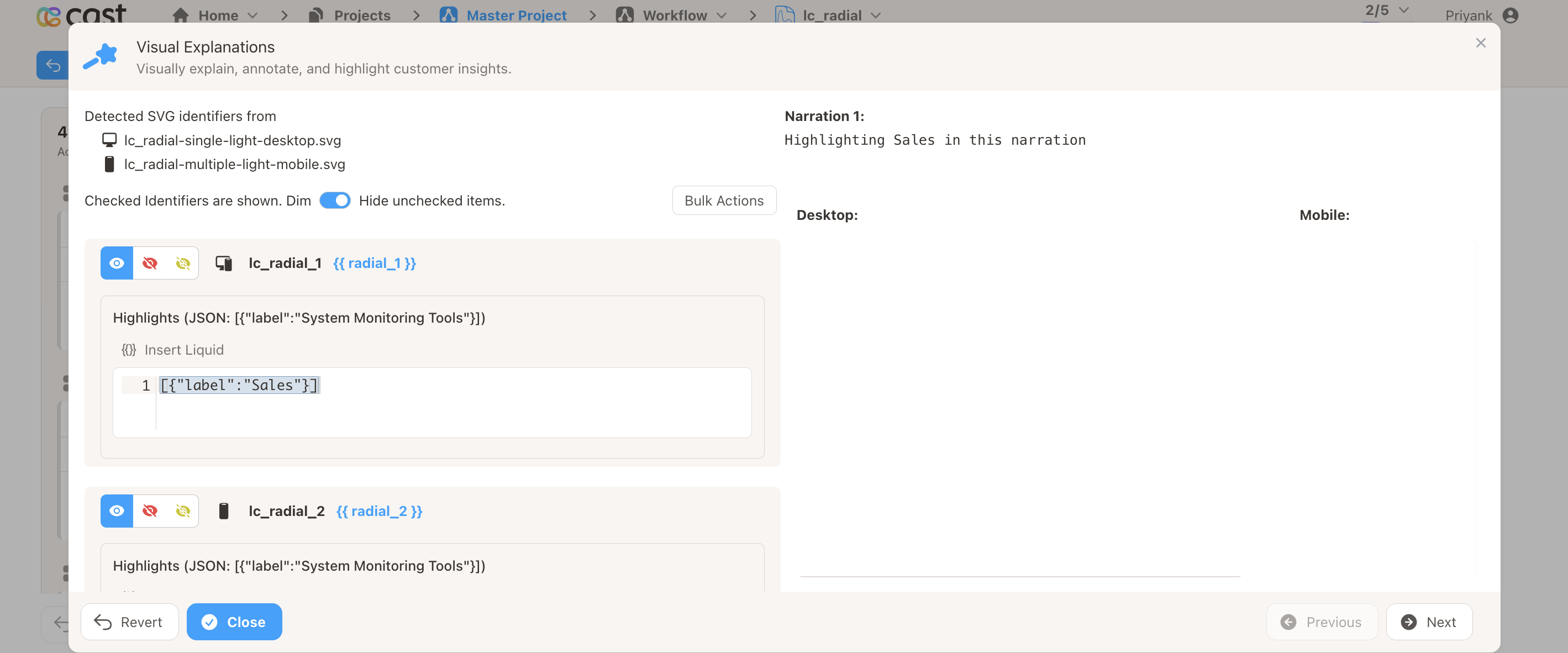
Highlight Preview:
When a segment is highlighted, it stays fully visible while the other segments are dimmed — making the selected categories stand out clearly.
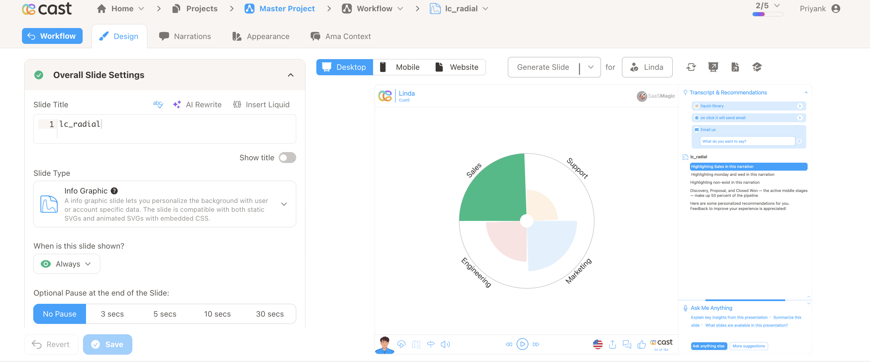
Example Usage
Section titled “Example Usage”Example 1: Simple Category Breakdown
Section titled “Example 1: Simple Category Breakdown”{ "data": [ { "label": "Mon", "value": 120 }, { "label": "Tue", "value": 80 }, { "label": "Wed", "value": 200 }, { "label": "Thu", "value": 50 }, { "label": "Fri", "value": 160 } ]}Example 2: Custom Colors with Guide Circle
Section titled “Example 2: Custom Colors with Guide Circle”{ "data": [ { "label": "Sales", "color": "#1ABC84", "value": 380 }, { "label": "Support", "color": "#F59E0B", "value": 140 }, { "label": "Marketing", "color": "#1D9BF0", "value": 260 }, { "label": "Engineering", "color": "#DC3232", "value": 200 } ], "showGuide": true}Example 3: Styled Chart with Inner Radius and Gap
Section titled “Example 3: Styled Chart with Inner Radius and Gap”{ "data": [ { "label": "Alpha", "value": 60 }, { "label": "Beta", "value": 40 }, { "label": "Gamma", "value": 90 }, { "label": "Delta", "value": 25 } ], "chartColor": "#4285F4", "labelColor": "#222222", "innerRadius": 0.25, "gap": 4, "showGuide": true}Example 4: 24-Hour Activity Radial
Section titled “Example 4: 24-Hour Activity Radial”Use this format when each segment represents an hour-of-day bucket.
{ "data": [ { "label": "12am", "value": 5, "color": "#4CAF82" }, { "label": "1a", "value": 3, "color": "#4CAF82" }, { "label": "2a", "value": 45, "color": "#4CAF82" }, { "label": "3a", "value": 30, "color": "#4CAF82" }, { "label": "4a", "value": 10, "color": "#4CAF82" }, { "label": "5a", "value": 2, "color": "#4CAF82" }, { "label": "6a", "value": 1, "color": "#4CAF82" }, { "label": "7a", "value": 0, "color": "#4CAF82" }, { "label": "8a", "value": 3, "color": "#4CAF82" }, { "label": "9a", "value": 8, "color": "#4CAF82" }, { "label": "10a", "value": 15, "color": "#4CAF82" }, { "label": "11a", "value": 20, "color": "#4CAF82" }, { "label": "12pm", "value": 85, "color": "#4CAF82" }, { "label": "1p", "value": 95, "color": "#4CAF82" }, { "label": "2p", "value": 80, "color": "#4CAF82" }, { "label": "3p", "value": 70, "color": "#4CAF82" }, { "label": "4p", "value": 55, "color": "#4CAF82" }, { "label": "5p", "value": 40, "color": "#4CAF82" }, { "label": "6p", "value": 25, "color": "#4CAF82" }, { "label": "7p", "value": 12, "color": "#4CAF82" }, { "label": "8p", "value": 8, "color": "#4CAF82" }, { "label": "9p", "value": 5, "color": "#4CAF82" }, { "label": "10p", "value": 35, "color": "#4CAF82" }, { "label": "11p", "value": 50, "color": "#4CAF82" } ], "showLabels": true, "showGuide": true, "innerRadius": 0.15, "gap": 1, "chartColor": "#4CAF82", "labelColor": "#666666"}Preview Placeholder:
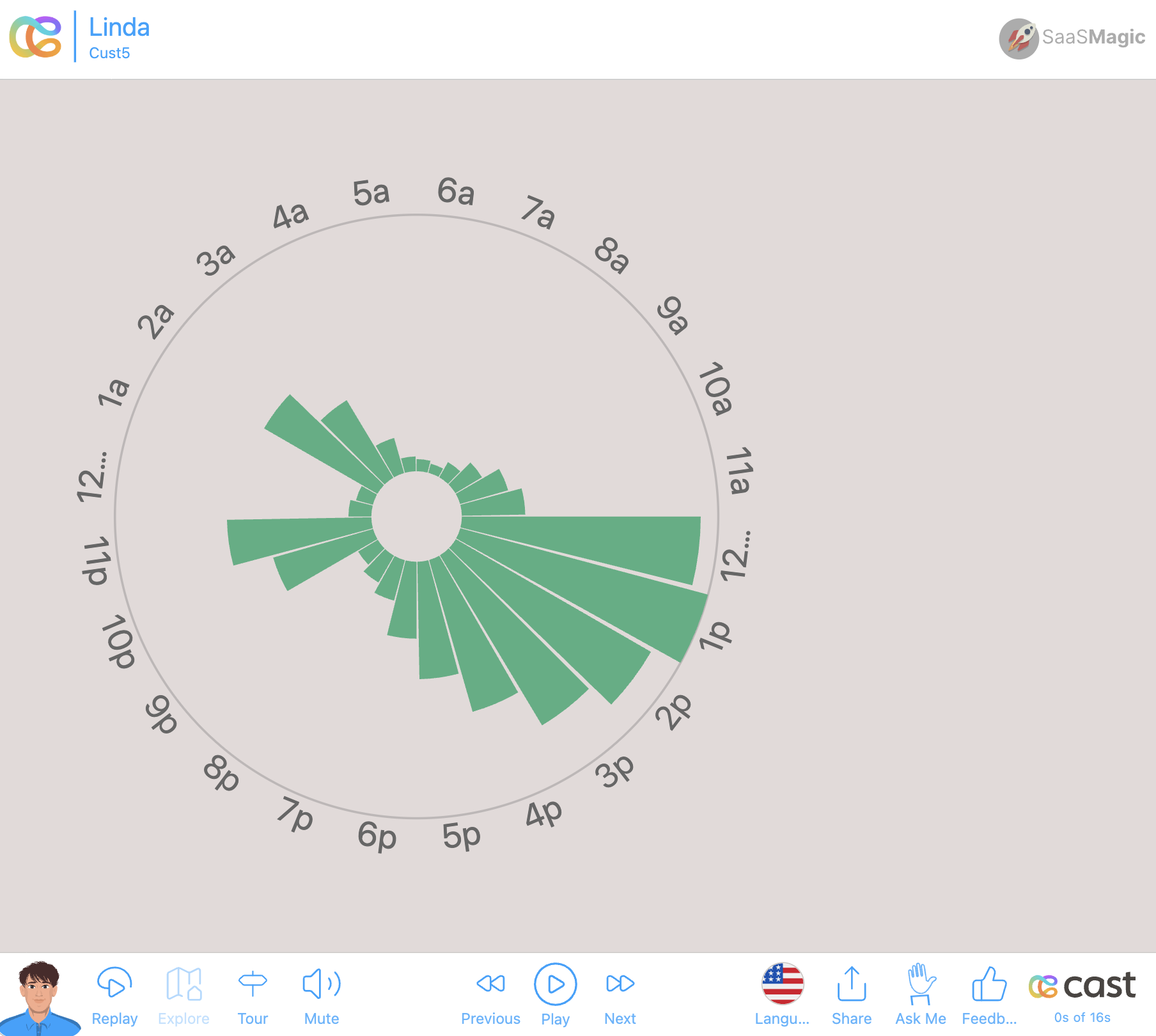
Example 5: Weekly Activity Radial
Section titled “Example 5: Weekly Activity Radial”Use this format when each segment represents day-of-week activity.
{ "data": [ { "label": "Mon", "value": 85, "color": "#5AABDE" }, { "label": "Tue", "value": 70, "color": "#5AABDE" }, { "label": "Wed", "value": 60, "color": "#5AABDE" }, { "label": "Thu", "value": 75, "color": "#5AABDE" }, { "label": "Fri", "value": 50, "color": "#5AABDE" }, { "label": "Sat", "value": 40, "color": "#5AABDE" }, { "label": "Sun", "value": 55, "color": "#5AABDE" } ], "showLabels": true, "showGuide": false, "innerRadius": 0.35, "gap": 3, "chartColor": "#5AABDE", "labelColor": "#555555"}Preview:
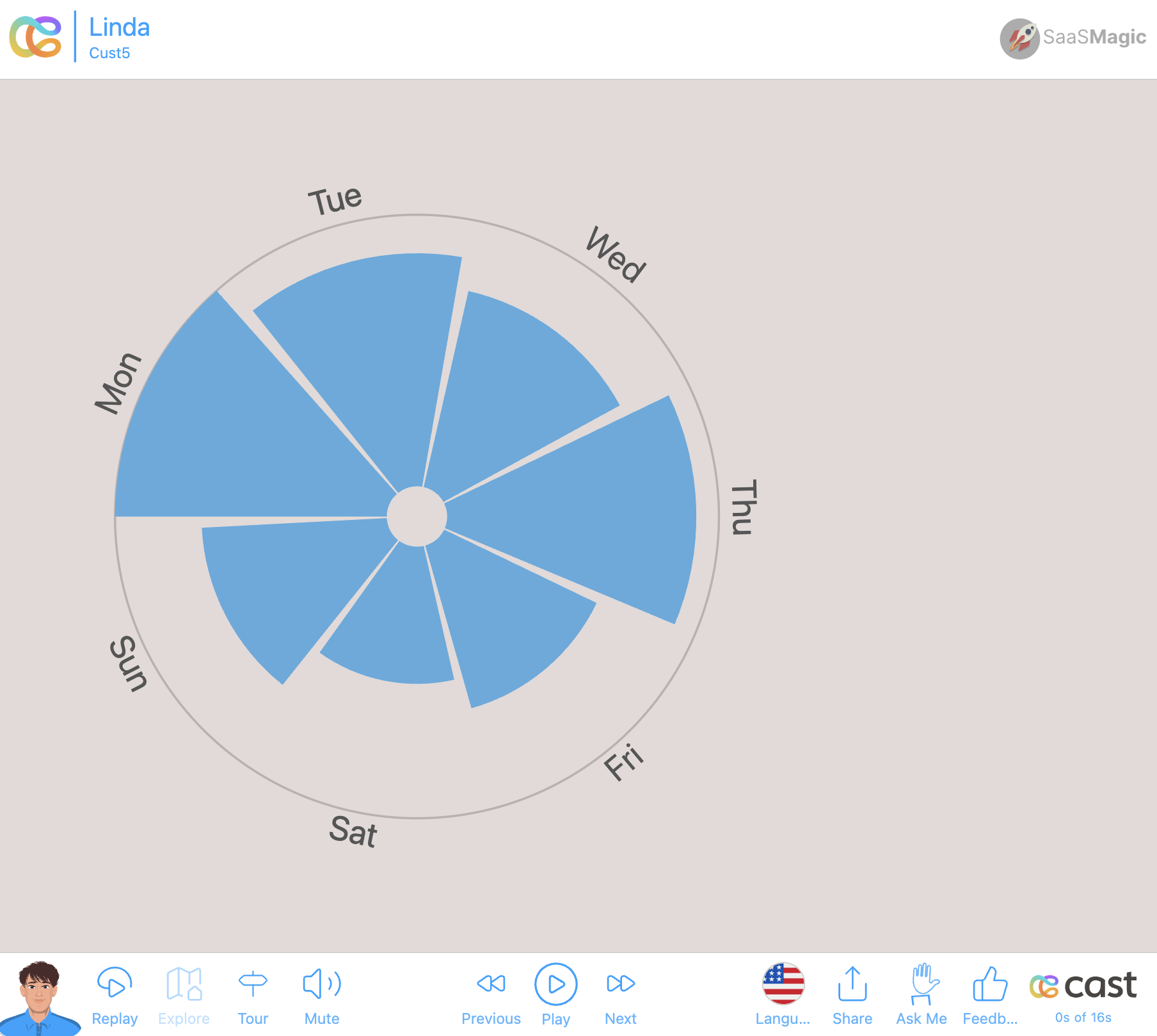
Data Handling
Section titled “Data Handling”- Segments with
valueof 0, negative, or non-numeric are silently skipped - If all segments are invalid, nothing renders
- If the JSON is malformed or the
dataarray is missing, nothing will render - Key names are case-insensitive for the first character (
Labelandlabelboth work) - Segments without a
labelwill not have labels and cannot be highlighted