
Progress & Metrics
Visualize KPIs, completion rates, performance scores, and comparisons using dynamic chart elements.
When to Use These
Section titled “When to Use These”Perfect for:
- KPIs and performance tracking
- Completion rates and progress indicators
- Sales metrics and revenue comparisons
- Goal attainment visualization
- Performance scores across categories
- Before/after comparisons
- Benchmark comparisons
Horizontal Bar Charts
Section titled “Horizontal Bar Charts”
lc_bar_* and lc_bar_bg_*
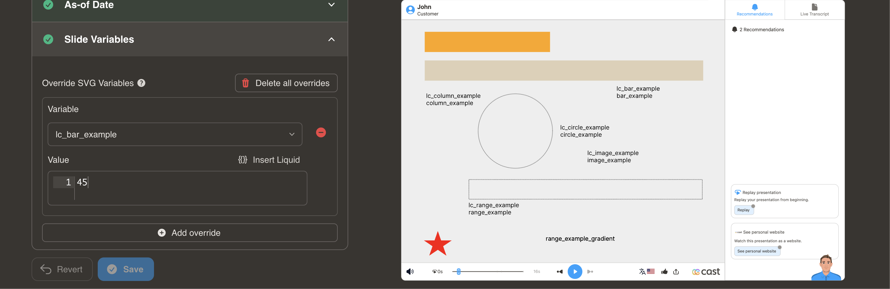
Section titled “lc_bar_* and lc_bar_bg_*”Create horizontal bars that automatically adjust width based on data values. Ideal for comparing multiple items side-by-side.
Element Setup
Section titled “Element Setup”Main Bar:
- Element type:
<rect> - ID format:
lc_bar_*(e.g.,lc_bar_revenue,lc_bar_q1-sales)
Background Bar (Optional):
- Element type:
<rect> - ID format:
lc_bar_bg_*(must match main bar name) - Automatically creates a semi-transparent background track at 30% opacity
Input Format
Section titled “Input Format”Simple Format - Value Only:
"40"Sets bar width to 40%
JSON Format - Value with Color:
{ "value": 45, "color": "yellow"}JSON Format - Full Options:
{ "value": 75, "color": "#34A853", "showDisplayValue": "true", "displayValue": "$75K"}| Property | Type | Default | Description |
|---|---|---|---|
value |
number | — | Percentage (0–100). Clamped automatically. |
color |
string | — | Hex, CSS name, or RGB color for the bar fill. |
showDisplayValue |
string | "false" |
Set "true" to show the value text on the bar (case-insensitive). |
displayValue |
string | null |
Custom text to show instead of the auto-rounded percentage. Requires showDisplayValue: "true". |
Color Options:
- Hex codes:
"#FF5722" - CSS names:
"royalblue","yellow","green" - RGB:
"rgb(255, 87, 34)"
Value Text (Background Bars):
lc_bar_bg_* elements can display the percentage value as split-color text on the bar — dark text on the unfilled track and contrast-based text on the filled portion. The text is right-aligned inside the bar and the font size scales to 80% of the bar height. Text is hidden by default and must be opted into.
- To show the value text, set
showDisplayValueto"true" - To show a custom label (e.g.
"$75K"), set bothshowDisplayValue: "true"anddisplayValue: "$75K"
Value Clamping
Section titled “Value Clamping”- Range: 0% to 100%
- Values above 100% → clamped to 100%
- Negative values → not processed (no change)
Usage Examples
Section titled “Usage Examples”{% raw %}
<!-- In your SVG --><rect id="lc_bar_bg_revenue" width="100" height="20" fill="#ccc" /><rect id="lc_bar_revenue" width="100" height="20" fill="#2196F3" />
<!-- Simple value — bar at 75%, no text shown (default) -->{{ revenue }} = "75"
<!-- With color — bar fill is green, no text shown -->{{ revenue }} = '{"value": 75, "color": "#4CAF50"}'
<!-- Show value text — displays "75" as split-color text on the bar -->{{ revenue }} = '{"value": 75, "color": "#34A853", "showDisplayValue": "true"}'
<!-- Custom display value — shows "$75K" instead of "75" -->{{ revenue }} = '{"value": 75, "color": "#34A853", "showDisplayValue": "true", "displayValue": "$75K"}'
{% endraw %}
Vertical Column Charts
Section titled “Vertical Column Charts”
lc_column_* and lc_column_bg_*
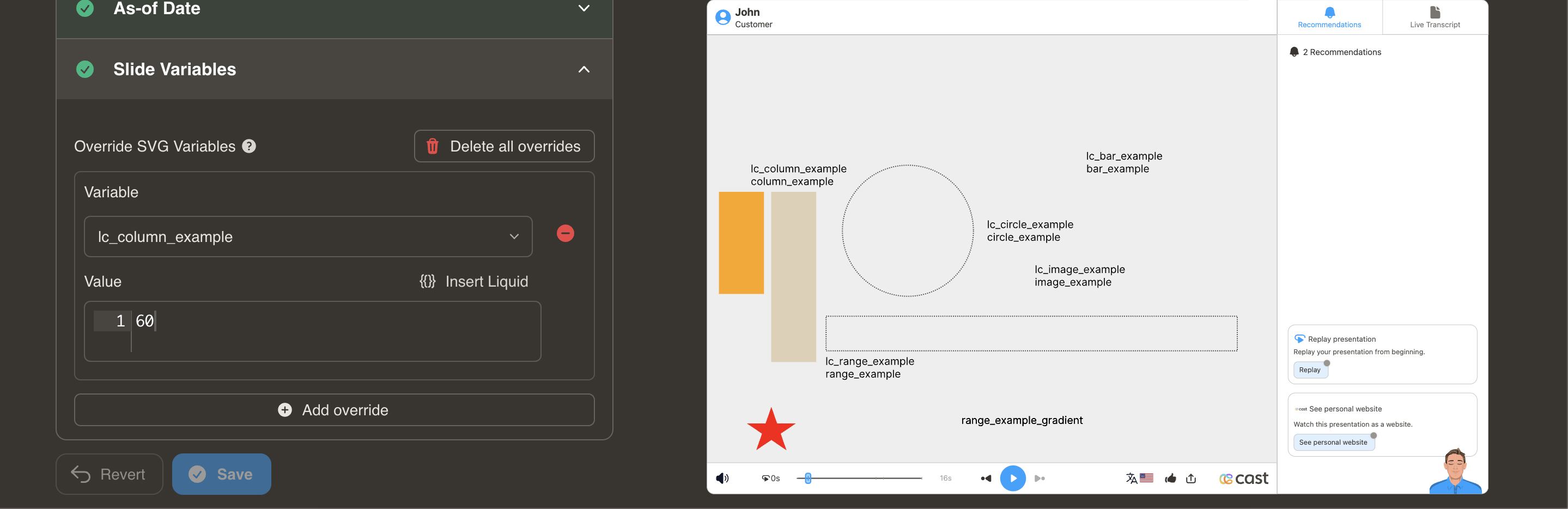
Section titled “lc_column_* and lc_column_bg_*”Create vertical columns that automatically adjust height based on data values. Perfect for time series or rankings.
Element Setup
Section titled “Element Setup”Main Column:
- Element type:
<rect> - ID format:
lc_column_*(e.g.,lc_column_jan,lc_column_q3)
Background Column (Optional):
- Element type:
<rect> - ID format:
lc_column_bg_* - Creates semi-transparent background at 30% opacity
Input Format
Section titled “Input Format”Simple Format - Value Only:
"60"Sets column height to 60%
JSON Format - Value with Color:
{ "value": 75, "color": "yellow"}Color Options: Same as bar charts (hex, CSS names, RGB)
Value Clamping
Section titled “Value Clamping”- Range: 0% to 100%
- Values above 100% → clamped to 100%
- Negative values → not processed
Usage Example
Section titled “Usage Example”{% raw %}
<!-- In your SVG --><rect id="lc_column_bg_q1" width="40" height="200" fill="#ccc" /><rect id="lc_column_q1" width="40" height="200" fill="#FF5722" />
<!-- In your dataset -->{{ q1 }} = "85"<!-- OR with color -->{{ q1 }} = '{"value": 85, "color": "green"}'
{% endraw %}
Result: Column displays at 85% height from bottom, growing upward
Circular Progress
Section titled “Circular Progress”
lc_circle_* and lc_circle_bg_*
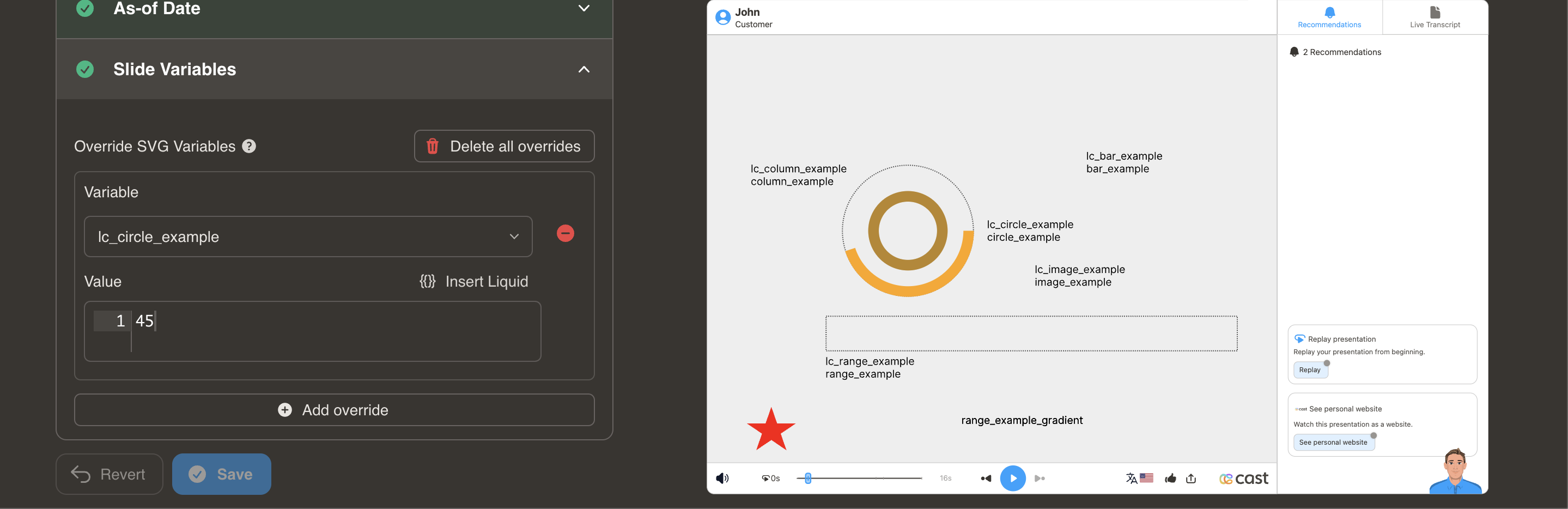
Section titled “lc_circle_* and lc_circle_bg_*”Display single percentages or completion status with circular progress indicators.
Element Setup
Section titled “Element Setup”Main Circle:
- Element type:
<circle> - ID format:
lc_circle_*(e.g.,lc_circle_completion,lc_circle_score)
Background Circle (Optional):
- Element type:
<circle> - ID format:
lc_circle_bg_* - Creates semi-transparent background at 30% opacity
Input Format
Section titled “Input Format”Simple Percentage:
"50"Sets circular progress to 50%
Value Clamping
Section titled “Value Clamping”- Range: 1% to 100%
- Values above 100% → clamped to 100%
- Negative values → not processed
- 0 values → converted to 1% (minimum)
Usage Example
Section titled “Usage Example”{% raw %}
<!-- In your SVG --><circle id="lc_circle_bg_completion" cx="50" cy="50" r="40" fill="none" stroke="#ccc" /><circle id="lc_circle_completion" cx="50" cy="50" r="40" fill="none" stroke="#4CAF50" />
<!-- In your dataset -->{{ completion }} = "68"
{% endraw %}
Result: Circular progress displays at 68% around the circle
Range Sliders
Section titled “Range Sliders”
lc_range_* and lc_range_bg_*
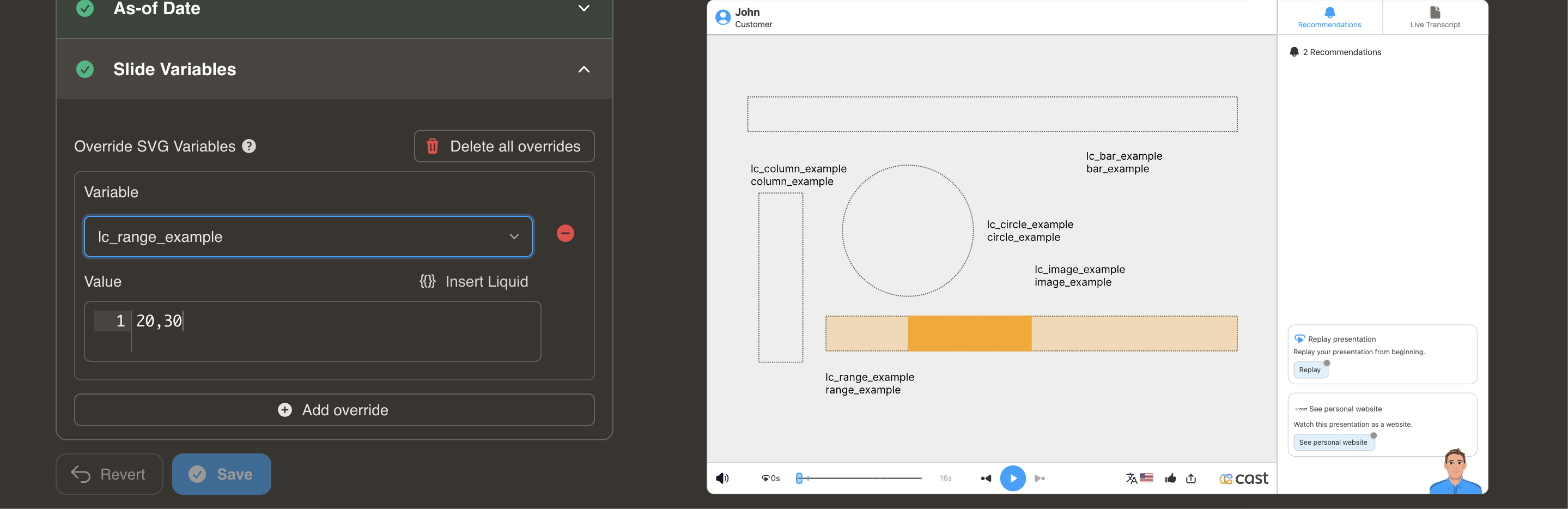
Section titled “lc_range_* and lc_range_bg_*”Show min-max values or data ranges with adjustable position and width.
Element Setup
Section titled “Element Setup”Main Range:
- Element type:
<rect> - ID format:
lc_range_*(e.g.,lc_range_temperature,lc_range_pricing)
Background Track (Optional):
- Element type:
<rect> - ID format:
lc_range_bg_* - Creates background track at 30% opacity
Input Format
Section titled “Input Format”Position and Width:
"10,40"- First value (10): Starting position at 10%
- Second value (40): Width of 40%
Value Clamping
Section titled “Value Clamping”- Position (X): 1% to 100%
- Width: 0% to (100% - position)
- Combined values cannot exceed 100%
- Negative values → not processed
Usage Example
Section titled “Usage Example”{% raw %}
<!-- In your SVG --><rect id="lc_range_bg_price" width="200" height="10" fill="#ccc" /><rect id="lc_range_price" width="200" height="10" fill="#FF9800" />
<!-- In your dataset -->{{ price }} = "20,50"
{% endraw %}
Result: Range indicator starts at 20% and spans 50% of total width
Common Use Cases:
- Price ranges ($20K - $70K)
- Temperature ranges (20°C - 35°C)
- Time windows (9am - 5pm)
- Age demographics (25-65 years)
Troubleshooting
Section titled “Troubleshooting”| Issue | Solution |
|---|---|
| Bar/column not showing | Check that element is <rect> and ID has correct prefix |
| Circle not animating | Verify element is <circle>, not <rect> or <ellipse> |
| Value not updating | Ensure dataset variable name matches ID (after lc_bar_) |
| Color not applying | Use JSON format: {"value": 75, "color": "blue"} |
| Range extends beyond 100% | Position + Width must not exceed 100 |
| Value text not appearing | Text is hidden by default. Use "showDisplayValue": "true" in JSON format. Only works on lc_bar_bg_* elements. |
| Want custom text on bar | Use "showDisplayValue": "true", "displayValue": "$75K" in JSON format |
Related Features
Section titled “Related Features”- Distribution Charts - Donut and ring charts for proportions
- Dynamic Colors - Change colors based on conditions
- Labels - Add colored labels to charts