
Styling & Effects
Add dynamic colors, heatmaps, and cinematic animations to enhance your Custom slides with visual effects that respond to data.
When to Use These
Section titled “When to Use These”Perfect for:
- Status indicators (success, warning, error states)
- Performance heatmaps and intensity visualization
- Data-driven color changes
- Hero images with subtle motion
- Highlighting important elements
- Creating cinematic presentation effects
- Drawing attention to key visual content
Dynamic Colors
Section titled “Dynamic Colors”
lc_color_*
Section titled “lc_color_*”Change element colors dynamically based on specific values, conditions, or data-driven logic.
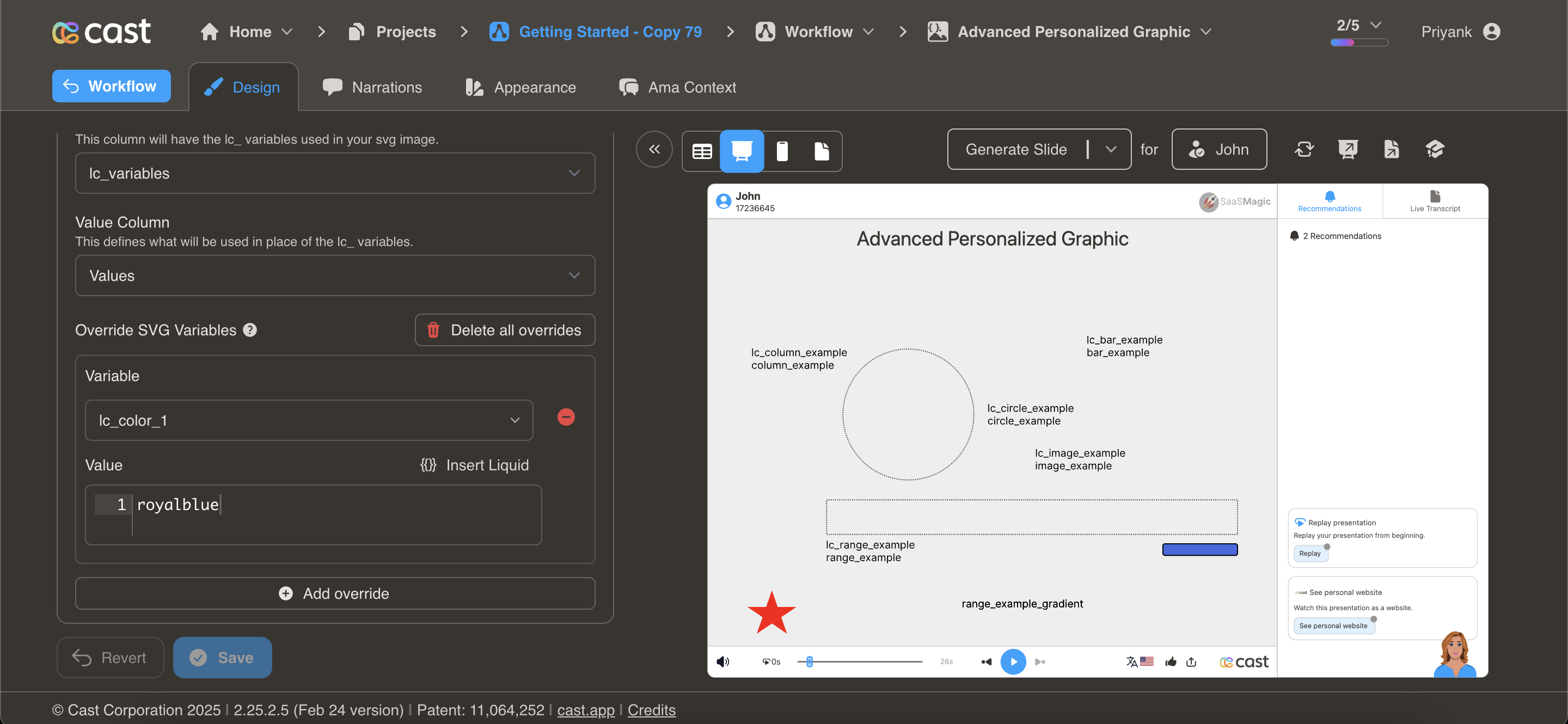
Element Setup
Section titled “Element Setup”Target Element:
- Element type: Any SVG element (
<rect>,<circle>,<path>,<polygon>, etc.) - ID format:
lc_color_*(e.g.,lc_color_status,lc_color_indicator)
Input Format
Section titled “Input Format”Hex Color Codes:
"#2196F3"CSS Color Names:
"royalblue""green""orange"RGB Values:
"rgb(33, 150, 243)"Usage Example
Section titled “Usage Example”{% raw %}
<!-- In your SVG --><rect id="lc_color_status" width="100" height="100" fill="#ccc" /><circle id="lc_color_indicator" cx="50" cy="50" r="20" fill="#000" />
<!-- In your dataset -->{{ status }} = "#4CAF50"  <!-- Green for success -->{{ indicator }} = "red"    <!-- Red for alert -->
{% endraw %}
Result: Elements dynamically change to specified colors
Common Use Cases
Section titled “Common Use Cases”Status Indicators: {% raw %}
<!-- Conditional color based on status -->
  {{ indicator-color }} = "#4CAF50"  <!-- Green -->{% elsif health_score >= 60 %}  {{ indicator-color }} = "#FFC107"  <!-- Yellow -->{% else %}  {{ indicator-color }} = "#F44336"  <!-- Red -->
{% endraw %}
Performance Colors:
Revenue vs Target:- Above target: "green"- At target: "blue"- Below target: "red"Priority Levels:
- High: "#F44336" (red)- Medium: "#FF9800" (orange)- Low: "#4CAF50" (green)Sentiment Analysis:
- Positive: "#4CAF50" (green)- Neutral: "#2196F3" (blue)- Negative: "#F44336" (red)Heatmaps
Section titled “Heatmaps”
lc_heatmap_*
Section titled “lc_heatmap_*”Visualize data intensity through color opacity. Perfect for showing performance metrics, engagement levels, or data density.
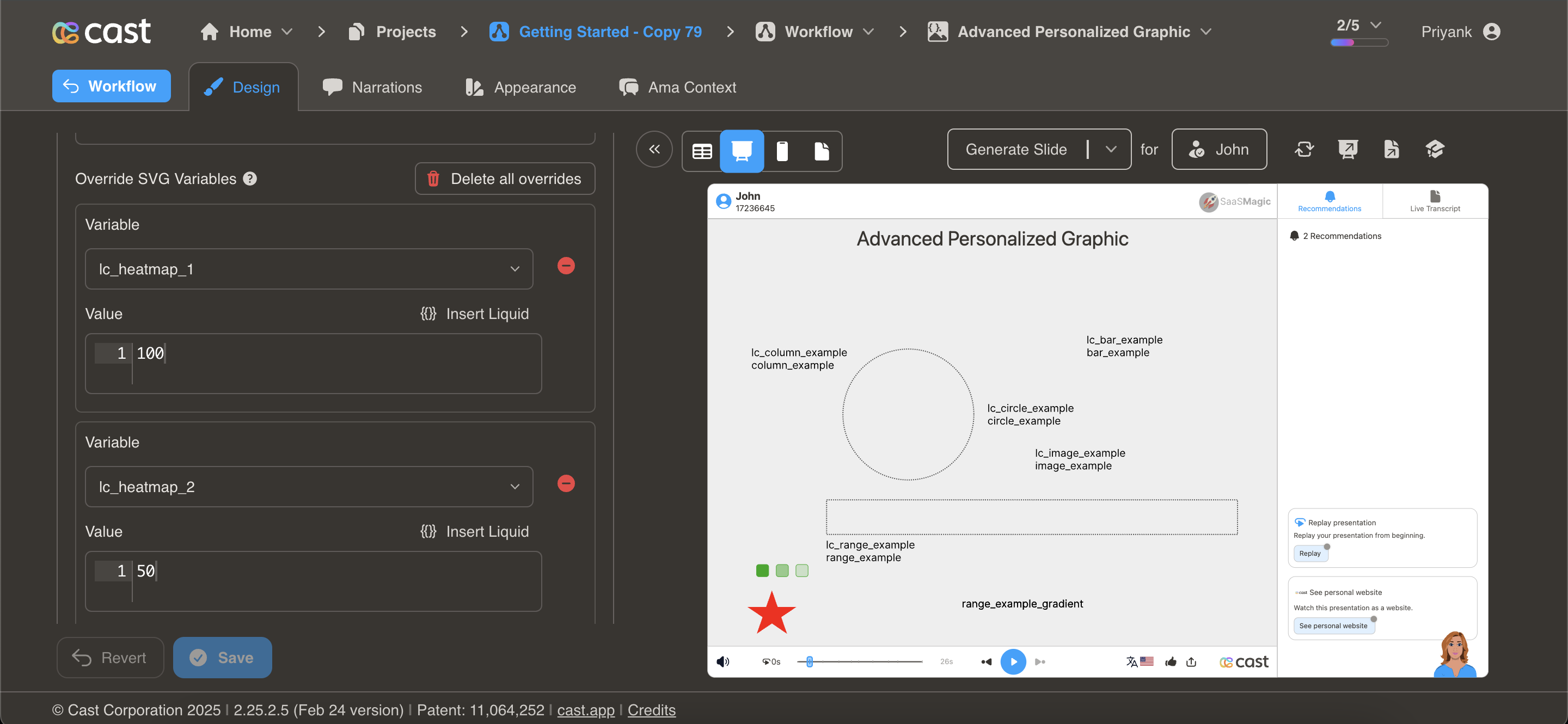
Element Setup
Section titled “Element Setup”Target Element:
- Element type: Any SVG element
- ID format:
lc_heatmap_*(e.g.,lc_heatmap_engagement,lc_heatmap_score) - Required attribute:
dataFill(defines base color)
Required Attribute
Section titled “Required Attribute”The element must have a dataFill attribute specifying the base color:
<rect id="lc_heatmap_q1" dataFill="#2196F3" />The system uses this color and adjusts opacity based on the provided value.
Input Format
Section titled “Input Format”Percentage Value (0-100):
"75"- 0 = Completely transparent (0% opacity)
- 50 = Semi-transparent (50% opacity)
- 100 = Fully opaque (100% opacity)
- Values > 100 are treated as 100
Usage Example
Section titled “Usage Example”{% raw %}
<!-- In your SVG --><rect id="lc_heatmap_q1" dataFill="#2196F3" width="50" height="50" /><rect id="lc_heatmap_q2" dataFill="#2196F3" width="50" height="50" /><rect id="lc_heatmap_q3" dataFill="#2196F3" width="50" height="50" /><rect id="lc_heatmap_q4" dataFill="#2196F3" width="50" height="50" />
<!-- In your dataset -->{{ q1 }} = "45"   <!-- 45% opacity -->{{ q2 }} = "70"   <!-- 70% opacity -->{{ q3 }} = "90"   <!-- 90% opacity -->{{ q4 }} = "100"  <!-- 100% opacity -->
{% endraw %}
Result: Four squares with same color but varying intensity based on values
Common Use Cases
Section titled “Common Use Cases”Engagement Heatmap:
Content pieces with engagement scores:- Article A: 25 (light)- Article B: 65 (medium)- Article C: 95 (dark/intense)Performance Matrix:
Regional performance scores:- West: 85% opacity (high performance)- East: 60% opacity (medium)- South: 40% opacity (lower)- North: 90% opacity (highest)Activity Tracking:
User activity by day of week:- Monday: 45- Tuesday: 70- Wednesday: 85- Thursday: 90- Friday: 60Conversion Rates:
Landing page conversion intensity:- Page 1: 30% → light blue- Page 2: 75% → medium blue- Page 3: 95% → dark blueDesign Tips
Section titled “Design Tips”- Choose appropriate base colors - Use colors that remain visible at low opacity
- Provide a legend - Show what intensity levels mean
- Use consistent scales - Keep value ranges consistent across related heatmaps
- Consider contrast - Ensure minimum opacity is still visible
- Group related data - Use same base color for related metrics
Ken Burns Animation
Section titled “Ken Burns Animation”
lc_kenburns_*
Section titled “lc_kenburns_*”Add cinematic zoom and pan effects to create visual interest and draw attention to key elements.
Element Setup
Section titled “Element Setup”Target Element:
- Element type: Any SVG element
- ID format:
lc_kenburns_*(e.g.,lc_kenburns_hero,lc_kenburns_feature)
Input Format
Section titled “Input Format”JSON Configuration:
{ "duration": 4, "startScale": 0.8, "endScale": 1.0, "ease": "power2.out"}Configuration Properties
Section titled “Configuration Properties”duration (optional)
- Animation duration in seconds
- Range: 1-10 seconds
- Default: 4 seconds
- Example:
"duration": 6
startScale (optional)
- Initial scale factor at animation start
- Range: 0-2 (where 1.0 = 100%)
- Default: 0.8 (80% of original size)
- Example:
"startScale": 0.7
endScale (optional)
- Final scale factor at animation end
- Range: 0-2 (where 1.0 = 100%)
- Default: 1.0 (100% of original size)
- Example:
"endScale": 1.2
ease (optional)
- GSAP easing function name
- Default:
"power2.out" - Common options:
"power1.inOut"- Gradual start and end"power2.out"- Slow end"power3.in"- Slow start"elastic.out"- Bouncy effect"back.out"- Slight overshoot
Animation Trigger
Section titled “Animation Trigger”Important: Animation starts when the element transitions from dimmed/hidden to visible state during narration playback.
Usage Example
Section titled “Usage Example”{% raw %}
<!-- In your SVG --><image id="lc_kenburns_hero" href="hero-image.jpg" width="1080" height="810" />
<!-- In your dataset -->{{ hero }} = '{"duration": 5, "startScale": 0.8, "endScale": 1.1, "ease": "power2.out"}'
{% endraw %}
Result: Image gradually zooms from 80% to 110% over 5 seconds with smooth easing
Common Use Cases
Section titled “Common Use Cases”Subtle Hero Animation:
{ "duration": 6, "startScale": 0.95, "endScale": 1.0, "ease": "power1.inOut"}Gentle zoom for professional presentations
Dramatic Zoom:
{ "duration": 4, "startScale": 0.7, "endScale": 1.2, "ease": "power3.out"}Strong emphasis effect for key visuals
Quick Attention Grab:
{ "duration": 2, "startScale": 0.85, "endScale": 1.0, "ease": "back.out"}Fast zoom with slight bounce
Slow Cinematic:
{ "duration": 8, "startScale": 0.9, "endScale": 1.05, "ease": "power2.out"}Slow, documentary-style movement
Design Tips
Section titled “Design Tips”- Keep it subtle - Overly dramatic animations can be distracting
- Match content tone - Use gentle animations for professional content
- Consider duration - Longer narrations allow slower animations
- Test visibility - Ensure startScale doesn’t crop important content
- Use sparingly - Not every element needs animation
- Coordinate with narration - Time animations to match voice-over timing
Troubleshooting
Section titled “Troubleshooting”| Issue | Solution |
|---|---|
| Animation too fast | Increase duration value |
| Animation too slow | Decrease duration value |
| Crops content | Increase startScale (use values closer to 1.0) |
| Too dramatic | Reduce difference between startScale and endScale |
| Doesn’t animate | Ensure element transitions from hidden/dimmed to visible |
| Wrong easing | Try different ease values (power2.out, power1.inOut, etc.) |
Combining Effects
Section titled “Combining Effects”You can combine multiple styling effects for powerful visual impact:
Example: Conditional Color + Heatmap
Section titled “Example: Conditional Color + Heatmap”{% raw %}
<!-- Color changes based on threshold, opacity shows intensity -->
<!-- In SVG --><rect id="lc_color_region" dataFill="#2196F3" width="100" height="100" /><rect id="lc_heatmap_intensity" dataFill="#2196F3" width="100" height="100" />
<!-- In dataset -->
  {{ region }} = "#4CAF50"  <!-- Green for high -->{% else %}  {{ region }} = "#F44336"  <!-- Red for low -->

{{ intensity }} = "{{ score }}"  <!-- Opacity matches score -->
{% endraw %}
Example: Ken Burns + Dynamic Color
Section titled “Example: Ken Burns + Dynamic Color”{% raw %}
<!-- Animated background with conditional color -->
<!-- In SVG --><rect id="lc_kenburns_background" width="1080" height="810" /><rect id="lc_color_background" width="1080" height="810" />
<!-- In dataset -->{{ background }} = '{"duration": 6, "startScale": 0.9, "endScale": 1.0}'{{ background-color }} = "#2196F3"  <!-- Dynamic color -->
{% endraw %}
Best Practices
Section titled “Best Practices”Color Strategy
Section titled “Color Strategy”-
Semantic colors - Use colors that convey meaning
- Green: Success, positive, complete
- Red: Error, negative, alert
- Yellow/Orange: Warning, caution
- Blue: Information, neutral
- Gray: Inactive, disabled
-
Accessibility - Ensure sufficient contrast
-
Consistency - Use same colors for same meanings across slides
-
Brand alignment - Incorporate brand colors where appropriate
Animation Guidelines
Section titled “Animation Guidelines”- Subtlety wins - Less is more with animations
- Performance - Limit simultaneous animations
- Purpose - Every animation should serve a purpose
- Timing - Coordinate with narration and music
- Testing - Preview on target devices
Related Features
Section titled “Related Features”- Progress Charts - Use with bar/column colors
- Distribution Charts - Color donut segments
- Content Display - Animate images and media