Widgets
A widgets slide shows various performance indicators, metrics and charts based on the dataset.
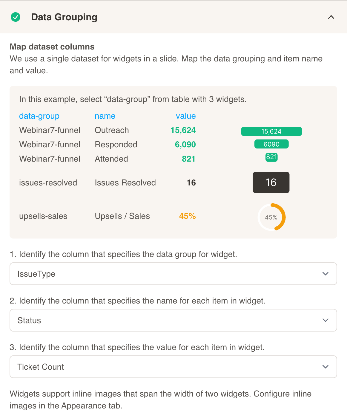
Here is a sample dataset that we can use to create multiple widgets. Having multiple groups (values within IssueType) allows us to do this.
| Status | IssueType | TicketCount | AccountID |
|---|---|---|---|
| Resolved | Tickets By Month | 270 | 17236645 |
| Resolved | Tickets By Month | 350 | 17236645 |
| Resolved | Tickets By Month | 483 | 17236645 |
| Resolved | Tickets By Month | 350 | 17236645 |
| Resolved | Tickets By Month | 250 | 17236645 |
| Resolved | Tickets By Month | 500 | 17236645 |
| Resolved | Tickets By Month | 650 | 17236645 |
| Resolved | CMS | 719 | 17236645 |
| Resolved | Tickets By Month | 480 | 17236645 |
| Resolved | DNS | 452 | 17236645 |
| Open | Tickets By Month | 650 | 17236645 |
| Open | DNS | 360 | 17236645 |
| Open | CMS | 357 | 17236645 |
| Resolved | Network | 311 | 17236645 |
| Not Resolved | DNS | 288 | 17236645 |
| Not Resolved | Tickets By Month | 589 | 17236645 |
Download Sample Data - Widgets
After selecting your dataset, configure Data Grouping for your widgets slide:
- First, choose a column that specifies the data group for the widgets. For the above dataset, we will select IssueType (there are several data groups - Tickets By Month, CMS, DNS, Network, WINS configuration, etc.).
- Next, choose a column that specifies the name for each item in the widget. For the above dataset, we will select Status. These names may appear as labels for the values in the widget.
- Then, choose a column that specifies the value for each item in the widget. For the above dataset, we will select Ticket Count.
- Select a widget type from the dropdown menu.
- Select a group identifier to base the widget on.
Optionally, you can customize your widget further. Choose a title, add formatting and color code your widget based on value.
Widgets of following types are supported:
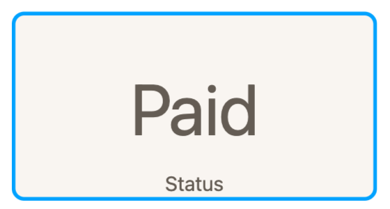
Label
The Label widget is used to display text values in the slide.
Here is an example of the data used:
| Group | Type | Value | AccountID |
|---|---|---|---|
| Status | July Payment Status | Paid | 17236645 |
Select Status as the Group Identifier. Press the save button to preview the new widget:
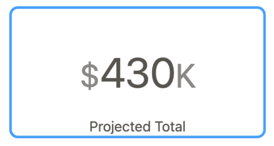
Number
The Number widget is used to display numeric values in the slide.
Here is an example of the data used:
| Group | Type | Value | AccountID |
|---|---|---|---|
| Projected Total | Projected Total | 430 | 17236645 |
Select Projected Total as the Group Identifier. Press the save button to preview the new widget:
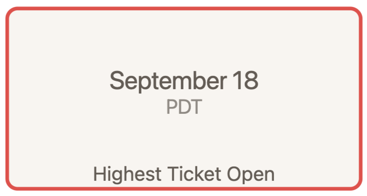
Date Time
The Date Time widget is used to display a date as a value in the slide.
Here is an example of the data used.
| Group | Type | Value | AccountID |
|---|---|---|---|
| Highest Ticket Open | Open | 09/18/2022 | 17236645 |
Select Highest Ticket Open as the Group Identifier. Press the save button to preview the new widget:
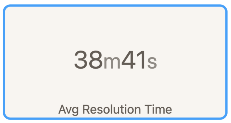
Time Range
The Time Range widget is used to display a formatted length of time as a value in the slide.
Here is an example of the data used. The value is calculated as seconds.
| Group | Type | Value | AccountID |
|---|---|---|---|
| Avg Resolution Time | Ressolved | 2321 | 17236645 |
Select Avg Resolution Time as the Group Identifier. Press the save button to preview the new widget:
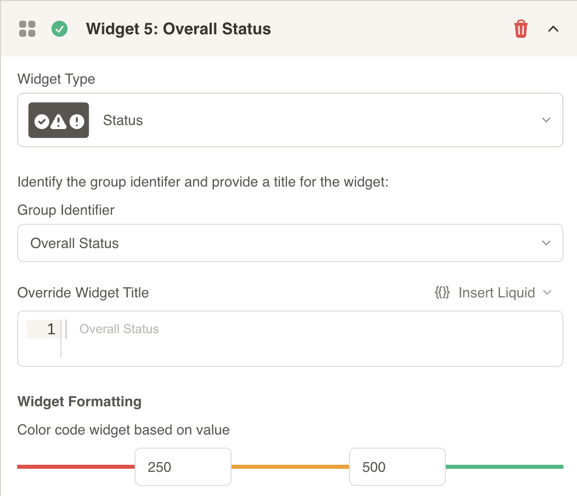
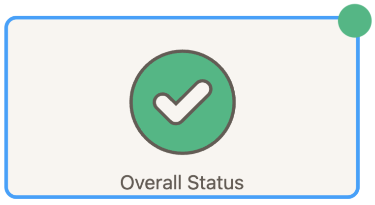
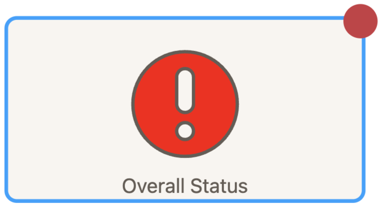
Status
The Status widget is used to display a status icon based on the value in the slide.
Here is an example of the data used. The value is calculated as seconds.
| Status | IssueType | TicketCount | AccountID |
|---|---|---|---|
| Resolved | Overall Status | 417 | 17236645 |
Select Overall Status as the Group Identifier. Press the save button to preview the new widget:
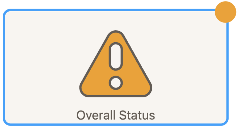
Since the value of 417 falls within the middle color code range (200-500), the yellow warning icon is displayed. You can adjust this range under Widget Formatting.
If the value was higher or lower, the green checkmark or the red warning icon would be displayed.
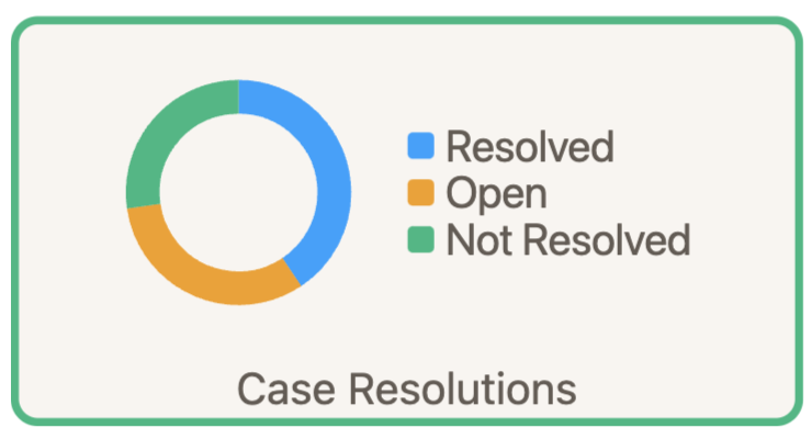
Doughnut
The Doughnut widget is used to display multiple values together as a Doughnut or a hollow pie chart.
Here is an example of the data used.
| Status | IssueType | TicketCount | AccountID |
|---|---|---|---|
| Resolved | Case Resolutions | 311 | 17236645 |
| Open | Case Resolutions | 246 | 17236645 |
| Not Resolved | Case Resolutions | 209 | 17236645 |
Select Case Resolutions as the Group Identifier. Press the save button to preview the new widget:
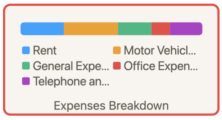
Piebar
The Piebar widget is used to display different values as part of a total, similar to a pie chart. It shows even the smallest slivers of data.
Here is an example of the data used.
| Group | Type | Value | AccountID |
|---|---|---|---|
| Expenses Breakdown | Rent | 4000 | 17236645 |
| Expenses Breakdown | Motor Vehicle Expenses | 5000 | 17236645 |
| Expenses Breakdown | General Expenses | 3100 | 17236645 |
| Expenses Breakdown | Office Expenses | 1700 | 17236645 |
| Expenses Breakdown | Telephone and Internet | 3000 | 17236645 |
Select Expenses Breakdown as the Group Identifier. Press the save button to preview the new widget:
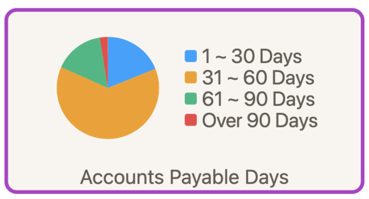
Pie
The Pie widget is used to display multiple values together as a pie chart.
Here is an example of the data used.
| Group | Type | Value | AccountID |
|---|---|---|---|
| Accounts Payable Days | 1 ~ 30 Days | 1200 | 17236645 |
| Accounts Payable Days | 31 ~ 60 Days | 4000 | 17236645 |
| Accounts Payable Days | 61 ~ 90 Days | 1000 | 17236645 |
| Accounts Payable Days | Over 90 Days | 163 | 17236645 |
Select Accounts Payable Days as the Group Identifier. Press the save button to preview the new widget:
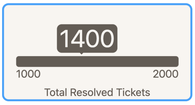
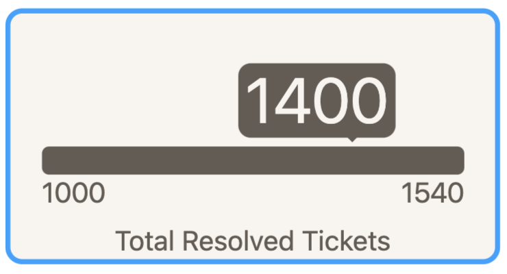
Progress
The Progress widget is used to display the progress made towards a goal, between a starting value and ending value.
Here is an example of the data used. The first value will be the minimum, the second value will be the value tracked, and the third value will be the maximum. Only the first three values from the dataset will be used if there are more than three.
| Group | Type | Value | AccountID |
|---|---|---|---|
| Total Resolved Tickets | Start of Quarter | 1000 | 17236645 |
| Total Resolved Tickets | Current | 1400 | 17236645 |
| Total Resolved Tickets | Goal | 2000 | 17236645 |
Select Total Resolved Tickets as the Group Identifier. Press the save button to preview the new widget:
Note: If there are two values, then 10% less or more will be calculated from the second value. In the example below, the second value for current is less than first value for Start of Quarter, so the maximum will be 1400 + 10% = 1540.
| Group | Type | Value | AccountID |
|---|---|---|---|
| Total Resolved Tickets | Start of Quarter | 1000 | 17236645 |
| Total Resolved Tickets | Current | 1400 | 17236645 |
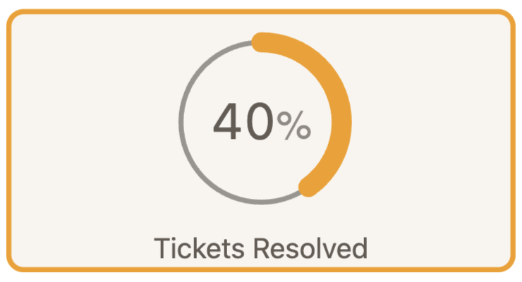
Percent
The Percent widget is used to display a percentage based on the values in the slide.
Here is an example of the data used. If more than one value is present, the last value will be used.
| Group | Type | Value | AccountID |
|---|---|---|---|
| Tickets Resolved | Resolved | .43 | 17236645 |
| Tickets Resolved | Resolved | .4 | 17236645 |
Select Tickets Resolved as the Group Identifier. Press the save button to preview the new widget:
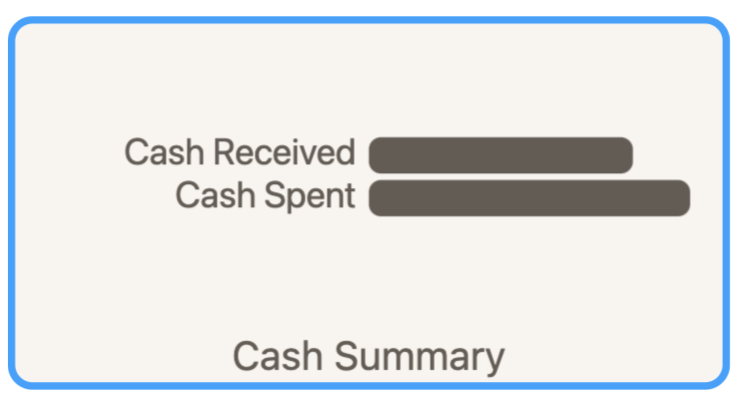
Bars
The Bars widget is used to compare multiple values in the slide.
Here is an example of the data used.
| Group | Type | Value | AccountID |
|---|---|---|---|
| Cash Summary | Cash Received | 1627 | 17236645 |
| Cash Summary | Cash Spent | 1980 | 17236645 |
Select Cash Summary as the Group Identifier. Press the save button to preview the new widget:
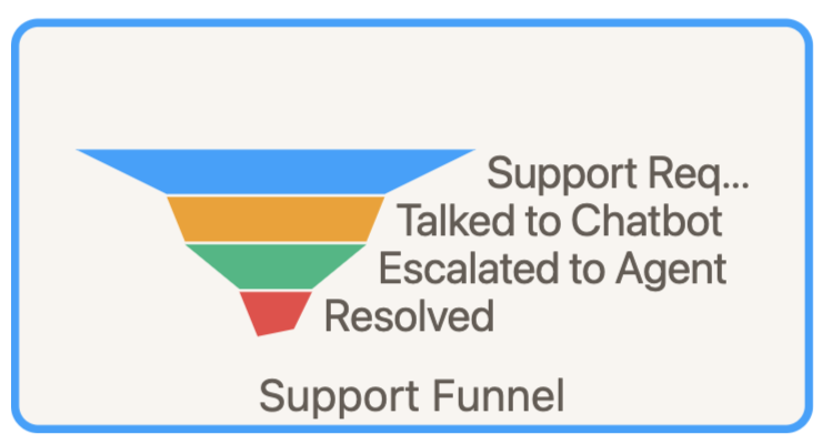
Funnel and Towers of Hanoi
The Funnel widget, or Towers of Hanoi widget, is used to display values across process stages.
Here is an example of the data used for a Funnel widget. The data must be arranged in descending value.
| Status | IssueType | TicketCount | AccountID |
|---|---|---|---|
| Support Request | Support Funnel | 550 | 17236645 |
| Talked to Chatbot | Support Funnel | 350 | 17236645 |
| Escalated to Agent | Support Funnel | 250 | 17236645 |
| Resolved | Support Funnel | 100 | 17236645 |
Select Support Funnel as the Group Identifier. Press the save button to preview the new widget:
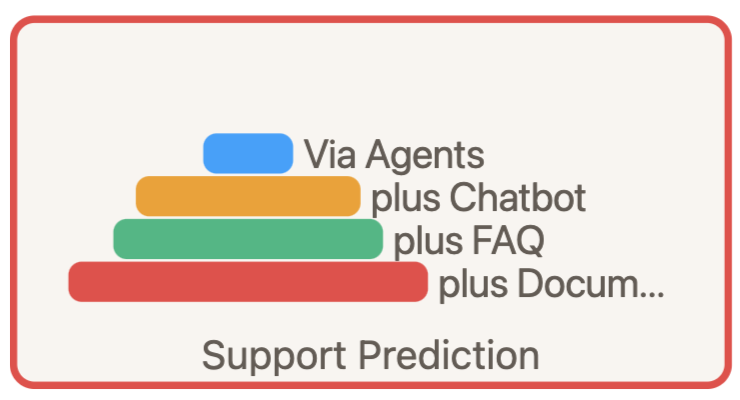
Here is an example of the data used for a Towers of Hanoi widget. The data must be arranged in ascending value.
| Status | IssueType | TicketCount | AccountID |
|---|---|---|---|
| Via Agents | Support Prediction | 100 | 17236645 |
| plus Chatbot | Support Prediction | 250 | 17236645 |
| plus FAQ | Support Prediction | 300 | 17236645 |
| plus Documentation | Support Prediction | 400 | 17236645 |
Select Support Prediction as the Group Identifier. Press the save button to preview the new widget:
Sparkline
The Sparkline widget is used to display a change in values over time as a spark line.
Here is an example of the data used.
| Status | IssueType | TicketCount | AccountID |
|---|---|---|---|
| Resolved | Tickets By Month | 270 | 17236645 |
| Resolved | Tickets By Month | 350 | 17236645 |
| Resolved | Tickets By Month | 483 | 17236645 |
| Resolved | Tickets By Month | 350 | 17236645 |
| Resolved | Tickets By Month | 250 | 17236645 |
| Resolved | Tickets By Month | 500 | 17236645 |
| Resolved | Tickets By Month | 650 | 17236645 |
Select Tickets By Month as the Group Identifier. Press the save button to preview the new widget:

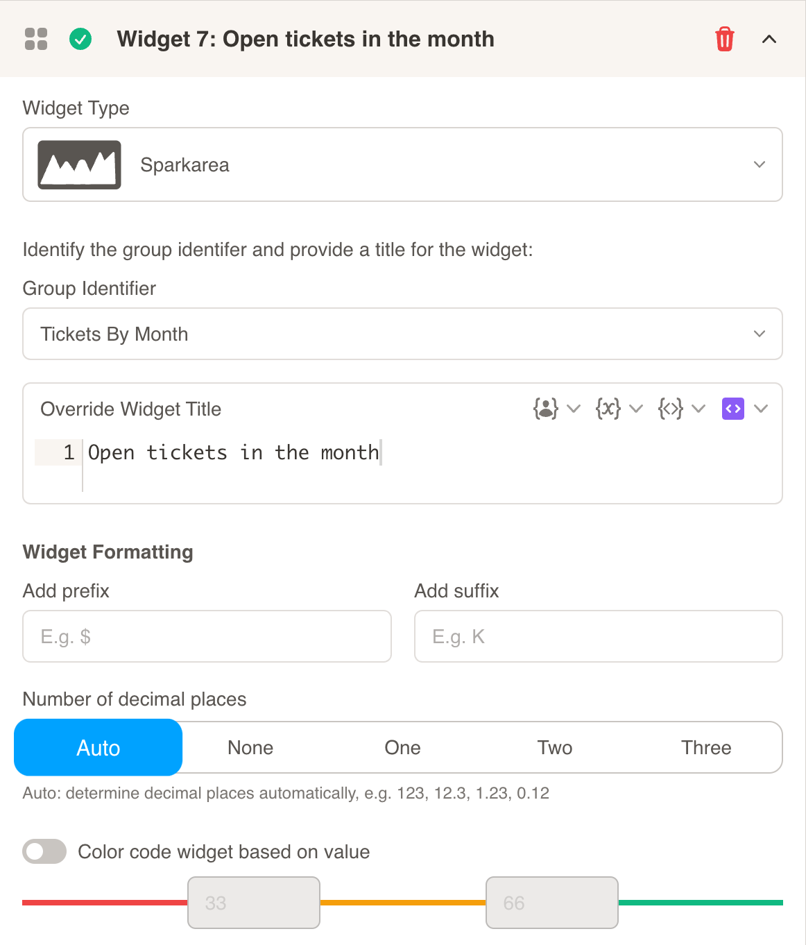
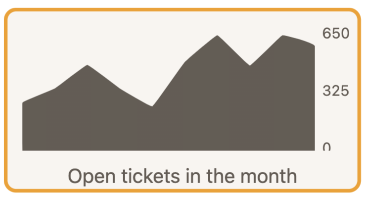
Sparkarea
The Sparkarea widget, like the sparkline widget, is used to display a change in values over time as a spark area.
Here is an example of the data used.
| Status | IssueType | TicketCount | AccountID |
|---|---|---|---|
| Resolved | Tickets By Month | 270 | 17236645 |
| Resolved | Tickets By Month | 350 | 17236645 |
| Resolved | Tickets By Month | 483 | 17236645 |
| Resolved | Tickets By Month | 350 | 17236645 |
| Resolved | Tickets By Month | 250 | 17236645 |
| Resolved | Tickets By Month | 500 | 17236645 |
| Resolved | Tickets By Month | 650 | 17236645 |
Select Tickets By Month as the Group Identifier. Press the save button to preview the new widget:
Sparkbar
The Sparkbar widget, like the sparkline widget, is used to display a change in values over time as a spark bar.
It is also is used to compare multiple values in the slide. The bars are displayed vertically.
Here is an example of the data used.
| Group | Type | Value | AccountID |
|---|---|---|---|
| Invoices by Status | Active | 34 | 17236645 |
| Invoices by Status | Void | 9 | 17236645 |
| Invoices by Status | Paid | 21 | 17236645 |
| Invoices by Status | Not Paid | 12 | 17236645 |
Select Invoices by Status as the Group Identifier. Press the save button to preview the new widget:

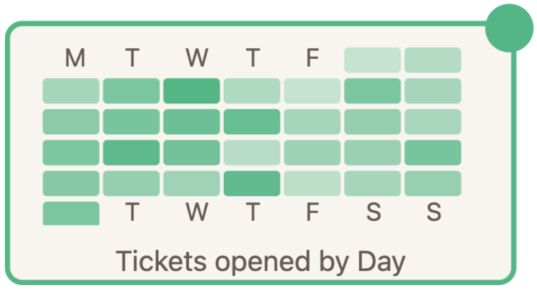
Days of Month
The Days of Month widget is used to display a calendar heatmap.
Here is an example of the data used.
| Status | IssueType | TicketCount | AccountID |
|---|---|---|---|
| 1/1/22 | Tickets By Day | 22 | 17236645 |
| 1/2/22 | Tickets By Day | 37 | 17236645 |
| 1/3/22 | Tickets By Day | 45 | 17236645 |
| 1/4/22 | Tickets By Day | 67 | 17236645 |
| 1/5/22 | Tickets By Day | 88 | 17236645 |
| 1/6/22 | Tickets By Day | 39 | 17236645 |
| 1/7/22 | Tickets By Day | 25 | 17236645 |
| 1/8/22 | Tickets By Day | 67 | 17236645 |
| 1/9/22 | Tickets By Day | 22 | 17236645 |
| 1/10/22 | Tickets By Day | 59 | 17236645 |
| 1/11/22 | Tickets By Day | 69 | 17236645 |
| 1/12/22 | Tickets By Day | 75 | 17236645 |
| 1/13/22 | Tickets By Day | 78 | 17236645 |
| 1/14/22 | Tickets By Day | 45 | 17236645 |
| 1/15/22 | Tickets By Day | 53 | 17236645 |
| 1/16/22 | Tickets By Day | 42 | 17236645 |
| 1/17/22 | Tickets By Day | 66 | 17236645 |
| 1/18/22 | Tickets By Day | 83 | 17236645 |
| 1/19/22 | Tickets By Day | 72 | 17236645 |
| 1/20/22 | Tickets By Day | 35 | 17236645 |
| 1/21/22 | Tickets By Day | 49 | 17236645 |
| 1/22/22 | Tickets By Day | 51 | 17236645 |
| 1/23/22 | Tickets By Day | 69 | 17236645 |
| 1/24/22 | Tickets By Day | 61 | 17236645 |
| 1/25/22 | Tickets By Day | 53 | 17236645 |
| 1/26/22 | Tickets By Day | 48 | 17236645 |
| 1/27/22 | Tickets By Day | 81 | 17236645 |
| 1/28/22 | Tickets By Day | 32 | 17236645 |
| 1/29/22 | Tickets By Day | 44 | 17236645 |
| 1/30/22 | Tickets By Day | 52 | 17236645 |
| 1/31/22 | Tickets By Day | 67 | 17236645 |
Select Tickets By Day as the Group Identifier. Press the save button to preview the new widget:
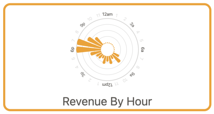
Hours of Day
The Hours of Day widget is used to display a circular bar chart with hours represented by a bar.
Here is an example of the data used.
| Value | IssueType | Amount | AccountID |
|---|---|---|---|
| 2022-01-08T08:00:00 | Revenue By Hour | 1450 | 17236645 |
| 2022-01-08T09:00:00 | Revenue By Hour | 2400 | 17236645 |
| 2022-01-08T10:00:00 | Revenue By Hour | 900 | 17236645 |
| 2022-01-08T11:00:00 | Revenue By Hour | 1800 | 17236645 |
| 2022-01-08T12:00:00 | Revenue By Hour | 1200 | 17236645 |
| 2022-01-08T13:00:00 | Revenue By Hour | 1770 | 17236645 |
| 2022-01-08T14:00:00 | Revenue By Hour | 750 | 17236645 |
| 2022-01-08T15:00:00 | Revenue By Hour | 1200 | 17236645 |
| 2022-01-08T16:00:00 | Revenue By Hour | 1350 | 17236645 |
| 2022-01-08T17:00:00 | Revenue By Hour | 2400 | 17236645 |
| 2022-01-08T18:00:00 | Revenue By Hour | 5400 | 17236645 |
| 2022-01-08T19:00:00 | Revenue By Hour | 5400 | 17236645 |
| 2022-01-08T20:00:00 | Revenue By Hour | 3500 | 17236645 |
| 2022-01-08T21:00:00 | Revenue By Hour | 2250 | 17236645 |
Select Revenue By Hour as the Group Identifier. Press the save button to preview the new widget:
Days of Week
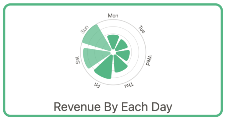
The Days of Week widget is used to display a circular bar chart with days represented by a bar.
Here is an example of the data used.
| Value | IssueType | Amount | AccountID |
|---|---|---|---|
| 2022-12-13T00:00:00 | Revenue By Each Day | 6302 | 17236645 |
| 2022-12-14T00:00:00 | Revenue By Each Day | 6781 | 17236645 |
| 2022-12-15T00:00:00 | Revenue By Each Day | 8897 | 17236645 |
| 2022-12-16T00:00:00 | Revenue By Each Day | 12276 | 17236645 |
| 2022-12-17T00:00:00 | Revenue By Each Day | 13832 | 17236645 |
| 2022-12-18T00:00:00 | Revenue By Each Day | 15335 | 17236645 |
| 2022-12-19T00:00:00 | Revenue By Each Day | 7287 | 17236645 |
Select Revenue By Each Day as the Group Identifier. Press the save button to preview the new widget: