Table of Contents
- Introduction
- SVG Backgrounds
- Vector Graphics - Exporting Personalized SVGs from Figma
- Vector Motion Graphics - Exporting Personalized SVGs
- Dynamic Width and Position Adjustments
- Dynamic Percentage Adjustments
- Dynamic Width Adjustments
- Dynamic Height Adjustments
- Dynamic Image Display
- Dynamic Heatmap Customization
- Dynamic Color Customization
- Dynamic Scrolling Text
- Dynamic Faded Text
- Dynamic Video Integration
- Dynamic Ring Chart Visualization
- Dynamic Ken Burns Animation
- Dynamic Time Range Display
- Dynamic Spark Chart Visualization
- Time-Based Visualization
 Infographic
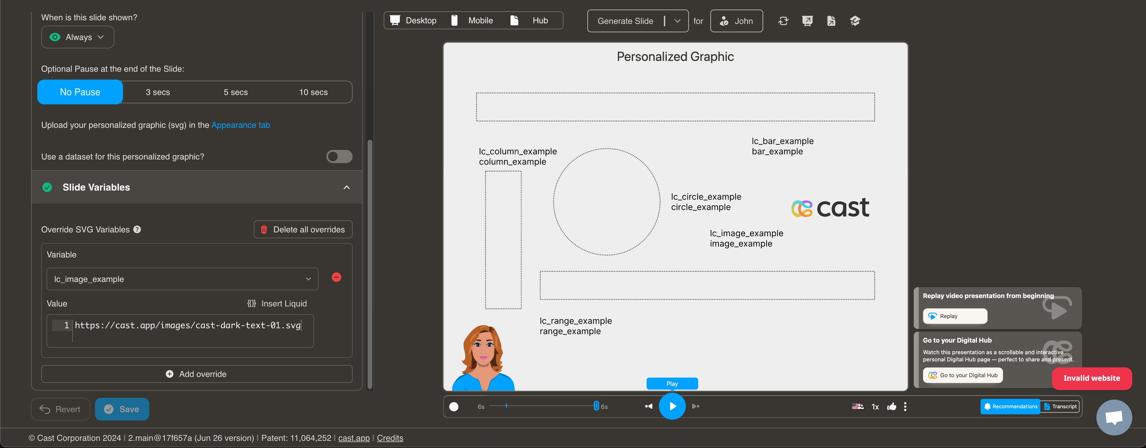
A Infographic slide lets you personalize the background with user or account specific data. The slide is compatible with both static SVGs and animated SVGs with embedded CSS.
To use this slide, you must create an SVG background image with certain variables.
SVG Backgrounds
You can use static or animated SVGs with embedded CSS as background.
For desktop SVGs, we have standardized on 1080 x 810, but the aspect ratio of 4:3 is what matters most.
For mobile, we chose 440 x 836; again, the aspect ratio (1: 1.9) matters for vector graphics.
Cast.app also supports Personalized SVGs. Personalized SVGs allow you to:
-
Personalize the contents of a variable in the SVG with svg element identifiers containing “lc_“.
E.g., abc-lc_csm-name and lc_csm-email would be replaced by contents of liquid variables named:
{{ csm-name }} and {{ csm-email }} <text id="abc-lc_csm-name">csmFirst csmLast</text> <text id="lc_csm-email">csm@email.com</text> -
Show, hide, or dim elements in the SVG with identifiers containing “lc_“ or “hid_“.
E.g., something-hid_nrr and abc-lc_csm-name could be displayed, hidden, or dimmed per narration.
<text id="abc-lc_csm-name">csmFirst csmLast</text>
<g id="something-hid_nrr"><path></path></g>
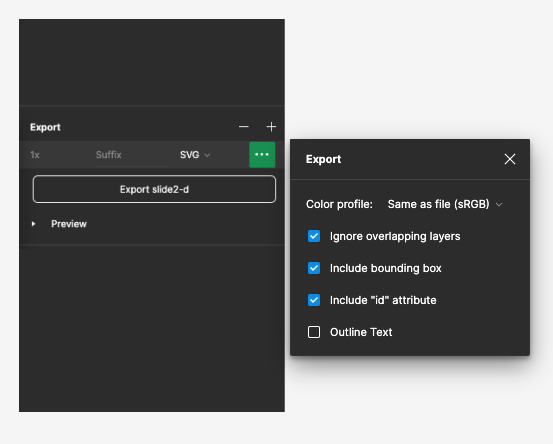
Vector Graphics - Exporting Personalized SVGs from Figma
To preserve SVG identifiers and text elements when exporting an SVG,
- Include bounding box should always be checked.
- Include “id” attribute must always be checked.
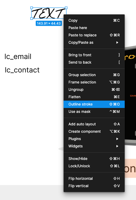
- Outline Text must be unchecked, especially if there are “lc_“ variables in your svg. However, if you have text elements with unique fonts you do not want to personalize, you can always right-click and select “Outline stroke” on the the variable and check Outline Text.
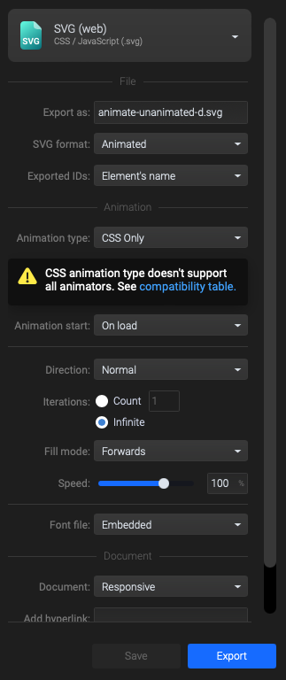
Vector Motion Graphics - Exporting Personalized SVGs from Figma, and animating them in SVGator
Create your base svg in Figma, then upload to Svgator and apply desired animations. When Exporting an animated SVG, make the following changes to preserve identifiers and text.
- Exported IDs: change to “Element’s name”
- Animation type: change to “CSS only”. We do not support javascript embedded animations because of security concerns.
- Set Direction to “Normal”, “Reverse”, or “Alternate”, etc.
- Set Iterations to “Infinite” or set a desired count
- Click on “Refresh preview” to view the configured animation
- Click “Save” after making changes to ensure your settings are preserved.
- Click “Export”
- Note: Svgator usually appends the file name to the id’s, before “hid_“ and “lc_“, so “lc_csm-name” will become “abc-lc_csm-name”. Cast will automatically detect ids with and without the prepended file name.
Dynamically Setting SVG Attributes with lc_xxx*
This documentation describes how to dynamically adjust the width/height of
Dynamic Width and Position Adjustments with lc_range_* and lc_range_bg_*
lc_range Prefix used for the IDs of
lcrange_bg* Creates a background track for range sliders with 30% opacity and Matches the color of the active range element
Identify the Element:
The target element must be a
Identify the target element as an <img> tag with an ID starting with lc_range_bg_*.
Input Format:
The input value should be a string in the format xPercentage,widthPercentage. Example: “10,40” xPercentage is 10% widthPercentage is 40%
Clamping Values:
- xPercentage will be clamped between 1% and 100%.
- widthPercentage will be clamped between 0% and (100% - xPercentage).
- Values above 100% will be reduced to 100%.
- Negative values will not be processed and will result in no changes.
Compatibility: Works with <rect> elements only
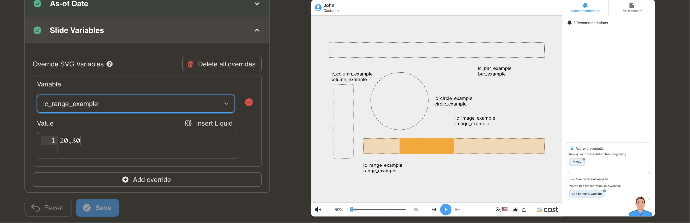
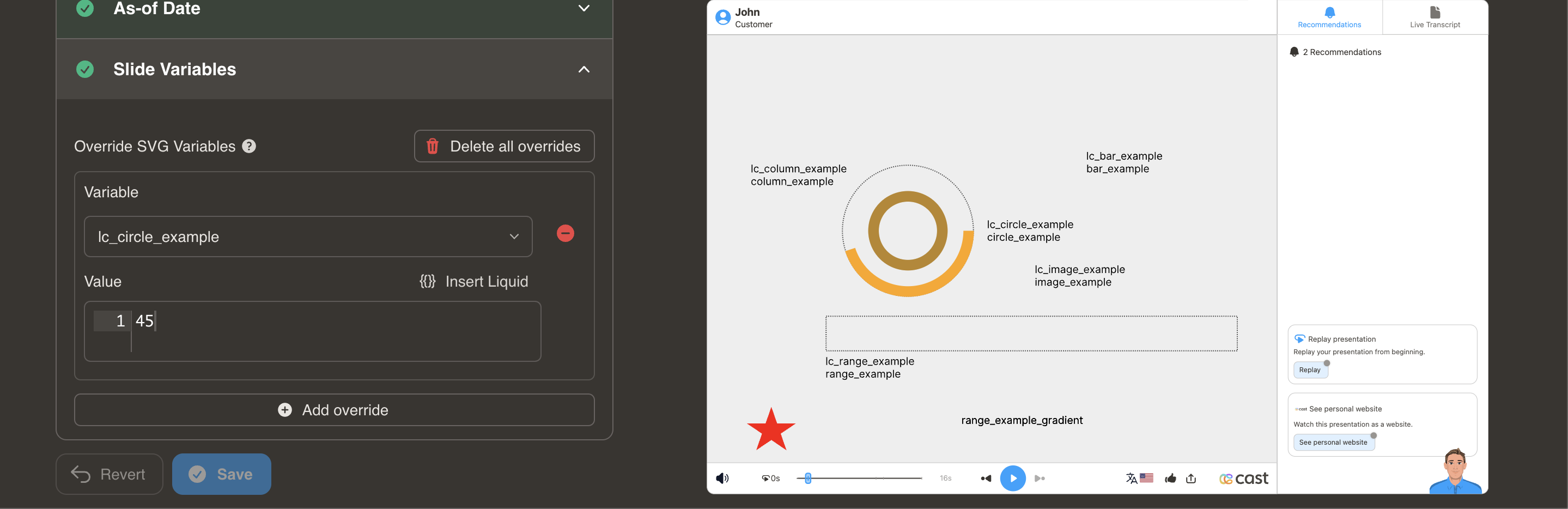
Dynamic Percentage Adjustments with lc_circle_* and lc_circle_bg_*
lc_circle Prefix used for the IDs of
lccircle_bg* Provides a semi-transparent circular background at 30% opacity and Uses the same color as the main circle segment
Identify the Element:
The target element must be a
Identify the target element as an <img> tag with an ID starting with lc_circle_bg_*.
Input Format:
The input value should specify the radius percentage. Example: “50” means the radius will be set to 50% of its original size.
Clamping Values:
- The radius percentage will be clamped between 1% and 100%.
- Values above 100% will be reduced to 100%.
- Negative values will not be processed and will result in no changes.
Compatibility: Works with <circle> elements only
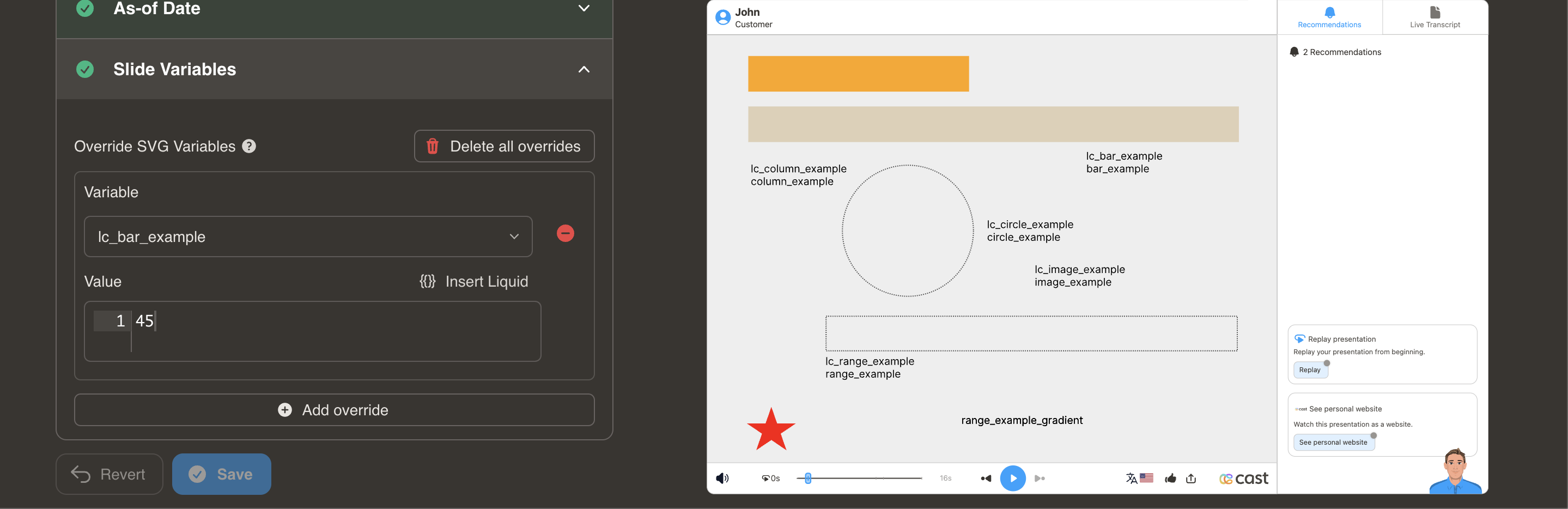
Dynamic Width Adjustments with lc_bar_* and lc_bar_bg_*
lc_bar is a prefix used for the IDs of
lcbar_bg* For Bar Chart Backgrounds Creates a semi-transparent background layer for bar charts with 30% opacity and Maintains the same color as the primary bar element
Identify the Element
The target element must be a
Identify the target element as an <img> tag with an ID starting with lc_bar_bg_*
Input Format
The input value should be a single percentage value representing the width of the bar. Example: “40” widthPercentage is 40%
Clamping Values
- widthPercentage will be clamped between 0% and 100%.
- Values above 100% will be reduced to 100%.
- Negative values will not be processed and will result in no changes.
Compatibility: Works with <rect> elements only
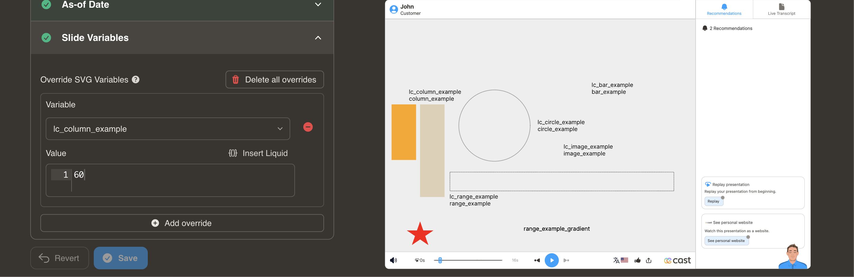
Dynamic Height Adjustments with lc_column_* and lc_column_bg_*
lc_column is a prefix used for the IDs of elements that need dynamic height adjustments.
lccolumn_bg* Provides a semi-transparent background for vertical column charts at 30% opacity and Uses the same color as the main column element
Identify the Element
The target element must be a <div> with an ID that starts with lccolumn_. Identify the target element as an <img> tag with an ID starting with lc*column_bg*_
Input Format
The input value should be a single percentage value representing the height of the column. Example: “60” heightPercentage is 60%
Clamping Values
heightPercentage will be clamped between 0% and 100%:
- Values above 100% will be reduced to 100%.
- Negative values will not be processed and will result in no changes.
Compatibility: Works with <rect> elements only
Dynamic Image Display with lc_image_*
lc_image is used to dynamically display uploaded images.
Element Identification Identify the target element as an tag with an ID starting with lc_image.
Input Requirements The input value can be a direct CDN URL to the image or a dataset containing the image URL.
Error Management If no image is uploaded or an unsupported file type is selected, display a user-friendly message such as “No Image”.
Compatibility: Works with <rect> elements only
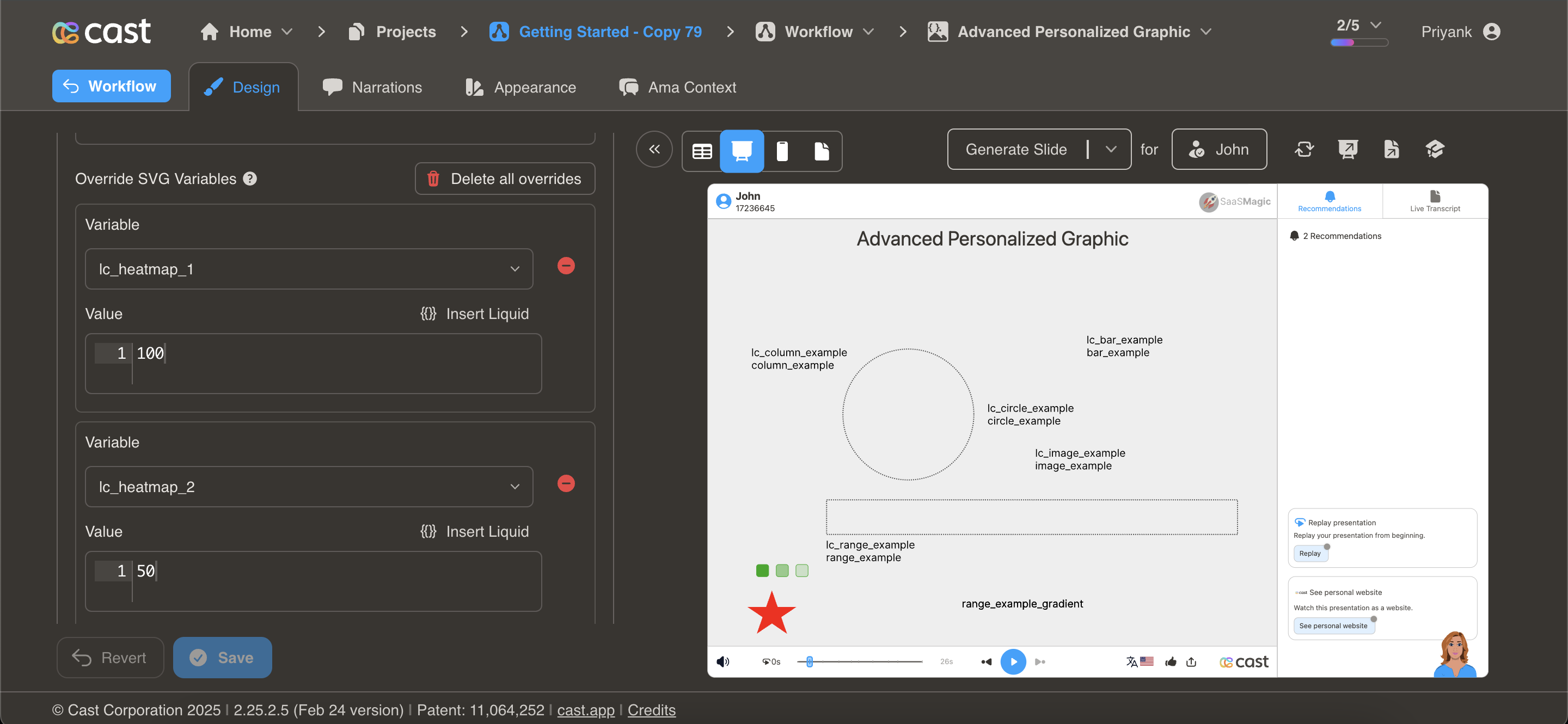
Dynamic Heatmap Customization with lc_heatmap_*
lc_heatmap is a prefix used for IDs of elements that need dynamic color intensity based on data values.
Heatmaps are ideal for visualizing:
- Performance metrics across different categories
- Engagement levels across different content pieces
- Comparison of values across time periods or regions
- Data density or concentration in specific areas
- Intensity of metrics like conversion rates, user activity, or satisfaction scores
Heatmaps make it easy to quickly identify high and low values in a dataset through color gradients.
Element Identification Identify the target element as an <img> tag with an ID starting with lc_heatmap_*
Required Attribute: The element should have a dataFill attribute. We take that attribute value which should be a color, then use the provided user value to determine the opacity of the color and add/replace the fill attribute of the same element.
Input Format:
The element accepts any value between 0 and 100. If a value greater than 100 is provided, it will be treated as 100 (full).
Compatibility: Works with any SVG element
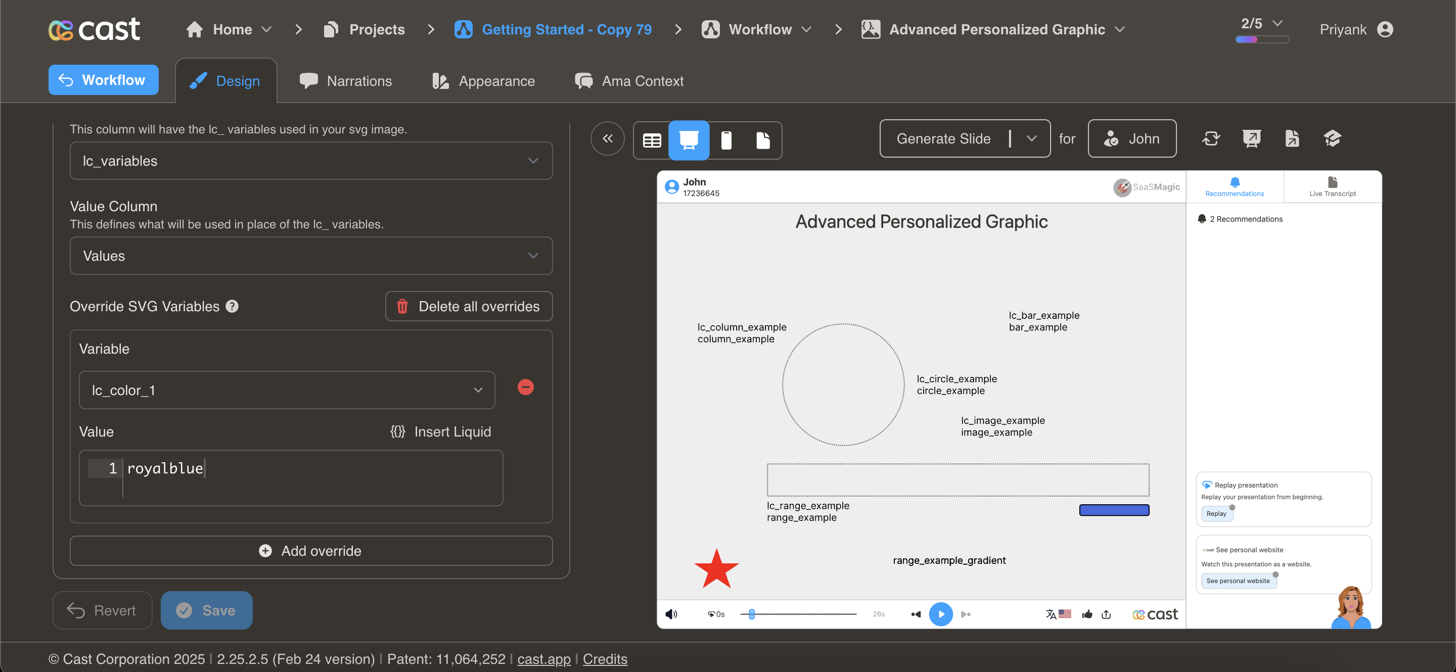
Dynamic Color Customization with lc_color_*
lc_color is a prefix used for IDs of elements that need dynamic color adjustments based on specific values or conditions.
- Status indicators (success, warning, error, neutral states)
- Data-driven color changes (profit/loss indicators, performance status)
- Highlight specific elements to draw attention
- Color-coding categories or segments in reports and dashboards
Element Identification
Identify the target element as an <img> tag with an ID starting with lc_color_*
Input Format:
The input value should be a valid color code in hex format or a named CSS color. Example: “#2196F3” or “royalblue”
Compatibility: Works with any SVG element
Dynamic Scrolling Text with lc_scrolltext_*
lc_scrolltext is a prefix used for IDs of text elements that need dynamic scrolling when content exceeds the container.
Identify the Element:
The target element must be a
Input Format:
The input value should be the text content to display.
Example:
“This is a long text that will automatically scroll if needed”
Implementation Notes:
Scrolling is automatically applied only when text length exceeds container dimensions If text fits within the container, it will display normally without scrolling
Compatibility: Works with <rect> elements only
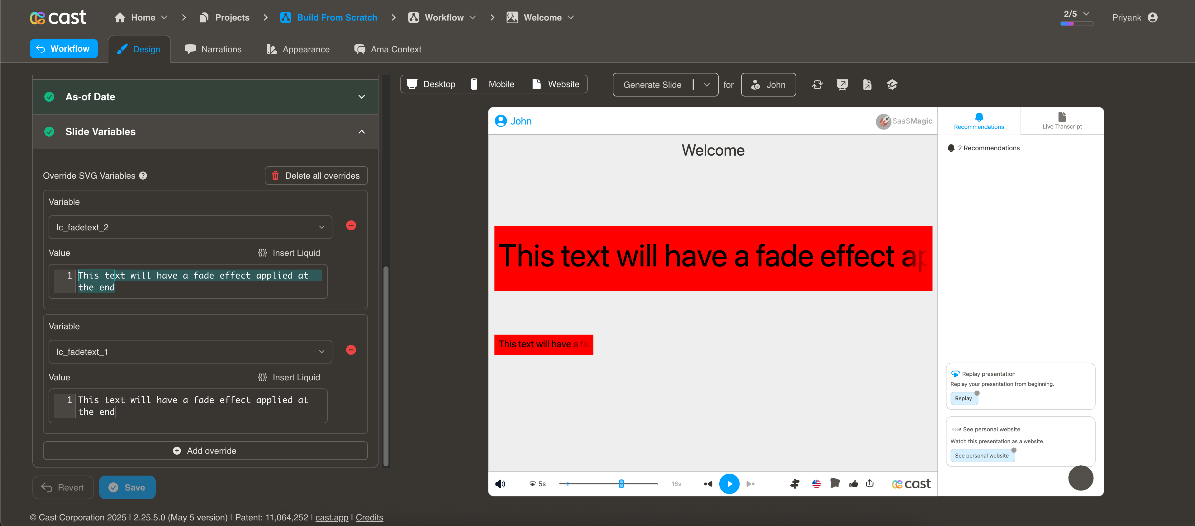
Dynamic Faded Text with lc_fadetext_*
lc_fadetext is a prefix used for IDs of text elements that need a fade effect applied at the end. Identify the Element:
The target element must be a
Input Format:
The input value should be the text content to display with fading.
Example:
“This text will have a fade effect applied at the end”
Implementation Notes:
- The fade effect is automatically applied at the end of the text
- Provides a visual indicator that text continues beyond what is visible
Compatibility: Works with <rect> elements only
Dynamic Video Integration with lc_video_*
lc_video is a prefix used for IDs of elements that need to display video content with autoplay and looping functionality.
Identify the Element: The target element must be a container with an ID that starts with lcvideo*.
Input Format:
The input value should be a URL to the video file. Example: “https://example.com/video.mp4”
Implementation Notes:
Videos will automatically play when the slide is displayed
Compatibility: Works with <rect> elements only
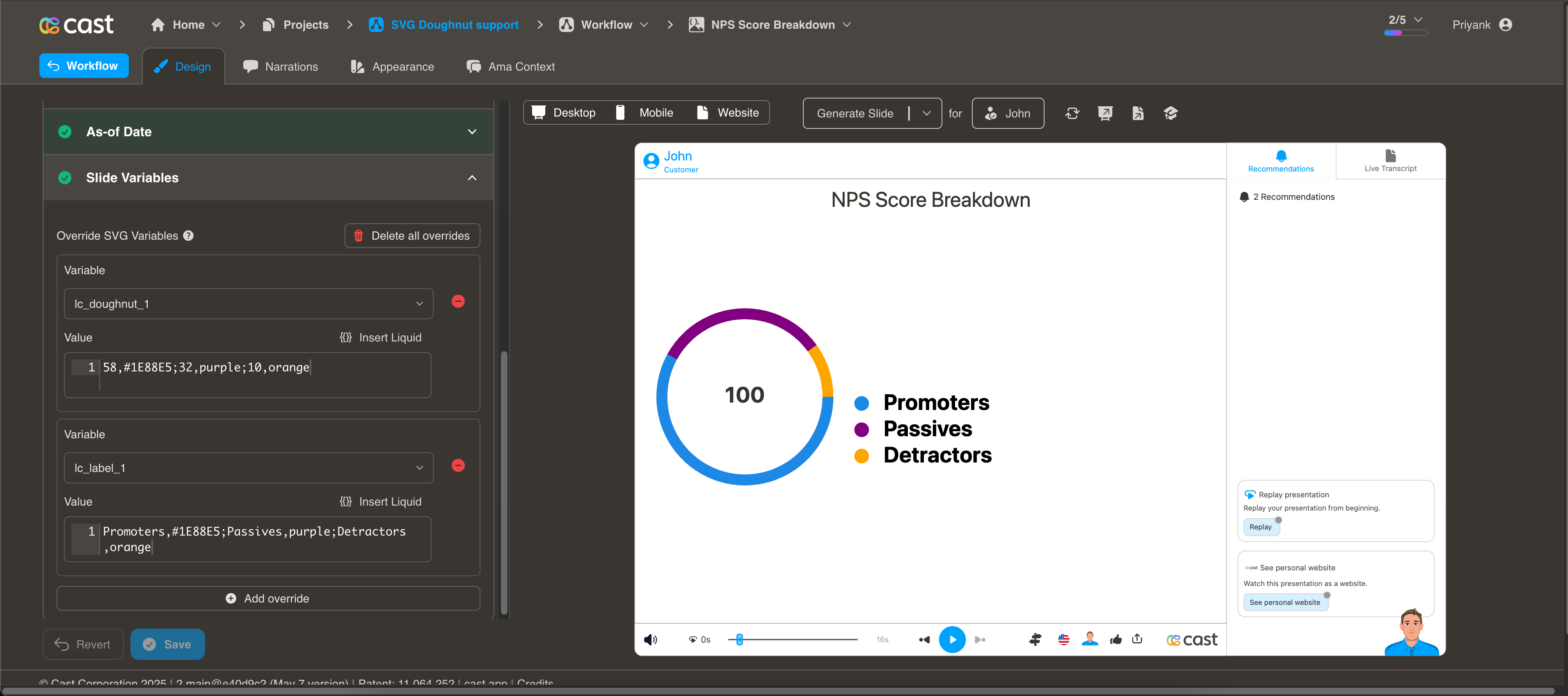
Dynamic Donut Chart Visualization with lc_doughnut_*
lc_doughnut is a prefix used for the IDs of SVG elements that need to display segmented data in a circular donut chart format, ideal for showing proportional distribution of values across different categories. The donut chart always displays as a complete circle, with values proportionally adjusted to fill the entire circumference.
Use Cases
- Proportional distribution across categories (e.g., NPS scores, market share)
- Survey results and response distributions
- Budget or resource allocation
- Customer segmentation data
- Completion status with multiple segments
Element Identification
The target element must be a
Input Format
The input value should be a string of semicolon-separated values representing each segment of the donut chart. Each segment can optionally include a color specification.
Basic Format:
“58;32;10” would create a donut chart with:
- First segment: 58%
- Second segment: 32%
- Third segment: 10%
With Color Specification:
“58,#1E88E5;32,purple;10,orange” would create a donut chart with:
- First segment: 58% with hex color #1E88E5 (blue)
- Second segment: 32% with named color “purple”
- Third segment: 10% with named color “orange”
You can specify colors using either:
CSS color names (e.g., “red”, “blue”, “purple”) Hexadecimal color values (e.g., “#FF0000”, “#1E88E5”)
If colors are not specified, the default colors from the project settings will be used.
Implementation Notes
- Colors can be specified inline with each value using the format value,color (e.g., “58,#1E88E5” or “32,purple”).
- Order of segments: Values are plotted clockwise starting from the 12 o’clock position.
- A minimum value of 1 is required for a segment to be visible.
- Negative values are treated as 1, and zero values are also converted to 1 (the minimum value for any segment is 1).
Compatibility: Works with <circle> elements only
Companion Elements
lclabel*: Used to provide labels for the donut chart segments.
Independent Operation:
Labels operate independently from the donut chart segments. They will display exactly what you pass to them without automatic synchronization with segments.
Input Format:
Labels should be provided as semicolon-separated values (e.g., “Promoters;Passives;Detractors”).
You can specify colors for each label by adding a comma followed by a color value:
- Using named colors: “Promoters,blue;Passives,purple;Detractors,orange”
- Using hex values: “Promoters,#1E88E5;Passives,#9C27B0;Detractors,#FF9800”
Compatibility: Works with <text> elements only
Manual Association:
You need to manually ensure that labels correspond to the appropriate segments. The system will not automatically associate labels with segments or adjust their positions based on segment sizes.
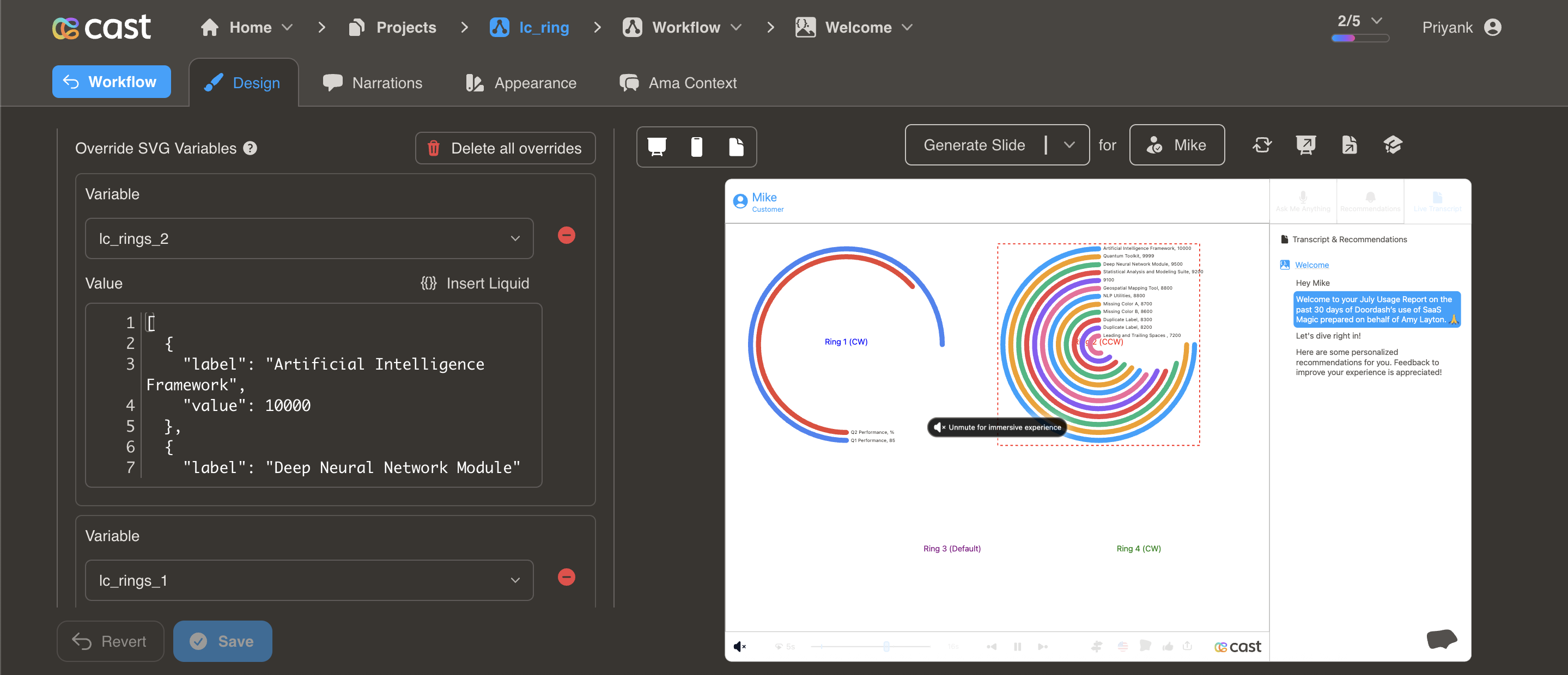
Dynamic Ring Chart Visualization with lc_rings_*
lc_rings is a prefix used for the IDs of SVG elements that need to display data in concentric ring format, ideal for showing hierarchical or comparative data across multiple categories with visual emphasis through ring positioning.
Use Cases
- Performance metrics across different time periods or categories
- Competitive analysis with multiple data points
- Hierarchical data visualization with emphasis on top performers
- Multi-dimensional comparison data
- Progress tracking across different initiatives
- Resource allocation across departments or projects
Element Identification
The target element must be a
Input Format
The input value should be a JSON string containing an array of objects with the following structure:
[
  {
    "value": 85,
    "label": "Artificial Intelligence Framework",
    "color": "#4285F4"
  },
  {
    "value": 72,
    "label": "Deep Neural Network Module",
    "color": "#EA4335"
  }
]
Required Properties:
value: Numeric value for ring sizing (negative values converted to 0)label: Text label for the ring
Optional Properties:
color: Color specification (hex, RGB, or CSS color names) - defaults to project color palette if not specified
Implementation Notes
- Rings are automatically sorted by value in descending order (highest values get outermost rings)
- Maximum of 12 rings are displayed (additional data points are truncated)
- Ring thickness and spacing are automatically calculated based on element dimensions
- Colors default to the project’s color palette if not specified
- Labels are positioned at the start of each ring with value formatting
Compatibility: Works with <rect> elements only
Dynamic Ken Burns Animation with lc_kenburns_*
lc_kenburns is a prefix used for the IDs of elements that need cinematic zoom and pan effects, commonly used to add visual interest to static images or graphics through subtle motion.
Use Cases
- Hero images and featured graphics
- Background elements that need subtle motion
- Highlighting important visual content
- Creating cinematic presentation effects
- Adding dynamic movement to static infographics
- Drawing attention to key visual elements
Element Identification
The target element can be any SVG element with an ID that starts with lc_kenburns_*
Input Format
The input value should be a JSON string containing animation configuration:
{
  "duration": 4,
  "startScale": 0.8,
  "endScale": 1.0,
  "ease": "power2.out"
}
Configuration Properties:
duration: Animation duration in seconds (1-10, defaults to 4)startScale: Initial scale factor (0-2, defaults to 0.8)endScale: Final scale factor (0-1, defaults to 1.0)ease: GSAP easing function (defaults to “power2.out”)
Implementation Notes
- Animation starts when the element transitions from dimmed/hidden to visible state
- Invalid configuration values are automatically validated and fallback to defaults
Compatibility: Works with any SVG element