Categorization
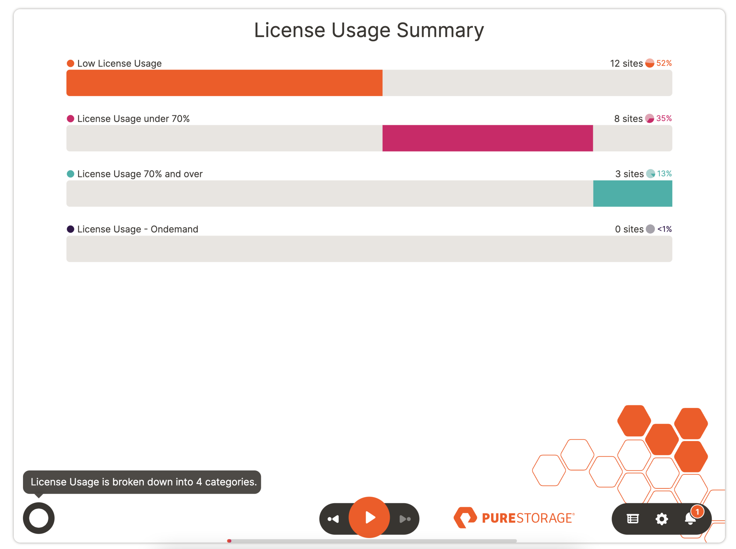
A categorization or pie-bar slide is a modern take on a pie chart and shows even the smallest sliver.
Here is some of the data that is used to generate the chart above for account 123954. You will need to format your data similar to the sample datasets for each slide type.
| ACCOUNTID | LICENSECATEGORY | NUMBEROFSITES |
|---|---|---|
| 123954 | Low License Usage | 12 |
| 123954 | License Usage under 70% | 8 |
| 123954 | License Usage 70% and over | 3 |
| 123954 | License Usage - On demand | 0 |
Download Sample Data - Categorization
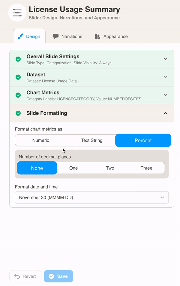
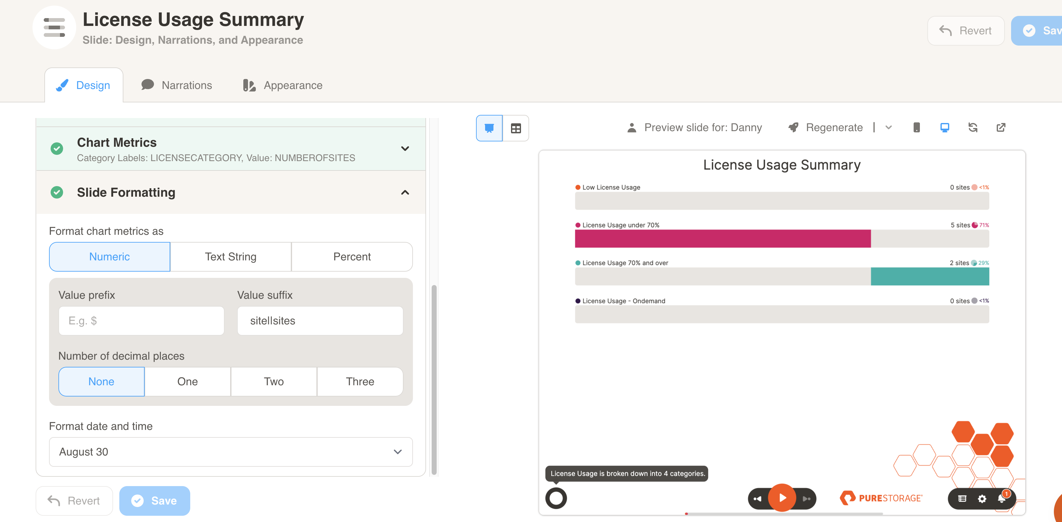
You can format the chart under Design. First, select your dataset from the dropdown menu.
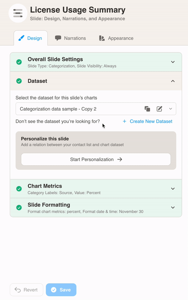
Then, define the chart metrics for your slide. Pick the Category Labels and Value.
In this example, the LICENSECATEGORY column is used for the Category Labels. The NUMBEROFSITES column is used for the Value.
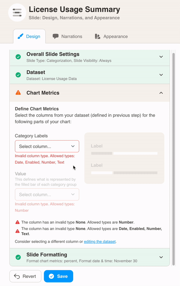
Finally, choose Slide Formatting for your metrics values. Here we added sites as a suffix after the bar values and set the values to no decimal places.