Compare Bar
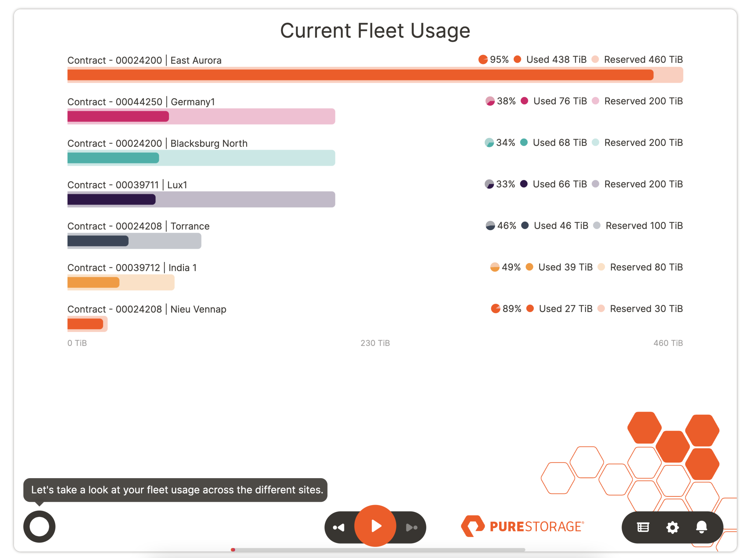
A compare bar slide compares a series of two data values. E.g., current vs. previous value, licenses used vs. bought, usage vs. overage, etc.
Here is some of the data that is used to generate the chart above for account 18745. You will need to format your data similar to the sample datasets for each slide type.
| ACCOUNTID | CASTNAME | FLEETDETAIL | VALUE |
|---|---|---|---|
| 18745 | Contract - 00038790 | Livonia | Reserved | 400 |
| 18745 | Contract - 00038790 | Dallas | Reserved | 400 |
| 18745 | Contract - 00038790 | Livonia | Used | 0 |
| 18745 | Contract - 00038790 | Dallas | Used | 0 |
| 18745 | Contract - 00024275 | New York | Used | 411.5220652 |
| 18745 | Contract - 00024275 | New York | Reserved | 365 |
| 18745 | Contract - 00024275 | California - SF | Used | 131.5328493 |
| 18745 | Contract - 00024275 | California - SF | Reserved | 127 |
| 18745 | Contract - 00024275 | London | Used | 81.78391647 |
| 18745 | Contract - 00024275 | London | Reserved | 64 |
| 18745 | Contract - 00024258 | Site2 | Reserved | 50 |
| 18745 | Contract - 00024258 | Site1 | Reserved | 50 |
| 18745 | Contract - 00024258 | Site1 | Used | 37.5029459 |
| 18745 | Contract - 00024258 | Site2 | Used | 24.93872738 |
| 18745 | Contract - 00038944 | Site 2 | Reserved | 75 |
| 18745 | Contract - 00038944 | Site 1 | Reserved | 75 |
| 18745 | Contract - 00038944 | Site 2 | Used | 4.907316208 |
| 18745 | Contract - 00038944 | Site 1 | Used | 0.01042461426 |
Download Sample Data - Compare Bar
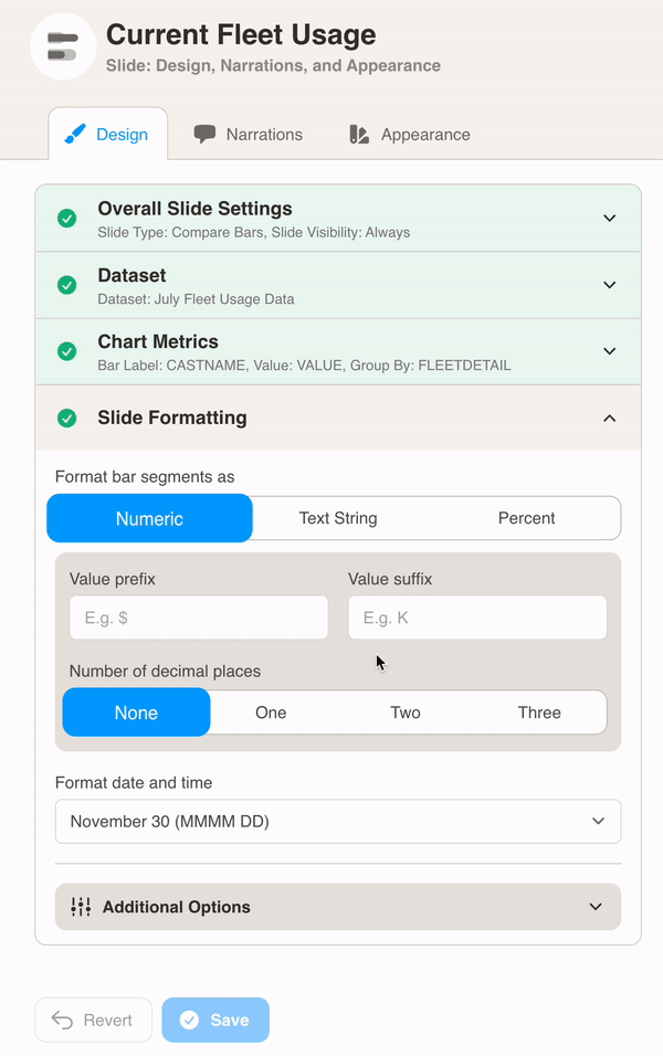
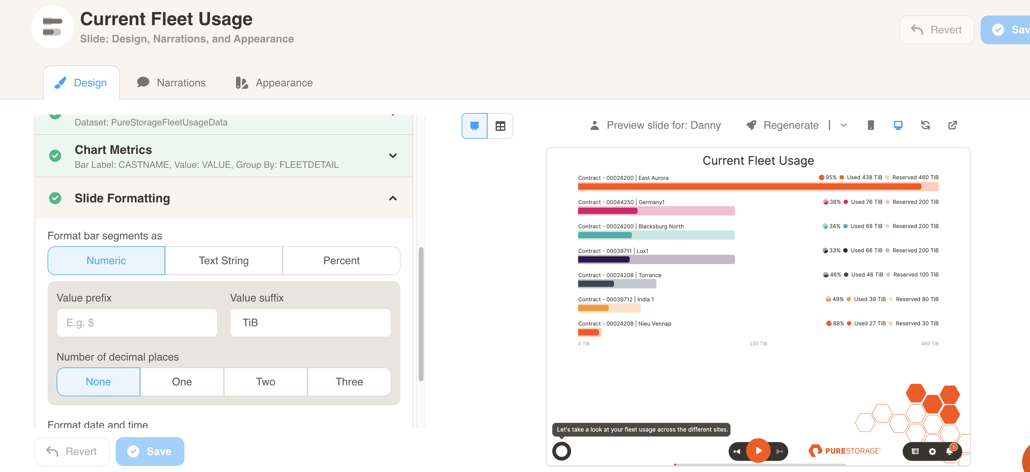
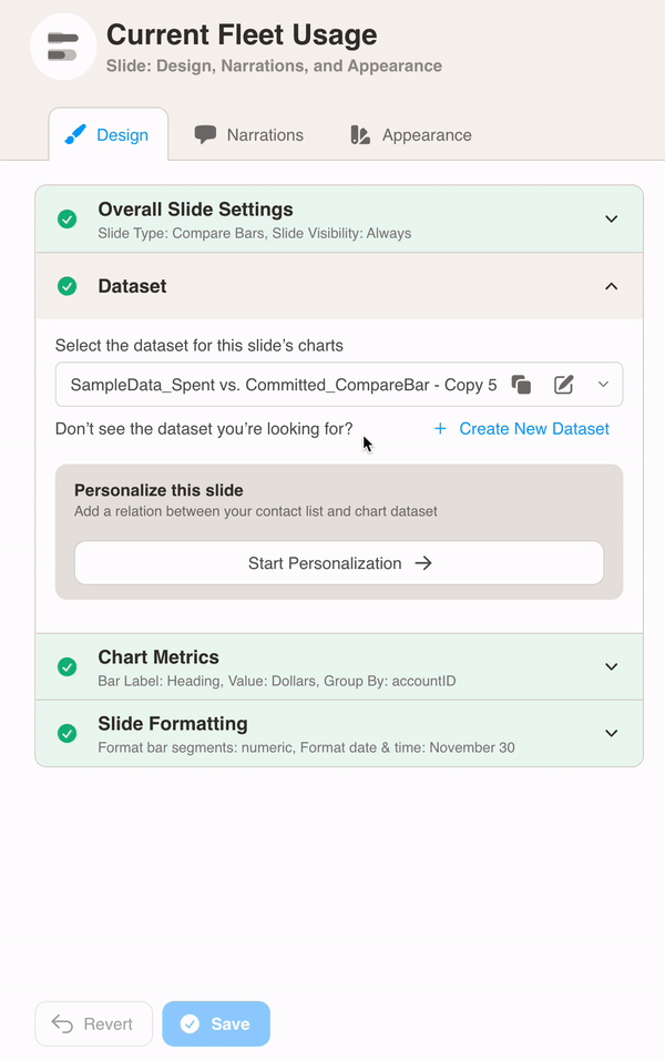
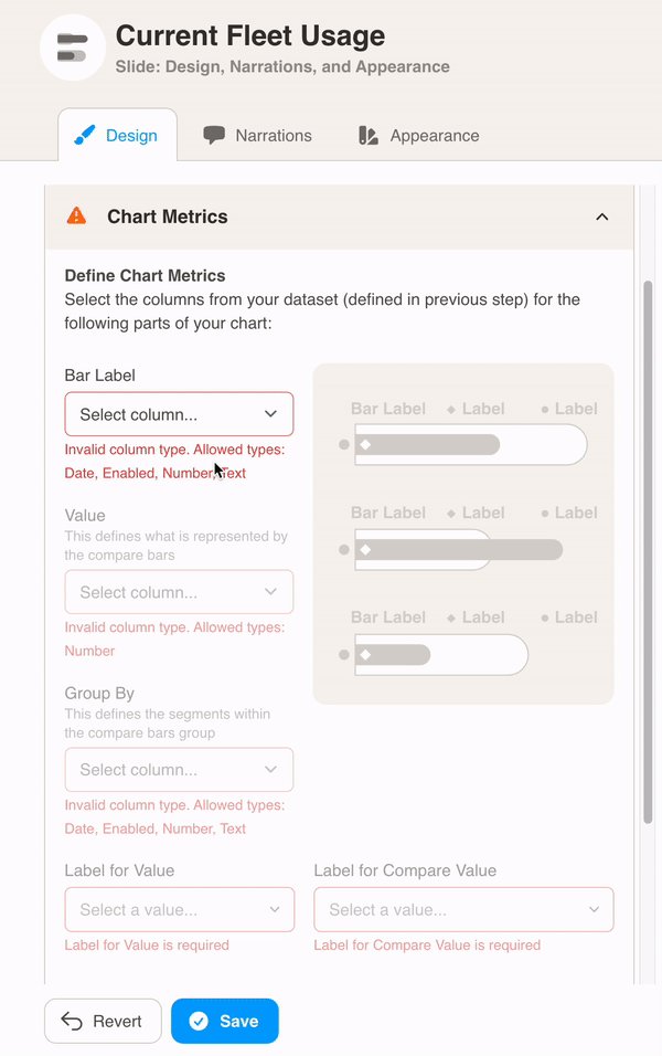
You can format the chart under Design. First, select your dataset from the dropdown menu.
Then, define the chart metrics for your slide. Pick the Bar Label, Value, Group By, Label for Value and Label for Compare Value.
In this example, the CASTNAME column is used as the Bar Label. Each CASTNAME (e.g. Contract - 00024275 | London) has two VALUEs, one for Reserved and one for Used, so we select FLEETDETAIL as the Group By column to show this. Used and Reserved are the values being compared.
Finally, choose Slide Formatting for your metrics values. Here we added TiB as a suffix after the bar values and set the values to no decimal places.