Gauges
A gauges slide represents a series of metrics against a color-coded context. E.g., health scores for features and products.
Here is some of the data that is used to generate the chart above for account 123954. You will need to format your data similar to the sample datasets for each slide type.
| ACCOUNTID | CATEGORY | METRIC | VALUE |
|---|---|---|---|
| 123954 | FeatureUsage | Dashboards | 20 |
| 123954 | FeatureUsage | Email Assist | 12 |
| 123954 | FeatureUsage | R360 (Relationships) | 40 |
| 123954 | FeatureUsage | Success Snapshots | 20 |
| 123954 | FeatureUsage | Surveys | 20 |
| 123954 | FeatureUsage | Timeline | 20 |
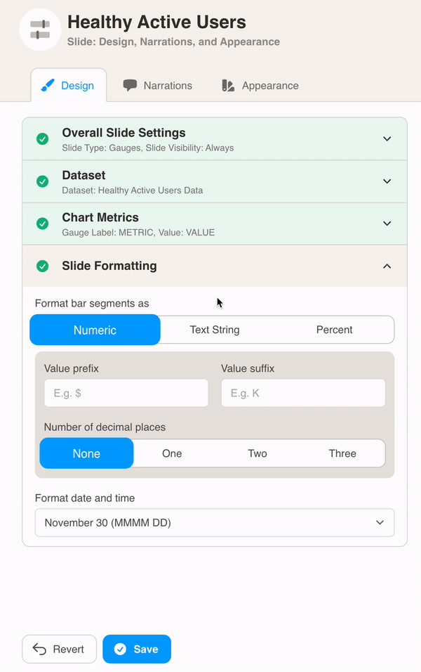
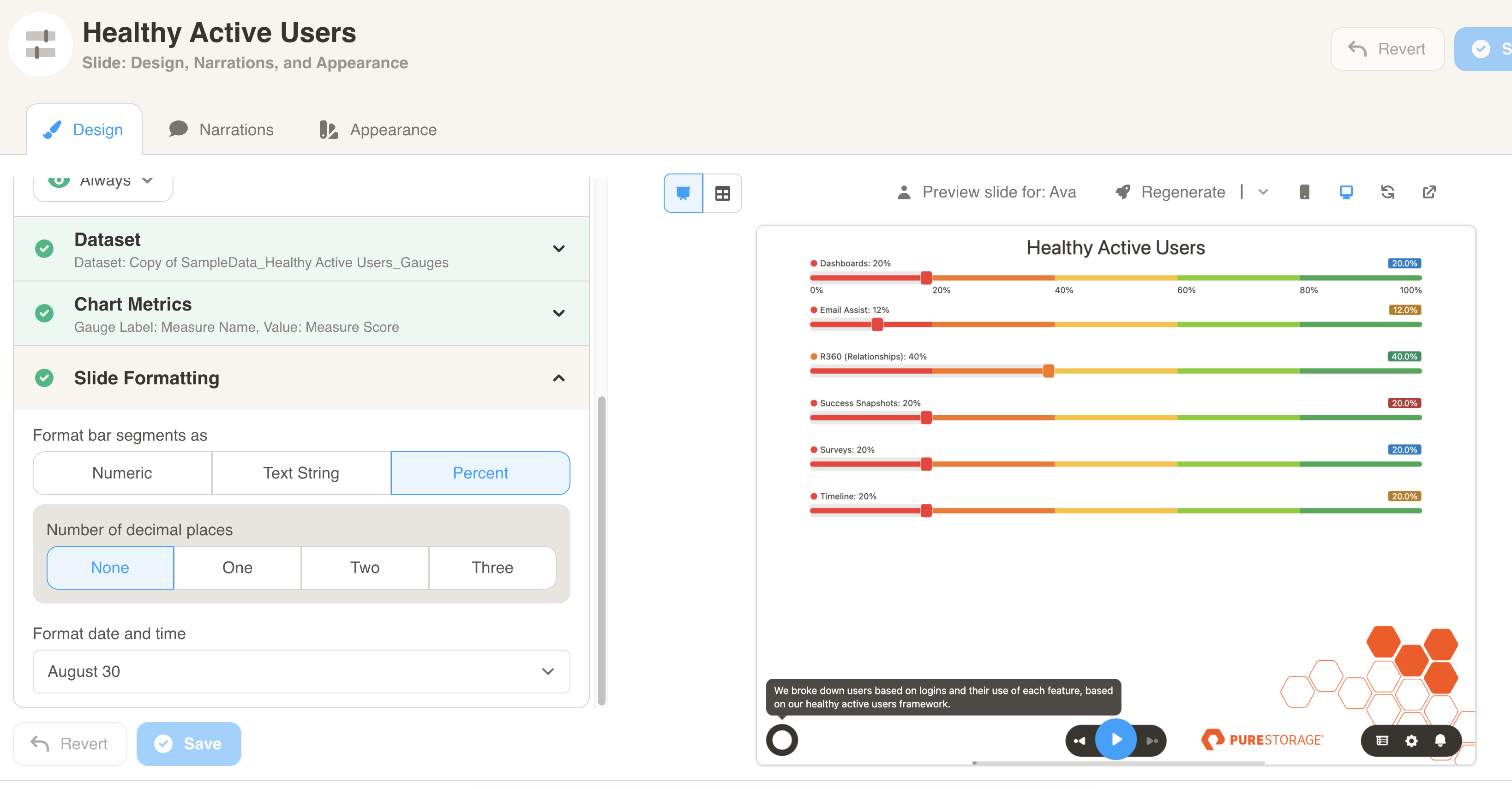
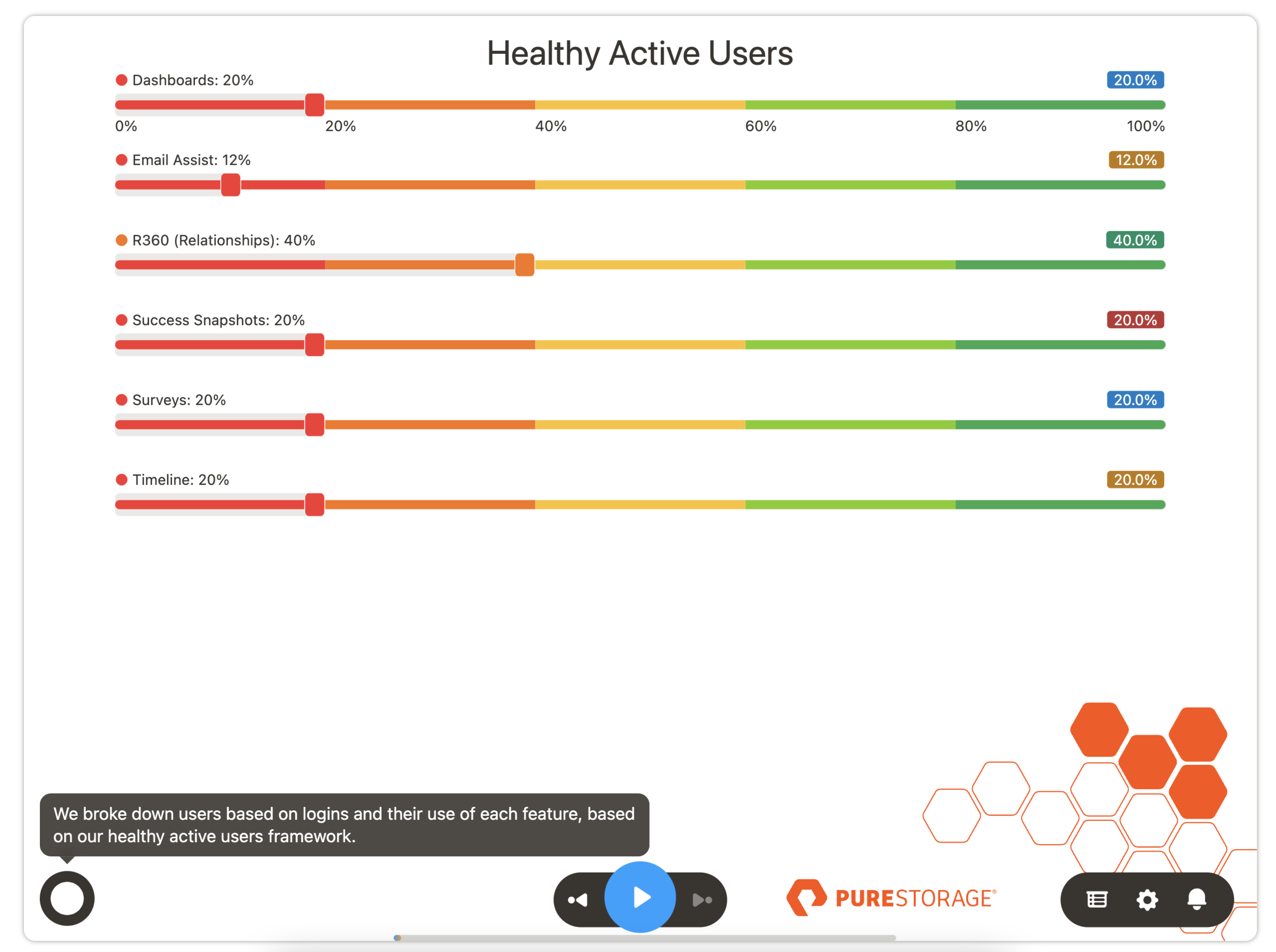
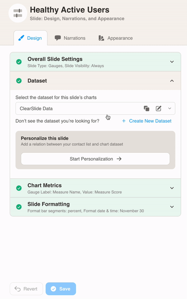
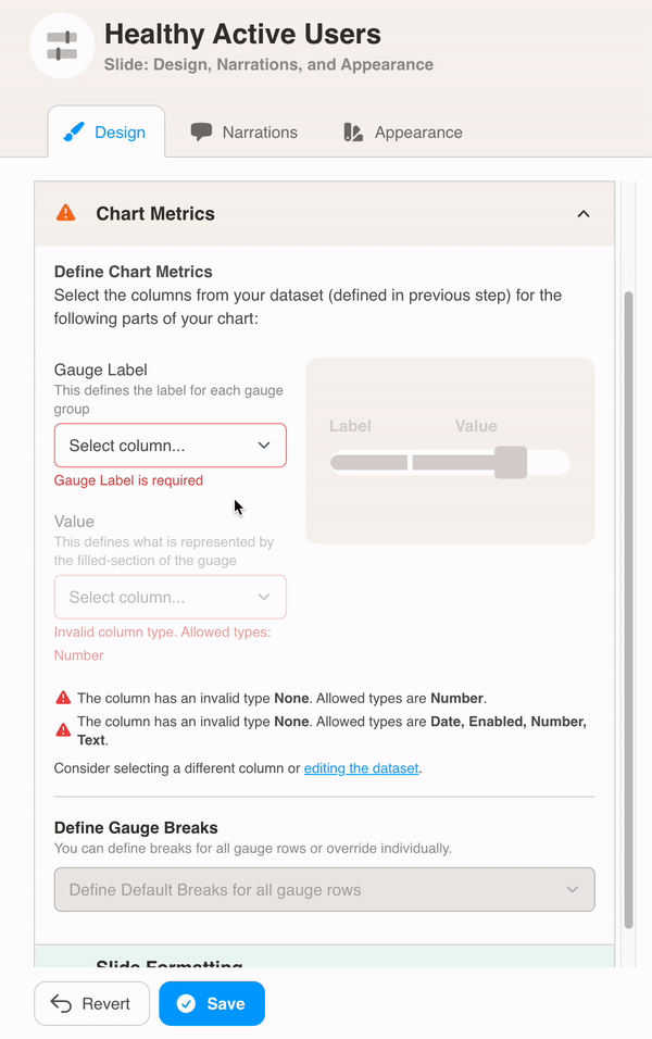
You can format the chart under Design. First, select your dataset from the dropdown menu.
Then, define the chart metrics for your slide. Pick the Gauge Label and Value.
In this example, the METRIC column is used for the Gauge Label. The VALUE column is used for the Value.
After, define gauge breaks for your gauge rows. This allows you to create percentage ranges and select colors for each of them.
In this example, the gauge is red from 0 to 20 percent, yellow from 20 to 60 percent and green from 60 to 80 percent.
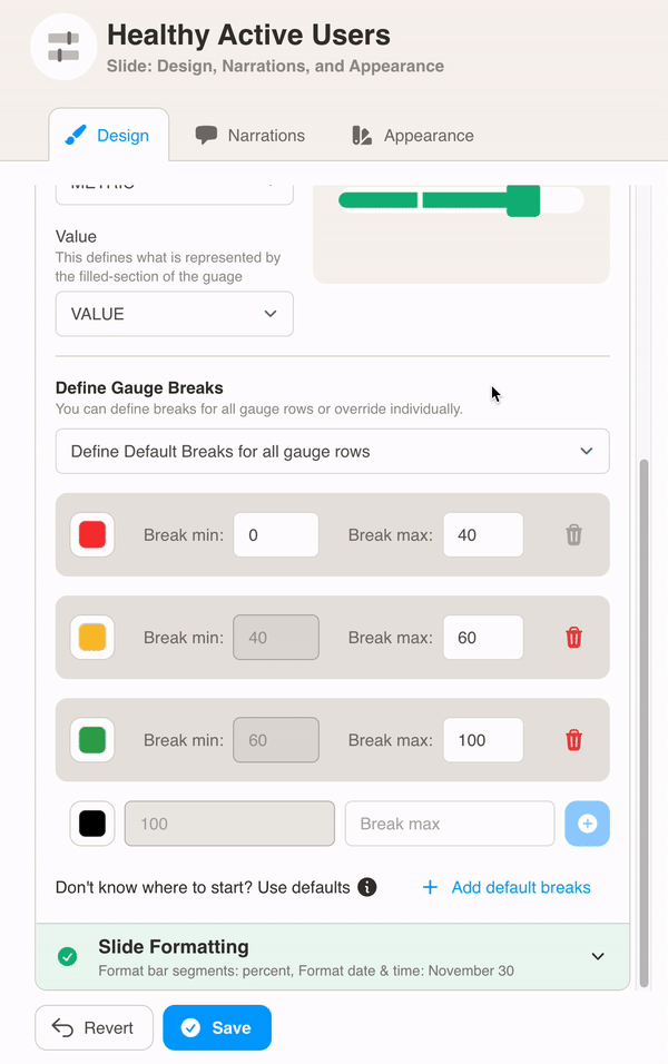
Finally, choose Slide Formatting for your metrics values. Here we formatted the bar values as percent.